

Closed (fixed)
Project:
Paragraphs
Version:
8.x-1.x-dev
Component:
Code
Priority:
Major
Category:
Task
Assigned:
Issue tags:
Reporter:
Created:
1 Jun 2016 at 13:20 UTC
Updated:
9 Dec 2016 at 17:34 UTC
Jump to comment: Most recent, Most recent file



Comments
Comment #2
johnchqueComment #3
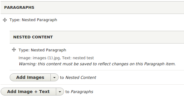
johnchqueVery early patch, supports only text fields and image fields. Not really sure yet if the approach is the correct one. Also used a two line display since the space in the closed mode is too narrow and got some problems with css.
Comment #4
miro_dietikerJust identified the "Warning this content needs save".
Should be a separate issue to make sure it's yellow and catches the users' eye. :-)
Comment #8
miro_dietikerThe screen shows more space below "Type: Nested paragraphs" than we currently have. Is there an empty element or accidental space added?
The code should still cutoff after a limited amount of text IMHO to some large value. Currently we would output here large full text bodies and then set them to a single line overflow hidden...
Not sure if we can always add this on closed items as long as it adds a full new line. We might want to have an optional setting "Show closed summary".
If we can display it after the type, i see no regression in space and we could always output it.
Since this is a great improvement and we are not adding any new API and contracts, we can commit this early. Flexibility to support more field types, ... can always be added later.
Comment #9
johnchqueFound a way to display everything in the same line. Also added a limit to the text, still might break tests.
Some examples here. It is also working with nested paragraphs.
Comment #13
miro_dietikerThat's great progress. We should discuss the approach with some UX people next week at DDD.
I think "Text: " is superfluous. Even if it's the field label, i think that the characters are so much limited, the value only is totally OK.
- How does it look if a nested level is collapsed?
- What if the type label is longer than the indentation?
Some first code feedback:
It's strange you pass in $collapsed_summary_text as boolean and then you do string concatenation on it. Anyway, it is never passed in.
What is the field sequence? I think it should be the default formatter field sequence.
We should also support major us cases through entity references.
Also thought about a tiny image, but not sure if it really helps at that tiny size.
There is a special UTF8 character for "..." we should use.
Caution, this can result in a recursion. Especially once we add support for entity_references.
Comment #14
miro_dietikerBTW there is just another issue that adds a collapsed summary by looking for a "title" field. #2749257: Show a paragraph title if there's a field with a title
Since we have dropped the concept of a label for regular paragraphs, this seems not to fit our approach.
Comment #15
johnchqueThe second image of my previous comment shows an example of nested paragraphs (3 nested). It works due to the recursion pointed in 13.5
Comment #16
johnchqueComment #17
miro_dietikerNote that
- I see the value of indentation for optical alignment of the summary start.
- I still would like to see real cases without any horizontal alignment. Google mail also decides against it (subject + body one line summary) since the subject length is even more variable than here.
Adding my gmail origin screenshot again here:

Comment #18
johnchqueI was also wondering if it is a good idea to just display the text of the first text field, the idea of my previous patch was to concatenate some text of each text field in the Paragraph.
Comment #19
tassilogroeper commentedSo I had rather long talk with @yongt9412 about other tickets, including this one. We came to some conclusions:
1. a gmail like row is desired
2. the preview area (orange, Plugin defined area) should expand as much as possible. (not exact in the screen)
3. it would be nice to have a plugin like system for each field type, to have a "preview" renderer if the field is not empty (orange)
4. the actual area to drag, click and expand (green area) needs to be quite big, to be usable. not only the draggable icon!
to 3.
Image you would need to implement a ParagraphFieldPreview. This allows every field type to define, how it will be broken down to one single line.
Text: formated or not
(image) File: the file path, or file name, file size, file type
Color Widget: the hex/hsl code AND a colored box
Paragraphs: titles of nested paragraphs inside it
and so on... A couple of core field types can be provided by paragraphs as well.
If there is no such PragraphsFieldPreview defined, it will fallback to some existing previews.
Comment #20
tassilogroeper commentedadding to my last comment
5. the Edit/delete button does not to be a split button at all if 4. will be implemented, we only need the remove button there.
To sum it up: the interactions with one single row would be
- resort on drag and hold (green)
- expand/collapse on click on the draggable area (blue)
- remove item by click on the button (button)
Comment #21
jmuzz commentedI agree with #18. One text field should be sufficient for collapsed paragraphs. There could be a setting to pick the field.
There is already the option to show previews instead of collapsed paragraphs for users who want to set up something more elaborate. If #2684187: Allow existing view modes to be used for the editor preview gets done they'll be able to set up a view mode specifically for that purpose too.
IMO the UI should follow Drupal standards and other common examples as much as possible. Inline Entity Form provides an edit button for its collapsed entities in multi valued fields. That makes it obvious how the item can be edited and accessible. One of the reasons that the area to click and drag items is limited to the icon in the side is that these icons represent the possibility of horizontal movement as well as vertical (the arrows point in 4 directions) which comes into play when they appear in, for example, field groups that can be nested at various levels. That may not apply to collapsed paragraphs but it's still a standard UI element with a well-defined behaviour. You can see them at admin/structure/block too, for example.
Comment #22
jmuzz commentedDidn't change much but tried to address a few of the comments:
About what I said in #21 I tried to add a setting to let the user choose a field to show in the summary but it wouldn't be able to be a widget setting because the type of paragraph won't be known at that point. I thought of making it a setting on the paragraph bundles too but that setting screen is something you usually only see once on the first step of creating the bundle and I didn't think trying to get people to go back there after they add fields would be user friendly.
Comment #23
johnchqueCan we get an screenshot with the changes?
Comment #24
johnchqueIf we remove this and add overflow: hidden we have a better display of the title with real ellipsis effect
The description is a bit short now, what if we change this to be 150 characters and remove the '...'? Would make more sense IMHO, especially that in gmail there is no ellipsis effect on the content.
Addressing those changes, I think the summary would look like:
What do you think?
Comment #25
johnchqueMade some changes as suggested above. What do you think?
Comment #26
johnchqueSorry, interdiff created in the wrong way.
Comment #27
miro_dietikerAwesome stuff. I will need some time to play with this. You're challenging me in convincing my finger not to be too committy! ;-)
I'm promoting it to consider it prior to next release.
Comment #28
miro_dietikerFor me, the paragraph types are cutoff way too early. At 1024, i can only see 5 characters of the paragraph type.
And with a mobile like browser width, it can happen that there is no type information at all.
This is not satisfying. I guess we need additional rules for lower widths, such as a fixed min width of the type info.
With the different visual indication, i now even consider removing "Type:" completely as a paragraph type prefix. At least when collapsed. It steals too much space.
I don't like that the summary indicates not if the content is clipped.
Also, the summary doesn't start at a consistent horizontal indentation - it looks misaligned to me.
I played with flex and overflow definitions and with setting flex-base to the summary also it was possible to have ellipsis also on summary.
Follow-up: I also have seen again the "Warning" on collapsing a para, that is still not yellow indicated, confusing me as it looks more like text that contains to the content and doesn't read like a message.
But yeah, i think it's a great improvement.
I think we should add support for entity references also, displaying the entity label. But if we add this, we need to prevent infinite recursion. Can be a follow-up in general.
Comment #29
miro_dietikerHow about cross browser testing? Do we need to spend some time in review?
Comment #30
miro_dietikerAh, and i'm getting this with some stale data:
So yeah, data is stale, like i have uninstalled paragraph types... But i guess the notice can be easily avoided.
Comment #31
johnchqueSmall changes. This should avoid warnings. Tried to add ellipsis effect to the summary with no success, I keep getting a broken width of the table after applying "white-space: nowrap" to the summary. Besides that, working nice.
Comment #34
johnchqueFixed tests. Btw I really wonder how to add the ellipsis effect to the description, because using white-space no wrap make the table break its width. I also tried with Flex based css but doesn't work either, if we try with display: table the ellipsis effect cannot be applied.
Comment #35
pivica commentedOkey, first thing this is very ugly stuff ;) And its ugly because of two things:
So what is done then? Here are the stuff that is done in new patch
Here are the screenshots:
Closed desktop

Closed mobile

Open desktop

Open mobile

Comment #36
johnchqueIndeed the css is much cleaner now and the display is more consistent!! really nice!! We must rework classes though (that for sure is a followup).
I think we should also add here
text-align: centerto make the star be in a better position like:Also in the previous screenshot the fade out effect doesn't match the background color. IMHO removing it and adding the summary without the ellipsis effect is clear enough.
About changing the warning color to the edit messages, I think we should fix also moving all the "Unsaved changes" messages to the top as a warning message. (That can be another followup).
Seems really nice now, not really sure if everyone agrees with not displaying the ellipsis at all.
Btw also the css indentation should be just 2 spaces.
Comment #37
pivica commented> I think we should also add here text-align: center to make the star be in a better position like:
Hmmm we are losing some vertical space there and also if everything is aligned horizontally then it make sense to try to put * also in the same line. Here it is how it looks with new patch
> Also in the previous screenshot the fade out effect doesn't match the background color.
New patch fixes this so hover and dropped background colors are followed now.
> IMHO removing it and adding the summary without the ellipsis effect is clear enough.
I don't have a stand on this basically, OK for me also to drop fade out if other agrees. But i would like somebody else to give opinion on this from UX perspective.
Also adding ellipsis is almost impossible with current Drupal core drag-able interfaces but we wanted multiple time in the past and now to add this indication to end user somehow so it make sense to think little bit more about this before deciding what to do finally.
Comment #38
pivica commented> Btw also the css indentation should be just 2 spaces.
Correct here is separate patch, just indentation changes so no interdiff needed.
Comment #39
johnchqueLooks nice! yes, now the fade effect fits with the background.
And I agree, we need the review from someone else, but the patch makes the css much nicer. :)
Comment #40
johnchqueI've been checking more and I like it more in this way:
So the width of the handler doesn't increase.
Still we need some other review.
The changes in the screenshot were made doing:
Removing this and instead adding:
display: inline-flexAnd removing this.
Comment #41
pivica commented> I've been checking more and I like it more in this way:
Not sure what is the better way, it seems more logical to me that its first because its easier to get notice like that. On the other hand block admin drag and drop page is putting * on the end of a label, something we can not do that easily here. So i guess your suggestion also make sense.
Comment #42
johnchqueI suggested that because we wanted to reduce the width of the handler as much as possible and with the last patch it adds some width that can make the indentation become bigger when creating nested Paragraphs.
Comment #43
pivica commentedOk make sense, do you wanna role a new patch with this?
Comment #44
johnchqueChanges made as suggested in the last screenshot. :)
Comment #45
miro_dietikerThat looks very promising.
What's this asterisk (*) for per paragraph in #40 screenshot?
Need to check this also on low width devices. Screenshots would also help.
Comment #46
johnchqueThe asterisk is the indication of core when a row was moved with the handler, so it indicates that there are changes.
Comment #47
miro_dietikerI checked a text field with multiple values.
Only lines that changed position get a "*" and also they are with yellow background.
Your screen above shows all lines - also non-yellow ones - with an asterisk.
Is this a general problem?
Comment #48
johnchqueOhhh no, in fact when a row has changed it keeps the asterisk. I was holding the one that is in yellow in the screenshot. I don't think that is a bug/problem. :)
Comment #49
johnchqueComment #50
miro_dietikerYeah i see, only one row remains yellow. So this could be fine.
Comment #51
megadesk3000 commentedI installed the patch and tested it in Chrome and FF. The improvements are awesome and work for me.
One suggestion: We use https://github.com/AmazeeLabs/paragraphs_collapsible in one of our projects and i like ease of use of their js solution to collapse and expand paragraphs. The advantage i see over the standard solution is, that it is possible to expand/collapse paragraphs even when creating new nodes. With the solution here its is not possible to collapse a paragraph while creating it.
But yes, basically that has nothing to do with this issue.
Comment #52
miro_dietiker@megadesk3000 There is an issue about adding JS based collapse in Paragraphs and it explains the process of adopting this and reasons for our decision here. This is a first step in a long process - see also other META issues and it's important that we move steps forward that keep complexity low, well test covered and being perfectly aligned with the long term direction.
Comment #53
miro_dietikerAlmost committed, but checked #30 comment again with code from then. The logic is still same.
A paragraphs field could have an image that has no file attached to it. So this needs better checking for empty cases to avoid notices.
Comment #54
johnchqueOK, tests added. also improved summary for images. :)
Comment #55
miro_dietikerMake this an array, always append and implode with comma at the end.
Comment #56
johnchqueChanging for using an array and implode.
Comment #58
miro_dietikerSo, let's take this one step further. ;-)
Committed and thus ready for big party for the weekend! :-D :-D
Thank you all for this awesome work. For now it remains hidden (because you need to switch to closed paragraph widget) but it will soon make people happy when we allow collapsing in more cases.
Comment #59
miro_dietikerI have the feeling that the grey is a bit too low and leading to contrast trouble for some screens and people. So we should make it a bit more dark.
Comment #60
johnchqueUsing the same color as seen in inmail. ;)
Comment #62
miro_dietikerOK, done.