
 Come together with the global Drupal community in Rotterdam, 28 Sept – 1 Oct 2026. Sessions, contribution, connection, and Early Bird savings until 8 June.
Problem/Motivation
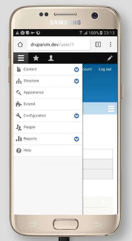
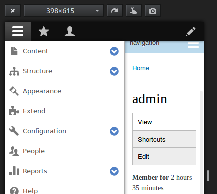
On mobile viewports, .toolbar-bar (the black toolbar with icons for Manage, Shortcuts and Admin) scrolls as it has position: relative - i.e. when you scroll down the screen it disappears from view. However .toolbar-tray-vertical (containing sub-menu items such as Content, Structure, Appearance, Extend…) has position: fixed - this means it stays on the left of the screen when scrolling, with an unwanted gap above it because the toolbar has moved off screen.


Proposed resolution
?
Remaining tasks
- Write patch
- Manual browser/device testing.
User interface changes
Yes (depends on what we do)
API changes
None.
Data model changes
None.
| Comment | File | Size | Author |
|---|---|---|---|
| #23 | screenshot-www.browserstack.com 2017-03-31 15-14-24.png | 177.45 KB | aaronchristian |
| #22 | fixed-the-navbar.png | 27.55 KB | brahmjeet789 |
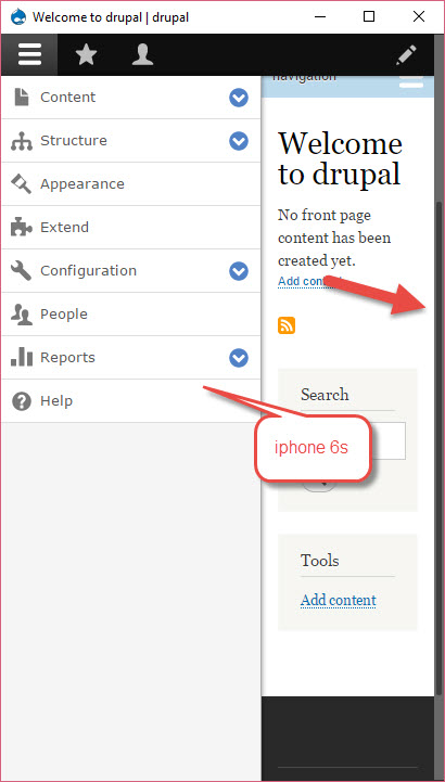
| #20 | before-iphone6s-top-of-page.jpg | 38.94 KB | wturrell |
| #20 | before-iphone6s-scrolled-down.jpg | 37.25 KB | wturrell |
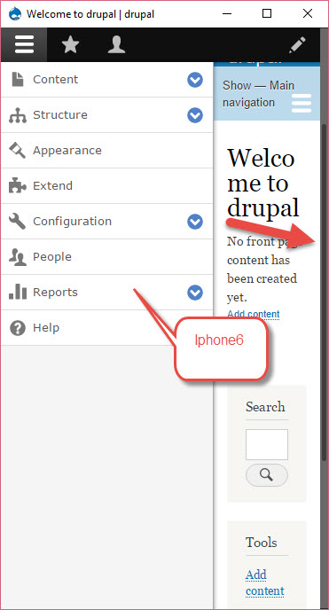
| #15 | iphone-6s.jpg | 62.63 KB | jaspreetsingh31 |

Comments
Comment #2
rajivmandve commentedAdded a media query in Drupal core file to fix this issue. Please find the attached patch file for the same
Comment #3
rajivmandve commentedComment #5
rajivmandve commentedI have fixed the issues in patch file. please find the attached updated patch file.
Comment #6
rajivmandve commentedComment #7
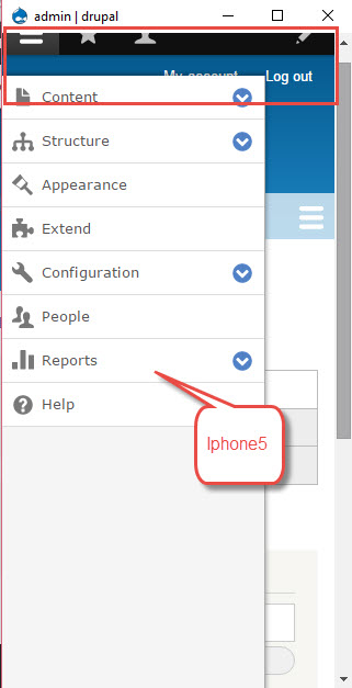
jaspreetsingh31 commentedI have tested the patch: drupalcore-admin_main_menu_sticky_for_below_767_resolution-2562251-5-drupal8.0.x.dev_.patch but still admin toolbar is not sticky.
For sake reference, please find the attached video and image.
Thanks
Jaspreet singh
Comment #8
kostyashupenkoComment #9
kostyashupenkowill check now #7
Comment #10
kostyashupenkoWell, there was an issue with default values of toolbar model. I've changed some properties and removed css changes from patch #5, because we don't need this css. Styles for class ".toolbar-oriented" is not related to our issue with fixed/unfixed position. To have fixed position we have class ".toolbar-fixed". So for now we have fixed toolbar for any resolutions.
before


after screen 1
after screen 2
Comment #11
jaspreetsingh31 commented@kostyashupenko, I have verified this issue on multiple simulators but still issue exists. Please review the attachments for sake reference.
Thanks
Jaspreet singh
Comment #12
nadiya commentedAdding patch for the fix, also adding the screenshot after applying the patch.
Comment #13
nadiya commentedComment #14
kostyashupenko@jaspreetsingh31, use 8.0.x branch, then apply my patch, after drush cr you should check my patch

Look on my screen. There is ".toolbar-fixed" class for body tag
And again in #12 comment.
.toolbar-oriented .toolbar-bar {
position: fixed;
}
I'm not sure that this way is correct for fixing position of toolbar. Read my message above #10. For sticky toolbar we have class "toolbar-fixed" ! Another ways to fix toolbar - it's a wrong ways. No?
Comment #15
jaspreetsingh31 commentedThanks @nadiya for your support. I have tested your patch : toolbar_menu_tray_for-2562251-12.patch and it works fine.
I have tested it on multiple screens.
For sake reference, Please find the attachments.
Thanks
Jaspreet singh
Comment #16
star-szrPutting back to needs review, this needs more discussion and an issue summary. UX and other considerations need to be taken into account before we do something like this I think.
Thanks for the work so far, everyone.
Comment #20
wturrell commentedRewritten issue summary + added screenshots.
Comment #21
wturrell commentedComment #22
brahmjeet789 commentedcan we put the navbar position to be fixed so that the space casn be retained.
.toolbar-bar{
position: fixed;
}
Comment #23
aaronchristian commentedAhhh I've noticed this many times during development. Super annoying!
Patch works well, I do believe this is the correct direction in terms of best UX patterns.
I would be comfortable setting this to RTBC unless anyone opposes.
Tested:
Windows;
- Chrome Latest
- Firefox Latest
- IE 8/9/10
Mac;
- Chrome Latest
- Firefox Latest
- Safari 10
Samsung Galaxy S7
Android HTC 10
iPhone 6 & 7
Comment #24
lauriiiDuplicate to #2516938: Set the toolbar to position fixed on mobile