
Closed (fixed)
Project:
Drupal core
Version:
8.0.x-dev
Component:
toolbar.module
Priority:
Normal
Category:
Bug report
Assigned:
Unassigned
Issue tags:
Reporter:
Created:
17 Jan 2015 at 22:35 UTC
Updated:
23 Feb 2015 at 12:44 UTC
Jump to comment: Most recent, Most recent file


Comments
Comment #1
joelpittetThis I think may have been a regression. Here is the fix for the vertical toolbar.
Because the horizontal mode has the LI's as float: left; the display: will work for both and is the simpler patch.
Comment #2
davidhernandezThis change happened here #1855066: In the "menu" toolbar tray, clicking/tapping white space should show the child level
Comment #3
Zombiecraze commentedTested in Firefox 35.0 & Chromium 39.0.2171.65 on Linux and seems to fix the reported issue
Comment #4
AlfredK commentedTested on Safari Version 8.0.2 (10600.2.5) and Chrome Version 40.0.2214.85 beta (64-bit) on OXS Yosemite 10.10.1. Fixed reported issue
Comment #5
joelpittetComment #6
sivaramakrishnan commentedTested and Reviewed in Chrome and Firefox on linux.
also tested in windows - opera, chrome,firefox and ie 11.
attached screenshots for linux.


Screenshot on Chrome:
Comment #7
lewisnymanI'd like some feedback from Wim before we commit this. We were discussing this in #1855066: In the "menu" toolbar tray, clicking/tapping white space should show the child level
Comment #8
joelpittetadding bat symbol
Comment #9
SteveK commentedApplied the patch and works as expected.
Tested on Firefox + Chrome on OSX.
Chrome (OSX)

Firefox (OSX)

Comment #10
davidhernandezThis requires more discussion. Lets leave it at 'Needs review" for now, please.
Comment #11
davidhernandezOops
Comment #12
joelpittetBack to RTBC. From the other queue:
@Wim Leers
Comment #13
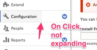
wim leersWith the toolbar in vertical orientation, clicking in the middle of the whitespace between the "Structure" link text and the arrow…
Sorry :(
Comment #14
joelpittet@Wim Leers do you have any UX patterns that support this pattern of click off the arrow would toggle the opening and closing of the children and not the link?
From my experience the action always happens on the link and the hit area for the arrow is acceptable for fingers on touch devices.
Comment #15
joelpittetThis is the closest pattern I could find that does parent link and toggle.
http://jasonweaver.name/lab/flexiblenavigation/
The only other ones I spotted were toggle only parents that had no links OR, they dumpped the parent link in the toggle (Foundation http://foundation.zurb.com/docs/components/topbar.html#mobile-parent-links).
Comment #16
wim leersI don't have supporting UX patterns, only the UX that benjifisher — the person who opened that other issue — and I found frustrating: those arrows are frustratingly small hit areas on touch devices:
I'd swear #1855066: In the "menu" toolbar tray, clicking/tapping white space should show the child level got a usability review, but apparently/clearly it did not. So if the behavior introduced there should be undone for UX reasons, so be it. This is also what Lewis Nyman said in #1855066-22: In the "menu" toolbar tray, clicking/tapping white space should show the child level:
Comment #17
lewisnymanBut the solution goes too far the other way, the hit areas for the arrows are now too big in some situations, and the parent link is too small.
I don't think this is an either/or issue. We can solve both of these problems by increasing the width of the arrow manually while maintaining the full width behaviour added in the patch in this issue.
Comment #18
wim leersSounds good!
Sorry for the delay on my part here. And for getting it wrong the first time.
Comment #19
joelpittetOk good idea, I'll post a patch with a wider hit area for the arrow tonight unless someone wants to take this in the meantime.
Thank you for the feedback @Wim Leers and @LewisNyman
Comment #20
joelpittetI added some padding to the left so the text was less likely to run into the hit area of the button so there would be no confusion of what is toggle button and which part is link.
Comment #21
joelpittetSame screenshots but this make sure it doesn't touch the horizontal toolbar padding.
Comment #22
joelpittetComment #23
skippednote commentedWorking as expected. The whole button is getting the hover/active state effect and the sub-menu button area is getting greyed out when clicking on the toggle arrow.
Comment #24
idebr commentedChanges look good! I found some css standards that should to be fixed before committing
For direction specific property/values, add the comment /* LTR */ on the same line preceded by a single space.
Found two spaces after [dir="rtl"], expected one space.
display: block; is the default for links in the toolbar, so this rule can be removed. See toolbar.module.css line 41/44.
Comment #25
joelpittetThank you for the review @idebr!
I hope I got the LTR comment right, I'd much rather put the LTR stuff in [dir="ltr"] stuff and be explicit about it.
Other than the removal of the display block, which I checked still works, is there anything else?
Comment #26
idebr commented@joelpittet Thanks for picking this up.
You are not the first to argue this and there are more that agree :). Let's follow the current standards for now and leave this discussion for a followup.
Just a minor issue left:
The /* LTR */ comment is per attribute, so it should be added to padding-right as well as padding-left.
Comment #27
joelpittet@idebr thanks, I was thinking I should do that too.
Comment #28
idebr commentedCheers! All CSS coding standards have been addressed.
Screenshot after for good measure:
Comment #29
alexpottThis issue is a normal bug fix, and doesn't include any disruptive changes, so it is allowed per https://www.drupal.org/core/beta-changes. Committed 0fe7e02 and pushed to 8.0.x. Thanks!