Supported chart types
Overview
Forena facilitates the creation of charts (graphs) in Drupal by using the SVG Graph library. Many of the chart types supported by this library, are also supported by forena, i.e.:
- Bar Graph, with a style of Simple, 3D, Stacked, Grouped, Horizontal, Cylinder, Stacked Cylinder or Grouped Cylinder.
- Pie Chart, with a style of Simple or 3D.
- Line Graph, with a style of Simple or Multi.
- Scatter Plot, with a style of Simple or 3D.
- Radar Graph, with a style of Simple or Multi.
Some of the very few exceptions are:
- a CylinderGraph or a RadarGraph was not supported in 7.x-2.x and before, though support for these types were added in 7.x-3.x., as detailed in #1953702: Add support for SVG Graph types CylinderGraph and RadarGraph.
- a DonutGraph, PolarAreaGraph or ExplodedPieGraph (who invents all these names for such graphs ?!?!?!) are not yet support, though it only requires a minor tweek (a patch of only a few lines?) to eventually support it.
- The more exotic graph types supported by SVG Graph are not yet supported by forena (filing an issue in the forena issue queue to support any of them usually helps to address that).
Checkout the example charts below for an overview of the most commonly used chart types, which are all supported by forena.
As of version 7.x-4.x, forena also supports crosstab tables (pivot tables). For an amazing demo of how easy it is to generate crosstab reports with charts, checkout the Crosstab Tables and Graphs video.
Notes:
- Comparison with other charting solutions illustrates how forena's charting features compare to some other Drupal modules that might be considered as an alternative.
- The list of examples below is an incomplete list: forena supports even more types of charts, not shown here ... And the list keeps growing with every new release of forena.
- All these examples are screenprints taken from one of the Sample reports shipped with forena, i.e. sample report sample.svg_demo. Its corresponding svg_demo.frx file, which contains all the specifications of this report, can be used as a sample for creating similar (amazing) charts.
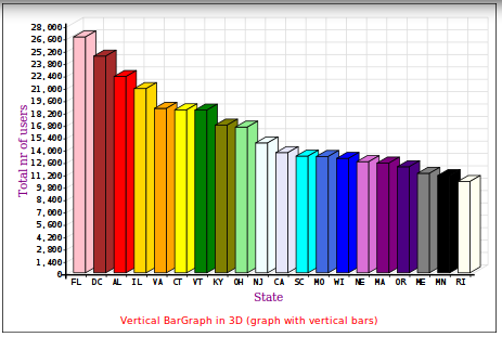
Vertical BarGraph
|
To get started, a vertical BarGraph (in 3D, so it is actually Bar3DGraph) with like 20 different colors. |
|
Here is most of what's needed to create the BarGraph above (about 16 lines only, of which 7 lines are because of the huge amount of different (20!) colors ...):
<svg id="Bar3DGraph" frx:block="sampledb/users_by_state"
frx:renderer="FrxSVGGraph" frx:type="Bar3DGraph"
frx:series_1="{total}" frx:label="{state}" frx:xpath="*[total>10000]"
frx:link="sample.user_distribution_simple?state={state}"
frx:back_colour="white" frx:graph_title_colour="red" frx:graph_title_font_size="12"
frx:graph_title="Vertical BarGraph in 3D (graph with vertical bars)"
frx:graph_title_position="bottom"
frx:label_v="Total nr of users" frx:label_h="State" frx:label_font="georgia"
frx:label_font_size="14" frx:label_colour="purple"
frx:colour_1="pink" frx:colour_2="brown" frx:colour_3="red"
frx:colour_4="gold" frx:colour_5="orange" frx:colour_6="yellow"
frx:colour_7="green" frx:colour_8="olive" frx:colour_9="lightgreen"
frx:colour_10="azure" frx:colour_11="lavender" frx:colour_12="cyan"
frx:colour_13="royalblue" frx:colour_14="blue" frx:colour_15="orchid"
frx:colour_16="purple" frx:colour_17="indigo" frx:colour_18="gray"
frx:colour_19="black" frx:colour_20="ivory"></svg>
Starting from line 4 in the above sample code, all keywords preceded by frx: are actually SVG Graph keywords. Forena just passes them all to the SVG Graph library, which implies also that those hundreds of SVG Graph keywords can be used to make any graph (literally) pixel perfect.
Horizontal BarGraph
|
A BarGraph with horizontal bars, actually a HorizontalBarGraph. It only shows states with a total nr of users of at least 12000 (instead of 10000) and the labels are swapped now. |

|
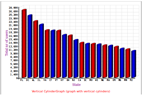
CylinderGraph
|
An example of a CylinderGraph with fewer colors than the Vertical BarGraph before. |
|
LineGraph
|
A LineGraph using green triangles as markers, the line that connects the markers is a blue dashed line (dashes of 3 pixels combined with 3 pixels of gap), and the area under the line is filled in red, using 25% opacity for that filled area. |

|
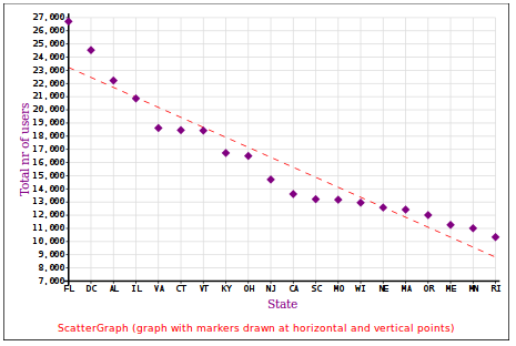
ScatterGraph
|
A ScatterGraph with purple diamonds as markers, with an extra best fit line to draw a straight (red) line through the data points (using 7 pixels dashes combined with 7 pixels of gap). And zoom in to the more interesting part of the graph: start the Y-axis only from 7000, and increment its values with 1000 to get more detailed Y-axis data. |
|
PieGraph
|
Change to a PieGraph (also in 3D, so it is actually Pie3DGraph). And use lots of colors (purple, cyan, red, blue, gold, green, indigo, orange, brown, pink, ...). |

|
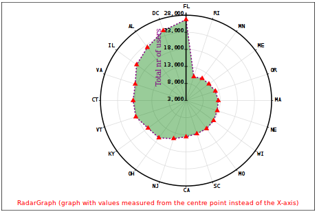
RadarGraph
|
One more for the road ... An example of a RadarGraph using red triangles as markers, the line that connects the markers should be a purple dashed line (dashes of 3 pixels combined with 3 pixels of gap), and the area within the line should be filled in green, using 40% opacity for that filled area. |
|
Help improve this page
You can:
- Log in, click Edit, and edit this page
- Log in, click Discuss, update the Page status value, and suggest an improvement
- Log in and create a Documentation issue with your suggestion

