On this page
- Here are the steps I used to turn scald into responsive/adaptavive mode:
- 1-Install breakpoints module
- 2-Install Picture module
- 3-Create few breakpoints
- 4-Create breakpoint groups
- 5-Create new styles for breakpoints
- 6-Configure image height and width per image style
- 7-Map image styles to picture options
- 8-Set the "Picture group" as a transcoder
Scald and responsive integration
Yes Scald works almosts out of the box with the Picture module and can handle your responsive site !
Here are the steps I used to turn scald into responsive/adaptavive mode:
1-Install breakpoints module
2-Install Picture module
3-Create few breakpoints
I am not sure if the following is true, but I have choose to use only the "min-width" queries. I could choose the "max-width" queries, but I think it is not a good idea to mix the queries if you are planning to use the picture module.
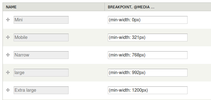
I Have checked my theme style sheet and found the following "min-width" media queries:
@media (min-width: 321px)
@media (min-width: 768px)
@media (min-width: 992px)
@media (min-width: 1200px)
Add those breakpoints in Configuration » Media » Breakpoints
As you are using the "min-width" media queries, add also "(min-width: 0px)"
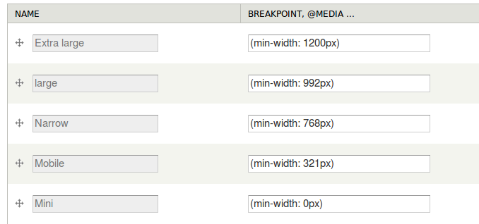
As I am planning to use Picture 7.x-2.0, I have to arrange the breakpoints from largest to smallest.
Thus, we need to order them the correct way picture will handle them
4-Create breakpoint groups
At this point we need to create a group for each image style you like to be responsive. On my side, I need to have 2 contexts/image styles to be responsive: "bazar-images" and "JQzoom" (I generally use the same names for contexts and image styles)
In Configuration » Media » Breakpoints, click "Add new group" and add all the breakpoints you have created. Names the group with the name of the corresponding context/image syle
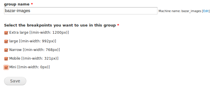
You have now all the groups corresponding to the image style you need to be responsive

5-Create new styles for breakpoints
Go to Configuration » Media » Breakpoints » Add responsive style
Here, you can create all the responsive image styles in once: select the style (here: "bazar-images") and type "resp_bazar-img_" in "Image style base name"
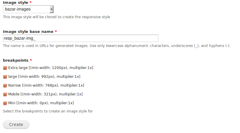
Do it for each context/image style you need to be responsive
6-Configure image height and width per image style
Go to Configuration » Media » Image styles
Since you based the style on a pre-existing image set, they are all the same to start. Tweak the sizes, such as making mobile small and the Extra large option larger.
7-Map image styles to picture options
Go to Configuration » Media » Picture mappings
Each breakpoint group you created will result in a picture group being created and listed on this page. For each picture group, associate the breakpoints with your preset image styles.
Click "Add" and select you "Breakpoint group" (here: "bazar-images")
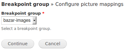
Click "Continue"
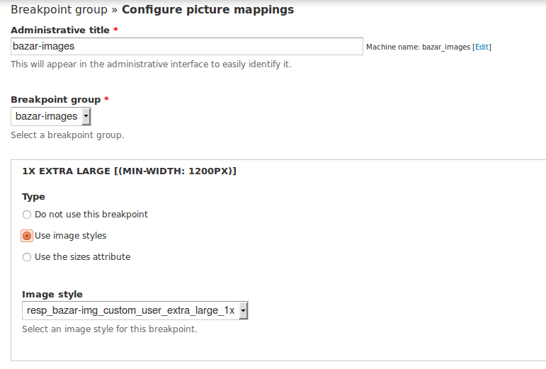
Use also "bazar-images" for the administrative name and select the image styles you have previously created for each breakpoint.
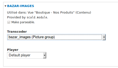
8-Set the "Picture group" as a transcoder
Go to Structure » Scald and click on "Contexts" for the "Images" atom type.
Select the context which needs to be responsive (here: "bazar-images")
And assign a new transcoder which is the Picture group name you have made at step 6
It's done!
Help improve this page
You can:
- Log in, click Edit, and edit this page
- Log in, click Discuss, update the Page status value, and suggest an improvement
- Log in and create a Documentation issue with your suggestion
