
Closed (fixed)
Project:
Drupal core
Version:
8.0.x-dev
Component:
Seven theme
Priority:
Normal
Category:
Task
Assigned:
Unassigned
Reporter:
Created:
28 Feb 2014 at 08:13 UTC
Updated:
15 Aug 2014 at 09:30 UTC
Jump to comment: Most recent, Most recent file


Comments
Comment #1
lewisnymanComment #2
emma.mariaComment #3
lewisnymanComment #4
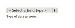
emma.mariaI have added webkit only styles for the select element. I have disabled the browser styles and applied the style guide styles plus the arrow using the Libricon icons.
Comment #7
lewisnymanLooks like this patch accidentally includes some changes from a recent commit
Comment #8
emma.mariaWork carried out for this new patch:
Adjusted the arrow icon position and the right padding to accommodate the background icon.
Added hover, focus styles and RTL styles.
I have attached screenshots and this patch should pass :)
Comment #9
longwaveIndentation looks off here?
Comment #10
lewisnymanthis property is missing “no-repeat 1% 63%”
There are also a few problems when the language is rtl and no SVG. We need to redeclare the multiple backgrounds again. It's a bit of a pain.
Comment #11
emma.mariaComment #12
emma.mariaI have fixed the issues pointed out in #9 and #10. I have also added the RTL no-svg styles that were missing.
I have listed all the different test scenarios in the issue summary.
Comment #13
rteijeiro commentedChecked with different browsers and RTL languages too. In Chrome, Safari and Opera looks awesome!
Chrome
In Firefox looks a little bit weird when you open it. I'm not sure if it's possible to fix it.
Firefox Closed
Firefox Opened
RTL
Comment #14
lewisnymanAha there is still styling being applied to all browsers on focus:
select.form-select:focusComment #15
emma.mariaI have removed all the non Webkit styles for Select elements. Firefox will only show the default browser styles.
Comment #16
rteijeiro commentedWell done! Only one thing more. I noticed some misplacement when you open selectbox in Chrome.
I'm not sure but I think it was not here before. Could you check it, pleeeeeease?
Comment #17
lewisnymanIt looks like you can fix this by reducing the right padding of the select styling, which doesn't seem to do very much anyway.
Comment #18
emma.mariaThe font weight of the select boxes is causing the misplacement. We cannot target the styles of the options that pop up when clicked on so their text cannot be made bold to match. Therefore removing the bold font weight makes everything line up a lot better.
Comment #21
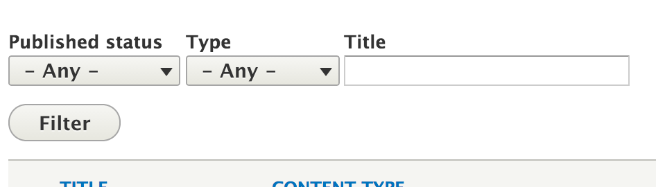
emma.mariaUpdated patch - I changed the padding so you cannot see any of the right of the select box.
Comment #22
lewisnymanGreat, the select element looks good on Webkit and just looks normal in other browsers.
Comment #23
wim leersThat's A LOT of additional CSS. And more HTTP requests to download the SVGs.
I'm sorry, but I really have to question the value here. Does the improved design really outweigh the decreased performance? Especially on mobile.
See https://speakerdeck.com/csswizardry/normalising-designs-for-better-quali....
Comment #24
lewisnyman@Wim thanks for raising the concern, it's definitely something we have to consider. We have a problem now because it's not clear how we move forward and this issue is going to stagnate. We need an actual gate that we need to pass here. Any suggestions?
Comment #25
lewisnymanOk I had a quick chat with Wim. There are a few things we can try to cut down on the weight.
Comment #26
Bojhan commentedHow does it look with the browser default arrow? Their might be crisp that happens, but if not we can remove it.
Comment #27
lewisnymanYeah we can try and see if we can use the default arrow by removing -webkit-appearance: none;
Comment #28
tompagabor commentedI tested, what we can do, when removing -webkit-appearance: none;
cursor: pointer; -> working
padding: 1px 1.571em 2px 0.5em; /* LTR */ -> not working
border: 1px solid #a6a6a6; -> working
border-radius: 0.143em; -> not working
background-color: #f2f1eb; -> working, but make a gradient, with the color
color: #333333; -> working, also change default arrow color
text-decoration: none; -> not working
text-shadow: 0 1px hsla(0, 0%, 100%, 0.6); -> not working
font-size: 14px; -> working
Comment #29
pakmanlhAgree with the last test comments, and I think is necessary do the second point that @LewisNyman comment on #25, because if not the background icon appears over the defauls arrows. I attach a screenshot.

Comment #30
Bojhan commentedComment #31
lewisnymanIt's worth exploring option 1 in #25 if #2286601: [policy] Drop support for browsers that don't support SVG is approved. That would half the CSS that we need for the arrow icon. Lets try it.
Comment #32
lewisnymanHere's a patch will all the no-svg fallbacks removed. I've also attempted to reduce up the multiple background declarations by using background-position and background-image where I can.
I wasn't able to test this because my local install is a bit borked.
Comment #33
lewisnymanI got my local working, here are some screenshots. Focus and hover works great as well :)
Seven's style.css has gone from 31kb to 32kb, not too bad.

Comment #36
lewisnymanComment #37
lokapujyaRerolled.
Comment #38
wim leersCan you add a newline here? :)
In any case, this patch looks much better already. Thanks :)
I still have some questions:
selectselector. AFAICT, thetext-decorationandtext-shadowand properties have zero effect (in Chrome and Safari).font-size: 14pxas a fallback forfont-size: 0.875remalso seems useless, because all Webkit browsers supportremin the first place! :)<select>than the bottom of letters is to the bottom of the<select>. It feels off-balance. Or is that just me, because I'm used to the default styling?This is what it looks like for me (in Chrome):
Comment #41
lewisnymanThis is an intense CSS review :P I like it.
I've fixed the newline and padding issues and removed 7 CSS properties that were for fallbacks or just not necessary.
If you try the JS fiddle in the latest Firefox it no longer works so :( The bug to add proper support for this is https://bugzilla.mozilla.org/show_bug.cgi?id=649849. We can add support once this is fixed.
Considering all browsers style these differently anyway, I don't think this is introducing a problem. I'd love to enable support for more browsers as it becomes realistic though.
Comment #42
lewisnymanComment #43
wim leersHehe, glad you like it :)
I have no further complaints. Thanks for spending the extra time to not affect front-end performance as much :) The difference with #21 is immense.
Manually tested and still works great.
Comment #44
alexpottWhy are we removing this? Won't this affect all browsers?
Duplicated.
Comment #45
lewisnymanThanks Alex, eagle eyed! I've removed that duplicated line, see interdiff.
Yes, this styling was added during #1986418: Update textfield & textarea style for consistencies sake but it doesn't feel very appropriate (compare other clickable elements like buttons). I'm happy to leave them styled by default in all browsers apart from Webkit for now and maybe open up another issue to see if we can sneak in little tweaks to other browsers here and there.
Comment #46
wim leersComment #47
alexpottCommitted 9e6dd21 and pushed to 8.x. Thanks!
Fixed the file mode of caret-down.svg during commit.
Comment #49
nod_No love for IE? it seems doable: http://sampsonblog.com/615/ie10s-pseudo-elements
Comment #50
lewisnymanI think it is, looks like we'd need to add some javascript so we can add conditional styling for IE10, so it doesn't affect Firefox. I'll create a follow up issue so we can slowly investigate cross browser styling with careful testing.