
More Seven Theme issues: #1986434: New visual style for Seven
Problem/Motivation
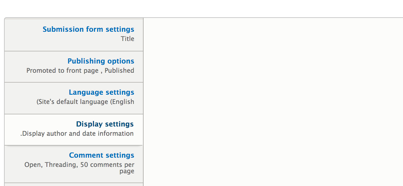
Vertical tabs have received a style update, this means rounded corners, color palette and shadow adjustments.
We developed Proposal: A Style Guide for Seven. This issue aims to introduce the proposed styling for verticals tabs to core.
Proposed resolution
In #1945544: Add Vertical Tabs we laid the ground work for this change. Keep in mind this is in the vertical tabs branch, not the master branch.
Remaining tasks
- Make a patch
- Review accessibility
User interface changes
The vertical tabs style will be changed, no functional differences.
API changes
None
Related Issues
| Comment | File | Size | Author |
|---|---|---|---|
| #27 | vertical-tabs-style-1989488-27.patch | 7.42 KB | echoz |
| #24 | Screen Shot 2013-05-17 at 8.40.34 AM.png | 79.08 KB | Bojhan |
| #23 | vertical-tabs-style-1989488-23.patch | 6.42 KB | echoz |
| #23 | selected-tab-23.png | 36.58 KB | echoz |
| #23 | focused-tab-23.png | 36.8 KB | echoz |


Comments
Comment #1
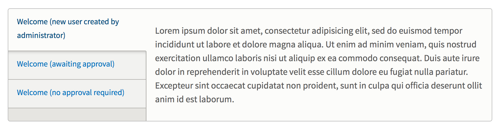
echoz CreditAttribution: echoz commentedThis patch replicates the visual style while keeping the existing class names. I assume implementing the awesome new naming conventions like in the Seventy Eight sandbox is beyond the scope of this issue.
This seemed to translate well except as shown in the second screenshot where the pane is a shorter height than the tabs, even obscuring the visual "pathway" into the selected tab.
not ok here:
Comment #2
Bojhan CreditAttribution: Bojhan commentedWow, this looks great! The corners look a little strange, is this because the radius is too small for proper smoothing?
The right pane should always consume the full height, we had this issue in D7 too - but fixed it, its likely something changed?
Comment #3
echoz CreditAttribution: echoz commentedThe corner issue is when the element with border radius also has a background color, and this now has the fix for that which is overflow: hidden; (Ryan has this is the prototype, I didn't realize why at first).
On the other issue, what was done in the previous design was using an image for a background and border (and a second one for rtl). We need to solve this a smarter way, I experimented and didn't come up with a solution.
This patch fixes the corners and adds rtl. I didn't delete the 2 images since I am unsure what's causing some weirdness with my setup with applying add or delete images.
Coincidentally, in a recent commit #1978036: Clean up css in vertical tabs I had removed a bunch of qualified element selectors, and we could further refine those (but not here since it involves the files in core/misc) but may be rewriting anyway.
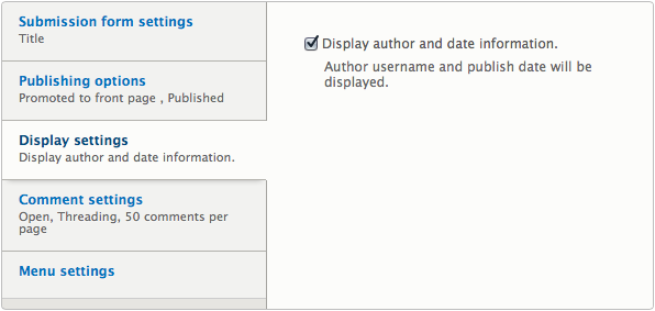
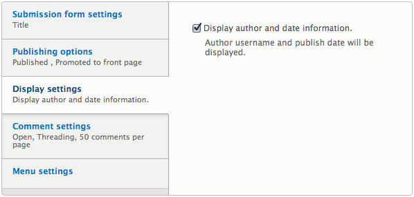
Comment #4
echoz CreditAttribution: echoz commentedScreenshot with fixed corners.
Comment #5
Bojhan CreditAttribution: Bojhan commentedA few additions:
1) Upon hover we should probally underline the link e.g. "Menu settings" to be more consistent with core.
2) The color of the active link probably shouldn't change on hover. Its hardly noticeable, and its a little weird that this is also triggered upon hovering the active tab - it feels inverted.
I have asked a few others to chime in on the background issue.
Comment #6
echoz CreditAttribution: echoz commentedI'm setting status to needs work for the issue where the pane is a shorter height than the tabs as shown in #1. Although I hadn't resolved this, I wanted to submit what I had so far.
Edit: oops, crosspost. Thanks Bojhan, yes I'd love to get Ryan's eyes on the bkg issue.
Comment #7
oresh CreditAttribution: oresh commentedDealing with that issue only with css (and I would really love to do that without js) I assume is pretty difficult. It needs some time...
Comment #8
echoz CreditAttribution: echoz commentedI have a solution. The only visual change to the design is the formerly darker background color now matches the right pane and selected tab. Then the border is now on both the pane and the tabs, overlapping.
Comment #9
Bojhan CreditAttribution: Bojhan commented@echoz Its not possible to then give a background on the left part? I dont think its desirable to lose that visual affordance, given that its a big signal that the left is different from the right - this helps guide the eye. As much as I agree, that we shouldn't do the image solution we did with D7 - is it really needed to fix that in this issue?
Comment #10
echoz CreditAttribution: echoz commented@Bojhan, that was the sacrifice to not use an image, which for a background color and border is pretty archaic. What we see on the left is a ul that is only as tall as the tabs, and under it is the background of the entire container. I do agree it would be somewhat better to have visual difference from the right, although it doesn't actually break the tab metaphor.
Comment #11
Bojhan CreditAttribution: Bojhan commented@echoz Its not possible to have the left in a container, and the right in a container? Just thinking out loud, but I really dont think we can lose the visual guidance this background color provides.
Comment #12
LewisNymanDon't ask me why, but adding clearfix to the pane container fixes it. Hooray!
I've made a conscious decision not to add the clearfix class but instead replicate it in the seven CSS. It's so tied to the current styling I wouldn't like this to spread to other themes.
Comment #13
echoz CreditAttribution: echoz commentedFantastic! I had tried overflow: hidden; and it didn't work. This patch completes the RTL.
Comment #14
Bojhan CreditAttribution: Bojhan commentedI tested this, it looks fine - RTBC from my pov, any other reviewers?
Comment #15
yoroy CreditAttribution: yoroy commentedThis looks nice! Two points:
1. Last active tab doesn't get a drop shadow. Seems because that shadow is applied to the (in that case non-existent) tab below the active tab. Bug, feature or conscious design trade-off?
2. The screenshots in #13 suggest a darker color for the link/title in the active tab. I didn't see that while testing (Firefox, OSX). Not sure what's intended.
Comment #16
Bojhan CreditAttribution: Bojhan commented1. Bug, as far as I know we should always have a shadow
2. I do think its intended, I am not sure if it really adds something.
Comment #17
echoz CreditAttribution: echoz commented#15 + #16,
1. Yes, the prototype does apply an inset box-shadow to the following adjacent sibling and IMO this looks like a rounded top on the element below, rather than a shadow under the tab itself. After testing, I like the shadow on the tab itself better (which looks like its shadow and also provides a shadow on the last item). If we clarify the intention of the design (Lewis?) it will be simple to move the box-shadow to each tab, afaict.
2. FF is interpreting the :focus styles differently. These link styles might be overly complex (plus combined with previous link css) as Bojhan touched upon in #5.
Comment #18
LewisNymanApplying an inset shadow on the following tab instead of a drop shadow on the active tab is a technical requirement of the design. We can't apply a box-shadow to the active tab without it overflowing out into the content panes. Maybe we can work out some kind of fiddling to get a shadow on the last tab if it is active but I wouldn't expect a shadow to appear above the tab, that would be reversing the direction of the light.
Comment #19
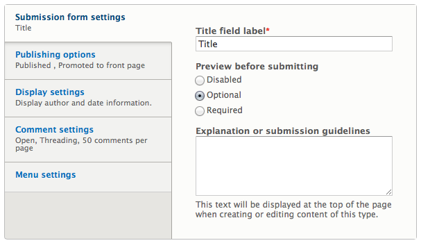
echoz CreditAttribution: echoz commentedWe do have the negative spread radius technique for a shadow on one side. The negative spread has to be equal to or greater than the blur to hide the shadow leaking on the sides not wanted. My error thinking we could use this as our shadow was I had only tested on the last tab. The other tabs' shadows using this technique are covered up by next tab under them!
Here's a screenshot of this on the last selected tab (doesn't work on the link, but on the li). It's a different looking shadow as I described in #17. If we are ok with the shadow on the last being different, here it is.
Compared to the existing shadow.
Comment #20
LewisNyman@echoz Can you post the code for this? I'm struggling to see how we can apply this shadow without affecting up the other styling.
Comment #21
echoz CreditAttribution: echoz commented@LewisNyman
Comment #22
echoz CreditAttribution: echoz commentedI can make this shadow work on all selected tabs (li items) by giving the li items position: relative; and the selected varient a z-index value, so the shadow does fall on top of the tab below it. The only conflict then is the focus styling when :active (on click) getting partially covered since that is on the anchor, and becomes behind the li. I suppose it's possible to build up a stacking order including the anchor tags, but what a mess. Ideas?
Comment #23
echoz CreditAttribution: echoz commentedThis patch now has the shadow working on all selected tabs (li items) including the :focus and :active states, which work on the li rather than the anchor tag. The focus style does work on clicking above and below a selected tab.
I've also further reduced the selectors in both the core/misc and seven versions of the vertical-tabs.css (+ rtl).
Comment #24
Bojhan CreditAttribution: Bojhan commented@echoz Great work!
I have tested this and the RTL style seems broken?
Comment #25
echoz CreditAttribution: echoz commentedWow, it looks like RTL vertical tabs do not work *before* applying the patch! After testing with a RTL language (I get like you do, it's english but right aligned text and punctuation), I find that neither of the RTL stylesheets (core/misc or seven's) are being recognized at all (testing obvious overriding styles don't display)!
Comment #26
echoz CreditAttribution: echoz commentedI just created a new issue for this, #1997630: RTL stylesheets not recognized for vertical tabs
Should we proceed on this or wait. The RTL css should be fine once it is recognized.
Comment #27
echoz CreditAttribution: echoz commentedAnother patch -
Removes the 2 images used in D7's vertical tabs css.
Corrects declaration ordering to comply with new CSS formatting guidelines
Sorry for another patch, but since I finally had the time to learn git rm, I wanted to get that in. There are no changes to the css, just declaration order.
This could wait until #1997630: RTL stylesheets not recognized for vertical tabs is figured out, or proceed separately.
Comment #28
Bojhan CreditAttribution: Bojhan commentedI am guessing this can proceed without, after all its a bug that preexisted this change.
Comment #29
amateescu CreditAttribution: amateescu commentedYep, this patch should go on regardless of #1997630: RTL stylesheets not recognized for vertical tabs, since that's a pre-existing bug in HEAD.
Comment #30
Bojhan CreditAttribution: Bojhan commentedAwesome, lets get this in then!
RTBC!
Committers please credit designers
Comment #31
echoz CreditAttribution: echoz commentedThanks for the review! Status needs to be changed to RTBC :-)
Comment #32
Bojhan CreditAttribution: Bojhan commentedComment #33
Dries CreditAttribution: Dries commentedCommitted to 8.x. Thanks.
Comment #34
Bojhan CreditAttribution: Bojhan commented@Dries Next time could you also credit the designers?
Comment #35
ry5n CreditAttribution: ry5n commentedOh geez, somehow I missed that this issue got created! Thanks everyone!
Comment #36.0
(not verified) CreditAttribution: commentedmeta issue added
Comment #36.1
joelpittetUpdated issue summary.