
 Come together with the global Drupal community in Rotterdam, 28 Sept – 1 Oct 2026. Sessions, contribution, connection, and Early Bird savings until 8 June.
Problem/Motivation
With Seven now using Normalize.css for its reset, there are some minor visual regressions to fix (none of which affect functionality). Regressions that potentially affect the usability are marked in bold.
Misc. UI
- Dropbutton arrow icon is mis-aligned (img)
- Simpletest pages add an underline to the acive breadcrumb link (img)
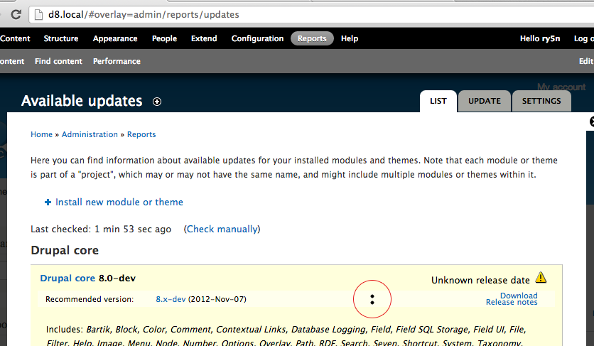
- On admin/reports/updates, bullets should not appear on the 'download/release' notes list items. (img)
Forms
- text
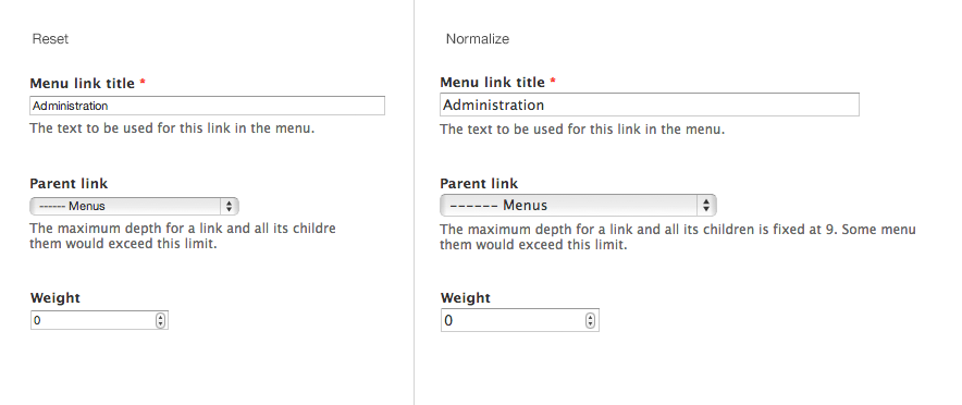
inputsandselects inherit body font and size, so are now larger and in Lucida instead of Helvetica (img) - Reduced vertical space between top-aligned labels and their form-items
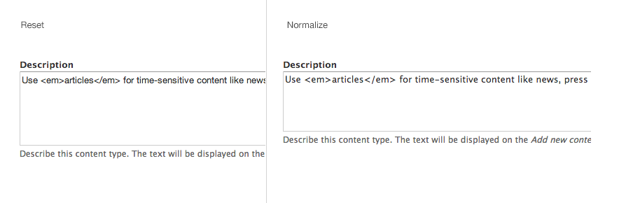
- textareas inherit body font and size and have smaller line-height (img)
Typography
- Numbered and bulleted lists have too much side margin/padding. Amount of extra margin not consistent in all contexts. (img)
- Numbered and bulleted lists have a small amount of extra vertical margin between list items (or larger line-height, TBD).
Tables
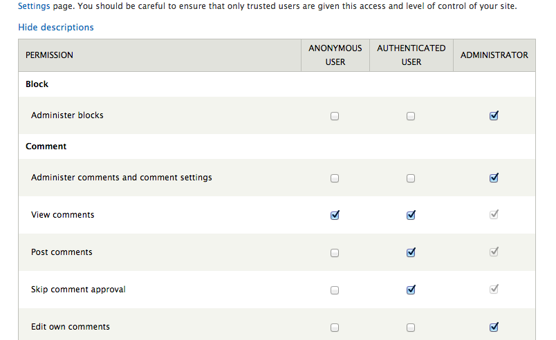
- Table rows in
admin/people/permissionshave extra top and bottom padding. (img)
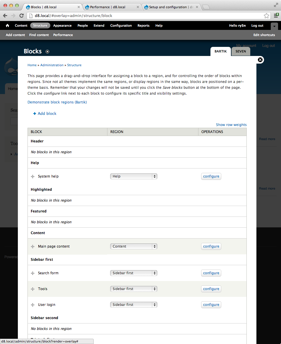
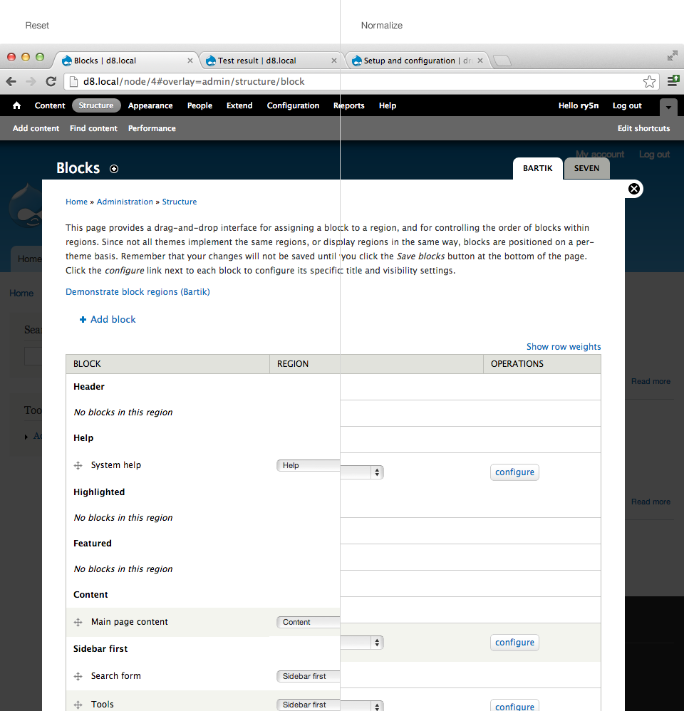
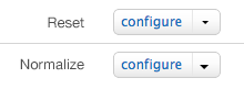
Blocks UI
- On
admin/structure/block, block table contains extra borders on table rows. Also a small amount of unnecessary extra vertical space within table rows. (img)
Field UI
- Form items withn Field UI tables have too much vertical margin.
- Some tables in Field UI add an unnecessary top border to the last table row.
Views UI
- Some (but not all) radio groups in Views UI have unnecessary extra vertical space between radio items.
Proposed resolution
Many or most of these regressions are minor, and may become moot as features and UIs are updated. The only one of these that affects usability or functionality at all is the Blocks UI issue, so this should be fixed now, and other regressions fixed later, after feature-freeze.
Remaining tasks
- Post patch fixing the Blocks UI regression.
- After feature freeze, fix any regressions that remain, or fix as part of completing other improvements to Core.
| Comment | File | Size | Author |
|---|---|---|---|
| #7 | After-Chrome-Blocks page.JPG | 69.47 KB | shyamala |
| #7 | After-Chrome-Help.JPG | 84.86 KB | shyamala |
| #7 | After-Chrome-dropbuttons.JPG | 4.49 KB | shyamala |
| #7 | After-Chrome-No -Wierd-Bullets.JPG | 77.84 KB | shyamala |
| #7 | After-IE-Blocks page.JPG | 99.59 KB | shyamala |

Comments
Comment #1
Bojhan commentedI would call the views UI issue quite a regression too, you often cant even see which belong together anymore.
Comment #2
ry5n commented@Bojhan I did quite extensive testing to come up with the list above, including testing Views UI. I used Kaleidoscope.app to do visual diffs between screenshots taken before/after the Normalize patch. I did not see any changes to Views UI from the Normalize patch other than the form element changes listed above. Is is possible that the regressions to Views are related to another patch? @tim.plunkett suggests they were; see http://drupal.org/node/723392#comment-6697098.
That said, we should fix all of these problems no matter the origin. I definitely see where Views UI and other places look wrong. EDIT: I would also be happy to see this issue encompass any visual regressions from other patches; it probably makes sense to tackle them all in one place.
For now, I want to spend our time where it counts, and I think the majority of these fixes should come later.
Comment #3
sunPlease note that most of the admin table/form item issues are resolved via #1168246: Freedom For Fieldsets! Long Live The DETAILS.
That is, because Seven overrides system.theme.css' .form-item styling to use vertical padding instead of margin to achieve spacing between form items, but the new details don't involve any quirks in any browser, so their excessive styling in Seven was able to be simplified a lot; going back to using the vertical margin spacing from system.theme.css.
That resolves the layout/styling of all form items, but also all administrative tables (e.g., Block UI), as the additional spacing is caused by the vertical padding (which was overridden through Seven's former reset.css previously).
I'd therefore strongly recommend to wait with fixes here until aforementioned patch has been committed.
Additionally, the table row border was brought up in #1813792-16: Remove ugly default CSS styles for table already, but I inspected the situation and think that the (originally unintended) change is actually not a regression, but a helpful visual guidance. Open to further discuss this here, of course.
Comment #4
ry5n commentedThis patch makes the following elements in Seven consistent with the state before the normalize patch:
- Blocks UI
- ol and ul
- dropbuttons (which should be more resilient in future)
- link list in update module (admin/reports/updates)
- line-height on textareas
Comment #5
ry5n commentedNeeds testing.
Comment #6
ry5n commented(Some help for reviewers.) You can test this patch by viewing the following pages:
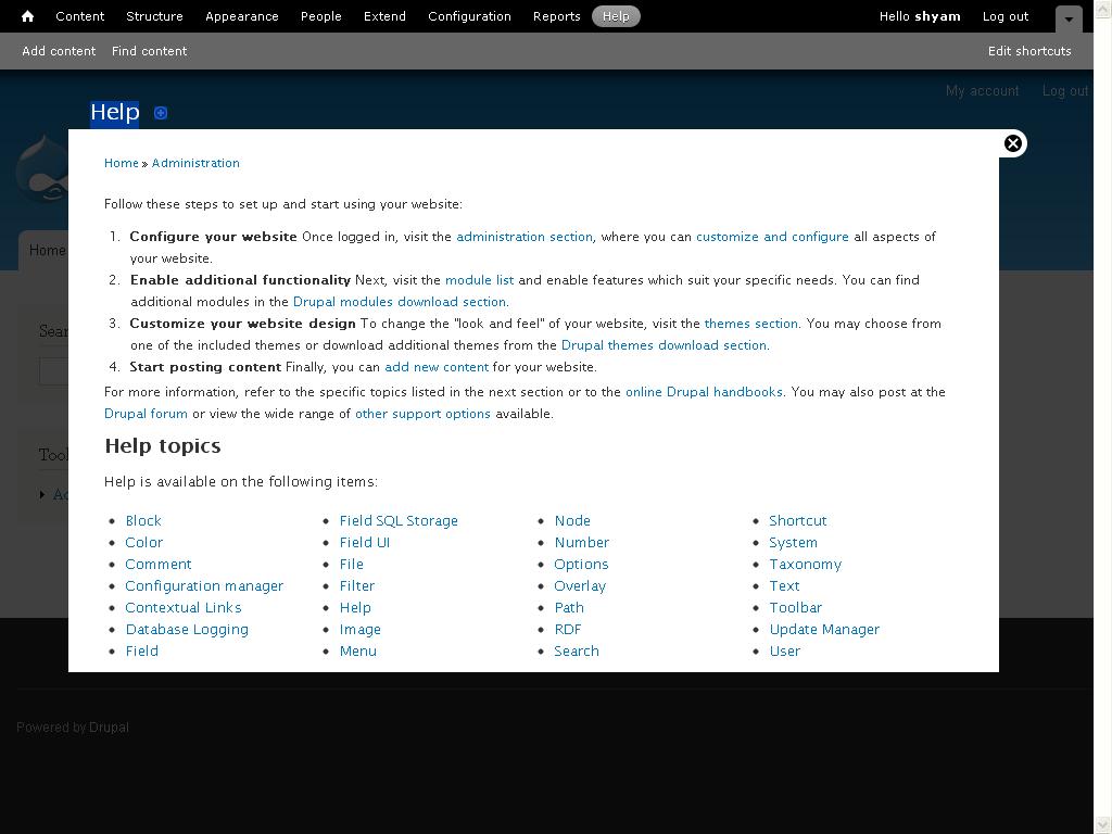
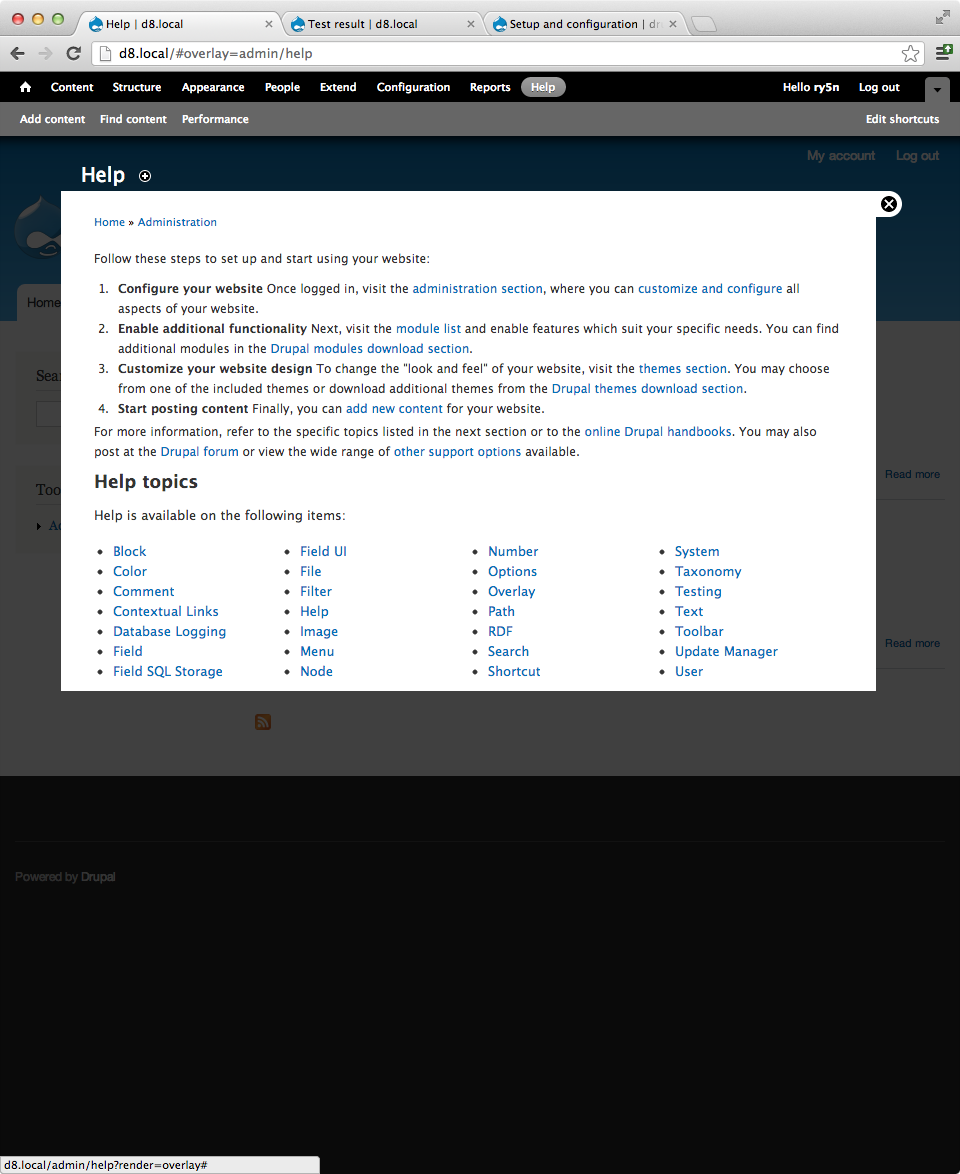
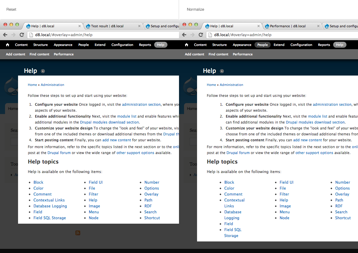
admin/structure/block. It should look like this screenshot from before the patch.admin/help. Should look like this.admin/structure/typesadmin/reports/updatesadmin/node/add/article, ensure that line-height is generous (computed value should be about 1.5em)Comment #7
shyamala commentedIn IE 8 the second dropdown is partly hidden.
Comment #8
ry5n commented@Shyamala Thanks for the review! I will take a closer look at the dropbutton and fix whatever is going on there.
Comment #9
rteijeiro commentedIt seems that all mentioned issues have been already solved so this patch is no longer needed. Should I close this issue as fixed?
Comment #10
rteijeiro commentedSorry, maybe it's better mark it as RTBC?
Comment #11
alexpottPatch no longer applies.
Comment #12
rteijeiro commentedRe-rolling...
Comment #13
rteijeiro commented@alexpott: Regarding #9 comment, this patch is no longer needed because all the issues are already fixed by the new Seven style issues. So no need to re-roll the patch.
Ping me in IRC if you want to discuss it. I am in the sprint room with LewisNyman ;)
Comment #14
rteijeiro commentedClosing as duplicated after discussing with alexpott :)
Comment #15
mcrittenden commentedTags