Closed (fixed)
Project:
Webform Hints
Component:
Code
Priority:
Normal
Category:
Feature request
Assigned:
Reporter:
Created:
7 May 2012 at 23:11 UTC
Updated:
3 Oct 2012 at 03:19 UTC
Jump to comment: Most recent file


When Webform Hints is applied to a required field, there is no indication within the hint that it is a required field. The standard star notation needs to somehow cascade into the hint as well.
| Comment | File | Size | Author |
|---|---|---|---|
| #5 | webform_hints-required-fields-append-1566212-5.patch | 725 bytes | guschilds |
| #5 | webform_hints-required-fields-suffix-1566212-5.patch | 660 bytes | guschilds |
| #1 | webform_hints_6-required.png | 18.33 KB | guschilds |
| #1 | webform_hints_7-required.png | 21.7 KB | guschilds |
| #1 | webform_hints_7-required_ie8.png | 14.06 KB | guschilds |


Comments
Comment #1
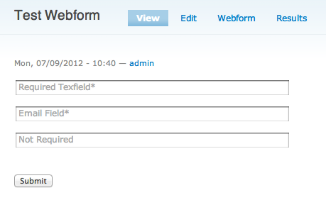
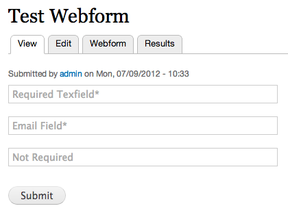
guschilds commentedCommits have been made to both 6.x and 7.x branches that append "*" to the end of the component's 'placeholder' attribute if that field is required.
"*" is also appended to the 'title' attribute of that field for browsers that do not support 'placeholder'. See #1139278: Use the HTML5 placeholder attribute for more on that.
Screenshots are attached.
Comment #2
eusonic commentedHere's an idea... required fields are given the class "required," so one could use css to indicate which fields are required. It would be great to be able to add an asterisk (or whatever) outside of the field as a css pseudo-element. Unfortunately, pseudo-elements can't be added to input elements. Would it be possible to add the "required" class to the wrapping div as well? We could then do something like this:
This may go beyond the intended scope of this project.
Comment #3
guschilds commented@eusonic
Thanks for your thoughts. It has been a busy month, hence the lack of a response.
I'm not sure I'm in love with the current implementation of having the * in the title and/or placeholder attributes. I am definitely open to suggestions here and am interested in exploring your idea. Perhaps even a number of solid options could be available from the admin menu.
Are you able to make a patch with your idea? If not I can give it a shot.
Thanks,
Gus
Comment #4
eusonic commentedUnfortunately, I don't have the expertise to provide a patch for this. I'm happy to advise on css and user interface though.
Thinking about this a little more, I don't think a pseudo-element is the way to go. Pseudo-elements can be confusing for themers because they aren't in the dom, so they can't be inspected with Firebug or Webkit inspector. They also can't be targeted with js (suppose someone wants to show some popup help text when the asterisk is clicked on).
How about adding an asterisk in a span tag after the input field. This is what normally gets added to the label. Like this:
This gives css authors tons of options. They could hide the asterisk, replace it with an image, adjust padding and positioning, etc etc.
-Cameron
Comment #5
guschilds commentedAs previously stated, we weren't necessarily satisfied with the previously committed solution of adding '*' to the placeholder of a required field, so we have reverted these changes, but have attached a patch for it here (webform_hints-required-fields-append-1566212-5.patch).
As @eusonic mentioned, required fields do have a 'required' class, so CSS can be used to signify required fields as necessary.
As for adding markup, as suggested in #5, the simplest solution is to use ['#field_suffix'] to add '*' after the required field. This is done in the attached patch (webform_hints-required-fields-suffix-1566212-5.patch) that will apply to the current 7.x-1.x branch, but we currently do not have plans on committing this patch to that branch.
If many other people find themselves needing a better solution than using CSS or one of these patches, believe that one of these patches is worth committing, or come up with a better solution we will be happy to revisit this issue.
Comment #6
guschilds commentedWe came to realize that only using color to indicate that an element is required is a violation of WCAG, which would likely happen often should users of this module have to theme these fields differently.
An option, "Required indicator", has been added to compromise with that realization and the battles listed above. The value supplied to this textfield will be appended to the hint of a required element. The option is configured as " (required)" by default.