

 The 2026 Drupal Business Survey is open. Your response will help shape the future of the Drupal business ecosystem.
Berdir brought this up in IRC. I'm creating an issue for it so that we can track it.
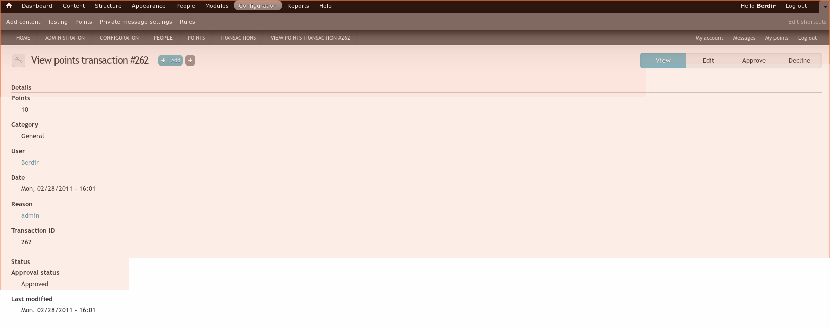
Basically, Berdir suggested re-ordering the totals/moderating local tasks. The url to view a transaction inside the admin ui would be like this: .../userpoints/transaction/txn_id
This would be used for:
a) when you are inside admin already
b) when you are viewing transactions of someone else.
This would allow to move viewing your own transactions below /myuserpoints/details/txn_id and solve the breadcrumb issue. The url to edit a transaction would then simply be .../userpoints/transaction/txn_id/edit
| Comment | File | Size | Author |
|---|---|---|---|
| #11 | reorder_admin_tasks4.patch | 16.47 KB | berdir |
| #7 | ApproveOverlay.png | 50.44 KB | BenK |
| #6 | reorder_admin_tasks3.patch | 15.49 KB | berdir |
| #3 | reorder_admin_tasks2.patch | 13.03 KB | berdir |
| #1 | userpoints_admin_reordered.png | 44.69 KB | berdir |


Comments
Comment #1
berdirOk, here is a first patch.
Basically implements what I was suggesting. I think it's pretty awesome, but some things need to be figured out. Especially, this needs a lot of testing with different permissions (only moderate, only edit, only add and so on) and in seven.module. I'm using rubik now which is pretty awesome :)
Here is the basic structure:
- Totals
- Transactions
-- Per transaction local tasks: View, Edit, Approve, Decline (see screenshot)
- Moderation
- Settings
+ Add (This is a local action now)
- There should be more or less proper titles now on every page and breadcrumbs are working nicely.
Comment #2
BenK commentedHey Berdir,
I like the new structure a lot. :-) Much simpler and cleaner! Here are a few things that I've noticed:
1. If you go to the "Users by Points" link (/userpoints), then a "(details)" link shows up next to your own username. But this link still takes the user to /myuserpoints and results in a Page Not Found error. In our new structure, isn't /myuserpoints no longer a valid link? If so, this details link should be pointing elsewhere.
2. When viewing another user's points transactions, it's a little weird that the breadcrumb shows "Home » My points". If you click on "My points" it takes you to your own points transactions page. So it sort of seems like the other user's points page is a subset of your own page. Should this breadcrumb be "Home >>Users by Points" instead?
3. Currently, when approving or declining points, I'm getting the following notice:
Notice: Undefined property: stdClass::$display in userpoints_tokens() (line 508 of /Users/benkaplan/git/drupal-7.0/sites/all/modules/userpoints/userpoints.module).
4. I like the per-transaction local tasks for "Approve" and "Decline", but it is slightly strange that you can go through the process of approving a transactions that has already been approved. If you click the "Approve" tab for an already approved transaction, it still asks you to confirm you want to approve it and then once approved gives you the drupal_set_message() confirmation... even though the transaction was already approved. Likewise, the same thing happens if you "decline" a transaction that was already declined. So do you think the "Approve" or "Decline" tabs should be hidden if it doesn't apply to the current transaction state? Or should there be some type of message that says "This transaction has already been approved" if you try to click the "Approve" tab when it is already approved (and vice versa)? Or maybe some type of CSS that greys out the state that it's already in and makes it unclickable?
5. It's now really easy for the approval/decline confirmation title to be hidden behind the four local task tabs. For instance, the title "Do you want to approve 3 kudos for Al Authenticated in the Goodwill category?" is only visible until the first half of the word "Goodwill". Is there any way to set the width of this or put it somewhere else so the full message is not obscured?
6. I like having +Add as a local task, but I'm not sure we need it on every single admin page. For instance, the +Add is showing if you're on the "Approve" or "Decline" tab for another transaction. In this case, it's just an unnecessary link that would probably never be clicked from that patch. So is there any way to hide it in a few instances like that?
7. When a user only has the "Add points" permission, should he be able to see the "Add or deduct points" link when visiting another user's profile page? Currently, such a user cannot see that link even though he has permission to add points.
8. If a user only has the "Edit points" permission, visits the sitewide points transactions page, and filters by category, then the following notice is displaying:
Notice: Undefined index: transactions in userpoints_admin_points() (line 409 of /Users/benkaplan/git/drupal-7.0/sites/all/modules/userpoints/userpoints.admin.inc).
--Ben
Comment #3
berdir1. Nice catch, but this hasn't to do with this patch. This is due to a change I did quite some time ago and this page wasn't updated. myuserpoints still exists but you must pass the uid, for your own page too. This is something we should probbaly improve. I suggest you create a new issue for the broken details link. Also, that link should be displayed for all users when you have the required permissions.
2. #1020126: Incorrect breadcrumb on points transaction view page
3. That's probably a new bug introduced by the tokens patch + having a rule or something that uses tokens. Should be fixed now.
4. Yes, makes sense. Added an access callback to hide them (and disallow access even if accessed directly) when the transaction is not in pending state. BTW: If you experience weird stuff, look at your rules first. I just had the case that all transactions that I updated changed to state declined. Took me a while to figure out that this was because of a rule that I had... o.0
5. The only thing that comes to my mind is shorten the title. What about just "Do you want to approve/decline this !points transaction" and then display the additional information in the content? Feel free to suggest something for the content...
6. Yes, it can be hidden. Though we shouldn't hide it on too many places imho. It certainly looks weird on the approve/decline pages. Where else? Also, we should probably rename it to "Add points" instead of just "Add"?
7. Yes, it should. Not a bug introduced by this patch however, that's just not using the new API function to detect access. So... new issue! :)
8. Fixed. The notice was actually just a side effect of the real error, it redirected to wronge page because it was using the old URL. Fixed that and also prevented the notice if you change the URL manually to something wrong.
New:
- I reworked the local tasks for single transaction, they show up as second level local tasks now instead of replacing the top-level tasks. What is strange is that the "List" default local task only shows if there are multiple local tasks on that level, meaning yo are viewing a transaction, not sure if that is a "feature" of Seven or something like that.
Comment #4
BenK commentedI tested the latest patch and it's starting to look real good. Consider an item fixed unless I mention it below:
5. I don't think shortening the title is going to be good enough. With those four big tabs in "Seven" there is hardly any room. Maybe we should put "Approve" or "Decline" (as the case may be) as the title. Then, in the white content area beneath , we can display the full question "Do you want to...?" in a bigger, bolder font than the other text. What do you think?
6. I agree that just "Add" is too short. I think "Add !points" is better, but I'm wondering if it should actually be "Add !points transaction" since that would only be for administrators. Also, at some point we've talked about allowing different branding for each points category. So not sure if we should make it more generic like "Add transaction". What do you think?
As for where to hide it, I would hide it from the following:
* the "!Points Settings" tab
* the "Approve" tab
* the "Decline tab
It's currently displayed on the view and edit pages of individual points transactions. I'm okay with this, but if clicked in that context it should really load the version of the "Add points" form with the username already filled in (the user whose points transaction you are viewing/editing). This would be like we do when the "Add or deduct points" link is clicked. Is this possible?
NEW STUFF:
9. I like the new second-level local tasks when viewing an individual transaction, but one thing is confusing... "List" takes the user back to the global transaction list page, but when you're viewing an individual user's transaction, you expect this to take you to the transactions list page for that individual user . Any way to change where this goes based on the context? I realize this may not be possible, but I thought I'd mention it.
10. When you are viewing the points transaction list page for an individual user, there is no easy way to get back to that user's main account page. Should we put a link at the top (the username/realname of the user as the link) that links back to the main account page. Or should the breadcrumb show the user's name so that it reads "Home > BenK"? I just think a common workflow for admin will be visit the user's account page, then view points transactions, then go back to user account page to do additional admin tasks.
11. When editing a pending transaction, all of the second-level local tasks are virtually running into the long breadcrumb (at least in the seven theme). One partial solution may be to shorten the local task labeled "View points transaction #414" . How about: "View transaction #414" Any other ideas? It's just that the breadcrumb is really long, too: "Home » Administration » Configuration » People » Points". But there may not be a way to shorten that. We could also possible get rid of "List" as a second-level local task since you can always click on the main "Transactions" tab to get back to the global transactions list.
--Ben
Comment #5
berdir9. Is it possible that this confusion comes from the fact that List is only shown when you are viewing a transaction? I think it's a fairly common behavior that List gets you back to the List where you came from..
For 10, see #1127904: "(details)" link results in Page Not Found error.
11. If we can't get it show show always, it's probably best to remove it, yes. I'll try out the shortened title. I don't remember having issues with the width, but maybe my resolution is higher (1440 on laptop, 1600 on main screen).
Comment #6
berdir5. I don't really see where you have width problems, maybe we have something set up differently. I tried to implement your suggestion, please test. Can you make some screenshots (also from 11)?
6. Implemented as you suggested. Used Add !points transaction however, liked that more.
11. Nothing changed yet, not sure if List should be removed. I think that it doesn't show if there is only one is a feature, not a bug. But not sure if s clearer when it's removed.
Comment #7
BenK commentedI just tested your latest patch and it's looking great! Here are my comments:
5. I like how this looks a lot. Totally solves the width issue for me. I've attached a screenshot so that you can see. Possibly one suggestion: Instead of having "Approve" and "Decline" as the titles of each respective overlay, would you prefer "Approve transaction" and "Decline transaction"?
6. This looks great! :-)
9. Actually, what I meant is that in the current implementation "List" doesn't always get you back to the List where you came from. It works fine if you came from the Userpoints admin back office. But if you were viewing a user's points transaction page, then click "edit" (to edit a user's transaction), then click "List", you are taken to the global list page instead of the user's list page. Not a huge deal, but I hope this is more clear. Basically, there are two possible paths to get to a user's edit transaction page and the "List" tab only takes into account one possible path.
10. How about this simple solution: When visiting a user's points transaction list, the title of the page is: "!Points for BenK". Can we make the username (BenK) a link back to the user's main account page? We do that with most other instances in which a username is mentioned for PM, UP, and UR.
11. The width isn't a problem for me anymore. Not sure why it was. However, I still think that we should probably shorten the local task labeled "View points transaction #414" . I'd recommend "View transaction #414". I just think that four words is pretty long for one of those sub-tabs (much longer than all the other ones). It would look better a bit shorter, I think.
When actually viewing the transaction, it is also debatable whether the page title should be "View !points transaction #414" or just "View transaction #414". I'd tend to be kinda wordy in the interface strings, so I've been trying to fight that urge. Thoughts? I'm probably fine either way.
Probably one more pass and this is ready to commit! :-)
--Ben
Comment #8
berdir5. Sure, can change that.
9. Ah, now I understood you. Maybe something we can tackle in #1127904: "(details)" link results in Page Not Found error. For example we could have the same local tasks that we have here for all users below user/%user/points as well. And then you would stay where you are.
10. Won't be necessary anymore with the linked issue, because that list will then be a local task in the user profile...
11. Hm, maybe just a plain simple "View" for the local task? That is how it's every where else, like user profiles. nodes, ... And "View transaction #1234" for the page title?
Comment #9
BenK commentedNice suggestions in comment #8... I agree with all of them! ;-)
--Ben
Comment #10
berdirOk, will do that today or so. Btw, it would be great if you could try out the patches posted by Bastlynn over here: http://drupal.org/project/issues/userpoints_contrib. Could use some help with improving texts and so on.
Comment #11
berdir5. Changed.
11. Changed too.
Comment #12
BenK commentedItem 11) looks nice now. :-)
But on 5), I think you may have misunderstood. I think the sub-local task tabs should still be "Approve" and "Decline" (this is the part you changed). But instead, I think the page title for the overlay should be "Approve transaction" and "Decline transaction" (this part wasn't changed). After that fix, this should be good to go.
--Ben
P.S. I'll take a look at the userpoints_contrib stuff...
Comment #13
berdirActually, i understood that correctly, just implemented wrong :)
Fixed and commited.
Will do a new beta either now or soon.