Columns and Rows
With several elements nested one inside the others is very difficult to avoid rows under columns under rows and other columns.
As a basic theme cornerstone, regions are separated within the ones that do not contain columns on themselves and the others.
Regions not containing columns within the .theme file are assigned to a no-wrap region theme, those are:
- Headers
- Sidebars
- Breadcrumb
- Content
- Footer
Other regions are wrapped with a row class to allow easy columns within the region. Even if there is only one column within a region, its block must have a column class, that at least should be col or other bootstrap column class. To achieve this we recommend the Block Styles Module.

To add columns to the main content modules like Bootstrap Layouts or Views itself can do the job. In the case of views, the view itself should have the row class.
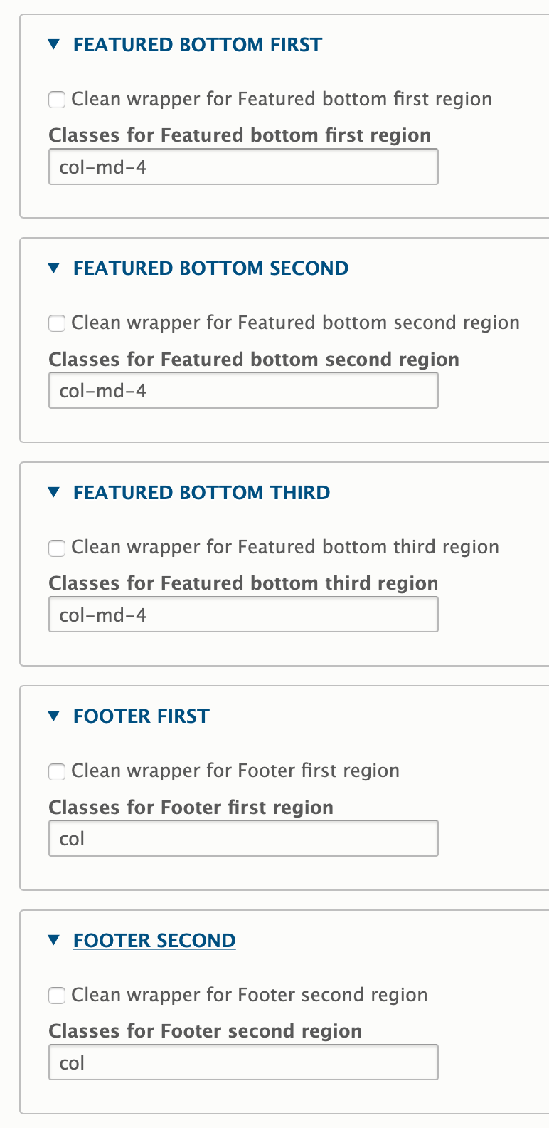
Example - side by side columns for “featured bottom" and "footer“
This frequent use case is best achieved with the SASS subtheme (from Barrio SASS Starter Kit), local libraries, display: flex and a few Barrio settings:
Amendments to page.scss:
/* BOTTOM
--------------------------------------------------*/

.featured-bottom .container,
.featured-bottom .container-fluid {
  display: flex;
  padding-left: 0;
  padding-right: 0;
}

/* FOOTER
--------------------------------------------------*/

.site-footer .container,
.site-footer .container-fluid {
  padding-left: 0;
  padding-right: 0;
}

.site-footer__top {
  display: flex;
}
Subtheme settings (excerpt):
Help improve this page
You can:
- Log in, click Edit, and edit this page
- Log in, click Discuss, update the Page status value, and suggest an improvement
- Log in and create a Documentation issue with your suggestion

