
Closed (fixed)
Project:
Claro
Version:
8.x-2.x-dev
Component:
Code
Priority:
Normal
Category:
Task
Assigned:
Unassigned
Issue tags:
Reporter:
Created:
17 Dec 2018 at 23:09 UTC
Updated:
25 Oct 2019 at 08:24 UTC
Jump to comment: Most recent, Most recent file


Comments
Comment #2
antonellasevero commentedComment #3
antonellasevero commentedComment #4
ckrinaDesign isn't finished yet.
Comment #6
ckrinaDesign is ready for implementation.
Comment #7
huzookaDesign isn't ready for implementation imho.
Issues I've found:
Question:
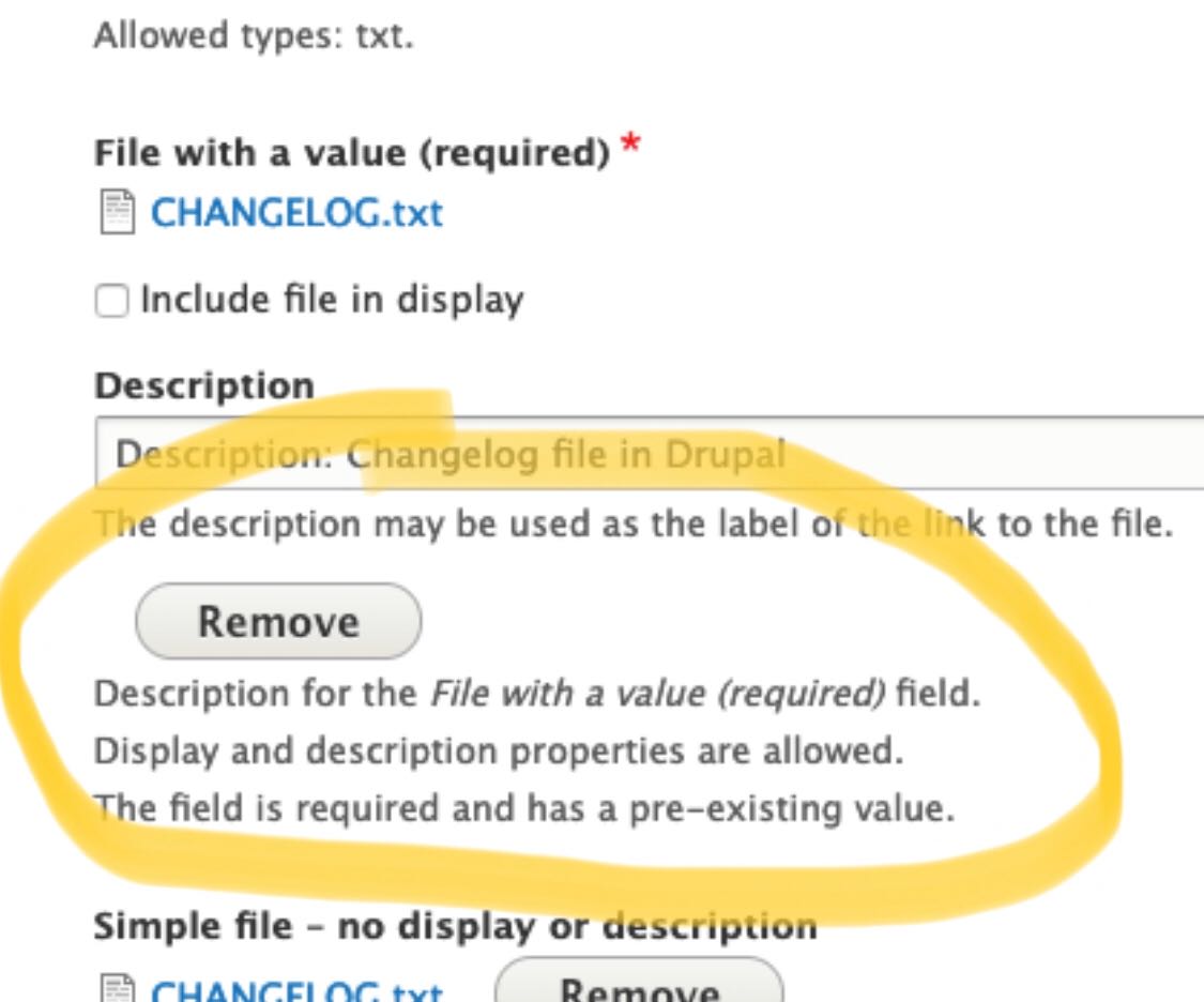
Added a screenshot about the file widgets displayed by Seven theme (with multiple states; but without errors).
Comment #8
huzookaI will start with this issue by setting up the needed markup changes for the single-field cases.
Comment #9
huzookaJust agreed on that we will handle the details wrapper of the single items in a follow-up (it seems to be a really complex task).
Comment #10
lauriiiComment #11
ckrinaAdding the updated design fixing this. Please use Figma to check spacing other specs, but here's an quick screenshot:

Comment #12
huzookaPOC for wrapping single file and image widgets into a details.
Comment #13
huzookaAssigning myself because I was (and am) working on this parallel with other issues.
Comment #14
huzookaThis is my current progress.
Comment #15
huzookaComment #16
huzookaThere are some issues with the design's current spacing and @lauriii noticed them :).
Questions:
Comment #17
ckrina#16.1 Good catch @lauriii & @huzooka! I just updated a part of the specs to follow the default fieldset styles. I'll update the styles later on.
#16.2 I would actually expect this result because the focus will sometimes appear surrounding an element instead of inside of it, and makes sense that it ends up over over something else. I'm more concerned with the right alignment/padding leaving a white space, but I think this is not the place to solve it. I'd say let's discuss it on another issue so we can unblock this one. :)
Comment #18
huzookaAttached a new patch that follows the old design. Hopefully, to address the new one from #17 we only have to remove some code :).
Comment #19
huzookaComment #20
huzookaComment #21
huzookaTabledrag-related enhancements were added to our follow-up #3083051-2: Refactor tabledrag when core issues are resolved.
#20 contains every needed improvements for the image widgets. I removed them at @lauriii's request.
What happened?
core/modernizr. I've refactored every small and extrasmall component variant and we use them only if the device is not touch-capable (this is exactly the same that we did for buttons).Differences from the design:
Comment #22
huzookaComment #23
lauriiiComment #24
huzooka@lauriii and I agreed on that we will remove this ugly workaround and accept that empty single cardinality file widgets will have the merged description, and that it will be displayed on the bottom of the upload field.
Comment #25
huzookaComment #26
lauriiiWe need follow-up for creating designs for #24 and we will try to update this based on that.
Comment #27
lauriiiI haven't reviewed the code yet (will work on that next), but in the meanwhile I noticed that the ajax throbber doesn't look great:
Do we have support for the progress bar as well? Would someone be able to post screenshots on how that looks?
Comment #28
huzookaComment #29
fhaeberleReally good work! I noticed, that the icon is not well aligned on RTL.
Comment #30
huzookaComment #31
huzookaAddressing #29.
Comment #32
huzookaComment #33
huzookaFound some minor RTL-related bugs and fixed them.
Comment #34
huzookaComment #35
lauriiiThis is missing some crucial parts to be able to understand why we actually depend on modernizr here. We should mention that we adjust some small controls to be bigger if the user is using a touch device and that we are using modernizr for recognizing that.
Why are we loading this always? Couldn't we load it only when one of these elements are present on the page?
Why do we have to duplicate the value from there?
Let's explain here why we have to do this.
Nit: According to Drupal coding standards, control structure conditions shouldn't be wrapped to multiple lines.
In the future, maybe we could use this: #2511548: Add a "context" array variable to all theme hooks and "#context" array property to all elements to provide optional contextual data here 🤔
👍
What is this change needed for?
Should we add a new class
form-managed-file__file?Can we document here why we can't add the
clearfixclass to these elements?How is this going to be read by screenreaders?
Maybe this is something that will be solved by #3068696: Tables overflow on mobile.
We could change this to just
Wrap single-cardinality widgets with a details element.🤯
How about
draggable-table--file-multiple-widget?👍
Comment #36
huzookaComment #37
huzookaComment #38
huzookaRe #35:
Well, not just for some. We do that for all of them. Comment rephrased.
I think I cannot guarantee full support. In theory, this would be possible (with a significant refactor of Claro's libraries +
claro.theme), but for example I cannot do this for every link, since LinkGenerator only calls the link alter hooks that are implemented by modules. I can only add it for those elements that can be preprocessed or pre-parsed by a theme.This is not a duplicate. This copies the behavior of the multiple file widget for the single cardinality widget. Comment added.
Done.
Fixed.
I just noticed this, and I'm sure we don't need this. We neither need this to be re-set for simpletest summaries. Nor re-setting it for Claro's Details. I bet that the design never defined that the details summary has to be capitalized.
9. No, I don't think so. File is a standalone component (both in terms of CSS and the template system).
We are able to add that, but it won't help. This is a
::beforepseudo, and not an::after!This will be read by screen readers the same way as the required mark of a form-item label or a fieldset label: won't be read at all, because there isn't anything to read. This is only a visual help.
This can be worse: make row weights be shown!
Done.
What? :)
Well, nothing guarantees that this will be a draggable table. Let's keep this.
:)
Comment #39
huzookaComment #40
huzookaThe danger variant of the new action link icons is broken.
Comment #41
huzookaFixed #40 and besides that, I applied the optimized SVGs on action links.
Comment #42
huzookaComment #43
lauriiiThis behavior on the single file upload is still a bit strange. Before uploading a file, the description is shown below the upload field:

However, after uploading a file, it's above the uploaded file:

Comment #44
huzookaRe #43:
Roger! You don't like that. But what to do then? Should we put back #24? I also hate that, but that is the only way to make this consistent.
Please, define your acceptance criteria and I'll ship the solution that matches them.
Comment #45
huzookaFrom slack pm with @lauriii:
lauriii 3:01 PM
I think we should place it under the uploaded image and the additional fields associated to the file
so it’s the same as Seven
huzooka 3:04 PM
Do you want me to do that?
lauriii 3:04 PM
that would be great
Comment #46
huzookaComment #47
huzookaComment #48
huzookaRe-rolled #41.
Let's see whether this applies cleanly or not.
Comment #49
huzookaComment #50
huzookaThis patch addresses #45.
Comment #51
lauriii#3085878: Test file widget designs with progress bar as a follow-up.
Comment #52
lauriiiComment #53
ckrinaIs it possible that the patch doesn't apply anymore?
Comment #54
lauriiiHere's a reroll of #50.
Comment #55
ckrinaThanks for the work here! I compared this with the designs and there are still a few things to do:
- Multiple field:
1. The remove button should be top aligned.
2. There should be top&bottom padding to the name.
3. The button should use the smaller size: XS.
- Single field:
4. The remove button should be right aligned.
5. There should be less space between the description field and the file name.
Comment #56
ckrinaAh, I forgot the screenshots:
Comment #57
lauriiiComment #58
ckrinaThanks for the work! I've found a few small things:
1. The left and right space should be the same when there's only 1 file.
2. The space between the icon and the file name should be bigger.
3. The file icon should be vertically aligned with the name.
Comment #59
fhaeberleReally good work @huzooka :) I recognized a few things:
Basically the horizontal alignment of the initial text and the input itself is off.
There is also an answer provided in the question.
https://stackoverflow.com/questions/27616054/file-upload-styling-in-chrome
Firefox (correct)

Chrome (wrong)

Now

Proposed solution

Comment #60
fhaeberleComment #61
huzookaComment #62
huzookaComment #63
huzookaThere was a small error in the rebased patch of #54.
Comment #64
huzookaNeeds reroll because #3023310: Vertical Tabs style update just landed.
Comment #65
huzookaRebase of #63.
Comment #66
huzookaComment #67
huzookaThis patch addresses #58.2, #58.3 and #59.
Re #58.1:
That's not a margin. I applied a max-width on the managed file widget. The motivation behind this decision is that I don't want to let the remove button be rendered too far from the other file-related UI elements.
Comment #68
ckrinaRe. #58.1 I'm not convinced with this solution, but I see the problem you're pointing to. It'll need a design solution, sol let's not block this issue with this. :)
I've found just a very small thing: when the file name is really long it jumps to another line and it should really remain on the same:
Comment #69
huzookaRe #68:
Sadly, we cannot do this when we're in the same table-cell where the drag-handle is.
Comment #70
ckrinaWe should be able to do it as discussed on Slack, but it can be a follow-up. So marking this as RTBC.
Comment #71
ckrinaFollow-up filled: #3086255: Align long file names for File field
Comment #72
huzookaComment #73
huzookaComment #74
fhaeberle@huzooka Can we generate screenshots for this, please? That would be really helpful to review this in detail!
Comment #75
huzookaMy Safari freezes right at the beginning of the Nightwatch test script.
I'll upgrade my system (hoping that it will help).
Screenshots attached (except Safari on OS X).
Comment #78
lauriiiI tested MacOS Safari manually. I also made some minor coding standard improvements, as well as improved wording on some documentation. Interdiff attached.
Thank you everyone! Pushed and committed!
Comment #79
huzooka