Problem/Motivation
As a result of the exploration of the possible integrations with the new left toolbar we’ve discovered that the existing left sidebar is missing the capacity to accommodate some of them. Items that are more actionable and related with the content of the existing elements on the page can’t be easily accommodated there.
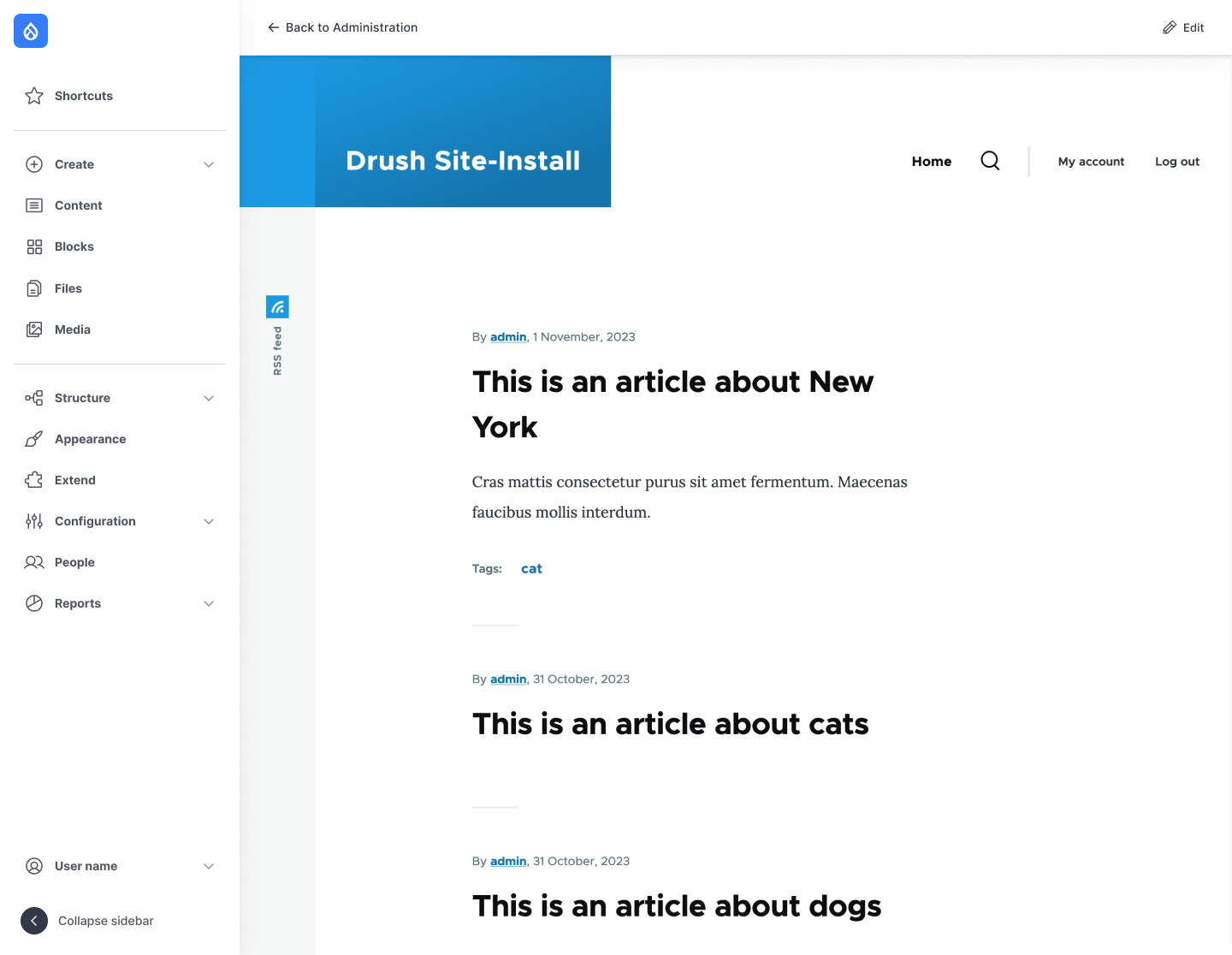
Proposed resolution
Create a new top bar that will show contextual elements based on the existing page content, plus it can hold the existing breadcrumb.

Top bar prototype, implemented on the new designs being developed for Claro (out of scope from this issue because they are not finished)
Content/elements to include:
Left section:
- Back to site: same feature we have right now
- Back to Administration: link to to /admin/content for now (it will go the Dashboard when it gets in)
- “Edit [Name of the content]” when a full viewmode/page entity is being edited
- Breadcrumb. Same as it is right now except on the node edit form, where it is replaced by “edit” + entity bundle
Note: this left section is almost the same as Gin’s implementation, so the existing code Gin implemented can be taken as an example.
Right section:
- Primary actions.
- Local actions, as the “Add content” in the content list.
- Edit actions.
- The Save and Preview button should be cloned (the bottom ones should be kept) to this top bar.
- The Delete action should be cloned inside the “More actions” dropdown.
- More actions. This should have the Local tasks, like Delete and Revisions. On a first step let’s also keep the “view” there, but let’s remove the active “edit” from the local tasks.
- Open/Close the form sidebar on the further right placement. Similar to what Gin does, but placed differently so the sidebar is perceived as “child” or “internal” to the node.
- Edit. Coming from the core In place editing that we already have on the Toolbar on the front-end.
Behavior:
- It should always be there unless there is no content to show. Not sure in which situation it’d happen though.
- Sticky at the top when scrolling
- It should have a shadow to stand out from the content of the page, and look like it’s on the “top”.
- Should be there on mobile, hiding the breadcrumb. For the prototypes is the least important thing for now until we do the first round of user tests and we validate the idea.

 Show commands
 changes
Comments
Comment #2
finnsky commentedGonna work on it.
Comment #4
finnsky commentedHello all!
I created few new components and did small modifications with existing one.
1. Created toolbar-dropdown. Floating UI based js. Button with links list. Js later need to be updated with close on click outside. For now only simplest script.
2. Created admin-extra-toolbar. It should not appear on all pages. So separated library. Same script as in main navigation wrapper but simplified. Displace supported. RTL need to be checked.
3. Updated Navigation Button to make it universal. Reverted icon logic. Also removed few styles which were same with this button. Added few new icons.
4. Updated Control-top bar styles to support fixed position + Drupal Displace.
5. Located new components twig logic in dummy twig sources directory. templates/temp-components.
6. Fixed js script. We definetly need to rework it.
IMO looks good: https://gyazo.com/cb14eafb91fe1737b83e0d8d9b21d979
Please review!
Comment #5
ckrinaMentioned in Slack: This looks really great. The only thing I would change in a component perspective is trying to separate the breadcrumb component from the “back to site” link, so styles will be easier and won’t be that difficult.
As an idea, maybe separate left and right regions:
Apart from this small detail, just to mention that the expectation from the work here is to have a "functional" prototype to run user tests. For example:
Comment #6
finnsky commentedGonna manage it now.
Comment #7
finnsky commentedAdded some conditions based on route.
Add content/media/block works.
Breadcrumbs are also ok.
Comment #8
ckrinaCool! Things I've noticed:
Comment #10
kostyashupenkoMade right sidebar scrollable. Fixed its height
Also do we need to have preview of sidebar on mobile display? Currently it's hidden. I'm thinking if we have to move on mobile display some toggling button?
Also `Edit` link in top toolbar now is a real link to edit page. Same for preview
Comment #11
ckrinaThanks @kostyashupenko!! And sorry it took me a while to review :)
Here's what I've found testing it:
I've left feedback, but the work happening in here is great. Thanks!!
Comment #12
ckrinaUploading the correct image.
Comment #13
kostyashupenkoEverything should be fixed now except of 7.
About preview - you have to create node first, then you will be able to click Preview button in top toolbar (this is how it works now, not sure if have to provide some extra logic).
Comment #14
kostyashupenkoAlso @ckrina can you add also https://www.drupal.org/u/yurkinpark to credit list? He helped me a bit with backend part
Comment #16
ckrinaComment #17
ckrinaThis is almost ready, good that we have the test almost ready too :)
Just 2 more things:
About the preview, let's forget about it for now. It's not important for the user tests and when we implement this beyond the prototype when can invest the time it needs.
Also, credits given. Thanks @YurkinPark!
Comment #23
ckrinaActually, I will use this issue to credit everybody that participated on the design part for this top contextual bar.
Comment #24
kostyashupenkoComment #25
ckrina@kostyashupenko thank you for the changes!
I just realized of 2 more things. Sorry I didn't catch them earlier:
Comment #26
kostyashupenkoComment #27
ckrinaThis is great!!! Thanks both @kostyashupenko and @finnsky for all the work here! I'm leaving this as RTBC for now instead of merging to discuss the strategy to convert this into code ready for an alpha release of the module. Meanwhile we'll start testing this hopefully next week on #3396125: Toolbar Prototype Usability Testing Phase 4.
Comment #28
finnsky commentedGonna rebase it with current 1.x
Comment #29
ckrinaTesting the script for the user tests I've found this error on the top bar: when you are in the front-end, if you click in the "more options" dropdow, it triggers the Inline edit too. See:
Comment #30
kostyashupenkoComment #31
ckrinaThanks for the fix @kostyashupenko! Moving back to RTBC.
Comment #32
rkollerI've applied MR123, one detail I've noticed if you try to tab through the interface on for example
/admin/config/media/image-stylesafter the visible "Skip to main content" link, you have four invisible focus states equal to the "Go back to Site", "Administration", "Configuration", and "Media" links. According to WCAG 2.2 SC2.4.7 the user should know which element has keyboard focus.Comment #33
finnsky commented@rkoller hi!
Thank you for review! but in this MR we only added rude prototype for just usability testing.
It has a lot of hardcode and weird solutions :)
Real work is planned here:
https://www.drupal.org/project/navigation/issues/3401826
And first MR with real component:
https://www.drupal.org/project/navigation/issues/3402046
Comment #34
ckrinaMarking this as Fixed after the results from #3396125: Toolbar Prototype Usability Testing Phase 4. Thanks everybody that make it possible to see what worked and what didn't from this initial idea. We've learned a lot!
Comment #36
ana barcelona commented