

Closed (fixed)
Project:
Drupal core
Version:
8.7.x-dev
Component:
Umami demo
Priority:
Normal
Category:
Bug report
Assigned:
Unassigned
Issue tags:
Reporter:
Created:
28 Mar 2019 at 21:17 UTC
Updated:
19 Apr 2019 at 05:34 UTC
Jump to comment: Most recent, Most recent file






Comments
Comment #2
gábor hojtsyThis is a current screenshot as of just now:
This issue is about the highlighted region above the page title. Keep in mind people may use it to place other content elsewhere, so it should not just be styled for this use in particular but as a general highlighted content region. Bartik puts a border around it.
Comment #3
gábor hojtsyComment #4
shaalA similar solution of Bartik does - a dotted border around the block-help message (Recipe Layout builder instructions)
/en/admin/structure/types/manage/recipe/display/full/layoutComment #5
pawandubey commented@shaal
I have reviewed and tested this and patch works fine as per the attached screenshot.
Moving this to RTBC.
Comment #6
gábor hojtsyLet's get @kjay agree to this as the point person for the Umami design. :)
Comment #7
kjay commentedI think we have a regression issue with the styling of the highlighted region and fixing it will impact on the styling of help messages.
See the following screenshot:
#3027614: Use Layout Builder in Umami for the recipe content type in full view mode adds a new div .container wrapper around the highlighted region, probably to contain the layout builder help text, but the design for content in the highlighted region is 100% width with an appropriate background colour for the type of highlighted message. Plus the message is enhanced with an icon in some cases.
I think the help text should not be placed on top of the page background colour because even with a border, the presentation feels like it is part of the page and we need to separate the purpose of this message out and use the same style for all help messages in the highlighted region.
I propose following the same design pattern we have used for the status messages in the highlighted region and place the content on a 100% width background coloured region. Pale blue for example helps separate this out from the regular page components, like the example in this screenshot...
I'll do a patch for this proposed design in the morning.
Comment #8
kjay commentedHere's a patch for the proposed design in #7.
Applied it should look like this:
This also fixes the style regression for the status messages by making the highlighted region full viewport width again:
Comment #9
markconroy commentedThis looks great. I'll create a follow up issue to come up with a generic solution to this region, so if other blocks are placed there they won't float to the left just because each block template hasn't got a specific class in it.
Comment #10
lauriiiSince we have control over the markup, could we add a specific class here? Something like
.block-edit__container.Nit: The indentations are not correct here.
Nit: These should be intended with 2 fewer spaces.
Comment #11
gábor hojtsyMy understanding was @kjay was planning on a more general solution that does not require block templates per special block. If that is not going to happen, this is still a visually superior solution :)
Comment #12
kjay commentedThanks @lauriii for the review. I've addressed your points in the attached.
Here's a version of the highlighted region that acts as a container for whatever blocks are thrown at it. It means moving away from the (slightly) better looking 100% width viewport status messages, but this still looks pretty good and I think is very clear.
And here's some screenshots to show how this should look when applied, including a custom block of lorem ipsum to show how the region looks with standard block content.
Comment #13
shaalLooks great!
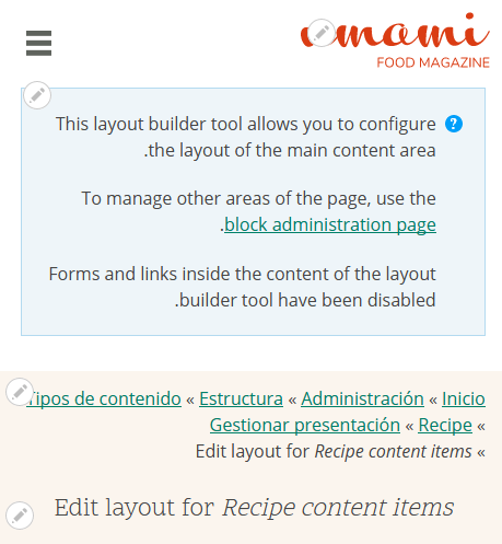
I tested it on desktop, mobile, and RTL.
Attached - a preview of RTL mobile

I added related issues of Layout Builder theming in Umami.
Comment #14
kjay commentedThanks for the review @shaar. I'm sorry, I messed the patch up. Plus 8.8.x just got an update that causes an error applying the patch in #12.
Here's a re-roll and to fix the error in my previous patch, the missing highlighted.css file is now included. The screenshots on #12 remain unchanged and there should have been margin around the highlighted region content on all screen sizes.
Comment #15
pawandubey commented@kjay
Patch#14 looks fine just need to fix end line issue.
Comment #16
shaalI added the missing newline in 2 files -
highlighted.css&help.svg@kjay this one looks even better :)
The new mobile RTL looks like this now -

Comment #17
lauriiiJust realized that we have nested container elements. Should we remove the inner container since it's redundant?
There's also some stylelint coding standard violations after #3024527: Add and configure stylelint-order landed. You can see the change record for how to fix those automatically.
Comment #18
kjay commented@lauriii We could remove the container but won't that mean we're going to be messing around with some fiddly offsets for the background image? At the moment we can use background position as left or right and it positions up against the padding of the parent nicely. If we go down the route of removing that inner wrapper, we'll need two switch to using px's or rems for the padding to give us fine control (or a mix of them both) and we'll need to do some kind of right offset (which I think is supported by modern browsers) as we can't just position the background image right.
Are we sure it's worth it?
Comment #19
kjay commentedI've misunderstood and @lauriii is referring to the unnecessary .container class on the inner wrapper, not the wrapper itself. New patch attached along with yarn fixes. Thanks @lauriii and @pawandubey
Comment #20
kjay commentedHoping this will nudge a new test.
Comment #22
pawandubey commented@kjay
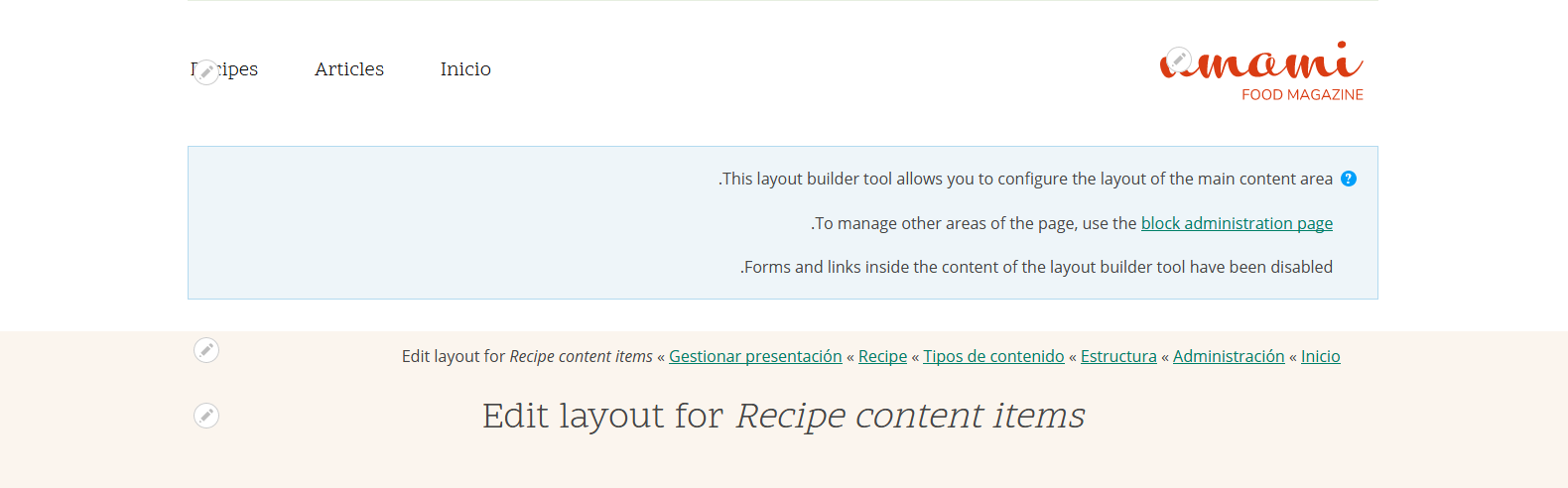
I have reviewed the patch and its working in both mobile and desktop layout as per attached screenshots.
I have re-rolled the patch again to fix the minor end line issue for the .svg file.
Comment #23
shaalI tested #22
I reviewed the code and tested the patch using Chrome, IE11, with LTR/RTL and various screen width.
In addition to the screenshots in #22, here's the preview of IE11 + RTL:

Comment #24
gábor hojtsyAssigning credits and cleaning up the title.
Comment #26
gábor hojtsyThanks all!