

 The 2026 Drupal Business Survey is open. Your response will help shape the future of the Drupal business ecosystem.
Problem/Motivation
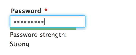
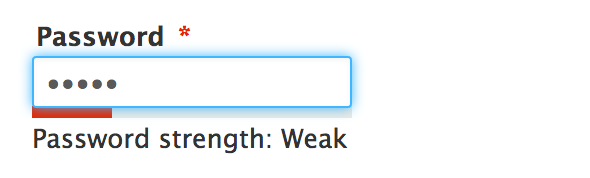
The focus style of the password field overlaps the password strength indicator bar and distorts the sharpness and colours of the indicator.

Proposed resolution
A fix with CSS, some suggestions:
- Add a small margin above the indicator which clears it of the focus area.
- Increase the height of the indicator bar.
- Position the indicator on the z-index so it sits ontop of the focus (not recommended).
Remaining tasks
Discuss solution
Write a patch
Test patch + upload patch and Screenshots.
Patch review + screenshots.
User interface changes
Improves visibility of password strength indicator.
API changes
n/a
| Comment | File | Size | Author |
|---|---|---|---|
| #14 | stark.png | 18.21 KB | ByronNorris |
| #13 | Screenshot 2014-09-08 22.24.37.jpg | 454.42 KB | lewisnyman |
| #13 | Screenshot 2014-09-08 22.24.37.jpg | 454.42 KB | lewisnyman |
| #9 | password-focus-margin-2318677-margin-height-9.patch | 401 bytes | ByronNorris |
| #5 | password-focus-margin-2318677-margin-height-5.diff | 400 bytes | ByronNorris |





Comments
Comment #1
ByronNorris commentedHere's a quick mockup of the password strength bar:
Comment #2
emma.mariaI prefer the margin solution, I can't stand the blue focus bleeding into the colours even with the height increase. Having a space makes both parties crisper. Also I only just noticed from my original screenshots that the text field has slight rounded corners and the password is square and they don't look good touching in my opinion.
Comment #3
Bojhan commentedI agree. Could you try playing a bit with the margin though - I am not sure if 0.45 or 0.52 work better (random values I tried).
Comment #4
astrocling commentedI agree with @emma.maria. I like the Margin option better, it looks a bit cleaner. As for the amount of margin, it seems like more of a personal preference to me. What you have looks fine, personally a little more, like @bohan's .52 recommendation looks a little bit better. But again that is just a personal eye thing at that point. I do like it broken up a bit, and the .52em does that well.
Comment #5
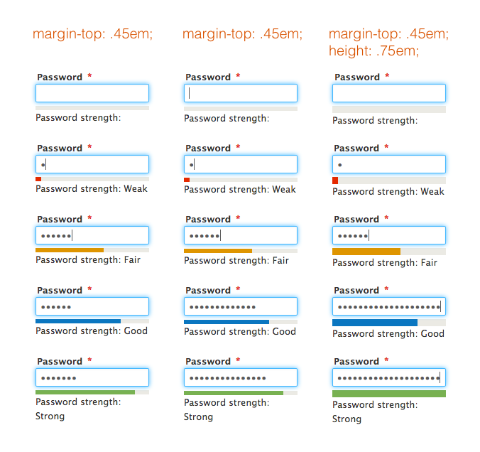
ByronNorris commentedFrom right to left:
I've attached diffs of each change as well.
Comment #6
lewisnyman@bluegriff Thanks this is awesome, I like the increased height of patch 3. I think we should go with that.
Comment #7
peterjlord commentedJust tested the patch on a clean install. Great UI improvement. Little things like this make for a great release
Comment #8
lewisnymanOk, let's go with the third patch. We need to rename the file type to .patch and change
.5emto0.5emComment #9
ByronNorris commentedExcellent! Here's the updated patch file for the third option.
Comment #10
astrocling commentedI agree with this option, I think it looks nice. The patch appears correct for me and tests correctly when I applied it, and is in the right format.
Comment #11
g-raph commentedLooks good and is fine by me. Good work!
Comment #12
webchickWow, great work and great testing on this!
Now the only problem is this is modifying user.css (meaning, all themes) but I only see testing in Seven. Could we get a quick run-through in Stark and Bartik as well? (Doesn't have to be super comprehensive like #5; just enough to show it doesn't mess up the display.)
Comment #13
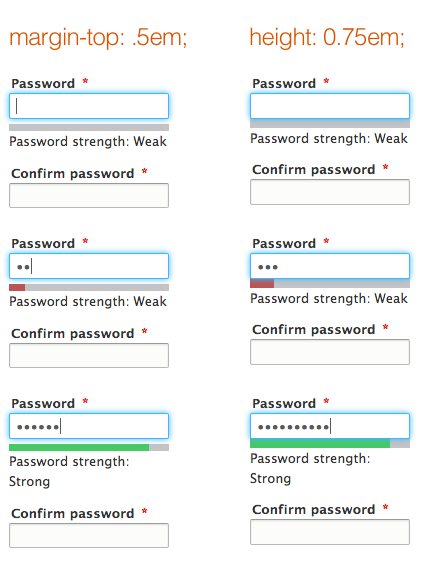
lewisnymanGood point, here are the screenshots.
Bartik looks good to me, Stark looks a little weird but not broken.
Comment #14
ByronNorris commentedBartik looks a-ok. Stark does indeed look weird, but it was weird pre-patch :D
Comment #15
lewisnymanThat's true, let's go!
Comment #16
webchickAwesome, thanks for the testing! Sorry that this dropped off my radar for a week there. :(
Committed and pushed to 8.x. Thanks!
Comment #17
lewisnymanNo push?
Comment #18
lewisnymanI don't know what the correct process is here but I'll assign it to Angie in case she misses it :)
Comment #19
webchickBah! Thanks. Got it this time. :)
Comment #21
lewisnymanThanks!