
 Come together with the global Drupal community in Rotterdam, 28 Sept – 1 Oct 2026. Sessions, contribution, connection, and Early Bird savings until 8 June.
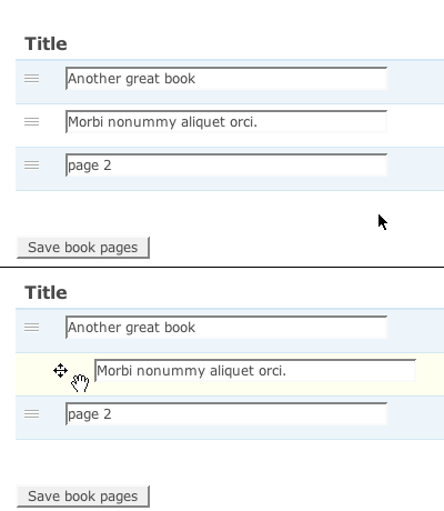
I think the design of draggable.png (found in the 'misc' folder) could be improved a bit:
The normal state should look more like grippie.png; grooves you can grasp on to. This is more consistent with the expandable formfields in Drupal and these 'grooves' are often seen in other software as well. It also looks less 'noisy' than a whole column of grey crosses.
Seperating the arrows from the horizontal bar makes that bar a little icon for the table-row you are actually dragging.
Together this also results in better contrast between the _up and _over states.
| Comment | File | Size | Author |
|---|---|---|---|
| #13 | draganddrop-icons.png | 30.14 KB | Sandripola |
| #7 | 216898-icon.jpg | 24.45 KB | deepti.verma |
| #4 | draggable-icons.png | 49.54 KB | yoroy |
| draggable.png | 1.13 KB | yoroy | |
| draggable-screenshot.png | 8.73 KB | yoroy |

Comments
Comment #1
webchickHm. I'm not sure about this. That "rest state" graphic doesn't indicate to me in any way whatsoever that the content is draggable. Where else have you seen this symbol this used?
I do agree that we could stand a bit less "noise" but are there other ways to accomplish that? Maybe a greyed out draggable icon, or a smaller one?
Comment #2
yched commentedAlso, the 4 arrows are here to indicate that horizontal dragging is also possible (on tree structures like the menu overview pages).
We can't simply drop them IMO.
Related : http://drupal.org/node/214817.
Comment #3
yoroy commentedOh well. See #633086: Dashboard visual design improvements
Comment #4
yoroy commentedNew decade, new possibilities! I still think we can update this to a more up to date look. @deg posted these sketches in the Slack UX channel:
Comment #5
droplet commentedNote: It able to drag left & right.
5 doesn't look like draggable.
2 & 4 only up and down (but looks good)
3 common icon on iOS, usually only up and down.
1 hmmm. Just feel that not so good.
Comment #6
deepti.verma commentedComment #7
deepti.verma commentedI have come up with 2 designs
Comment #8
deepti.verma commentedComment #9
pramodga commented@Deepti : First icon looks good to me.
@yoroy Any views?
Comment #13
Sandripola commentedHere are my proposals for Drag and Drop button.
Comment #14
Sandripola commented