
 Come together with the global Drupal community in Rotterdam, 28 Sept – 1 Oct 2026. Sessions, contribution, connection, and Early Bird savings until 8 June.
Panopoly Magic (only panopoly module we still have) adds the ability to preview content prior to adding it to a panel pane which is a very nice feature. However, with th ecurrent layout if there are a lot of elements (fields, content panes, etc.) in a particular category then the add content modal window becomes difficult to use because each item takes too much space. It would be nice to come up with a method whereby the user sees more of the content links and still has the ability to see a preview.
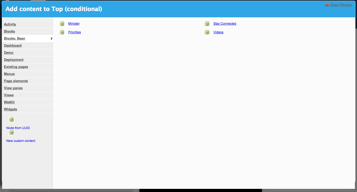
Panopoly Magic Enabled

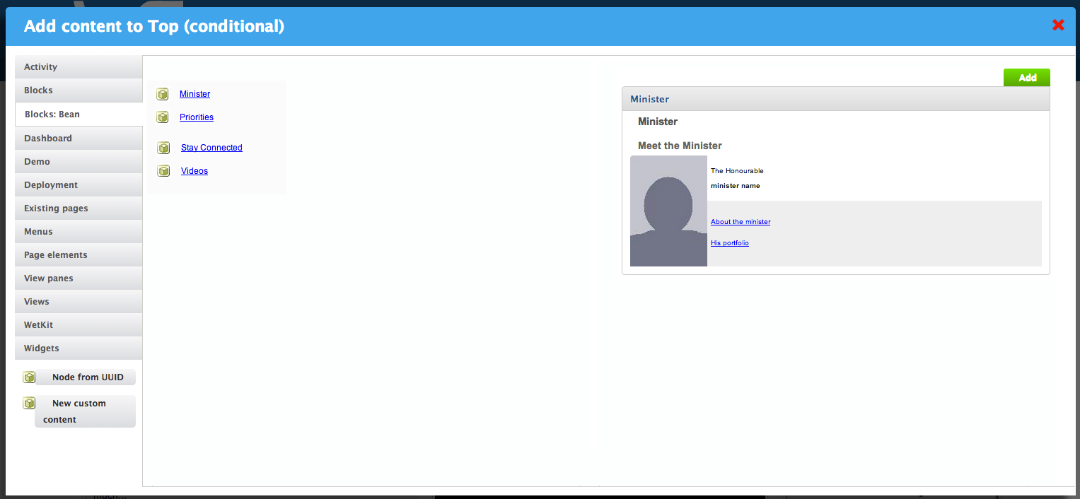
Panopoly Magic Disabled
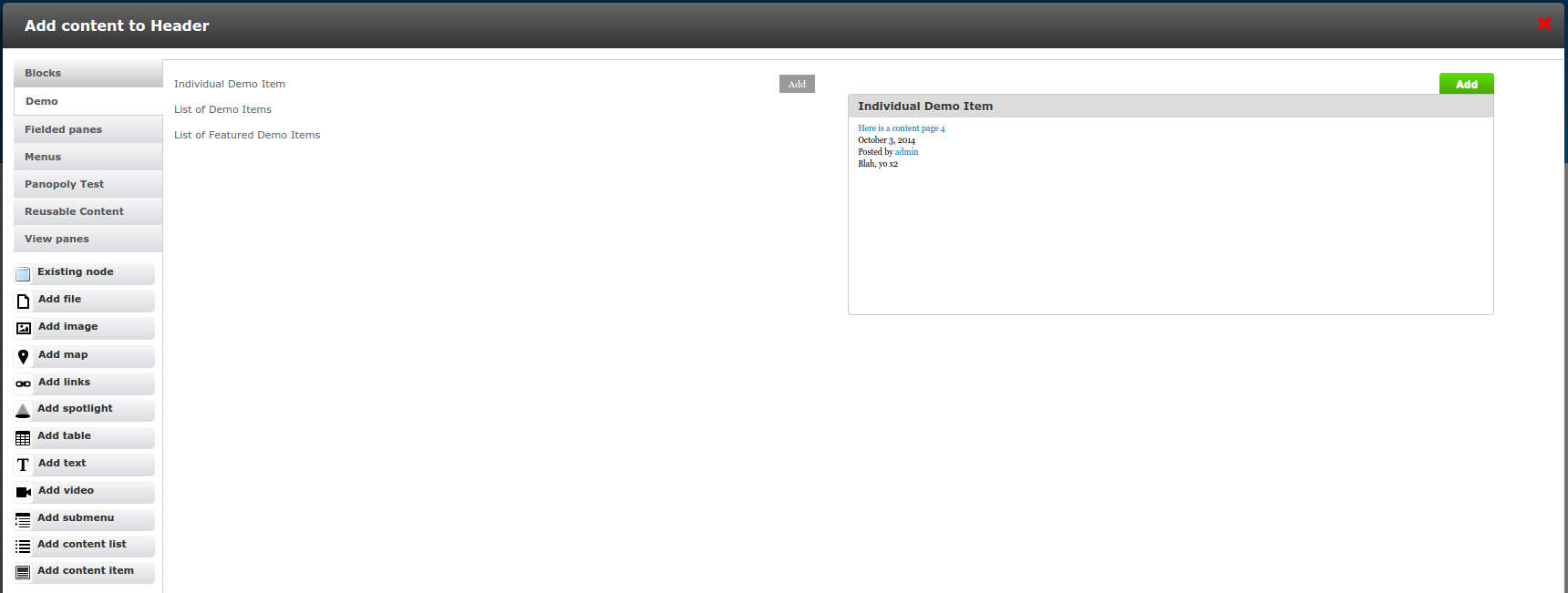
Prototype
Still @todo to get this committed!
Some more visual clean-ups. @sylus's styles look better in his screenshot than they do on a vanilla Panopoly site - I assume the extra styling is from his theme. Here's a screenshot of what this looks like on vanilla Panopoly:

Make this the default on new sites. This is so cool, and generally more useful than the previous default, that I think this should be the default on new sites. This means adding ahook_update_N()to set the old default on sites that saved the'panopoly_magic_pane_add_preview'variable, and changing the value ofPANOPOLY_ADD_PREVIEW_DEFAULT.Adding Behat tests for the functionality. The panopoly_magic code is sooo complicated, I don't want to add any new functionality without having tests for it. Otherwise we're just going to break it later!Patch needs in-depth code review.Preview shows "No Preview. Select a pane to show its preview." for panes that give an empty preview and "Add" button is missing! For example, if you select the "Inline differences" block (from the Diff module), it doesn't have the context to render a preview so it's empty. However, it's still instructing the user to select a pane even though one has been selected!

Use the term "Widget" rather than "pane". Panopoly has standardized on the term "widget" as opposed to "pane" in user visible strings.Pane titles that contain HTML show the HTML tags rather than rendering. Something is probably being run throughcheck_plain()when it should befilter_xss_admin()for pane titles:

- Fix accessibility issues! Several were identified in #53, #54 and #55
I've quickly read through the patch, but not given it the full treatment yet!
| Comment | File | Size | Author |
|---|---|---|---|
| #61 | panopoly_magic-show-single-preview-21553377-61.patch | 16.31 KB | dsnopek |
| #51 | panopoly_test-show-single-preview-2155377-51.patch | 11.87 KB | dsnopek |
| #39 | Selection_083.png | 53.96 KB | dsnopek |

Comments
Comment #1
sylus commentedComment #2
sylus commentedComment #3
sylus commentedComment #4
sylus commentedComment #5
sylus commentedComment #6
sylus commentedI am going to move this to panopoly so we can all work on solving this UX issue.
I am also going to upgrade this to a bug because will no doubt be a problem for larger sites.
Comment #7
lsolesen commentedMoving to active, as there is no patch.
Comment #8
lsolesen commentedAnd this is not a bug, but a feature request.
Comment #9
sylus commentedI disagree that this is not a bug.
A feature request implies there is nothing currently breaking whereas this design does represent a break in the default UX of panels.
Once you reach a certain threshold of content / panes it becomes impossible to use the new design to find and work with panes properly.
Does a break in UX not represent a bug?
Comment #10
lsolesen commented@sylus If it is because you cannot scroll in the ctools modal to see the other panes, it is a bug. After doing a little more investigation, it seems at least in Chrome on a Mac that the scrollbar is not visible. I just never noticed because I use the scroll wheel on my mouse. So I think this should be investigated as a bug. Sorry.
Comment #11
joel_osc commentedI would argue that the best solution from a UX perspective is to not have the scrollbar at all. I really like the concept of this feature, but for every site that I have worked on I have needed to disable this module because once you have more than 10 view panes the add content modal become unusable. Just my 2 cents. Cheers.
Comment #12
mpotter commentedWe really wanted to improve this for Open Atrium also, so I got started on a patch for this.
It adds a new option to the "Enable previews when adding panes" setting called "Single". It shows a single preview on the Add Content form. Clicking each pane will update the preview. There is an Add button next to each pane so you can add it without needing to see the preview first.
What this patch needs now is the css changes to make it look nicer. But I think it handles the backend functionality. If I get more time I'll submit a css update. We might need to add a class somewhere so this can be themed properly.
Comment #13
mpotter commentedComment #14
dsnopekUpdated issue title to better reflect the current proposal and patch.
Comment #15
sylus commentedThanks for the awesome patch I did some custom css and modify the above patch to wrap the add button and title inside a div to ease css.
Attached a picture of how it currently looks for us. If looks satisfactory can commit the patch.
Comment #16
dsnopek@stylus: Can you share the patch? Even if it's not finished, it'd be great to have it here so that others can carry on your work later. Thanks! :-)
Comment #17
sylus commentedApologies for the whitespace correction as my IDE automatically corrects this.
This patch includes the CSS additions, as well fixes for watchdog issues such as undefined index 'preview' etc.
Comment #18
sylus commentedAttaching a cleaner patch without most white space corrections.
Comment #19
cboyden commentedThis is also an accessibility issue: If you're using the keyboard to add panes, you'll have to tab through every link that's rendered in each of the previews in order to select something that's further along in the list.
Comment #20
dsnopekThanks again to @mpotter and @sylus! I just manually tested this patch and it works beautifully. :-) I've just started the automated tests on Travis-CI: https://travis-ci.org/dsnopek/panopoly/builds/51424011
However, there's a couple things that we need to do before we can commit:
hook_update_N()to set the old default on sites that saved the'panopoly_magic_pane_add_preview'variable, and changing the value ofPANOPOLY_ADD_PREVIEW_DEFAULT.I've quickly read through the patch, but not given it the full treatment yet!
Comment #21
dsnopekEr, and a found a couple more small bugs in manual testing:
check_plain()when it should befilter_xss_admin()for pane titles:Comment #22
dsnopekOops, accidentally hid the latest patch!
Comment #23
dsnopekBelow is my in-depth code review! Sorry for so many nitpicks. You guys have done great work so far, thanks so much!
I'm just a little hard on changes to panopoly_magic because it's simultaneously some of the ugliest code and most important code in Panopoly. I want each addition to help de-uglify as much as possible within the scope of its changes. :-)
Having
!importantin a module is usually a bad sign and points to something that should probably really be done in the theme.Removing this doesn't change the visual appearance for me at all.
Same for this one.
We should probably check both
$type_nameand$sub_type:$sub_typeisn't guaranteed to be globally unique, only unique within its type.This is probably where
check_plain()is getting run on the pane title.Likely fix:
$options['html']should be set to TRUE, and the title should be run throughfilter_xss_admin().We do almost this same exact lump of code three times. Here, and ...
... and here, and ...
... and here. Would it be possible to refactor this out into a function?
That would also probably make it easier to understand from reading the code what it's doing, and what makes each of these sections a little different (since it'd be represented in function arguments).
If it's not possible (I haven't actually tried), well, I guess we have to live with it, but I'd rather not. :-)
Strings in
t()should use a single space to separate sentences (there's two spaces here).Thanks again!
EDIT: Fixed a bunch of type-o's!
Comment #24
dsnopekComment #25
dsnopekRunning on Travis-CI again: https://travis-ci.org/panopoly/panopoly/builds/53462520
This one still needs new Behat tests to test the new functionality!
Comment #26
andrew_mallis commentedExcited to see these improvements.
Please excuse these observations if they distract us from the functional task at hand.
It would be really, really awesome if instead of a live preview, we could optionally load an image.
I could not find a hook for this.
Probably its own request, but thought I would mention it in the context of the broader UX considerations being brought to bear.
Widgets out of context can look really strange sometimes.
Many widgets require a context to render an data at all.
A preview, to achieve its goal of helping a site admin select the appropriate widget would be well served by such an option.
Comment #27
dsnopek@Andrew_Mallis: That's a great idea! And it shouldn't be too hard to implement - I'd imagine having a special key on the CTools content type plugin which points to the image. Then we could have panopoly_magic check if the content type it's rendering the preview has that key set, and show the image instead. However, this should definitely be a new issue! This issue already has a clear path to completion and these changes don't really depend on each other - they could be worked on simultaneously.
Comment #28
dsnopekGoing to do some work on this!
Comment #29
dsnopek@Andrew_Mallis: I created a new issue for your comment in #26: #2484843: Allow widgets to control how their "example" is rendered on the "Add content" dialog (including using a static image rather than rendering)
Comment #30
dsnopekHere's a new patch that fixes all the code review that I did on #23. The hardest bit to get right was the refactoring for #23.5, #23.6 and #23.7, but the code is way easier to read and understand now!
I also fixed the bugs identified in #21.
But I still need to address the functional review in #20, so leaving this as "Needs work"
Comment #31
dsnopekFound some more opportunities for clean-up and refactoring. The codes even simpler now!
Comment #32
dsnopekHere's a patch for panopoly_test that adds tests for all the different 'Add content' preview modes. It required a small change to panopoly_magic to make it easier to test the manual previews. I'm going to run this on Travis in a moment.
EDIT: Here's the Travis build: https://travis-ci.org/panopoly/panopoly/builds/61644652
Comment #33
dsnopekUnassigning for now. I may come back to this soon-ish, though!
#20.1 and #20.2 still need to be done. If the tests pass on Travis, then that's all that needs to be done to finish this!
Comment #34
dsnopekEr, helps to actually unassign when I'm saying that I'm unassigning. :-)
Comment #35
dsnopekTests didn't pass on Travis. :-( Here's a new patch that attempts to fix them!
EDIT: Here's the new Travis build: https://travis-ci.org/panopoly/panopoly/builds/61763936
Comment #36
dsnopekHere's a new patch that fixes TODO #2 and #5 in the issue summary. I tried to make some visual clean-ups, but the CSS for this is a mess. In a lot of ways these aren't new visual issues, but pre-existing ones so it might make sense to address them in a new issue? But I'll try and take one more stab at it before deferring until later.
EDIT: Another Travis build for this patch (including upgrade tests): https://travis-ci.org/panopoly/panopoly/builds/61767759
Comment #37
dsnopekUpdating TODO's in the issue summary.
Comment #38
dsnopekFor my own personal organization, I'm marking this as a "Feature request". This is no way affects my commitment to finishing this and getting it merged into Panopoly!
FYI, the last test build on Travis-CI succeeded so the only thing remaining now is the visual fixes. :-)
Comment #39
dsnopekAlright! Here is my attempt to fix the visual styling issues that I laid out in #20.1 (or point #1 in the issue summary). I also fixed a logic issue in the
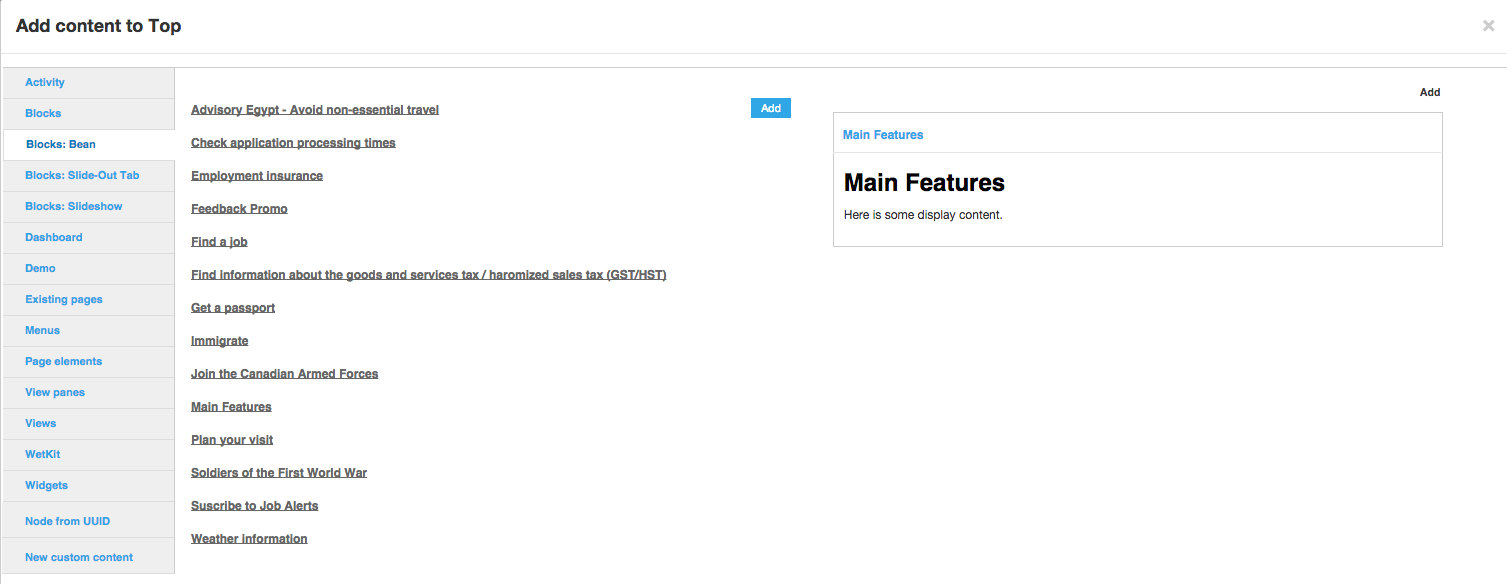
hook_update_N()function: I didn't take into account that one of the valid values was 0 (for manual previews).And here is a screenshot after the visual clean-ups:
At this point, all this really needs is lots and lots of review! I'd really appreciate any code reviews or manual testing. :-)
Comment #40
dsnopekUpdating issue summary.
Comment #41
segovia94 commentedFunctionally it all works well. Great job! There are just a couple code cleanup items.
margin-top should be on its own line
The $title is not set anywhere
Also, the ajax throbbers don't look very good. I don't think that should block this though since a lot of the issues are already present in past releases. We should have another issue to go in and clean up the appearance of throbbers.
One possible help visually would be to add a background color on the preview link row when hovering over it so that the "Add" button isn't just floating off on the side unrelated to anything. Maybe something like:
I didn't have a chance to run the test patch yet. I'll try to get to that later tonight.
Comment #42
segovia94 commentedThe tests passed for me. There is one TODO sitting in a function that I'm not sure if it got missed or not.
Does something need to go here?
Comment #43
dsnopek@segovia94: Thanks for the review! Sorry it took me a bit to get to it. :-)
#41.1: Fixed.
#41.2: Great catch! That was actually a mistake I made in refactoring that bit of code, and missing
$titlewould have broken a the fix that was originally there for views.Sure! Can you create a new issue describing exactly what doesn't look good about throbbers now and how they should work? Thanks!
Yeah, good idea, that does look better! I've added your suggestion and adjusted the padding a little bit.
#42: That TODO is more a placeholder for future tests. Eventually, we'll probably need to flesh out the configuration form and submit function. I'm fine leaving this as is, since it's support code for the tests anyway.
Leaving open for a bit more to see if I can't get some more review!
Comment #44
mglamanDidn't we remove this stuff in another Panopoly Magic test? Can't recall which, was committed during sprint.
Comment #45
dsnopek@mglaman: Ah, yeah, you're right! I forgot to merge 7.x-1.x back into my branch for this issue, so I generated a bad patch. Here's a better one!
Comment #46
mglamanOk, so I'm at 90% to RTBC. I think the patch needs review against changes to Panopoly Magic from the sprint that happened in LA (see #44.)
I was also a bit confused by the buttons - but loved the way it worked (HUGE IMPROVEMENT.)
The Add isn't a button, but the title is, and clicking the button pushes it to the preview. I'd probably se this option as our default for our product, but customers would probably be confused (even more) on how to work this.
Comment #47
mglaman:) I applied the patch in #45 and I love it. I don't know what happened in #46 for me.
Comment #48
sylus commentedJust chiming in here that tested this out and is working great for us!
Comment #49
dsnopekDid some testing with this in the Radix theme and found some problems, because Radix copied a bunch of code from panopoly_magic. :-/ Of course, we can patch Radix to take newer copies of the code, I create a follow-up issue for a better solution: #2496027: Generate preview markup in a theme function/template
Anyway, I don't want the Radix issues to hold this up! We can fix that afterward...
Comment #50
dsnopekI re-rolled the test patch after #2371247: Upgrade to Behat 3 / Drupal Extension 3 was merged!
The tests pass locally, but I'm going to run them on Travis in a moment.
EDIT: Here's the Travis build: https://travis-ci.org/panopoly/panopoly/builds/64564699
Comment #51
dsnopekBlergh! The last re-roll was bad. Here's a new panopoly_test patch that will hopefully pass!
EDIT: Here's the build on Travis: https://travis-ci.org/panopoly/panopoly/builds/64588915
Comment #52
dsnopekHrm. Test re-roll looking good now, but the patch for #45 seems to have disappeared from the main issue summary? Re-uploading it and hiding the patch from #43. Now THIS should pass on Travis. :-)
EDIT: Build on Travis: https://travis-ci.org/panopoly/panopoly/builds/64605673
Comment #53
cboyden commentedThis patch needs some accessibility work. The "Add" buttons that you can use to add a widget without clicking to see the preview first are only available on mouseover. They should also appear on focus.
I'm going to apply the Panels and CTools keyboard accessibility patches to see if they resolve one of the other problems with keyboard focus.
Comment #54
cboyden commentedAfter applying the patches from #2280853: Keyboard trap when using ctools modal and #2390803: Keyboard focus should be on the first element in the selected category tab in the "Add content" model (accessibility problem), there are still some focus issues.
To reproduce:
The behavior I'd expect is:
Comment #55
cboyden commentedAlso, the Add buttons are before the links that reveal them in the source code. Ideally the source code order should match the visible order, so the Add buttons would go after the preview links.
Comment #56
dsnopek@cboyden: Thanks for the accessibility review! Here is a patch that should fix the issues identified in #53, #54 and #55.
However, I think tabbing through and getting both the preview link and "quick add" buttons is kinda awkward, because you're always going over two links that do sort of the same thing. What would you think of just hidding the "quick add" buttons from the tab order entirely? Since the focus will be on the "Add" button once the preview loads, its just a matter of pressing enter twice to add something, rather than having to tab twice as many times when trying to find the widget you want.
Please let me know what you think!
Comment #57
dsnopekOh, and I forgot to mention that my last patch doesn't do this from #54:
This is because we're hiding/showing these buttons purely via CSS and I couldn't come up with a good way to do it without Javascript. However, I'm hoping you'll be OK with just removing the "quick add" buttons from the tab order anyway. :-)
Comment #58
mpotter commentedTesting this in the latest -dev of Panopoly. Seems to be working well for me.
My only minor complaint is that when you click an item in the list of widgets to update the preview, the ajax spinner image is shown on the next line, rather than to the right of the widget name. Just makes it a bit ugly since the items below it shift down to show the spinner, then shift back up when the preview is done loading. Probably just needs some simple css for inline-block or something.
Comment #59
cboyden commentedIn the latest patch, when you activate the widget link that shows the preview, you are focused on the green Add button that's on top of the preview. The problem is that the focus highlight on the button isn't distinguishable. Since the button appears all at once already focused, there's no contrast to its unfocused state. And since it isn't styled like a regular button or link, you don't have any previous knowledge to draw on to tell that it's focused.
Comment #60
dsnopek@mpotter: Thanks for testing!
Attached is a patch that should fix this! Please let me know what you think.
@cboyden wrote:
How far would we have to go with the style so that it'd be acceptable? (ex. more color contrast? added border?)
This is a variation on your original suggestion to focus on the inline "Add" button in #54, but (a) I'd like to make those not tabbable/focusable because it seems awkward to me to tab twice as many times to find the item you want (could be a lot of items!) and (b) targeting that item is kinda tricky since it's Panels that's rebuilding the dialog (although, I do have a couple of "interesting" ideas about how it could be done :-)).
Anyway, please ping me on IRC when you can jam about this so we can discuss the options!
Comment #61
dsnopekAlright, here is a patch that is much closer to @cboyden's suggestions in #54! It does the following:
However, for the record, I still don't like all tabbing from the inline "Add" buttons! Will hopefully jam with @cboyden about this soon on IRC...
Comment #63
dsnopekAlright! Jammed with @cboyden about this, and decided that the patch in #61 is acceptable from an accessibility standpoint, but that we'd need to do some more work to come up with a way to remove all the extra tabbing. So, we're deferring that to a follow-up issue:
#2499269: Improve usability of "Add content" dialog from the keyboard
I also just got the CTools and Panels keyboard accessibility patches in:
#2499273: Include Panels and CTools patches for improved keyboard accessibility
So, it's time to finally commit this!
Thanks to everyone who helped write, test, review or come up with ideas for this! This is a huge win for Panopoly on several levels. :-)
Here is the final test build on Travis-CI for this commit: https://travis-ci.org/panopoly/panopoly/builds/65161123
Comment #64
dsnopekFYI, the tests are failing because of #2499595: Build failing because host of jquery.imgareaselect (odyniec.net) has gone offline, not because of anything wrong with this commit! I'll post a comment here with the new Travis build with the fix once there is one.
Comment #65
dsnopekThis Travis build should work and includes the changes from this issue:
https://travis-ci.org/panopoly/panopoly/builds/65259007