
 Come together with the global Drupal community in Rotterdam, 28 Sept – 1 Oct 2026. Sessions, contribution, connection, and Early Bird savings until 8 June.
As a follow up to the addition of the color palette, #1547146: Color palette , the 'view' portion had requests to finesse the styling. The original suggestion was something close to https://drupal.org/node/1051644
| Comment | File | Size | Author |
|---|---|---|---|
| #6 | styleguide-1863424-6.patch | 2.36 KB | dead_arm |
| #6 | interdiff.txt | 1.05 KB | dead_arm |
| #2 | swatch-CSS.png | 24.61 KB | dead_arm |
| #2 | styleguide-swatchCSS-1863424.2.patch | 1.31 KB | dead_arm |

Comments
Comment #1
dead_armComment #2
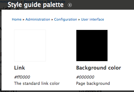
dead_armAttached patch adjusts the styling of the swatches in the view mode. I added some spacing and alignment, moved the title of the swatch to sit under the swatch not above it, and changed the border of the swatch from #000 to #f1f1f1.
In the original issue, #1547146: Color palette ifrik requested that the black border be removed because it makes the colors look different. I agree with this, but I also think we need some sort of border if a swatch is white or close to it. Hopefully the light border is sufficient for this edge-case but also does not get in the way.
Example if a swatch color is white:

Comment #3
jptarantoI've reviewed this, code looks fine and I think it's a great change.
Comment #4
jptarantoComment #6
dead_armUpdated patch attached. The test needed to be changed as well, so that is why the patch failed before.
Comment #7
dead_armThanks for reviewing this. Committed! http://drupalcode.org/project/styleguide.git/commit/5701b4968066255b67eb...