
Closed (fixed)
Project:
Commerce Kickstart
Version:
7.x-2.x-dev
Component:
User interface
Priority:
Major
Category:
Task
Assigned:
Unassigned
Reporter:
Created:
21 Jul 2012 at 13:49 UTC
Updated:
8 Aug 2012 at 09:51 UTC
Jump to comment: Most recent file

Comments
Comment #1
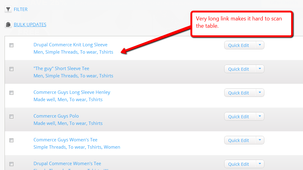
guguss commentedI think it makes sense to keep those taxonomy terms. But I agree they should not be linked, nor blue...
The title field needs to be updated on the product view (see the current state on the attached screenshot).
Comment #2
guguss commentedComment #3
theo_ commentedhttps://code.drupalcommerce.org/208
Comment #4
bojanz commentedThe terms never should have stayed as links, or have been styled with the same importance as the title.
Attaching a screenshot of how the page looks after theo's changes (terms.png). It is a good start, and I've merged it.
Also attaching the original wireframe (product-mgmt products_v2.jpg) based on which the product screen was made.
Notice how the terms are styled differently there, so we should see if we still want to apply that styling (with or without further tweaks).
So, this needs feedback from Bojhan.
Comment #5
Bojhan commentedDefinitely don't apply that styling, it adds way to much clutter. This looks good, potentially going to change the color a bit of this - but that can be fixed later, if I get to it.
Comment #6
bojanz commentedOkay, let's close it for now then.