
 Come together with the global Drupal community in Rotterdam, 28 Sept – 1 Oct 2026. Sessions, contribution, connection, and Early Bird savings until 8 June.
Problem/Motivation
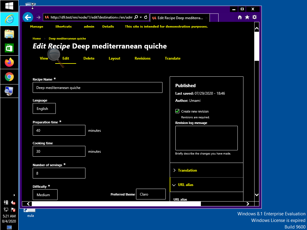
Required fields are not identifiable on Internet Explorer 11 because the required marker is not visible. This field is supposed to have the required marker:

This is how this field looks like in Edge:

Proposed resolution
Ensure that required fields are identifiable on Internet Explorer 11 high contrast.
Remaining tasks
User interface changes
API changes
Data model changes
Release notes snippet
| Comment | File | Size | Author |
|---|---|---|---|
| #29 | IE11-patched.png | 14.17 KB | dyannenova |
| #29 | IE11.png | 21.28 KB | dyannenova |
| #28 | Screenshot.png | 3.6 KB | komalk |
| #28 | Screenshot (1).png | 4.31 KB | komalk |
| #28 | 3127466-28.patch | 1.78 KB | komalk |

Comments
Comment #2
kostyashupenkoMaybe we can replace svg icon by "*" symbol as a
content: "*";'?Comment #3
sd9121 commentedComment #4
sd9121 commentedPatch details:
Made alterations to the background sizes.
Didn't replace it with content as the content will be read by screen readers. Please review.
Thanks!
Comment #5
kiran.kadam911Comment #6
kiran.kadam911Thanks, @sd9121 for the patch, it applies successfully.
Required fields(asterisk mark) are now visible on IE11 high contrast.
Screenshot:

Thanks!
Comment #7
lauriiiFor some reason I still don't see the required marker on IE 11. Can anyone else reproduce this after applying the patch?
Comment #8
deepalij commentedComment #9
deepalij commentedApplied patch #4. Verified and tested the issue on IE11.
The required marker is visible. Looks good to me.
Comment #10
lauriii@DeepaliJ Thank you for testing this! This bug is specific to the Windows high contrast mode. Would you be able to test this again with that enabled? Here's how to turn that on: https://support.microsoft.com/en-us/help/13862/windows-10-use-high-contr... .
Comment #11
deepalij commentedComment #12
deepalij commentedTested the issue on the Internet Explorer 11 high contrast. Required Marker is visible for me.
Tested in the following 2 ways:
1. Installed and Enable 'High Contrast' extension
- Open up the site in the IE11 on the Browserstack
- Verified the required marker
2. Go to the System Preferences > Accessibility > Display > Choose options like 'Invert Colors'
- Open up the site in the IE11 on the Browserstack
- Verified the required marker
Marker is visible in high contrast but displaying little half cut.
Refer attached screenshots
Comment #13
bnjmnm@DeepaliJ the detail and screenshots in your review are great. It looks like the testing was not actually done with Windows high contrast mode, but different settings that impact contrast. More info on using Windows high contrast mode can be found here https://support.microsoft.com/en-us/help/13862/windows-10-use-high-contr...
Comment #14
andrewmacpherson commented#12-#13: @bmnjmn is correct. The screenshots in don't show Windows High-Contrast mode. This screenshot comes from the Chrome HIgh-Contrast extension (which I think has been ported to Chromium/Edge?).
Tip for screenshot evidence: get a full-screen capture. That way, we can confirm (a) Windows high-contrast mode is active (because the whole desktop environment will be changed), and (b) which application is active (we see the rest of the browser window, not just the web content). In addition to the browser window, you could also include the settings window to show which Windows high-contrast theme is active.
I've noticed that people testing with Windows high-contrast always seem to go for the yellow-on-black default theme. However users can specify ANY colour overrides they wish. Workplace disability assessors have told me that a popular choice among dyslexic users is a custom Win-HC palette such as sepia-on-peach. A red asterisk can't be guaranteed to have sufficient contrast, because we have no idea what the background colour will actually be. It would be better if the asterisk matched the colour of the label text in high-contrast mode.
I tested patch #4, and it doesn't fix the problem. I see the same as @lauriii in #7. The problem is that the asterisk is included using
background-image. These are always stripped out by IE11 (originally by design, though that has been intentionally changed in Edge in favour of a text backplate). The patch in #4 doesn't address this, it just changes some sizes.Important images are best as content, not a background image. It can be a HTML img, or CSS content.
It's true that CSS screen readers will announce text inserted like
content: 'FOO', but they won't announce anything forcontent: url(foo.png)or an un-labelled SVG.It doesn't matter how the required fields are indicated...
content: "*". Screen readers already announce that is is required because of the attributes. However it wouldn't be a total disaster if screen readers announced "name asterisk, required". Inelegant, but the asterisk will be commonly understood by users in many regions.Triage:
@rainbreaw and I discussed this one today, about where it should be in the Claro roadmap.
We can live without some icons, but we can't live without an indication of required fields.
A relevant WCAG success criterion here is SC 3.3.2 Labels or Instructions at level A:
Since this involves WCAG success criteria at level-A, it warrants major/must-have for the stabilization roadmap.
Comment #15
bnjmnmAt the moment, I don't believe there is a way to reliably target high-contrast mode in CSS. There's currently no way to do this in Firefox, this post provides details about the addition of the prefers-contrast to the Firefox nightly build, but it's not clear when this will be added to a release. In addition -ms-high-contrast is no longer supported by Edge as of version 18, in favor of
forced-colorsSince it doesn't seem possible to reliably identify high contrast modes, it sounds the implementation needs to be one that works in all modes. I don't think there's a way to do this without deviating a bit from the current design. Here are the two solutions that come to mind:
Comment #16
rainbreaw commentedBoth of the proposed solutions will technically suffice, but I would suggest that a better approach would be to simply use the word "required." Yes, this is a design shift, but it is far more clear to everyone seeing it. The word itself can be styled a little differently so that it doesn't feel like clutter.
The Nielsen Norman Group has a good article about marking required fields from a UX standpoint, and offers both the text and asterisks style options: https://www.nngroup.com/articles/required-fields/
From an accessibility standpoint, however, thinking beyond screen readers and including cognitive accessibility, using the word itself is far more concrete and easy to understand.
A good article that dives into this more: https://usability.com.au/2013/05/accessible-forms-2-required-fields-and-...
For the record, there is also conversation in A11y and UX communities about whether or not it makes more sense to mark the optional fields with the word optional instead of the required fields. This would be a bigger shift and I'm not recommending it for Claro at this time, especially since there is still considerable debate about the quality of this approach. I'm simply documenting it so that it is in mind to consider further in the future.
Comment #17
rainbreaw commentedAdding here based on our discussion:
Given that the goal right now is to get to stable and my comment is a big design change, I'd suggest using Ben's suggestion: "Use content: "*" instead of a background image" for the time being.
Note that the goal isn't necessarily to have the same *color*, but rather the same *contrast*
Comment #18
andrewmacpherson commented#15
The Mozilla Hacks article you linked to is a bit premature. There's still active discussion in the CSS-WG about what the values for
prefers-contrastwill be. Theforcedkeyword has detractors; one of the issues is whetherprefers-contrastis being conflated withforced-colors.You don't need to. Something like this usually works:
In Windows high-contrast mode, the
color: redwon't be applied. No media query is needed.Not really. Designers don't get a say about colours in Windows high-contrast mode; that's the whole point of the feature. The user has explicitly overridden the author's choice.
If the author tries to dictate what colour the asterisk should be, then there's no guarantee that the asterisk will be clearly visible at all. For instance, if a Windows high-contrast user chooses a black text on a salmon-pink background, a red asterisk may be hard to see.
Comment #19
bnjmnm@andrewmacpherson and @rainbreaw addressed all the concerns/confusion I'd expressed earlier. This patch adds the asterisk in content: and removes the background image. Screenshots attached for IE11 and Firefox in Windows high contrast mode. There's also with default contrast so reviewers can see the slight visual change that comes from using
content: "*"'instead of a background image.No interdiff since this does not build on prior patches.
Comment #20
rainbreaw commentedTested with both IE 11 and Edge 44, Windows 10, high contrast mode without any customizations. The required field asterisks is now visible.
Marking as RTBC.
Comment #21
lauriiiThe font-size is documented as 14px in the design system. We should either update this or update this value to the design system https://www.figma.com/file/OqWgzAluHtsOd5uwm1lubFeH/Drupal-Design-system...
This seems to based on the color of the SVG. However, according to the design system this should use the maximum red variable. We should either update the new color to the design system or use maximum red here.
Comment #22
kishor_kolekar commentedWorked on #21.
Please review the patch
Comment #23
lauriiiDiscussed this with @bnjmnm, @Gábor Hojtsy, @ckrina, @nod_, @saschaeggi and @katherined today. @saschaeggi and @ckrina confirmed that the Figma designs are up to date and we should implement this based on them. It was also mentioned that the designs might have been changed at some point, which has caused the imparity of the designs and the implementation.
We could probably remove these because it seems like the asterisk is aligned to the top of the line on the designs.
Can we remove the width and height now that we are using content instead of a background?
Shouldn't this be
0.875remto match 14px defined in the designs?Comment #24
komalk commentedWorked on #23
23.3:
--font-size-s: 0.889rem; /* ~14px */For 14px this is defined in variables.pcss.css can we use this to match 14px. or use
0.875rem.Comment #25
komalk commentedPlease consider this interdiff.
Comment #26
lauriiiHere's a screenshot of the asterisk when #24 is applied:
Comment #27
lauriiiIt seems like the asterisk could be a bit far away from the label now. Maybe we should half the margin to 0.15rem?
Comment #28
komalk commentedWorked on #27.
Attached screenshot for the reference.
Comment #29
dyannenovaI've tested this on Windows 10 in the 4 High Contrast Mode themes with IE 11 and it looks good to me. The margin reduction looks much better.
Comment #33
lauriiiCommitted 763a9c5 and pushed to 9.1.x, 9.0.x and 8.9.x. Thanks!