

 The 2026 Drupal Business Survey is open. Your response will help shape the future of the Drupal business ecosystem.
Problem/Motivation
To reproduce:
Add several links to the Main Navigation menu, with a hierarchy.
Place the Main Navigation menu as a block on Sidebar Second.
The hierarchy is not easy to see, because the sub-menus are not indented. All you have is a small arrow next to the parent item. See screenshot -- in this menu, "How to do it" and "What's out there to do" are under "Leave physics" in the hierarchy, and the Bicycling link is NOT under Leave Physics, but this is not at all obvious from the menu styling.

Proposed resolution
Add some indentation, text sizing, or some other signal besides a small triangle in the margin, to aid understanding that there is a hierarchy.
Remaining tasks
Make a patch.
User interface changes
Hierarchy of menus will be evident when they are displayed as blocks.
API changes
None.
Data model changes
None.
| Comment | File | Size | Author |
|---|---|---|---|
| #10 | 2794565-10--LTR -after-patch.png | 22.61 KB | jordana |
| #10 | 2794565-10--LTR-before-patch.png | 23.08 KB | jordana |
| #10 | 2794565-10--RTL-after-patch.png | 19.81 KB | jordana |
| #10 | 2794565-10--RTL-before-patch.png | 21.79 KB | jordana |
| #10 | 2794565-10.patch | 835 bytes | jordana |





Comments
Comment #2
jhodgdonBetter screenshot showing the next menu item.
Comment #3
Vidushi Mehta commentedAdding a patch for the same with the attached before and after screenshots.
Comment #4
Vidushi Mehta commentedComment #5
jhodgdonThat is way clearer to me... I'm not sure the circles on the child list items are needed though -- the indentation seems like it would be enough to provide clarity... so maybe turn off the circles?
Also this part of the patch looks out of scope for the issue:
And I'm unsure as to whether the other part of the patch would have implications outside the scope of this issue?
Comment #6
jhodgdonComment #7
jordanaI checked this and didn't think the circles were necessary, nor adding a font size imho.
I also figured it would be a bit more scalable if we changed the padding to be in ems instead of px.
So basically the only thing this patch does is adding a padding of 1 em to the sub-menu's.
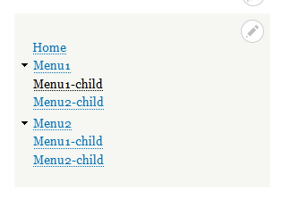
Before patch:

After patch:

Comment #8
jhodgdonThat looks like an excellent and simple solution to me. It seems like it would be specific to just this one problem, too. Thanks!
I think I will go ahead and mark it RTBC.
Comment #9
alexpottThis needs to work for RTL (right-to-left languages) as well. Also it would be great to see a screenshot of an expanded menu inside an expanded menu.
Comment #10
jordanaSo, I checked everything by adding another expanded menu within the expanded menu.
I also set up a dummy RTL language set and to my great surprise the RTL works perfectly without any extra code.
In elements.css the nested ul and ol are already handled well on ln 143 to 151.
The code is in bartik/css/base/elements.css
I checked where it was going wrong in LTR and found that in two instances padding styles are added to only the LTR "ul.menu" element.
As far as I can tell, I can't seem to find a purpose yet as to why they are added.
They are:
in
bartik/css/components/menu.css (note that in rtl no padding styles are added)
and in classy/css/components/menu.css (again note the lack of added padding styles for rtl)
My proposal and Fix:
Remove the (apparently) redundant adding of 0 padding to the menu.css files in bartik and classy.
Find attached patch and screenshots.
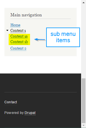
RTL BEFORE & AFTER:
LTR BEFORE & AFTER PATCH:
Comment #11
jhodgdonThis is a very thorough analysis and the patch and screenshots look great to me. Thanks!
Comment #12
xjmThanks @jhodgdon and @jordana; the screenshots are quite helpful.
#offcanvasis provided by an experimental module and AFAIK we should not put support for it in Stable. Maybe this fix is out of scope or belongs in Settings Tray (a.k.a.outside_in) CSS?Comment #13
jhodgdonUm. This is weird.
The patch that is in #10 is not the same as the one that is shown in the Issue Summary area at the top of the page, which is from an earlier attempt.
The patch in #10 is the one I reviewed, and based on the comment in #11, xjm was looking at the older patch.. So, setting back to RTBC and fixing files section hopefully.
I don't get why the earlier files were being shown at the top of the page. ?!? Weird.
Comment #14
xjmAh, thanks @jhodgdon for clearing that up. So in the correct patch, there is just one change in Bartik and another in Classy.
The change in Bartik makes sense to me. However, Classy is supposed to be one of the stable base themes:
(From https://www.drupal.org/core/d8-bc-policy.)
Such a small whitespace change for a visual bugfix might be okay in a minor, but is it a required part of the fix?
Assigning to @Cottser for review.
Comment #15
xjmFor reference, the lines in Bartik were added with the whole file in #2548805: Add sensible base layout styles for lists in Bartik. and the line in Classy was similarly introduced with the whole file in #2395853: Split system.module.css and system.theme.css files into SMACSS style components.
Comment #17
star-szrSorry for the delayed response, but this seems like a duplicate of #2607210: Visual regression: Sidebar menus are missing indentation styles., and we shouldn't be changing Classy, that's too risky. Since the other issue is much older, maybe we can inject some new energy into that one and close this as a duplicate. The other issue last I checked needed manual testing and screenshots. I can add issue credits for anyone who has worked on this issue to the other one if we agree it's a duplicate.
Thanks @xjm for the heads up on this.
Comment #18
star-szrComment #19
jhodgdonIt looks like the issue linked in #17/#18 should be marked as a duplicate of this issue then? This one has been around longer.
Comment #21
jordana@cottser I agree. I'll go ahead with whatever you guys think is the best way to tackle this. We can mark as duplicate and try to finally get this committed through the other issue :)
Comment #22
jordana