Closed (duplicate)
Project:
Bluecheese
Component:
Code
Priority:
Major
Category:
Task
Assigned:
Unassigned
Reporter:
Created:
19 Oct 2010 at 03:40 UTC
Updated:
19 Oct 2010 at 04:19 UTC

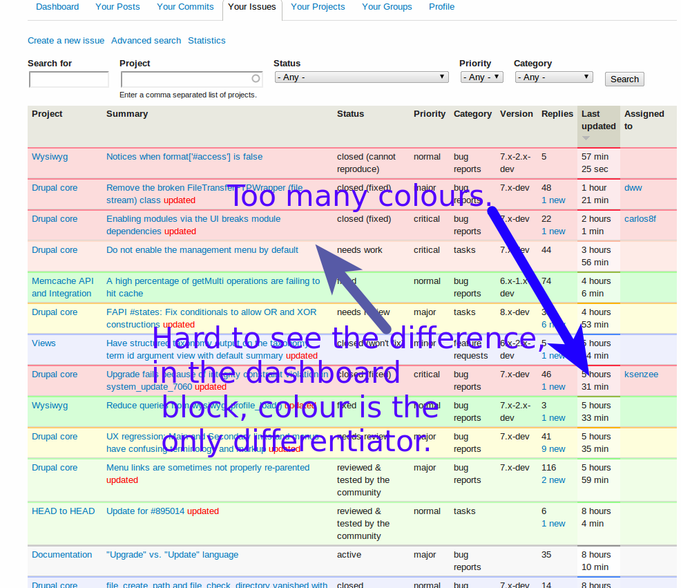
This was pointed out in Michelle and I agree - the issue queue colours in the redesign lack contrast. I also noticed that the table styling looks a little odd - depending on the colour of the row, the border colours can be quite different, which means a lot of colours in total.
This may partially just take some getting used to, but for example the differences between 'needs work' and 'closed are much less than before. When trying to use the dashboard block, colour is the only indicator of status.
Separate issue but i don't want to open loads just after the relaunch, the dashboard 'your issues' block doesn't show comment count or new links (but 'your posts' does), pretty much all I'd ever use that block for is quick scanning for updates to issues and jumping to new comments, so would be handy to have those.
| Comment | File | Size | Author |
|---|---|---|---|
| Desk 1_010.png | 207.06 KB | catch |


Comments
Comment #1
webchickI think this is actually a BlueCheese thing.
See #936926: Update color scheme for status-based issue tables and issue link filter for back-story on how the colours got to be this way, but I agree with the screenshot. Promoting to "major" since this impacts the ability for contributors to get stuff done.
Comment #2
dwwLet's talk about the "My issues" block (for the dashboard) at #936648: Make the "My issues" block (for the dashboard) more beautiful and functional.
Let's talk about issue queue contrast at #936926: Update color scheme for status-based issue tables and issue link filter
Thanks,
-Derek