Responsive images for art direction
As pointed out by Jason Grigsby in his insightful blog post titled Don’t use <picture> (most of the time), the two most common use cases for responsive images are:
- Resolution switching — In the resolution switching use case, we need to select a different source of the same image because we need a different resolution for any number of reasons. These reasons include the image being used at a different size based on the size of the screen, the pixel density of the screen, or to avoid downloading unnecessarily large images.1
- Art direction — In the art direction use case, there is some reason why we need to modify the content of an image under certain conditions. Maybe we need to crop the image differently on small screens. Or perhaps we’re working with a hero image that contains text and simply providing a smaller version of the image won’t work because the text will be unreadable.
The module Image Replace together with the core module Responsive Image covers the second use-case, e.g. responsive hero images. In that case semi automated cropping (à la Focal Point) usually does not produce the desired effect.
Summary
The Image Replace module provides a new image effect. When the effect is used in an image style it will act as a placeholder for the content of another image field.
The core module Responsive Image provides a way to map a set of breakpoints in a breakpoint group to a set of image styles. Therefore it is enough to combine this functionality with styles containing the image replace effect to produce art directed <picture> elements where the author may choose to provide a distinct image for each screen size.
Basic setup
Setting up an image field for this use-case is admittedly cumbersome. For this reason, there is a sandbox with an installation profile which can be used to spawn a demo site on simplytest.me. Select the Image Replace Demo profile in the first step of the installation.
In order to reproduce the demo, the following steps are required on a Drupal instance installed with the standard profile with enabled Image Replace and Responsive Image modules.
Step 1: Add new image styles
Navigate to Administration » Configuration » Media » Image styles and add two new image styles (Image Replace Large and Image Replace Medium). Add Replace image as the only image effect to both styles.

Step 2: Add responsive image style
Navigate to Administration » Configuration » Media » Image styles and create a new responsive image style. Select a breakpoint group (e.g., Bartik). For every breakpoint choose select a single image style and select one of the image styles you created in step 1.

Step 3: Add new image fields
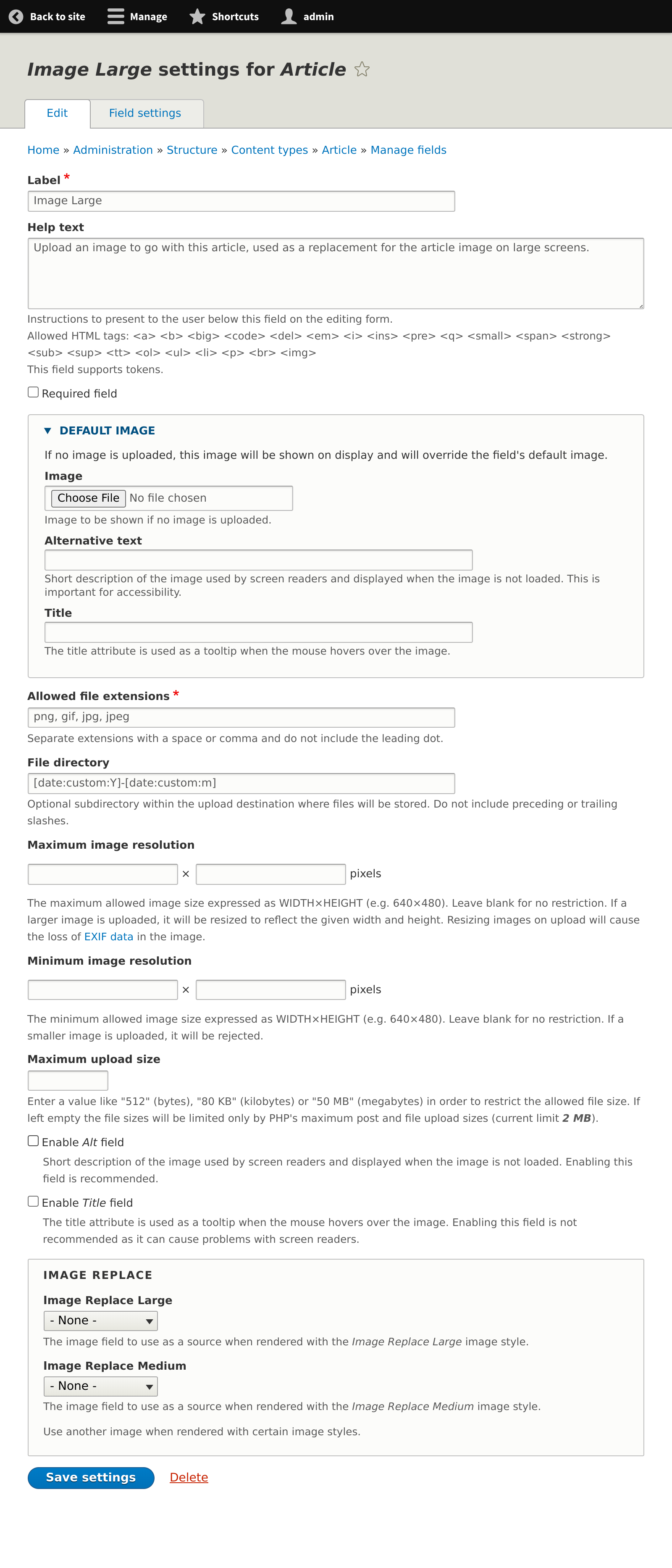
Navigate to Administration » Structure » Content types » Article » Manage fields and add two new image fields (Image Large and Image Medium). Use the same settings as in the existing Image field, optionally tweak the description a bit.
As a result the article content type should have the following list of fields:

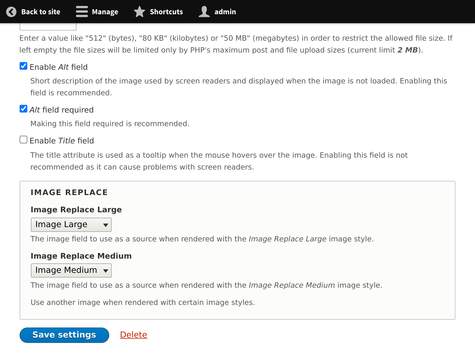
Step 4: Configure replacement styles on the image field
Edit the setting of the original image field and specify Image Large and Image Medium as the sources for the Image Replace Large and Image Replace Medium image styles respectively.
Step 5: Configure responsive image formatter on image field
Navigate to Administration » Structure » Content types » Article » Manage display and choose the Responsive image formatter for the original Image field. Choose the newly created picture mapping in the formatter settings.
Also make sure that the additional image fields ore excluded from display.

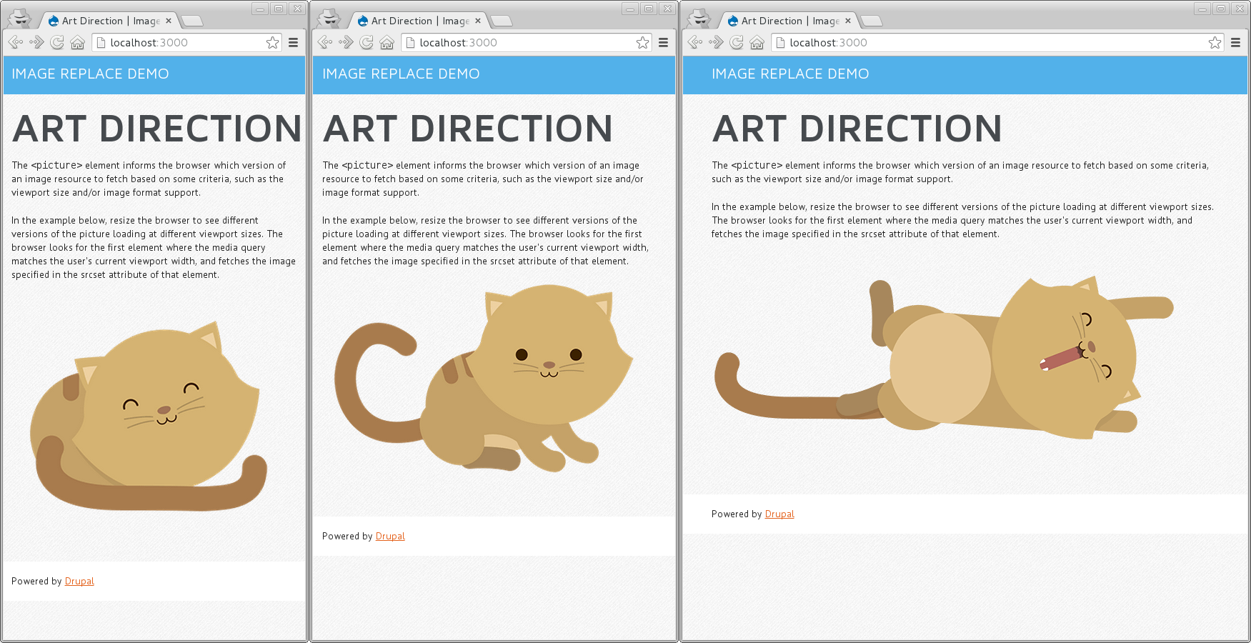
Create content
After preparing the image fields, it is now possible to specify other images for different screen sizes on newly created content. The demo installation profile uses the images from the Chrome picture element demo page.
Help improve this page
You can:
- Log in, click Edit, and edit this page
- Log in, click Discuss, update the Page status value, and suggest an improvement
- Log in and create a Documentation issue with your suggestion

