
 Support for Drupal 7 is ending on 5 January 2025—it’s time to migrate to Drupal 10! Learn about the many benefits of Drupal 10 and find migration tools in our resource center.
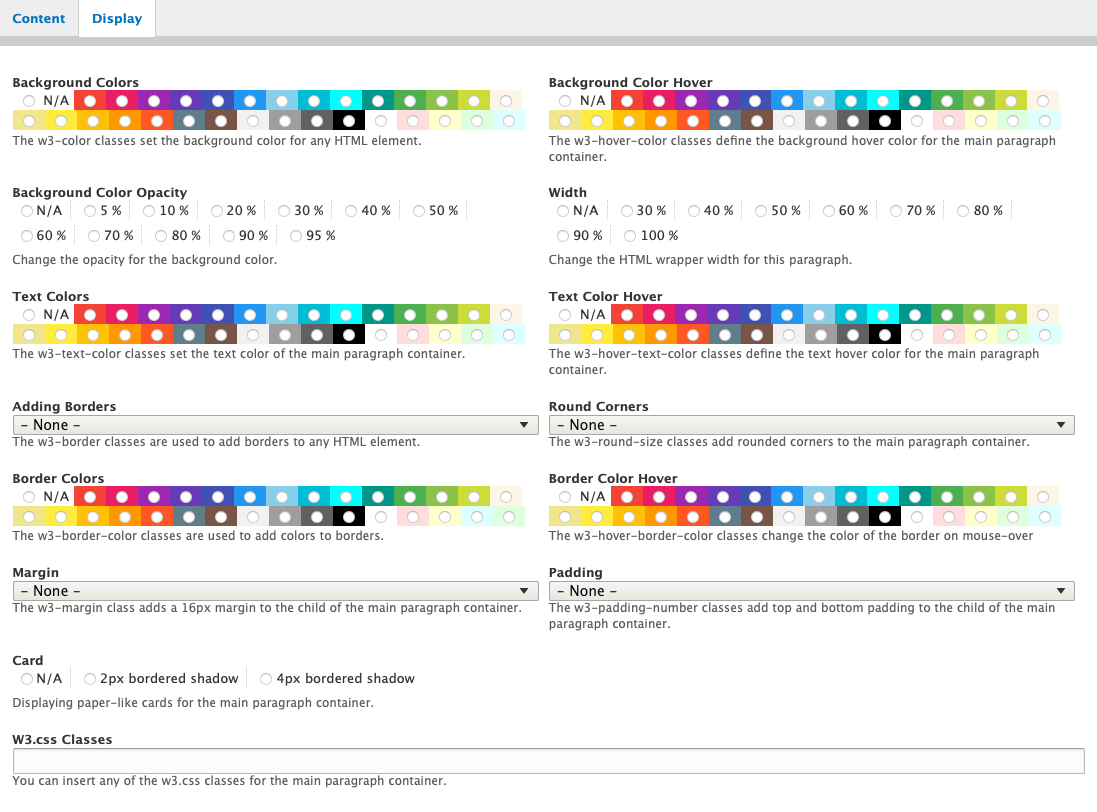


⚡️ What does the w3css paragraphs module entail? This module offers a collection of paragraph bundles constructed using the W3.CSS front-end framework. It is compatible with the ⚡️W3CSS Theme. This gives you the capability to generate an infinite number of UI designs utilizing the features of the paragraph bundle.
The primary module, w3css_paragraphs, encompasses the initial two fundamental paragraph bundles: Text and Image. All other child bundles are contained within a separate bundle/module.
*All images utilize the media module.
Merge the capabilities of the w3.css front-end framework with Drupal Paragraphs, a robust module enabling content creators to construct layouts and structured pages.
With the w3.css Paragraphs Drupal module, you can swiftly create features such as Slideshow, Accordions, Hero Banner, Image Overlay, Parallax, 3D Carousels, Modals, Tabs (Horizontal or Vertical), 3D Flip Box, One Column Layout, Two Columns Layout, and Three Columns Layout in a matter of minutes.
Additionally, Drupal allows for referencing Text, Images, Blocks, Webform, Links, and Views.
Bundle Types: for each bundle type I created a demo, feel free to check it.
As usual everything in the demo is out of the box, nothing is customized.
-
⚡️W3CSS Paragraphs Simple
Watch how to build it - ⚡️W3CSS Paragraphs Image
- ⚡️W3CSS Paragraphs Responsive Image (Wide)
-
⚡️W3CSS Paragraphs Responsive Image (Narrow)
Watch how image or responsive image -
⚡️W3CSS Paragraphs 3D Flip Box
Watch how to build it -
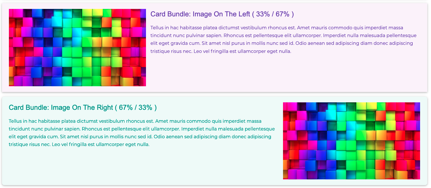
⚡️W3CSS Paragraphs Card
Watch how to build it -
⚡️W3CSS Paragraphs Hero
Watch how to build it -
⚡️W3CSS Paragraphs Image Overlay
Watch how to build it -
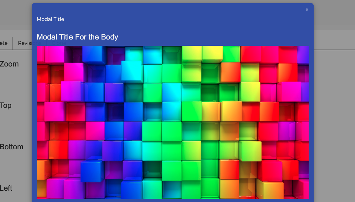
⚡️W3CSS Paragraphs Modal
Watch how to build it -
⚡️W3CSS Paragraphs Parallax
Watch how to build it -
⚡️W3CSS Paragraphs Contact Form
Watch how to build it -
⚡️W3CSS Paragraphs Drupal Block
Watch how to build it - ⚡️W3CSS Paragraphs Menu
-
⚡️W3CSS Paragraphs Quicklinks
Watch how to build it -
⚡️W3CSS Paragraphs Views
Watch how to build it -
⚡️W3CSS Paragraphs Webform
Watch how to build it - ⚡️W3CSS Paragraphs One Column
- ⚡️W3CSS Paragraphs Two Columns
-
⚡️W3CSS Paragraphs Three Columns
Watch how to use the one, two or three layout -
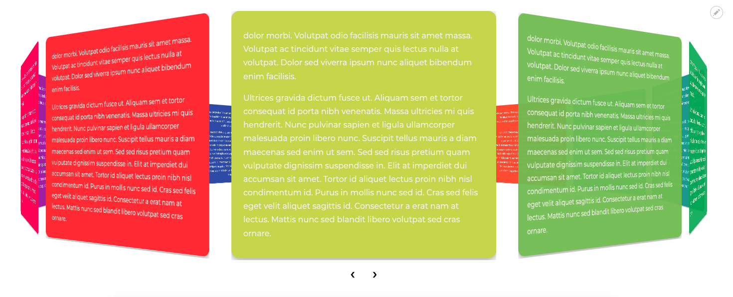
⚡️W3CSS Paragraphs 3D Carousel - Images
⚡️W3CSS Paragraphs 3D Carousel - Text
Watch how to build it -
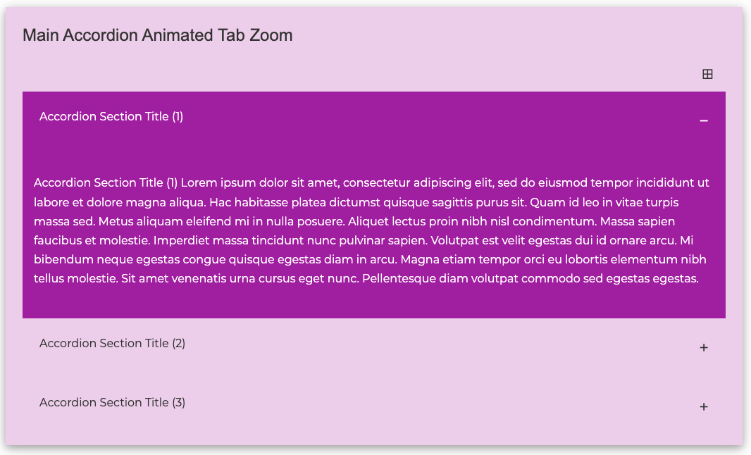
⚡️W3CSS Paragraphs Accordion
Watch how to build it -
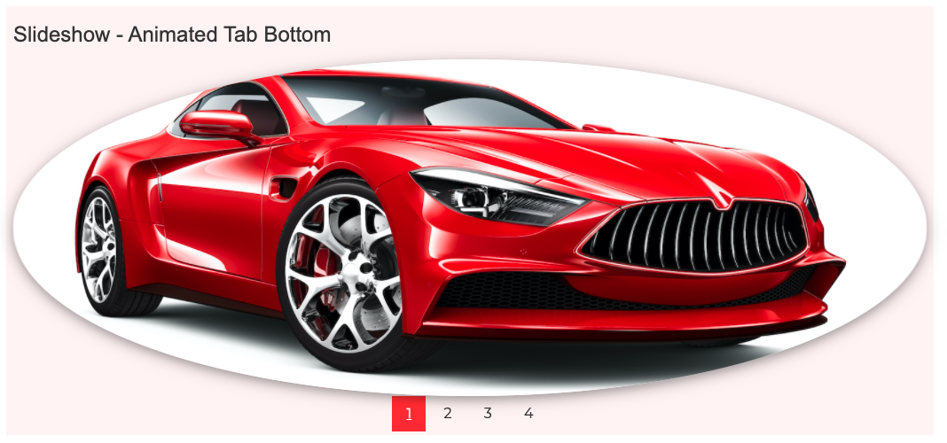
⚡️W3CSS Paragraphs Slideshow
Watch how to build it -
⚡️W3CSS Paragraphs Tabs (Horizontal/Vertical)
Watch how to build it -
⚡️W3CSS Paragraphs Content Type
Understanding the W3CSS Paragraphs Content Type:
This content type disables the left and right regions by default, with a standard width of 100%. However, you have the flexibility to adjust the width as per your requirements from the paragraph bundle display.
You have the option to disable any of the following regions: Main Navigation Regions, Header Region, Welcome Region, Highlighted Region, Top Regions, Page Title Region, Breadcrumb Region, Bottom Regions, Footer Regions, Footer Menu, and Hide Copyright.
There may be instances where you'd want to design a webpage with a unique layout, perhaps without the header, footer, main menu, etc., or maybe you'd want to experiment with different color schemes. This feature, when combined with the paragraph bundles of one, two, or three columns, allows you to create any layout you envision.
Features of the Bundle Type (may vary with different paragraph bundles):
- ⚡️Background colors: Choose from 30 different colors.
- ⚡️Background color Hover: 30 color options available.
- ⚡️Text colors: 30 color options available.
- ⚡️Text color hover: 30 color options available.
- ⚡️Border color: Choose from 30 different colors.
- ⚡️Border color hover: 30 color options available.
- ⚡️Background color opacity: After selecting the background color, you can adjust the opacity from 5% to 95% (in increments of 10%). This gives you a total of 330 color variations. Note that the opacity applies only to the background color.
- ⚡️Width: Options range from 30% to 100%.
- ⚡️Borders: Choose from 11 different styles.
- ⚡️Round Borders: 6 styles available.
- ⚡️Margin: 6 styles available.
- ⚡️Padding: Choose from 8 different styles.
- ⚡️Card: Add a 2px or 4px bordered shadow.
- ⚡️W3CSS Classes: An extra field for any w3.css classes.
# DEPENDENCIES
- W3CSS Theme: https://www.drupal.org/project/d8w3css
- Paragraphs: https://www.drupal.org/project/paragraphs
- Field Group: https://www.drupal.org/project/field_group
For Some Sub Modules:
- You must enable the Contact Formatter module to install W3CSS Paragraphs Contact Form.
- You must enable the Link Attributes widget module to install W3CSS Paragraphs quicklinks.
- You must enable the Views Reference Field module to install W3CSS Paragraphs Views.
- You must enable the Webform module to install W3CSS Paragraphs Webform.
- You must enable the Menu Reference Render (Formatter) module to install W3CSS Paragraphs Menu.
# INSTALLATION
Install as any other contrib module.
Developed & Designed By: Alaa Haddad
If you have any questions or comments, please use Drupal.org for communication with me.
Supporting organizations:
Project information
 Maintenance fixes only
Considered feature-complete by its maintainers.- Module categories: Content Editing Experience, Content Display
 365 sites report using this module
- Created by flashwebcenter on , updated
 Drupal 10 is here!
All bundles are updated to Drupal 10 except: Menu.
 Stable releases for this project are covered by the security advisory policy.
Look for the shield icon below.


