
 Support for Drupal 7 is ending on 5 January 2025—it’s time to migrate to Drupal 10! Learn about the many benefits of Drupal 10 and find migration tools in our resource center.
This project is not covered by Drupal’s security advisory policy.
Have you ever imagined if you can provide a matrix-layout form to your customers, visitors? With this module you can have the chance to build a highly configurable form layout.
The goal of this module is to be able to format submission forms into matrix-form (like a spreadsheet).
This module declares two new field_group types: table-wrapper and table-row.
Table wrapper generates the outer table and collects table rows within itself. Every rows need an individual field_group (table-row) and the children fields become the columns of the rows. Compatible with both of basic content types and entityforms.
Custom table headers or custom first cell of rows can be defined as well.
Many options are available to configure the table itself:
Rows can be configured as well in many ways:
# Similar module
- Field Group Table (simplier, supports only a label and a field in a single row)
USAGE
----------
Go to one of your content type's "Manage field" section (e.g. admin/structure/types/manage/story/fields)
and add a new field group at the bottom of the site.
Choose a label (which can be used as header for the table), declare an individual name for the group
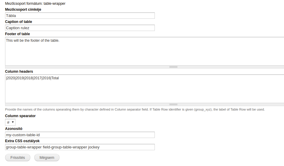
and choose "Table wrapper". It will define the <table> element as output. You can configure this element as follows:
- Label can be set as header
- Option to add caption to the table
- Option to add footer information to the table as <tfoot> element or a single row for Drupal versions older than 7.67
- You can define custom headers for your table.
Table headers can use colspan in the following format: header_1{colspan:2}|header_2{colspan:3}.
This will create two <th> elements, first's content will be "header_1" and has colspan="2" attribute,
while the second's content will be "header_2" and has colspan="3" attribute
- You can add individual ID or classes as well
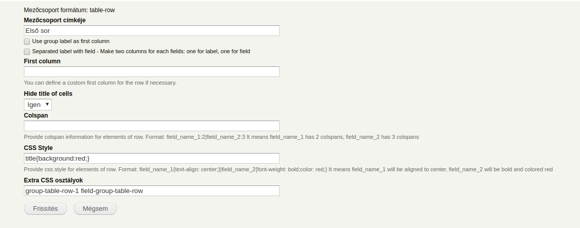
For every row, you have to create a unique group. At the bottom of the screen add a new group with an appropriate label,
declare a unique identifier, and choose "Table row" as a widget. Your options to configure the table row:
- Use group label as first column: Place the label in the first column as <td> element.
- Separated label with field - Make two columns for each fields: one for label, one for field
- First column: You can define a custom first column for the row if necessary.
- Hide title of cells: you can hide globally all labels of fields that are placed in the current row.
- Colspan: Provide colspan information for elements of row. Expected format: field_name_1:2|field_name_2:3
It means field_name_1 has 2 colspans, field_name_2 has 3 colspans
- CSS Style: Provide css style for elements of row.
Format: field_name_1{text-align: center;}|field_name_2{font-weight: bold;color: red;}
It means field_name_1 will be aligned to center, field_name_2 will be bold and colored red
- You can add individual classes as well
Last step is to move the fields into "Table Row" group and those will be the cells of the rows.
Note: Administrators have to pay attention to the number of cells in rows and headers,
the module won't count the cells instead of administrators.
Supporting organizations:
Project information
- Module categories: Site Structure
- Ecosystem: Field Group
 15 sites report using this module
- Created by danyg on , updated
 This project is not covered by the security advisory policy.
Use at your own risk! It may have publicly disclosed vulnerabilities.
Releases
7.x-1.0
released 23 December 2020
Works with Drupal: 7.x
Development version: 7.x-1.x-dev updated 7 Jan 2021 at 18:52 UTC


