
 Support for Drupal 7 is ending on 5 January 2025—it’s time to migrate to Drupal 10! Learn about the many benefits of Drupal 10 and find migration tools in our resource center.
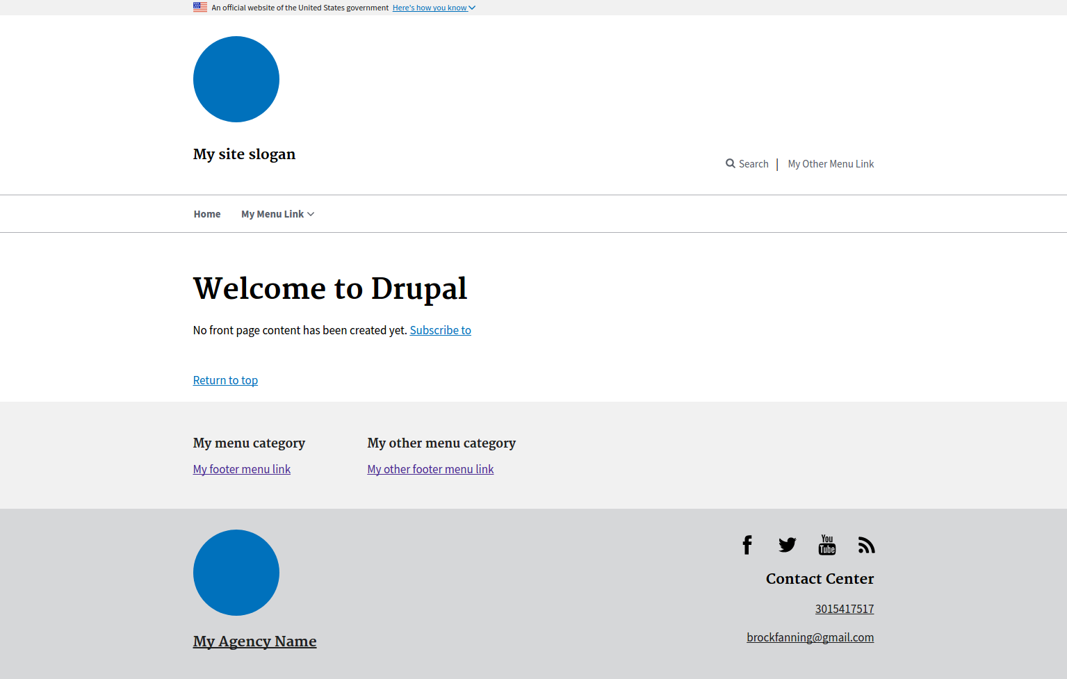
Drupal integration of the U.S. Web Design System library.
The U.S. Web Design System is a library of design guidelines and code to help government developers and designers quickly create trustworthy, accessible, and consistent digital government services.
This base theme focuses on tweaking Drupal's markup so that it will work with the USWDS library. Some CSS is added to deal with unavoidable Drupal quirks, but only as a last resort.
Subtheming
As with most Drupal themes, it's recommended that your active theme be a subtheme of this one, to make updates easier. Simply copy out the /examples/my_subtheme folder to get started, following the directions in /examples/my_subtheme/README.md.
Customizing
The theme makes no assumptions about how you would like to add site-specific CSS. You can either:
1. Use the pre-compiled USWDS library
If you would like to use the pre-compiled USWDS library, download the zip file, extract and rename the folder to "assets", and place it in your theme folder. Afterwards, this should be a valid path inside your subtheme folder: `assets/css/uswds.css`
2. Use npm to include the USWDS Sass source files
The library's source can be installed directly in the subtheme directory by running `npm install` in that location. After doing this, you can set up your assets by copying them from node_modules/uswds/dist, and then running a basic npm script to compile the CSS. The commands to do all of this are:
- npm install
- cp -r node_modules/uswds/dist assets
- npm run build
Or if you have a preferred front-end workflow you can adjust the package.json file accordingly.
Menus
In USWDS there are four styles of menus: Primary menu, Secondary menu (upper right, by "Search"), Footer menu, and Sidenav. You can implement these menus simply by placing a menu block into the appropriate region. (Eg, you would put the menu block for your primary menu in the "Primary menu" region.) There is also an optional "Mobile menu" region where you can specify the menu to be used for mobile. If left empty, it defaults to whatever you have in your primary and secondary menus.
Configuration
After installation, see the theme settings inside Drupal for various customizations, mostly involving the header and the footer.
Complex components via Paragraphs
A separate project providing some Paragraph types is available here: USWDS Paragraphs.
CKEditor's "Style" dropdown
To add some USWDS-specific entries into the CKEditor "Style" dropdown, follow this procedure:
Drupal 7: Install and enable the CKEditor module. Then configure your CKEditor "profile" to "Use theme CSS" (under the "CSS" section.). If customization is needed, change the ckeditor.styles.js file in your subtheme.
Drupal 8: Configure your text formats and add this (customized to your liking) in the "Styles dropdown" section:
a.usa-button|Button
a.usa-button.usa-button-gray|Button - Gray
a.usa-button.usa-button-outline|Button - Outline
a.usa-button.usa-button-outline-inverse|Button - Outline Inverse
a.usa-button.usa-button-big|Button - Big
a.usa-button.usa-button-secondary|Button - Secondary
table.usa-table-borderless|Borderless Table
p.usa-font-lead|Lead font
Notes
Note: This code was originally forked from this repository, and was split off at 18F's suggestion.
Other USWDS Drupal Theme(s)
Supporting organizations:
Development sponsor
Granted us time to contribute to this theme
Development sponsor
Project information
 548 sites report using this theme
- Created by brockfanning on , updated
 Stable releases for this project are covered by the security advisory policy.
Look for the shield icon below.
Releases
3.0.1
released 8 December 2023
released 8 December 2023
Works with Drupal: ^10
✓ Recommended by the project’s maintainer.
Install:
Development version: 3.x-dev updated 7 Dec 2023 at 18:49 UTC
8.x-2.7
released 24 January 2023
released 24 January 2023
Works with Drupal: ^9 || ^10
Install:
Development version: 8.x-2.x-dev updated 4 Oct 2023 at 19:15 UTC
7.x-1.0-rc1
released 17 June 2018
Works with Drupal: 7.x
Development version: 7.x-1.x-dev updated 17 Jun 2018 at 22:38 UTC


