Add functionality and customize your Drupal application with thousands of projects contributed by our amazing community.

43 themes match your search

A theme is a set of files that define the visual look and feel of your site. You can use themes contributed by others or create your own. Learn more about creating and using Drupal themes.

Gin Admin Theme

Gin Node EditGin Node Edit (Darkmode)

A radically new UI layout paired with goodies like a Darkmode will give your Drupal's Admin interface a facelift. The Gin theme also includes things which are currently out of scope for Claro and/or some customisations we're experimenting with for the future. Built on the foundation of Claro from one of the lead designers of Claro & Drupal Design System.

SettingsGin Content ViewGin Content View

We're actively looking for new sponsors!

Until we found new project sponsors issues might stay open longer as we have less resources to look into them.

This theme is being developed in spare time. While the goal is not to make money from it, it does help to take days off from work to focus on working on it. You can sponsor starting at $1. Thanks to all sponsors who support this project financially 🙏.

Github Sponsors Open Collective

Installation & Configuration

composer require drupal/gin_toolbar:^1.0@rc drupal/gin:^3.0@rc


Barrio Bootstrap 5 Theme

Bootstrap Barrio Drupal Theme

Barrio is a Drupal - Bootstrap 5 Base Theme. Drupal markup is completely overwrite as standard Bootstrap 5 markup using from roots twig templates referencing only to Bootstrap CSS and little custom CSS. Barrio is Flex based for whatever is not covered by Bootstrap. Use SASS Barrio Drupal Starterkit Subtheme to streamline your development, creating custom compiled Bootstrap styles by just changing a few variables.

Color Management

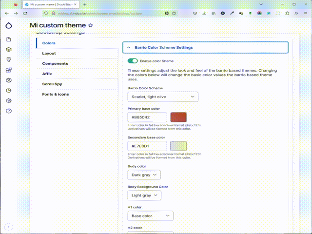
Color management using predefined or custom color combinations, declaring CSS variables.

Variables will generate a complete color scheme overriding Bootstrap default color variables.

Variables could also be referenced from custom CSS or SCSS

Bootstrap Barrio Color Management

jQuery is no longer required on Barrio 5.5.*.

If your subtheme requires jQuery ensure that the dependency is declared on your subtheme info file before upgrading to 5.5.7

Docksal Barrio Drupal 9 Boilerplate

SASS Barrio Drupal Starterkit

This theme has no style rather than layout to serve as a start Base Theme.

Starterkit subtheme is fully integrated with Color Module.

1, 2 or 3 columns are handled automatically with configurable column widths. An extensive easy to use configuration form allows to configure 'Bootstrap Style' tables, buttons, navbars, containers, rows, Google Fonts, icons, messages, menus, etc.

To upgrade from Barrio 8.x-4.x to Barrio 5.1.x, if your theme does not use the Barrio Layouts on Display Suite then you can upgrade your Barrio theme with no harm

If your theme use Barrio Layouts on Display Suite please read before upgrading to Barrio 5.x.

Upgrade to Barrio 5.x

Cards and Media Bootstrap layouts are declared to use them out of the box on Barrio Subthemes.

Bootstrap Cards and Media Quick Tutorial.

Now Barrio comes with optional SVG Bootstrap icons defined for Drupal default menu links, to activate go to Font & Icon settings. New Barrio version also includes automatically generated classes for all menu links.

Personalize icon usage

For awesome block style manipulation use Block Styles Module. With this module any block could be turned into dropdown, modal or collapse with a click. It also let you add classes to blocks allowing padding and margins being handled from configuration.

A detailed guide for Barrio can be seen at:

Configuration Guide

Create a Bootstrap Barrio Sub-Theme

Layout note

Barrio 5.x layouts are defined using layout discovery classes, this layouts can be used out of the box with Layout Builder, Display Suite or any other module that consumes layout.

Layouts included:

  • Cards (several formats)
  • Media
  • 2 columns (6-6, 3-9, 9-3)
  • 3 columns (4-4-4)
  • 4 columns (3-3-3-3, collapse to 6-6 on small)

✔ SASS

We strongly recommend to use the Bootstrap 4/5 Barrio SASS Subtheme to completly unleash Bootstrap 4/5 power on your site.

Almost every Drupal CSS is overriten using Bootstrap variables for sitewide standard colors and spacing. Based on Google Material Design full color scheme is generated including variants for main and secondary colors.

This subtheme is compatible with Bootstrap Material Design.

✔ Features

  • Columns
    • Column based grid
    • 1, 2 and 3 column automatic layouts
    • User defined column widths
    • Container and container fluid layout
  • Markup
    • Standard Bootstrap 4 or 5 markup replacing Drupal twig templates
    • Easy to customize twig templates
    • Standard markup for header navigation
    • Bootstrap 5 offcanvas menu
    • Hide node titles on all view modes
    • Multilevel main menu flyout submenus options
    • Collapsed left slide main menu option
    • Bootstrap form elements, including custom elements
    • Classes to identify menu links
    • Customized Bootstrap themed tables
    • SVG icons integration on default links
    • Scroll class on body on window scroll, with scroll up and down class added on scroll behaviour
    • Three options for messages customizations
    • Replace Commerce templates with Bootrstrap twig template
  • Features
    • Color Module integration on subtheme
    • Bootswatch integration via CDN
    • Predefined Google Fonts combinations
    • Card Column Views template to alllow card column listings
    • Extra theme suggestions for entities and blocks
    • Body classes for entities and views

✔ Installation

  • Download and install Barrio.
  • Define Barrio Settings
  • Choose how to load Bootstrap files, CDN or locally
  • If load Bootstrap files from CDN, choose version to load on Bootstrap Library settings.

✔ Bootstrap Libraries Load

Since 8.x-4.24 version, Bootstrap is automatically downloaded via composer and copied into vendors folder.
To copy dist files into libraries folder during installation, you can add the following 2 lines of script into your main composer.json file:
    "scripts": {
        "post-install-cmd": [
            "@composer drupal-scaffold"
        ],
        "post-update-cmd": [
            "@composer drupal-scaffold",
+           "mkdir -p web/libraries/bootstrap",
+           "cp -R vendor/twbs/bootstrap/dist web/libraries/bootstrap"
        ],

This will mantain your bootstrap version up to date when updating via composer.

Also, Bootstrap Libraries could be loaded by the Bootstrap Library module, this give you extra flexibility to load the library either via CDN or locally, choosing an up to date Bootstrap version regardless of the theme version.

Zero Point

Zero Point

The Zero Point theme is a modern and versatile design developed by Dr. Radut that brings a sleek and responsive aesthetic to your Drupal-powered website. With a focus on user experience and visual appeal, ZeroPoint combines functionality with elegance to provide a seamless and engaging interface for your site visitors.

It uses Yahoo Pure.css, a powerful responsive CSS framework and also fully supports right to left languages. Pure is ridiculously tiny. The entire set of modules clocks in at 3.5KB minified and gzipped.

Key Features:

  1. Responsive Design: ZeroPoint ensures a flawless experience across various devices and screen sizes, enhancing accessibility and user satisfaction.
  2. Customization Options: Tailor your website effortlessly with a range of customization options. From color schemes to layout preferences, ZeroPoint gives you the flexibility to create a unique and branded online presence.
  3. Performance Optimization: Built with performance in mind, ZeroPoint prioritizes fast loading times and smooth navigation, contributing to an optimal user experience and improved search engine rankings.
  4. Drupal Compatibility: ZeroPoint seamlessly integrates with Drupal, utilizing the platform's robust features and capabilities to empower your website with the latest in web development standards.
  5. Intuitive Configuration: Whether you're a seasoned Drupal user or a newcomer, ZeroPoint's user-friendly configuration options make it easy to set up and manage your website with minimal effort.

Social Base

Base theme

The Social Base theme is designed as a base theme for Open Social. This base
theme holds has a lot of sensible defaults. It doesn't however contain much
styling. We expect developers to want to change this for their own project.

As you can see there is also a theme called socialblue.
Socialblue is the demo/styling sub theme for Open Social.

Aurora

Aurora

Aurora is an HTML5, Sass and Compass powered minimalist base theme. It is optimized for both responsive and mobile first web design. Built to encourage best modern front end practices, Aurora comes with, LiveReload, and Typekit integrations, with advanced integrations with Bower for package management and Gulp for task management (Sass compiling, JS Hinting, Image Optimization, and app-free Live Reloading out of the box) available. It also suggests and recommends Drupal modules to get the most out of both Aurora and out of Drupal. All of the optimizations and integrations in Aurora are designed to be there only when you need them and get out of your way when you don't.

Bamboo

Bamboo Theme with Mobile, Tablet and Desktop shown

A Responsive Drupal 7 Theme

Bamboo is a responsive Drupal 7 theme designed and developed by Danny Englander (@Danny_Englander). Based on the CSS Skeleton Framework, it allows for a choice of backgrounds, color palettes, sidebars and fonts in the theme's settings page.

Bamboo is aimed at users who want to get a nice looking theme up and running fast, and may not want to take the time to create a sub-theme and fuss about with regions, settings, media queries, and other super technical things. It's also aimed at the casual Drupal user who has some familiarity with building sites. This is designed with this type of user in mind, so it may not be for the developer per se who would most likely use Omega or Zen. This theme also does not require any base theme. I am considering offering some downloadable Features as well, i.e. "Slideshow", "Gallery", etc...

The Demo

(Demo coming back soon)

ABC

ABC theme

The ABC theme is a modern and versatile design developed by Dr. Radut that brings a sleek and responsive aesthetic to your Drupal-powered website. With a focus on user experience and visual appeal, ABC combines functionality with elegance to provide a seamless and engaging interface for your site visitors.

It uses Yahoo Pure.css, a powerful responsive CSS framework and also fully supports right to left languages. Pure is ridiculously tiny. The entire set of modules clocks in at 3.5KB minified and gzipped.

Key Features:

  1. Responsive Design: ABC ensures a flawless experience across various devices and screen sizes, enhancing accessibility and user satisfaction.
  2. Customization Options: Tailor your website effortlessly with a range of customization options. From color schemes to layout preferences, this theme gives you the flexibility to create a unique and branded online presence.
  3. Performance Optimization: Built with performance in mind, ABC prioritizes fast loading times and smooth navigation, contributing to an optimal user experience and improved search engine rankings.
  4. Drupal Compatibility: ABC seamlessly integrates with Drupal, utilizing the platform's robust features and capabilities to empower your website with the latest in web development standards.
  5. Intuitive Configuration: Whether you're a seasoned Drupal user or a newcomer, ABC's user-friendly configuration options make it easy to set up and manage your website with minimal effort.

Rivet

Rivet Design System Drupal 10 base theme

Rivet is the modern pluggable platform-agnostic design system from Indiana University that can be dropped-into any web project. It comes with a Figma UI kit, a rich set of original iconography, and a Drupal-friendly license (BSD-3).

Drupal Theme using Zen Child Theme

Drupal custom theme development using Zen theme

PSD to Drupal 7 Theme conversion.

Uses following Modules and API's

  • Views
  • Rules
  • CCK
  • Date API
  • Users Registration

Black Hole

Black Hole Theme for Drupal

The Black Hole theme is a dark, modern and versatile design developed by Dr. Radut that brings a sleek and responsive aesthetic to your Drupal-powered website. With a focus on user experience and visual appeal, Black Hole combines functionality with elegance to provide a seamless and engaging interface for your site visitors.

It uses Yahoo Pure.css, a powerful responsive CSS framework and also fully supports right to left languages. Pure is ridiculously tiny. The entire set of modules clocks in at 3.5KB minified and gzipped.

Key Features:

  1. Responsive Design: Black Hole ensures a flawless experience across various devices and screen sizes, enhancing accessibility and user satisfaction.
  2. Customization Options: Tailor your website effortlessly with a range of customization options. From color schemes to layout preferences, this theme gives you the flexibility to create a unique and branded online presence.
  3. Performance Optimization: Built with performance in mind, ZeroPoint prioritizes fast loading times and smooth navigation, contributing to an optimal user experience and improved search engine rankings.
  4. Drupal Compatibility: Black Hole seamlessly integrates with Drupal, utilizing the platform's robust features and capabilities to empower your website with the latest in web development standards.
  5. Intuitive Configuration: Whether you're a seasoned Drupal user or a newcomer, Black Hole's user-friendly configuration options make it easy to set up and manage your website with minimal effort.

Mobile

Mobile theme provides clean markup and content for your own custom styling

Mobile is designed as a mobile-only HTML5 theme with a focus on clean, readable, usable display of content and accessibility of functions. You can use the base theme, use one of the included child themes, or make your own child theme.

The intent here is to keep the theme clean, lightweight and simple. There are not oodles of custom variables, theme settings or extraneous stylesheets to manage.

Highlghts

HTML5

Mobile 3.x branch is HTML5/CSS3, with support for most modern mobile browsers. Recommended: Modernizr to enhance support for browsers less supportive of HTML5. See http://mobilehtml5.org/ and http://caniuse.com for up-to-date info on what browsers support the HTML5 features you need.

Three Themes

Mobile – Base theme focusing on layout and templates.
Mobile Light – Some limited CSS for an aesthetically pleasing light-colored theme.
Mobile Dark – Some limited CSS for an aesthetically pleasing dark-colored theme.

See Branch 3.x Status, below, for important information.

Drupal 7

Branch 3.x (HTML5)

Focus is on user-facing output. As HTML5 is evolving, so will this branch of the theme, at least until there's a stable 1.0 release.

Features:

Min Theme

Min Theme is a responsive, single-column, minimalist theme for Drupal 7. Min is geared towards content creators who are looking for a lightweight blogging theme that requires relatively few customizations to get started.

Create blog posts out of the box as Min Theme utilizes Drupal's default Article content-type which already includes the ability to create tags and upload images.

Components & Standards

Web Experience Toolkit: Bootstrap

A modern, component based and accessible theme powered by the Bootstrap base theme and integrated extensively with the WxT jQuery Framework.

This theme will strive to always work with the native Drupal 8 workflow which consists of leveraging block layouts and twig templates by default. Over time full support for various contributed modules such as Display Suite and Panels will be added for more complex layout functionality.

Bootstrap Blue

Front Page

Overview
A Blue sub-theme for Bootstrap. Inspired by Fervens.

This theme, although stable, is in its infancy. Please report bugs and expect frequent feature changes and updates.

Features

Hurl

Hurl Theme - A site launching or under construction theme for Drupal.

Only local images are allowed.

Designer Relief

Designer Relief Drupal Theme

Designer Relief is a Wordpress theme that I converted to a Drupal 6 theme. It's great for use as a blog theme, and has some customizations done to the page.tpl and node.tpl files to allow for the date and comments to be displayed differently than they normally are in themes. It's very close to the original Wordpress theme, but has a few minor adjustments I made to Drupify it a bit. I would say that it is 95% completely converted. I did add a new region to the theme, which was perfect for the Primary Links/Main Menu. It is located across the top of the theme in the wood area.

Fuse Basic

screenshot.png

A branch of the basic theme by Steve Krueger and Hubert Florin.

Development sponsored by Fuse Interactive.

We've expanded the 960px layout to 975px to give us more breathing room and added a spiffy javascript grid overlay based on # grid.

Please note

Chitown

It's great for a drupal camp site.

This theme was created by Palantir.net for DrupalCamp Chicago 2009 , and continues to be maintained by Palantir themers. Please use it and help us make it better!

Contributed modules used on the DrupalCamp Chicago Site include:

ad

Beep Edition

Beep.

[From the maintainer: This project is no longer being maintained (and to be honest I think is too far out-of-date to be worth updating)]

Beep Edition is designed from the ground up as a mobile-first responsive theme. I created this out of the desire to make as light-weight a theme as I could, using all the tricks I know to make it a solid HTML5/CSS3 responsibly-responsive starting point. It does use SASS and Bourbon+Neat (minimal use of grids to be honest).

While very basic, it's a good starting point and lighter in code and 'stuff' than anything else I've tried.

I'm looking forward to collaborating with others on this - I'd like to develop this further with everyone's contributions. I don't want it to be an all-consuming everything theme - but I do want it to continue to serve as a solid starting point (and one that I use for rapid prototyping and 'living wireframing' with clients) for projects that can go pretty much anywhere.

Spacelift

Spacelift

Introduction

Spacelift is a forward-thinking, developer-focused base theme for Drupal 8 providing a minimalistic, standards-based framework to ease headaches, encourage component-based code reuse, and help you take your next Drupal project to new heights.

Some of the features provided by this theme are:

Zen Midnight

zen-midnight.png

This theme should be considered deprecated. Please use the Zenophile Midnight module included with the 2.0 branch of the Zenophile module instead, as it is more up to date.

Smokers

smokers-small-banner.png

Smokers is an advanced theme developed by Dr. Radut for Smokers Association to be ideal for a wide range of sites, been optimized for e-commerce with Ubercart. It contains the same kinds of features you'll find in our other professional Drupal themes.

The theme validates XHTML 1.0 Strict / CSS 2, and it is cross-browser compatible; works perfect in Firefox, IE 6, IE 7, IE8, Safari, Opera and Google Chrome.

Live demo at: Smokers Association.

TS-Biz

TS-Biz is a great looking Drupal 7 theme. The theme is not dependent on any core theme. Its very light weight . TS-Biz’s clean layout and light weight code make it a great theme for business organization.
Live Demo

Required Modules
No dependency on any module.
Support Modules

TS-Institute

ts-institute

TS-Institute is a great looking Drupal 7 theme. The theme is not dependent on any core theme. Its very light weight . TS-Institute’s clean layout and light weight code make it a great theme for education sector.
Live Demo

Required Modules
No dependency on any module.
Support Modules

Pages