Add functionality and customize your Drupal application with thousands of projects contributed by our amazing community.

3,135 themes match your search

A theme is a set of files that define the visual look and feel of your site. You can use themes contributed by others or create your own. Learn more about creating and using Drupal themes.

Rubik

Rubik is a clean admin theme. It features a set of icons for admin pages provided by Drupal core and aggressive styling to reduce visual noise wherever possible.

It is one of the most popular admin theme replacements for Drupal and is reported to be installed on over 15,000 sites.

Ember

Screenshot of 7.x-2.x

Ember is a responsive administration theme built for use with the Spark, Lightning, and Demo Framework distributions.

Ember 7.x-2.0 alpha4is now available!

The 7.x-2.0 alpha3 release resolves compatibility issues with various contributed modules including Views, Navbar, and Media. A number of bug fixes are in place with draggable elements (including child elements), headlines, token browser, and vertical tabs.

Nexus Theme

This module is unsupported due to a security issue the maintainer didn’t fix.

If you want to use this module, your options are:

The X - Drupal 8, 9 and 10 Base Theme

The X - Base Theme Screenshot

The X is a clean, lightweight and fully responsive Drupal 8, 9 and 10 base theme.

The X theme is developed by Drupar.com. This theme will be used as the base theme by many themes developed by Drupar.com

The X is not limited to be used by Drupar.com
It can be used by themers to build awesome Drupal 8 / 9 and 10 themes.

MAYO

screenshot-big.png

Note: MAYO 8.x-1.0 released today (2015-Nov-19) which is a responsive mobile first HTML5 version. Check the release notes and project Documentation.

MAYO theme's name is taken from a phrase "Make Your Own" and "MAYOnnaise" which I love ;-). As the name describes itself, MAYO is developed to be a theme that provides users easy way to customize and create a theme they like.

MAYO is developed based on the experience with PIXTURE theme. However, it takes full advantage of Drupal 7's color module and advanced theme settings. MAYO is simple but flexible. You can customize the look of your MAYO theme easily from theme settings page. It does not require you to have the good knowledge of CSS, HTML and PHP.

What can be customized from the theme settings page?

  • Color of most of the theme elements (base, page, header, sidebar, node, footer). In many cases, you can specify text color, link color, background color and border colors of each element.
  • Base font and heading font type (either Serif or Sans-serif) and base font size.
  • Page layout options such as width of the site (fixed width layout or liquid layout), margins, sidebar layout and width, etc.
  • Styles such as menubar styles and round corner for node/sidebar block.
  • Detail layout of header area contents (logo, site name, slogan, search engine box)
  • You can easily upload and add your own image as the background of the header area. (You can use both background image and logo at the same time).

Responsive Bartik D7

This project is the D7 version of Bartik with a responsive, mobile-first layout.
It is derived from this issue: #1192044: Convert Bartik's layout to mobile-first and responsive; which is the D8 version.

This project uses Drupal 8 Bartik Theming guide provided here Bartik theme.

Zero Point

Zero Point

The Zero Point theme is a modern and versatile design developed by Dr. Radut that brings a sleek and responsive aesthetic to your Drupal-powered website. With a focus on user experience and visual appeal, ZeroPoint combines functionality with elegance to provide a seamless and engaging interface for your site visitors.

It uses Yahoo Pure.css, a powerful responsive CSS framework and also fully supports right to left languages. Pure is ridiculously tiny. The entire set of modules clocks in at 3.5KB minified and gzipped.

Key Features:

  1. Responsive Design: ZeroPoint ensures a flawless experience across various devices and screen sizes, enhancing accessibility and user satisfaction.
  2. Customization Options: Tailor your website effortlessly with a range of customization options. From color schemes to layout preferences, ZeroPoint gives you the flexibility to create a unique and branded online presence.
  3. Performance Optimization: Built with performance in mind, ZeroPoint prioritizes fast loading times and smooth navigation, contributing to an optimal user experience and improved search engine rankings.
  4. Drupal Compatibility: ZeroPoint seamlessly integrates with Drupal, utilizing the platform's robust features and capabilities to empower your website with the latest in web development standards.
  5. Intuitive Configuration: Whether you're a seasoned Drupal user or a newcomer, ZeroPoint's user-friendly configuration options make it easy to set up and manage your website with minimal effort.

AMP Theme

The AMP theme works together with the AMP module and AMP library to convert Drupal pages into pages that comply with the AMP standard.

See links to documentation in the sidebar of this project.

Professional Theme

Professional

Professional Theme is a very modern and professional FREE Drupal theme that is perfect for all sorts of corporate and small business websites. It comes with a very elegant and professional responsive design that is sure to impress no matter what screen size your visitors are using.

Features

  • Responsive, Mobile-Friendly Theme
  • 1-column, 2-coumns and 3-columns layout support
  • A total of 12 block regions
  • Mobile support (Smartphone, Tablet, Android, iPhone, etc)
  • Flexslider (Responsive Slider)
  • Multi-level drop-down menus (Multilingual support)
  • Supported standard theme features: site logo, site name, site slogan, user pictures in comments, user pictures in nodes, favicon
  • Use of Google Fonts and Nice Typography
  • Drupal standards compliant
  • Web Content Accessibility Guidelines (WCAG) level 1 and 2 compliant
  • HTML5 & super clean markup
  • Professional, Minimal and elegant design
  • Ideal for corporate, business and personal sites
  • Detailed CSS rules for Typography, Forms Elements, Node Teaser, Comments, etc.

Like this? Have a look at our Free Themes.

Skeleton

Skeleton - Responsive, Mobile Friendly Drupal Theme

Skeleton theme for Drupal by More than (just) Themes is a free responsive Drupal theme, built upon the Skeleton Boilerplate. It has been inspired by the excellent Skeleton Wordpress theme, which was designed by Simple themes.

Skeleton theme has been ported to Drupal and is supported by More than (just) Themes, as part of our ongoing effort to bring top quality themes to Drupal community.

To stay tuned with new theme releases, updates to existing themes, offers and other goodies follow us on Twitter or like us on Facebook. Check out our blog too.

Live Demo

Mediteran administrator

Mediteran

Mediteran administrator is a responsive administration theme with a clean and modern design - optimized for mobile, tablet, and desktop screens. Mediteran is based on Drupal's blue color palette and it is compatible with Drupal ^9.2 and Drupal 10.

Features:

  • Mobile-friendly
  • No dependencies of other theme
  • Custom theme modifications per commonly used modules, i.e: module_filter, page_manager, coffee & etc


Vani - Modern Drupal 8, 9, 10 Theme

Vani Modern Drupal 8 Theme

Vani is a clean, elegant, professional, multipurpose and fully responsive Drupal 8, 9 and 10 Theme.

This theme is light weight, clean, modern, fully responsive (mobile first approach) and very easy to customize according to your needs. It is quick and easy to setup.

Vani is built for ALL types of business, corporate, consulting agency and personal websites.

Read more about vani theme

Acquia Claro

Acquia Claro Theme

Synopsis

Acquia Claro provides an admin theme based on Claro and is part of the Acquia CMS ecosystem.

Installation through Composer

composer require drupal/acquia_claro

Bootstrap 5 - SASS Starter Kit

Bootstrap SASS starter theme

This is a Barrio subtheme that simplifies integrating Bootstrap 5 SASS with Drupal.

This subtheme is compatible with Barrio Bootstrap 4 (5.1.x) and Barrio Bootstrap 5 (5.5.x).

By default package and gulp files are compatible with Bootstrap 5, if you wish to work with Bootstrap 4 use legacy versions of package and gulp files available on root folder.

Startup Growth Lite

Startup Growth Lite is a free Bootstrap based Drupal theme and the core of our popular Premium Startup Growth theme distribution. Designed to help you create great-looking business websites, it balances a modern and a classic touch, combining gorgeous typography, careful use of white space and a little taste of minimalism.

Venture Theme

Venture Drupal Theme

Venture theme is an elegant and flat responsive Drupal theme design by Devsaran. This theme could easily be used for a blog, small business, portfolio or a variety of other websites. The theme was designed using flat elements for the header, navigation, buttons and more. This sharp design is elegant, modern and functional. The clean elements are easy for users to understand and make navigating your website a pleasure.

Features

  • Responsive, Mobile-Friendly Theme
  • Simple, Minimal and Clean Design
  • 1-column and 2-columns layout
  • Mobile support (Smartphone, Tablet, Android, iPhone, etc)
  • Flex Image Slideshow with Caption (Customizable)
  • Multi-level drop-down menus (Multilingual menu)
  • HTML5 & super clean markup
  • A total of 12 block regions
  • Drupal standards compliant and Supported standard theme features
  • Google Font and nice typography
  • Ideal for business, company and portfolio sites
  • Detailed CSS rules for Typography, Forms Elements, Node Teaser, Comments, etc.

Like this? Have a look at our Free Themes.


Corolla

Corolla - Powered by Adaptivethemes

Corolla is a highly stylized colorable theme for Drupal 7 with many theme settings to allow you to completely customize the look and feel of your site.

The 7.x-3.x and 7.x-2.x versions are subthemes of Adaptivetheme which includes a powerful new responsive layout engine with full support for mobile devices.

Here’s a basic run down on the features:

  • 6 preset color schemes
  • Custom color options
  • Built in support for the Superfish module
  • Configurable layout - lots of options
  • Responsive Mobile support - Smartphone, Tablet, iPad, iPhone, Android devices etc
  • Font selection - includes Google fonts
  • Font size setting
  • Heading styles
  • Rounded corner settings
  • Box shadow and background texture options
  • Image position settings
  • Menu bullets option
  • Breadcrumb settings
  • Search results display settings
  • Optional horizontal login block setting
  • 18 regions including a 3 and 4 column panel

Color Settings

Corolla uses the color module (like Bartik and Garland). This allows you to modify the color of the theme to your liking. There are 6 preset color combination's and you can generate your own by using the color picker on the theme settings page.

Superfish Module and Drop menus

The 7.x-1.x and Drupal 6 version have hard coded support for drop menus. This has been deprecated in the 7.x-2.x version in favor of supporting the Superfish module. See our tutorial on setting up Superfish menus in Adaptivetheme sub-themes. The 7.x-2.x version also allows you to add a menu to the Header region (to the right of the logo/site name) which will be automatically styled and work as a Superfish menu.

Sub-theming Corolla 7.x-2.x

Take the easy route and download Footheme, our quickstart starter theme for Corolla, Sky and Pixture Reloaded. With full instructions and all the hard bits taken care of Footheme can get you up and sub-theming in no time. View online help about Footheme!

Adaptivetheme Base

The Drupal 7.x-2.x versions of Corolla are subthemes of Adaptivetheme - you must download and install it first. Adaptivetheme provides the core functionality such as layout control and other settings.

Marinelli

marinelli screenshot

Marinelli is a 3 column, tableless layout theme with a wide image banner and a "top-tabbed" primary-links system.

3x Main Features

  • Flexible 3 column system with 8 extra collapsible regions and a "top slide-box". You can move content on the right or in the middle from theme settings
  • Optional built-in megadropdown menu per Primary links: Just activate it in the theme settings page
  • Integrated rotating banners system based on jquery cycle: upload banners from theme settings and decide where to rotate them. Each banner con also point to an url to highlight content
  • Progressive enhancement with modernizr for css3 features
  • Better headings mangement. Now you can use headings even for primary links or megamenu (usefull for screenreaders)
  • Better css organization to improve theme customization
  • Semantic xhtml and attention to accessibility. With the proper theme settings you can accomplish WCAG2 AAA

Pixture Reloaded

Pixture Reloaded for Drupal 8

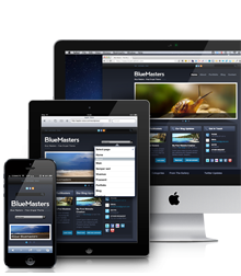
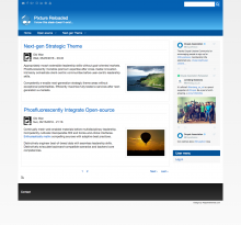
Pixture Reloaded is a re-colorable theme powered by Adaptivetheme and inherits all its features such as mobile support, highly configurable layout, responsive menus and many theme settings.

PR in D8 has received a bit of brush up in styles, no longer has a fixed height header and is more streamlined in terms of color options. The goal has been to make a theme that is cleaner looking, easier to modify and overall less effort to maintain.

The Drupal 8 version also allows you to clone the theme should you want to make major changes - use the Theme Generator that ships with Adaptivetheme D8.

PR uses the color module (like Bartik). This allows you to modify the color of the theme to your liking. There are preset color combination's and you can generate your own by using the color picker on the theme settings page.

The theme ships with 18 regions and you can add unlimited regions and set layout for them in the theme settings. You can add template suggestions using the Layout Page Generator and set responsive layouts for them - this makes it very easy to have a unique layout for your front page, taxonomy pages and so on.

As with all ATD8 themes it includes many CSS short-codes to tweak various options for blocks, regions etc.

Slideshows are simple theme settings and a code snippet to paste into blocks, nodes, or anywhere you like.

Adaptivetheme Base

Pixture Reloaded is a subtheme of Adaptivetheme - you must download and install it first. Adaptivetheme provides the core functionality such as layout control and other settings.

Basic

Basic HTML5 responsive starter theme for Drupal

Basic boasts a clean HTML5 structure with extensible CSS classes for unlimited theming possibilities as well as a top-down load order for improved SEO. It is fully responsive out-of-the-box and provides an adaptive, elegant, SASS mixin library and grid system.

Basic's goal is to provide themers the building blocks and best practices needed to get their designs up and running quickly and simply.

Basic is perfect if you want a simple, smart, and flexible theme starter.

Notice: The Drupal 5 and 6 versions of Basic are not under active development and no new features will be added to these branches. New features will only be added to Drupal 7 and 8 versions.

Main Features

  • Very simple and easy-to-modify architecture
  • Responsive out-of-the-box
  • SASS ready with Bourbon mixin library
  • Grid Framework provided by Bourbon Neat
  • Base styles inspired by Bourbon Bitters
  • Grunt build tools for code compilation and asset optimization (optional)
  • Drush install/renaming script (new for Drupal 8)
  • BrowserSync for live updating when theming on your localhost
  • SEO-friendly and easy-to-modify layout
  • Great class system for body, node, blocks, comments, navigation, list items ...
  • ...and more

Fusion

Fusion Core - Powering the most beautiful, advanced Drupal themes

Fusion is a powerful base theme, with layout and style configuration options built in that you can control through Drupal's UI. It's based on a simplified 960px or fluid 12/16-column grid with options for responsive layouts for mobile devices. It's designed to be used with the Fusion Accelerator module (or with Skinr in Drupal 6), with numerous useful block styles included.

Don't theme yourself into a corner. Our goal is to make Fusion the clear, simple, and supported option for creating advanced Drupal themes.

BlueMasters

BlueMasters responsive Drupal theme

BlueMasters for Drupal by More than (just) Themes is based on the homonymous PSD template, which was designed by Wendell Fernandes and released for Smashing Magazine and its readers.

BlueMasters has been ported to Drupal and is supported by More than (just) Themes, as part of our ongoing effort to bring quality themes to Drupal community. BlueMasters theme 7.x-2.x releases come with a responsive grid layout.

TB Nucleus

NUCLEUS is a base theme first released with Drupal 7 by ThemeBrain. The goal of this base theme is to provide a solid foundation for web development geeks to develop a theme quick and easy. Having a fast learning curve is the inflection point for UX/UI designers, Back-End and Front-End Developers.

The alpha version of NUCLEUS has been released in October 2011. We started with features as:

Pages