Add functionality and customize your Drupal application with thousands of projects contributed by our amazing community.
A module is code that extends Drupal's by altering existing functionality or adding new features. You can use modules contributed by others or create your own. Learn more about creating and using Drupal modules.
This module protects web layouts by filtering out empty HTML paragraphs, preventing layout issues from excessive carriage returns. It is not related to the Paragraphs module but can be used with it.
This provides a condition based on menu position. For example, you can use it to specify that a block should only show for a particular menu item and all its children.
Because I can never get a straight answer for a simple solution to include an image in a block with a easy-to-use interface for non-technical folk.
Create reusable templates for single or multiple sections!
The Multiselect module defines a field widget to be used with the following fields types: List fields (text, float, or integer) or entity reference fields.
Did you ever run into an issue of creating new paragraph type with the same fields only because it looks a bit different?
Overview
This module provides the Fluid Grid style plugin for Views. This plugin displays the view as a fluid grid using an HTML list element.
The plugin settings form provides options to define the width and height of the elements in the grid. But it also provides advanced layout options implemented in separate CSS classes that allow you to define item margins, alignment and a couple of CSS3 properties (box-shadow and border-radius).
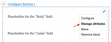
The Layout Builder Component Attributes module allows editors to add HTML attributes to Layout Builder components (blocks).
Description
This module provides a formatter leveraging views for the Field Collection module.
🇺🇦
|
This module is maintained by Ukrainian developers.
Please consider supporting Ukraine in a fight for their freedom and safety of Europe. |
The Custom Formatters module allows users to easily create custom Field Formatters without the need to write a custom module. Custom Formatters can then be exported as CTools Exportables, Features or Drupal API Field Formatters.
Features:
- Pluggable editor/renderer engines:
-
Formatter preset
Create simple formatters from existing formatters with preset formatter settings.
-
HTML + Tokens
A HTML based editor with Token support.
-
PHP
A PHP based editor with support for multiple fields and multiple values.
-
Twig
A Twig based editor provided by the Twig filter module.
- Supports for all fieldable entities, including but not limited to:
- Drupal core - Comment, Node, Taxonomy term and User entities.
- Field collection module - Field-collection item entity.
- Media module - Media entity.
- Exportable as:
- Drupal API formatter via:
- Custom Formatters export interface.
- CTools exportable via:
- Custom Formatters export interface.
- CTools Bulk Export module.
- Features module.
- Live preview using real entities or Devel Generate.
- Integrates with:
-
Coder Review
Review your Custom Formatter code for Drupal coding standards and more.
-
Contextual links (Drupal core)
Adds a hover link for quick editing of Custom Formatters.
-
Display Suite
Format Display Suite fields.
-
Features
Adds dependent Custom Formatters (from Views or Content types) to Feature.
-
Form Builder
Drag'n'Drop interface for builder Formatter Settings forms.
-
Insert
Exposes Custom Formatters to the Insert module.
-
Libraries API and the EditArea javascript library
Adds real-time syntax highlighting.
-
Token
Adds the Token tree browser to the HTML + Tokens engine.
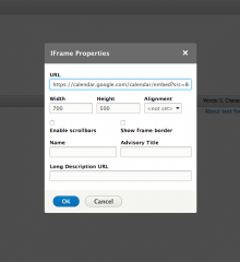
This project allows you to inject content into the $head, $scripts and $styles elements in the
Define and expose self-contained UI patterns as Drupal plugins and use them seamlessly in Drupal development and site-building.
Also called "components", UI patterns are reusable, nestable, guided by clear standards, and can be assembled together to build any number of applications. Examples: card, button, slider, pager, menu, toast...
This module recreates the Block Content for a exported Custom Block.
It doesn't exports the content, the block is created as a placeholder, with no content.
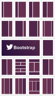
This module adds some of the most common Twitter Bootstrap layouts to Display Suite.
Requirements
Installation
Nothing particular, just download and enable as described in Installing contributed modules.
17 Available layouts
Single column:
Two columns:
- Bootstrap: 2 - 10
- Bootstrap: 3 - 9
- Bootstrap: 4 - 8
- Bootstrap: 5 - 7
- Bootstrap: 6 - 6
- Bootstrap: 6 - 6 stacked
- Bootstrap: 6 - 6 bricks
- Bootstrap: 7 - 5
- Bootstrap: 8 - 4
- Bootstrap: 9 - 3
- Bootstrap: 10 - 2
Three columns:
- Bootstrap: 2 - 8 - 2
- Bootstrap: 3 - 6 - 3
- Bootstrap: 4 - 4 - 4
- Bootstrap: 4 - 4 - 4 stacked
- Bootstrap: 5 - 5 - 2
Additional layouts in dev version
- Bootstrap: 1 - 11
- Bootstrap: 11 - 1
Versions
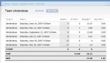
This module adds simple calculations to a views table. Requires the Views module.
Integrate Dmitry Semenov's Magnific Popup jQuery lightbox plugin with Drupal as a field formatter.
Modal forms make use of the modal feature in the ctools module to open some common forms in a modal window.
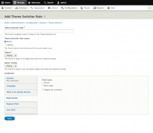
Theme Switcher module allows you to create theme-switching rules which allow automatic selection of a theme based on Drupal 8 Conditions system.
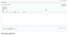
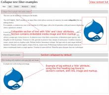
The Collapse text module is an input filter which allows sections of content to be made collapsible (like on editing forms).
For example, a common use case is the creation of a FAQ page, with a list of questions, with each answer displaying when a question is clicked.
Surround a section of text with [collapse] and [/collapse] to make it collapsible. [collapse] tags can be nested within one another.
The parameters may be combined in (almost) any order.
[collapse class="class-example" title="Collapse Text example"]
This text can be hidden by clicking on the header.
[/collapse]
The module provides theming functions and extensive documentation on project's page.
Widgets enables you to centrally manage and configure code snippets on your site such as share and follow buttons or Twitter updates and Facebook like boxes. It implements a user interface that allows you to easily organize and configure various widget elements. Using a UI similar to core’s image styles, elements can be assembled into widget sets which can be reused throughout the site via blocks and other render displays.
The Widgets module is primarily a user interface API and as such includes only generic markup widgets. You can add new custom widgets using the widget definition admin or enable modules that provide widgets. There are several dozen widgets available through the Social media and Service links modules.
Usage
- Installation. Use standard methods to install the Widgets archive files into your Drupal site. Then go to admin > modules and enable the Widgets module. You will want to install the Social media and/or Service links modules also to provide widget sources.
- To display widget sets on your site use the blocks admin at admin > structure > blocks or other method for managing blocks such as Context or Panels. Look for blocks that start with the label "Widgets:" Several pre-built widget sets are provided by the Social media module.
This module provides a framework for creating table of contents (TOC) from an HTML fragment's header tags.
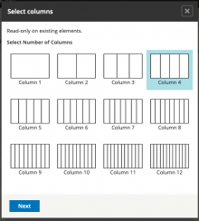
Allows creating rows and columns within CKEditor using Bootstrap syntax.
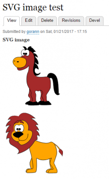
SVG Formatter module provides support for using SVG images on your website.
Drupal node titles are restrictive and do not support italicized text or superscript text (e.g., Book titles, trademark symbols).
Pages

 Support for Drupal 7 is ending on 5 January 2025—it’s time to migrate to Drupal 10! Learn about the many benefits of Drupal 10 and find migration tools in our resource center.