
Here are some small improvements to the UI:
- Added more contrast for the paragraph type labels
- Added the ghost item again since it clarifies what is about to happen before dropping an item and also makes it a lot easier to drop into the desired location because the drop zone is a lot bigger.
- Changed the background color of the nesting indicator to grey and moved it from the parent to the children because that makes understanding the strcutre a lot easier.

| Comment | File | Size | Author |
|---|---|---|---|
| #38 | paragraphs_2901582_dragdrop_summary.patch | 1.1 KB | miro_dietiker |
| #37 | 2901582-37.patch | 8.35 KB | Jacine |
| |||
| #35 | paragraphs-nested-count.png | 22.1 KB | miro_dietiker |
| #30 | dragging-over-droppable-list.png | 356.54 KB | Jacine |
| #30 | dragging-from-bottom-to-top.png | 351.9 KB | Jacine |


Comments
Comment #2
Lukas von BlarerI tried to improve the margins of the "Complete drag & drop" button. For that I removed the removal of the margin of the actions alltogether.
Additionally I increased the vertical margin.
Comment #3
miro_dietikerOops, please check our documentation about CSS contribution. CSS files are generated from .scss.
Also i guess there are already some overlaps. Let's focus here only to drag + drop mode, no changes to the widget itself.
See #2900874: Convert the root 'Collapse All' dropdown to the new paragraph_actions element and #2868225: UI for mobile devices is not looking nice
There's currently a lot of related local work by @pivica that will be uploaded soon.
Comment #4
Lukas von BlarerComment #5
BerdirYeah, the dragdrop css file isn't scss yet.
Thanks for working on this.
Can you include a screenshot of how it looks when you have an empty nested paragraph field?
That is the main reason I added that ugly yellow thing, do highlight places where you can put items, including currently empty fields.
Comment #6
Lukas von BlarerRemoving the changes to the actions button.
Comment #7
Lukas von BlarerCrosspost. Ok, but we should solve that differently.
I am about to convert the files to scss. Lets get the current state committed.
Comment #8
Lukas von BlarerHere is the screenshot.
Comment #9
Lukas von BlarerJust added a placeholder for empty fields.
Comment #10
Lukas von BlarerMaking the placeholder darker.
Comment #12
miro_dietikerYeah, committed. Thx.
Now let's convert this to a scss as well! :-)
Comment #13
Lukas von BlarerSome more UI improvements:
Sorry, I don't have any screenshots because this is hard to do on MacOS :)
Comment #14
miro_dietikerCommitted this again.
I think we should look at how Thunder visualises the dragee.
I'm still confused i see the dragged element as target and below my mouse. And it is still transparent below my mouse.
Thunder applies some background to the whole element and it makes me better aware of the element i'm dragging as a whole.
Also not fully sure about displaying the dragee at the target location.
If i drag some container with many children, that's a huge thing to drag and this behavior steals most of my viewport.
Dragging down and finding the right position seems very hard to me.
Comment #16
miro_dietikerHere's how Thunder looks like:

Comment #17
miro_dietikerComment #18
Lukas von BlarerI tried to create a minimal prototype that uses a ver reduced dragged element, uses the drop location indicator line again and adds some very rough animations to communicate the user what happens to the paragraphs structure.
Comment #19
JacineHey all! Any pointers on how I can test this?
Trying to look at this now, but not able to get drag and drop working properly. I installed the sortable (1.5.1) library, and Paragraphs is showing me the drag and drop UI, but it's not working. I can drag, but cannot drop. Is there some other patch that I need, or combination of widget settings?
Thanks!
Comment #20
Berdir@jacine I think the 1.5.1 version broke at some point with latest Chrome at least, possibly other browser too.
What we are currently using in our project is version 1.6.0 with the change from https://github.com/RubaXa/Sortable/pull/1154. We need to update the docs...
Comment #21
BerdirAnd yes, using a different JS library is something we could consider. I saw that there is a recent core issue to investigate options, would be great if we could use something that's already in core.
Comment #22
JacinePerfect. Thank you! Here's a patch for that: #2946684: Update README with Sortable Library Instructions
Comment #23
miro_dietiker@Lukas tested a bit. Some annoying effect is gone. Still a bunch of findings where we can / need to improve:
- The black bar is very dominant.
- If i scroll down to the end and drag a longer container, the removal of that said container leads to reduction of the scroll length of the browser, effectively scrolling up, flickering, confusing me about the changed position.
- If i move an item up towards a container with children, i have multiple flicker effects when entering the container. Sometimes flickering up as second-last position, even once flickering up as before the container. That said, note that flickering is different for a (collapsed) container than for a single item.
- If i drop it in the upper part of a container, it proposes landing before the container, until i almost pass the first item.
Comment #24
JacineThis is just quick a reroll of #18 so far, since it no longer applies.
Comment #25
miro_dietikerWhile on it, i would love to have these CSS definitions commented a bit with the next improvement cycle.
It's many definitions and hard follow how all elements are connected.
Comment #26
JacineHere's a patch with the progress I've made, to force myself to tweaking it!
RE: #21:
I looked into this a bit, and even with its flaws, I think Sortable.js is probably the best bet when it comes to nested list support. :/
Regarding the requests in #23 and #24:
Documented all the things, hopefully not too much.
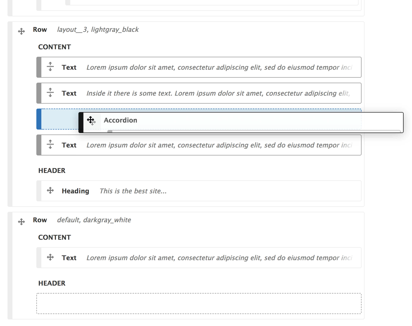
I assume you meant the drop zone, and I've tweaked the design here in two ways. It now looks like the other containers except with a light blue background and blue border. If you meant the left border, let me know.
This is due to the animation of the max-height, and unfortunately, I can't figure out an acceptable way around it. I've commented out that code for now, and left a comment with a related @todo note.
Also in the patch
.tabledrag-handlecode, and implements.paragraphs-dragdrop__handle, bringing the move icon into the project (so it can be properly referenced in CSS), and styled without legacy jank. Also uses thedragcursor while dragging, and extends to the full height of the container so dragging can be initiated on the entire left side of the item..is-dragging-paragraphsclass to<html>to indicate dragging is happening..is-droppable-targetclass to the parent list when dragging indicating that dropping is allowed. This class is used to:Because of the classes I've added in this patch, it's possible to get more risky and bold with the styling of these elements, but I wanted to be careful not to overstep, or do too much where it will be a pain to work with.
NOTE: Regarding the
<span>in the drag handle. I had originally done it using only a link and generated content, e.g.::before. However, there is some bug, either with Sortable.js or Firefox directly, (or maybe both!) that breaks drag and drop when it exists. The only workaround I was able to find was to setforceFallback: truewhich would be a real shame, so instead I added a<span>.Comment #27
miro_dietikerGreat improvements.
Yes, it was the strong black horizontal that was irritating me. That's gone now.
I experience less flickering with the patch applied.
Here 3 problems i still face...
I still see the cursor: move while over the whole "Drag and drop" items. However they can't be dragged. This is confusing. Instead i can only drag on the drag handle. As the whole mode is about drag & drop, why not making the whole item draggable?

If i drag a container item with 2 children, i can't drop it inside a container with 1 item. It only jumps to before or after the other container.


If i drag that larger container towards the potential target, the indicated target is below:
And as soon as i drag 1px more, it indicates target above.
Thus it's pretty impossible to drop this inside that other container.
This is a (previously existing) major limitation that i hit when reordering containers.
And still dragging an item into a container as the first item is not possible directly.


Even if i'm deep into the container, the target is still indicated before the container:
And if i go a pixel more into the container, it drops as second item.
It should be considered as a first item short after hovering into the Container.
Also, i only tested with Chromium. Needs more Browser testing.
@Jacine What do you think, can we improve these limitations?
Comment #28
JacineThanks for these screenshots and the fast feedback! 😁
This can be done, sure.
The rest I’ll look into, but I’m curious... were screenshots you posted taken with this patch applied? I tested in Chrome and Firefox, and it looks pretty different. Looks like you don’t have the “ghost” container, which I agree would make it difficult to drop in any circumstance let alone the ones you posted about. I’ll try Chromium too when I get a chance.
Comment #29
miro_dietikerLol, maybe it was too late and i tested the wrong local URL/instance after applying the patch ;-D
Can u post a screenshot of the new look so i will recognise?
Sorry for the noise... ;-) will retry tomorrow!
Comment #30
JacinePhew! 😀
Ok, here's a screencast (using Chromium): https://vimeo.com/258024124
And a few screenshots:
Default State
Dragging over a droppable target list
Dragged from bottom, dropping at top
Comment #31
BerdirCan confirm that Miro was not testing the latest patch. Looks great so far, nice work.
Comment #33
miro_dietikerSo yeah, tested it and it works really well.
Committed this because it's a big step forward.
Still a few additional findings:
Didn't check mobile behavior yet... :-)
Comment #34
JacineGreat! Going to working on trying to make the whole area clickable today, hopefully, so let me ask a question while I'm here.
Yes, this is due to the height set on the draggee while dragging. Which of these sounds good to you?:
I don't think I've experienced this. For me, it seems to just goes wherever you hover, if it's allowed. One thing that I do notice is that you do have to drag carefully, direction-wise, to stay in the same list sometimes. My top-level paragraphs are not allowed in any of the children items, and I have to carefully drag straight up or down to move them. If I move left or right, the drop zone is reevaluated as a different list, and a ghost drop zone is not shown to me until I manage to get to an acceptable spot. It's not actually an easy problem to solve, while allowing dragging and dropping in all directions at the same time, so I imagine it might be part of the reason the maintainer of Sortable is hesitant to actually support nesting.
Yes, this is a annoying. I really tried to get around this, but haven't been successful to far. This is because technically you are not always hovering over the current list. For example, if you move right, and there are children, you just exited the list. And sometimes if you move vertically, because of margins, you are technically hovering over a parent. I may try to add another div or something and see if it can be alleviated that way.
Comment #35
miro_dietikerI think collapsing the item to one element row is best.

The summary can also ship a badge element that lists the child count. Let's enable this and the situation is pretty clear.
Comment #36
Jacine👍 Thanks!
Comment #37
JacineI was unable to get the count badge. The value is protected and I can't figure out how to get it in the page output. Can someone else get that working or point me in the right direction?
Here's another patch.
- Makes the whole item clickable.
- Hides the children items while dragging.
- Miscellaneous cleanup.
Comment #38
miro_dietikerAwww, we didn't have this case and it seems we need to rework the API a bit.
There is getSummary that initiates the child counter, but it is limited to depth=0. On the other hand the counter is increased only in getNestedSummary() and that's not called at all here, so even if i call getIcons tha then should return the counter accordingly, the counter is not initialised as we never traversed into children.
And if i set then the depth_limit to 1, i get the counter with modifications, but the container has a duplicated child summary.
Which makes me realize that we maybe want that to have a summary of the collapsed children. ;-)
Attached a patch that is needed ON TOP that results in display of the count, and the summary of the children.
As some initialization and classes from the regular widget is missing, the output looks odd.
It looks like the two structures got out of sync by refactoring and we should catch up as well, checkout the common initialization of $element['top'] on line 454.
As my time is running out for tonight, i didn't have yet time to test your patch.
Comment #39
miro_dietikerCommitted the cleanuup with the Entity Browser UI.
Ready for some last iteration to also output the patches.
Comment #41
miro_dietiker