
 Support for Drupal 7 is ending on 5 January 2025—it’s time to migrate to Drupal 10! Learn about the many benefits of Drupal 10 and find migration tools in our resource center.
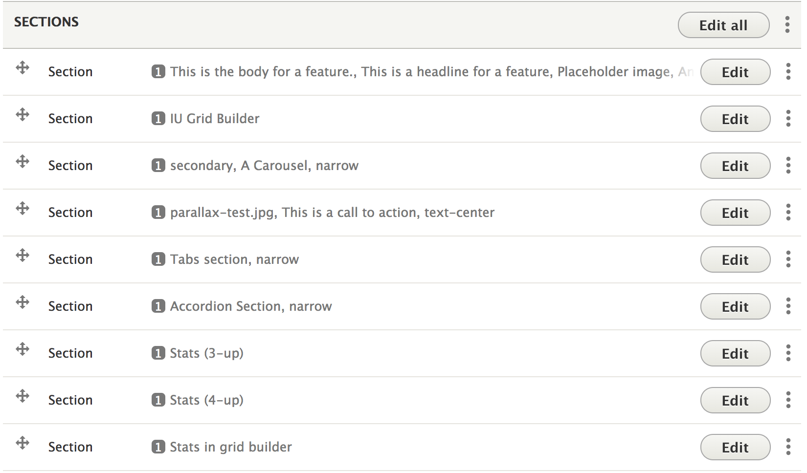


Paragraphs for Indiana University
This module provides custom Paragraph types for building complex pages comprised of elements from the IU Pattern Library like section, grids, and chunks that conform to the design standards in the IU Web Style Guide.
This module should be used in combination with the IU Drupal Theme.
Supported widgets
Paragraph types currently available with this module include:
- Banners - Edge-to-edge "hero" sections built as a Paragraph type. To configure, you should add a Banner field on your content types and use the provided View Block to enable it on your nodes in the Highlighted region; the Paragraph type supports background colors & images, videos, and text alignment, all from the standard IU Framework CSS.
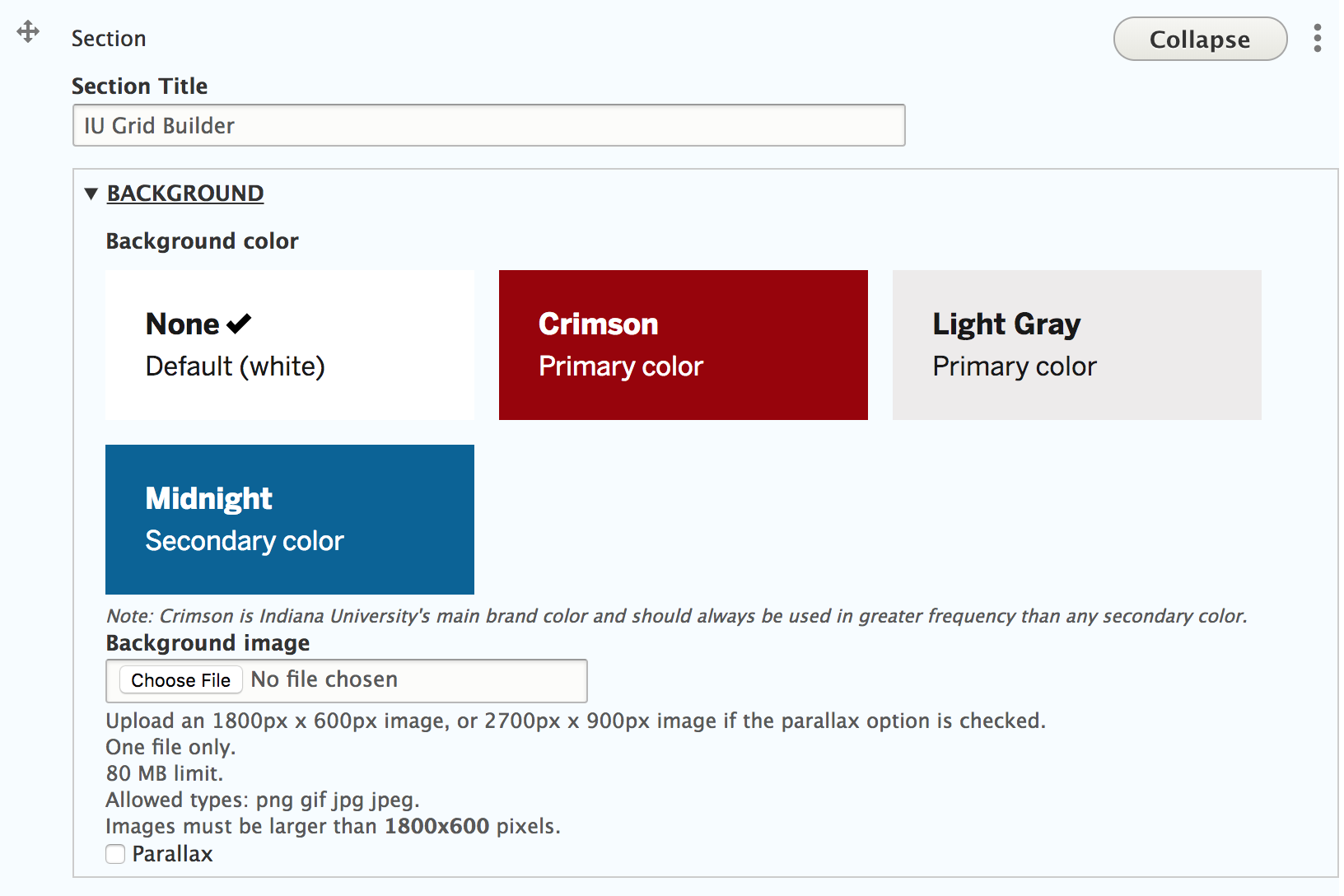
- Section - the top-level Paragraph type that appears in the content of your nodes. To configure you should add a "Sections" field to your content types; it supports background colors & images, parallax, as well as other display settings like height/width/padding, text alignment, and visibility rules, all from the standard IU Framework CSS.
- Text
- Image
- Image Carousel
- Call To Action
- Callouts & Pullquotes
- Feature
- Features Carousel - a 3-column grid carousel/rotator layout for features. It is undocumented in the IU Style Guide, but code exists in the IU Framework to support this common layout pattern.
- Panels & Interactive Panels
- Accordion
- Stat
- Tabs - Not mentioned in the IU Pattern Library, but code was found in the IU Framework CSS for these. The implementation is based on Zurb Foundation Tabs and styling is completed via the IU Drupal theme
- Grid Layouts - Build rows of equal-width grid item columns.
- Drupal Block - Embed a Drupal block inside a Paragraph.
- Drupal View - Embed a Drupal view in a Paragraph via viewsreference module.
- Forms - Embeds a Drupal webform via the included iu_paragraphs_webform submodule.

Roadmap
The following widgets still need to be implemented to completely support the IU Framework:
- Image essay - #2929946: Support Image essays from IU Pattern Library
- Social Media Items
- Video & Audio
Contrib Dependencies
- Drupal Core version 8.4.x or greater - w/ patch from #2890758: Block visibility node type not working on preview/revision routes
- Media Entity Browser (the module does not yet use the Core Media Library)
- Field Group
- IU theme
- Paragraphs - w/ patch from Issue #2868155: Add paragraph bundle to widget forms to allow easier editing of paragraph forms
- ViewsReference
Color Field 2.x - w/ patch from Issue #2854199As of issue #2929965: Replace background color field with basic color selector, Color Field is no longer a dependency.
Installation
- Download and enable the module and its contrib dependencies (see above).
- Open Admin > Structure > Content types > Basic Page > Manage fields.
- Add a field named Sections of type Paragraph (aka Entity Reference Revision); For Reference Type, include only the Section type;
- We recommend the Paragraphs Experimental field widget for Form Display. Note that the IU Paragraphs implements a nested Paragraphs architecture, so it is highly recommended to install the Sortable.js library to leverage the advanced Drag & Drop feature in the Experimental widget because the basic tabledrag feature only allows you to reorder items within a single level. Follow Drag & Drop installation instructions in the Paragraphs module's README.
- Ensure your Sections field and node type display is configured in an Edge-to-edge layout. See Layout settings on the Manage display tab of your content type. (Field Layout and Layout Discovery modules must be enabled). We recommend leveraging the IU Page Layout from the IU theme for your field layouts. This custom layout provides two regions: Constrained and Edge-to-edge. Place the Body field in the Constrained region and the Sections field in the Edge-to-edge region. An alternative approach would be to use the Page Manager module to handle field layouts, but Page Manager is outside the scope of this instruction manual.
- Ensure your theme is configured to display the Main page content in a region that spans the width of the screen (aka, edge-to-edge). We recommend using the IU theme which contains appropriately labeled regions to support both edge-to-edge (for node pages) and constrained for non-node page content. The theme comes preloaded upon installation with two Main page content blocks; one for node pages and one for non-node pages. The Main page content block for nodes is placed in the IU theme's Edge-to-edge region, while non-node Main page content block is in the standard Content region which has a constrained maximum width.
Credits
- Indiana University Libraries - for sponsoring initial development.
- Bluespark - for sponsoring ongoing development.
Special thanks to Paragraphs Pack and Bootstrap Paragraphs, both of which provided the initial code from which this module was forked.
Supporting organizations:
Ongoing development support
| Attachment | Size |
|---|---|
| greybox2.png | 8.59 KB |
Project information
 Minimally maintained
Maintainers monitor issues, but fast responses are not guaranteed.- Maintenance fixes only
Considered feature-complete by its maintainers. - Module categories: Content Editing Experience, Content Display
 5 sites report using this module
- Created by jwilson3 on , updated
 Stable releases for this project are covered by the security advisory policy.
Look for the shield icon below.


