
 Support for Drupal 7 is ending on 5 January 2025—it’s time to migrate to Drupal 10! Learn about the many benefits of Drupal 10 and find migration tools in our resource center.
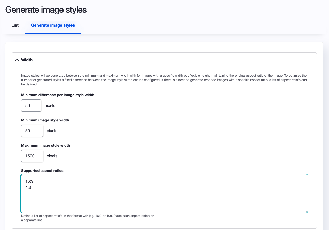
When using media to add images to content, having media view modes defined by aspect ratio, combined with a bunch of different image styles for the images in that specific aspect ratio solves the responsive images problem in the easiest way possible.
Easy Responsive Images needs a minimum and maximum width, in combination with a preferred amount of pixels between each image style. An optional list of aspect ratio's can also be defined. When the configuration is saved, the image styles are automatically generated. For example generating image styles for a 4:3 ratio and 16:9 ratio will produce the following styles:
- responsive_4_3_50w
- responsive_16_9_50w
- responsive_4_3_150w
- responsive_16_9150w
- …
- responsive_4_3_1450w
- responsive_16_9_1450w
Usage
After generating the desired image styles for the different aspect ratio's, create a media view mode for each aspect ratio. This can be done using the Easy Responsive Images formatter, but module provides a Twig filter to create URLs for the images styles (including an optimized WebP version of the image when using
ImageAPI Optimize WebP or WebP).
Create a template for your media view mode, eg. media--image--16-9.html.twig for a 16_9 view mode, containing the following code:
{#
/**
 * @file
 * Default theme implementation to display an image.
 */
#}
{{ attach_library('easy_responsive_images/resizer') }}

{% set file = media.field_media_image.entity %}
{% set src = file.uri.value|image_url('responsive_16_9_50w') %}
{% set srcset = [
  file.uri.value|image_url('responsive_16_9_150w') ~ ' 150w',
  file.uri.value|image_url('responsive_16_9_350w') ~ ' 350w',
  file.uri.value|image_url('responsive_16_9_550w') ~ ' 550w',
  file.uri.value|image_url('responsive_16_9_950w') ~ ' 950w',
  file.uri.value|image_url('responsive_16_9_1250w') ~ ' 1250w',
  file.uri.value|image_url('responsive_16_9_1450w') ~ ' 1450w',
] %}
<img src="{{ src }}" data-srcset="{{ srcset|join(',') }}" alt="{{ media.field_media_image.alt }}" loading="lazy" />
Each time media is displayed using the view mode, the JavaScript will check the
available width for the image container, and load the optimized image style.
Also notice the HTML5 "loading" attribute to enable lazy loading of images for
even more optimization.
Supported modules
This module works even better in combination with:
It also supports external images via Imagecache External.
Supporting organizations:
Sponsor
Sponsor
Project information
 Minimally maintained
Maintainers monitor issues, but fast responses are not guaranteed.- Module categories: Media
- Ecosystem: Image
 606 sites report using this module
- Created by seanB on , updated
 Stable releases for this project are covered by the security advisory policy.
Look for the shield icon below.
Releases
1.3.3
released 23 December 2023
released 23 December 2023
Works with Drupal: ^9.3 || ^10
✓ Recommended by the project’s maintainer.
Install:


