 Support for Drupal 7 is ending on 5 January 2025—it’s time to migrate to Drupal 10! Learn about the many benefits of Drupal 10 and find migration tools in our resource center.
Problem/Motivation
When the Dreditor plugin is installed in a browser the issues are given a facelift. Update the standard issue queue design to match.
The background colors provide a greater visual indication to the testbot's status and the size changes and possition of links provide a better hierarchy for action links.
Proposed resolution
The old files list:

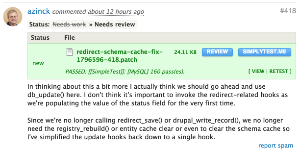
The new files list:

The old issue comment display:

The new issue comment display:

Note: This issue doesn't need to address adding the buttons. There is/will be a separate issue for that change here #2786361: Move features from Dreditor into drupal.org
Remaining tasks
- Address concerns with multiple test results from different environments in #4
User interface changes
CSS only
| Comment | File | Size | Author |
|---|


Comments
Comment #1
drummWhat specifically are the changes?
Comment #2
DamienMcKennaThe old files list:
The new files list:
The old issue comment display:
The new issue comment display:
Comment #3
DamienMcKennaAlso, the comment form itself is tweaked slightly:
Comment #4
drummFor files - the green background won't scale to DrupalCI's multiple results for different DB backends and PHP versions. Maybe there could be a yellow background for partial passing, along with the additional details. #2238007: DrupalCI retest & special test UI is more about triggering tests at the moment, but probably is the best place.
There was some discussion on the comment number, but I can't find it right now. It could have been IRC-only. My understanding is that people mainly use the comment number for patch file naming. If we want to make that easier, maybe it should live in the files section.
Comment #5
star-szrJust want to mention even though I like how they look and am a co-maintainer of Dreditor, I doubt the Dreditor styles for files are accessible in terms of WCAG 2.0 AA (not enough contrast) if that's a factor in terms of actually getting this into d.o.
Comment #6
DamienMcKennaComment #7
drummComment #8
joelpittetAdded screenshots from #2 and #3. And tag for accessibility review needed for #5.
re #4, Yes I used the comment number for naming patches, that can be a separate issue if need be.
It may be good to see what we can do with the re-test styles.
Task: Could someone find a few other references where that is displaying and try to apply dreditor styles and some tweaks to deal with that?
Comment #9
joelpittetMoved the "add a new comment" number to #2786661: Port Dreditor styles to keep this issue lean and focued;)
Comment #10
drummSince this new comment number is moved to a separate issue (thanks!), and I think we want to leave the PIFT styles out (see #4), I’m not sure what’s left.
Comment #11
joelpittetI'd like to see what we could do with the PIFT styles. But in general this issue is about visual hierarchy within the elements being displayed to bring the important ones into focus and the less important ones visually shifted in their hierarchy. Look at size, position, color, uppercase vs lowercase, left vs right and other subtle visual hierarchy cues.
Comment #12
markhalliwellI agree that PIFT changes will need to be rethought now that there can be multiple tests per comment. Regardless, closing this issue as a dup of these two related issues.