
See attached screenshot.
It does not display all the theme regions (only the overlay ones), and forcing Garland to display within the overlay like that looks a bit weird to begin with (the normal paradigm being that if you have an admin theme, the overlay should always use it).
Possible solution: Wait for #87994: Quit clobbering people's work when they click the filter tips link to go in, and then display this page in a separate modal popup instead?
| Comment | File | Size | Author |
|---|---|---|---|
| #157 | block-demo+overlay-context.patch | 5.76 KB | casey |
| #156 | 655416-156-block-region-demo.patch | 5.53 KB | ksenzee |
| #154 | demoblockslink.patch | 2.64 KB | yoroy |
| #142 | block-demo-overlay-655416-142.patch | 5.33 KB | BTMash |
| #141 | block-demo-overlay-655416-141.patch | 4.88 KB | BTMash |


Comments
Comment #1
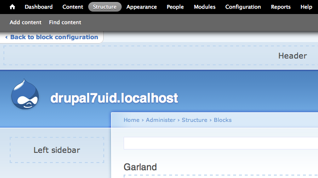
bleen CreditAttribution: bleen commentedAlso, clicking "Demonstrate block regions" in the overlay traps the user. There is no (good) way to get back to where you just were. There should probably be a link that says something like "back to block configuration" or something like that.
Comment #2
bleen CreditAttribution: bleen commentedIncidently, I do see all the regions when I click "Demonstrate block regions" on a clean D7 install
Comment #3
webchickThis is obviously broken user-facing functionality. I would love to see this fixed prior to alpha. Can we just not open this link in the overlay to solve the issue?
Comment #4
casey CreditAttribution: casey commentedLike @webchick suggested.
This approach does however still have the problems @bleen18 indicated in #1.
Comment #5
mrfelton CreditAttribution: mrfelton commentedDefinitely an improvement.
Comment #6
webchickCould we put add an unobtrusive link in the upper-left corner? Since this will need some discussion/design, tagging appropriately.
Comment #7
Bojhan CreditAttribution: Bojhan commentedI would indeed favor such a thing, it could be similar in style to the Skip navigation button. No need to display this inside the overlay
Comment #8
webchickCool, that makes this a "needs work" then.
Comment #9
scroogie CreditAttribution: scroogie commentedBut how does it help? It would still need to be shown in the User-Facing theme instead of the admin theme, right?
Comment #10
Bojhan CreditAttribution: Bojhan commentedIt solves the problem, of not knowing how to get back to administration of blocks.
Comment #11
babbage CreditAttribution: babbage commentedPatch works as intended. Personally, however, it was initially disorienting to find myself still in an admin task, but no longer in the overlay. I would definitely +1 a solution that somehow showed a correct demonstration of the block regions, while remaining in the overlay... having it encapsulated in the overlay just makes it immediately clear you are looking at a preview/demonstration of something, rather than the possibility of thinking that these weird dotted lines have just been actually applied to what other users are seeing on your real site. Not sure how one would go about making the originally intended functionality work for this, however, so don't think I could attempt it myself!
Comment #12
Gábor Hojtsy@dbabbage: Maybe we should add some substantial white border around the preview so it it looks more evident that it is in the overlay? Also, we should need to avoid omitting the regions then.
It would be good to get some more feedback on this IMHO. If we'd display it outside the overlay, we need some treatment to get back to an overlay page to edit blocks, otherwise we need some reorientation of stuff in the overlay (wide white border). Keeping the preview in the overlay could cause problems especially for wide themes.
Comment #13
Bojhan CreditAttribution: Bojhan commented@Gabor Actually the solution has already been proposed in #6. Just needs someone to patch it.
Comment #14
Gábor Hojtsy@Bojhan "this will need some discussion/design" == "just needs someone to patch it"?!?
Comment #15
Bojhan CreditAttribution: Bojhan commented@Gabor Yes, I can't do the styling in CSS of something that needs to be created on PHP level. An initial patch, would allow me to do that, also said it could look similiar to the skip navigation look (thats the design discussion :D)
Comment #16
Bojhan CreditAttribution: Bojhan commentedComment #17
Gábor HojtsyOk, this will place a nice link in the body of the page. Since it has the "block-back-to-list" class, it can be styled however you want, you can place it in a ribbon on top of the screen, put in the corner, whatever. Feel free to tweak wording as well.
Comment #18
Gábor HojtsyWe have a couple tasks / questions here:
1. It shows in the overlay but not with the overlay theme. That looks very creepy since it will not be on white in many cases (unlike Seven), so the borders around the overlay and background theme will be an issue. This still seems to be in debate.
2. Not all regions are demonstrated. Because it displays in the overlay, and the overlay drops numerous regions.
3. There is no back-navigation.
I think these three issues are highly interrelated, so we should solve them in context. Fixed the title to cover the whole scope.
Comment #19
jide CreditAttribution: jide commentedTo make it clear for the user about what is happening while displaying the demonstration in the parent window, we could make the overlay slide on the left of the screen. See attached mockup.
I think this would be great in a UX perspective, but surely more complicated to implement.
Comment #20
Gábor HojtsyHow would the interaction of the underlying page change go then? (It does sound like a considerable challenge to implement also, yes).
Comment #21
jide CreditAttribution: jide commented@Gábor Hojtsy :
Sorry, but I don't understand what you mean here. How the user goes back to the overlay ?
Yes it is challenging to implement, let's see if there is interest for this solution.
Comment #22
casey CreditAttribution: casey commented- Demo inside overlay
- A bar on top of the demo page with a back link (also without overlay)
- A invisible layer over the demo page so no links can be clicked (also without overlay)
Comment #23
Bojhan CreditAttribution: Bojhan commentedCan you provide a screenshot otherwise I cant review
Comment #24
casey CreditAttribution: casey commentedComment #25
Bojhan CreditAttribution: Bojhan commentedWhy does the without overlay, exclude toolbar and shortcuts? Also I think that without overlay should be our primary interaction model, I dont see any reason to have it inside the overlay.
Comment #26
casey CreditAttribution: casey commentedOops you are totally right. When I was checking my patch the toolbar was already gone and I assumed that was how it was implemented.
Comment #27
Bojhan CreditAttribution: Bojhan commentedOk, here is an example of what I mean - don't pay to much attention to the styling that could probally use some touching still. But I never intended it to be inside the overlay, I see no advantage to doing that.
Comment #28
casey CreditAttribution: casey commentedIt's a little hackish but this is what I tried to accomplish with my previous patch.
Comment #29
casey CreditAttribution: casey commentedOw forgot garland style. Patch defenitly needs works.
Comment #30
Gábor HojtsyOk, since Bojhan requested to not show this in the overlay, we can reach back to #4, which excludes this from the overlay. That in itself also solves the displayed regions issue, so we don't need to special case code for that. Then we don't need to employ conditional altering, since we can just build in the backlink when we will in the regions. We can employ the mandatory page_top region to add this link right below the toolbar.
Now, we'd only need to find ways to make this link appear at a sane place in our themes. Since I did not have a great success with that, I'd leave that to others. My approach/patch attached.
This is how it looks:
Comment #31
casey CreditAttribution: casey commentedBacklink won't work correctly when you have opened the demo from within the overlay.
- Navigate to a non-frontpage page.
- Open the overlay and navigate to block configuration. (path will be something like /user/1#overlay=admin/structure/block/list/garland)
- Click on demonstration link (which will take you to /admin/structure/block/demo/garland)
- The backlink will point to /admin/structure/block/list/garland while browser's history will take you back to /user/1#overlay=admin/structure/block/list/garland
Comment #32
Gábor HojtsyI'm not sure I understand what you mean. Do you mean that the demo link now opens a new browser window/tab, and therefore the browser back button will not work?
Comment #33
yoroy CreditAttribution: yoroy commentedTried the patch, working well for me. Can't reproduce what casey describes in #31. I think I followed the steps outlined there. Then, both the browser back button and the 'back to block configuration' link take me back to the blocks page within the overlay.
Some of the 'Back to block configuration' styling gets overridden by (in this case) Garland. Should be more in line with Seven styling. I'll have a look.
Overall: great patch!
Comment #34
yoroy CreditAttribution: yoroy commentedHmm. on clicking around some more, there's something funny going on indeed. I ended up on the 'reports' page and noticed that 'structure' was still shown as the active link. URL at that point was "/admin/structure/block/demo/garland#overlay=admin/reports".
Comment #35
yoroy CreditAttribution: yoroy commentedSeems as if you never leave the 'demonstration context'. Screenshot:
Comment #36
Gábor HojtsyYes, the assumption of the toolbar is that you'd not get an admin page displayed in both the background and the overlay. So we should hide the toolbar on the demo page to encourage clicking on the backlink? (Would make positioning the backlink at the right place way easier).
Comment #37
Bojhan CreditAttribution: Bojhan commentedNo, hiding it will only cause confusion.
Comment #38
Gábor HojtsyYoroy demonstrated that showing it causes confusion. So how to solve it then?
Comment #39
Bojhan CreditAttribution: Bojhan commentedWait hiding the toolbar will cause confusion, because there is currently no mode in Drupal core where there is no toolbar except updating/installing. The bug portrait by yoroy, is unavoidable - as far as I know.
Comment #40
moshe weitzman CreditAttribution: moshe weitzman commentedThis feature has always been very poorly implemented. I would be fine droppong , to be honest. Just throwing it out there. Its obviously preferable to keep it and improve it.
Comment #41
Gábor Hojtsy@Bojhan: ok, so looks like @yoroy can look at the styling as he suggested and we can much on the updated patch then.
Comment #42
yoroy CreditAttribution: yoroy commentedGabor: to be clear the screenshot in #35 is *not* while in 'demonstration mode'. I had already click the exit link. This is a screenshot of a little while later, browsing other admin pages. Somehow the demonstration context does not get removed (this I noticed from the url and the wrong hilite showing up).
Comment #43
Gábor Hojtsy@yoroy: the first part of your URL clearly shows you are on the garland block demo page in the background (also, the back to block admin link is visible there). The structure item was highlighted due to being under a path there, but then you kept navigating around via the toolbar, so you got the reports page displayed eventually above.
Comment #44
yoroy CreditAttribution: yoroy commentedSketching things in Firebug:
1: http://skitch.com/yoroy/ni67m/garland-d7
2: http://skitch.com/yoroy/ni671/firefox
3: http://skitch.com/yoroy/ni67b/garland-d7
Not sure how eye-cathing this should be though. These are all stylings found nowhere else, because this is quite a unique context to be in as well. Thoughts?
Comment #45
Bojhan CreditAttribution: Bojhan commentedI do think the yellow is a bit to much, we don't use this anywhere in Drupal - nor do we promote such visual styling. I would rather go with a white-ish button, as it puts some difference with the toolbar (where you can see the gray doesn't). Also with the shadow ontop of it, it decreases its visual appearance immensely - perhaps make it bigger?
Comment #46
Bojhan CreditAttribution: Bojhan commentedTrying to move this along @yoroy , lets talk some more on IRC to find a suiting style. Regarding the position, in the middle might be better then the top left, as its more clearly there - the problem I see that its very likely to overlap an important theme style element?
Comment #47
yoroy CreditAttribution: yoroy commentedAgreed with centering being best. But:
Could we use a standard Drupal message (dsm) here?
Like so in Stark: http://skitch.com/yoroy/n4f5j/untitled-4-100-layer-2-rgb
- pro: will not cover other elements, reuses an existing pattern
- contra: invisible *because* it reuses an existing pattern?
Comment #48
tstoecklerI like that. I think it will be more visible in Garland, i.e.
Comment #49
amc CreditAttribution: amc commented#30: block-demo-page-backlink.patch queued for re-testing.
Comment #50
sunWhy do we suddenly need a back link gimmick that does not fit into any other pattern we have in core? The patch in #4 nicely solved the problem at hand. No need to display the preview in the overlay. The breadcrumbs allow you to navigate back. Be done with it.
Comment #51
yoroy CreditAttribution: yoroy commentedBecause this is the only place where we apply the 'preview' from admin-into-frontend pattern in core.
Preview is tricky. For most, it's 'magic'. You want to provide a clear and simple click that lets you stop the illusion and return safely to where you came from. Breadcrumbs are not that click. Nor is my message idea in #47 appropriate.
Showing it inside overlay adds to the magic and we want to avoid that.
Making things feel simple just takes more work :)
So this needs a bump with a new or re-attached earlier patch? Then we can test and review again.
Comment #52
sunSure.
Comment #53
yoroy CreditAttribution: yoroy commentedthanks
Comment #54
catchHere's a screenshot. The breadcrumb is quite dominant but without hovering over it you can't really be sure that it'll take you back to the non-preview state, so I think we need something else too. Definitely this is a non-overlay page though.
Comment #55
yoroy CreditAttribution: yoroy commentedRelying on breadcrumbs is not going to cut it, So another visual design option:
Comment #56
aspilicious CreditAttribution: aspilicious commentedI *really* like yoroy's design...
First time in this issue I have a "nice job" feeling!
Comment #57
aspilicious CreditAttribution: aspilicious commentedYoroy suggested in irc to change the colour of the slide out to something like this: http://skitch.com/yoroy/n96u4/firefox
But In my eyes, the design in #55 looks nicer and it still pops up enough.
What do the others think?
Comment #58
bleen CreditAttribution: bleen commentedI like #55 much better ... #57 looks disjointed but #55 looks nice and coherent but still pops out
Comment #59
amc CreditAttribution: amc commented#55 is nice. It blends nicely into the shortcut bar but it'll look different if shortcuts are disabled or the drawer is closed. Toolbar may be disabled too, in which case it'll pop out of the top of the screen. Is that okay design-wise?
Comment #60
babbage CreditAttribution: babbage commented#55 is a departure from anything else in D7, but then so is the preview. However, instead of "< Back to block configuration" I'd have that tab say:
"Site Layout Preview [x]"
...with the [x] obviously closing the preview and returning you to where it came from. In my mind, that'd make more sense of the centered nature of that additional tab as well, as it would be an overlay (to confuse the term) indicating it applies to the content directly below.
Comment #61
amc CreditAttribution: amc commentedAnother alternative is the "blue bar" mentioned in http://drupal.org/node/655388#comment-2638782 and the following comments. Using it for that case and here would bring some consistency and establish a pattern for similar UI circumstances.
Comment #62
casey CreditAttribution: casey commentedI like the "blue bar" best too.
Shouldn't be too hard to accomplish:
- make overlay dependant upon toolbar
- add a drawer to toolbar like shortcut module is doing (overlay_page_alter() and overlay_toolbar_pre_render())
- add a generic class to toolbar.css to style drawers like the proposed "blue bar".
Comment #63
aspilicious CreditAttribution: aspilicious commentedwhat if we disable toolbar...
Comment #64
amc CreditAttribution: amc commentedSince the block regions page can be shown whether or not toolbar/shortcuts are enabled, the blue bar would have to be shown in all cases. Indeed, if you look at http://www.d7ux.org/edit-on-page/ the mockup for the bar is shown in a situation without the overlay.
Comment #65
Bojhan CreditAttribution: Bojhan commentedLets stop assuming this wouldn't be modular and make it modular. Obviously it can't depend on toolbar or shortcut bar, however it should integrate nicely. I dont think we have chosen a design yet
Comment #66
kika CreditAttribution: kika commentedNote that there is a similar UI proposal for backlink but other way around: a special link getting _back_to_the_nonadmin_page_ http://drupal.org/node/659488#comment-2901204, mockup here: http://drupal.org/files/issues/back-to-previous-page-link.png
Perhaps these efforts could be unified?
This means the context-aware backlink needs to be nicely abstracted so in different scenarios different link content can be injected. Also, it should be bolted to permanent place in the page (likely docked to the menubar) and work both in admin and non-admin pages.
Comment #67
David_Rothstein CreditAttribution: David_Rothstein commentedThe proposal @kika mentioned now has its own dedicated issue here: #787896: Add a link so that administrators can return to their most recently visited non-admin page
Comment #68
Owen Barton CreditAttribution: Owen Barton commentedSubscribe
Comment #69
yoroy CreditAttribution: yoroy commentedIf centering is not a problem (link text width is not explicitly set, afaik makes it impossible to do a margin: 0 auto;) then I think we should center this.
As for the blue or the grey, we could go either way. What I think might work here is a little animation magic to slide in this button on page load. Will make sure it catches the eye. Could be annoying but it's quite important to communicate this 'preview' state and show the way out of it.
Comment #70
yoroy CreditAttribution: yoroy commented3 scenarios: 1. toolbar + shortcuts, 2. toolbar only, 3. no toolbar, no shortcuts.
I'm opting for a right-aligned here, since centering is likely to cover the region labels.
Attaching a patch to get things on track again.
Comment #71
yoroy CreditAttribution: yoroy commentedNeeds review for testbod.To do: make the 'demonstrate' link on the blocks page break out of the overlay.
Comment #73
aspilicious CreditAttribution: aspilicious commented#70: blocksdemolink.patch queued for re-testing.
Comment #74
yoroy CreditAttribution: yoroy commentedOk, passes. Now needs work to make the 'demonstrate' link break out of the overlay.
Comment #75
Jeff Burnz CreditAttribution: Jeff Burnz commentedsubscribe
Comment #76
YesCT CreditAttribution: YesCT commentedIn preparation for the new "major" issue priority, I'm tagging this (not actually critical, but still important) issue as priority-major.
See: http://drupal.org/node/669048#comment-3019824 (#669048: We should have four priorities not three (introduce a new 'major' priority)) for more information about the coming major issue priority.
Comment #77
yoroy CreditAttribution: yoroy commentedWe'll want to use the blue tint: #d5e9f2 It'll be introduced in the fields ui as well for 'general signposting': http://drupal.org/node/796658#comment-3043192
Comment #78
Bojhan CreditAttribution: Bojhan commentedPerhaps instead of center alignment, we should aim for left alignment. Ie, left alignment makes sense for going back, more so then right because of the browser window its back location.
Comment #79
casey CreditAttribution: casey commentedyoroy's todo "Now needs work to make the 'demonstrate' link break out of the overlay." is done since #668640: Overlay shouldn't be based on jQuery UI Dialog.
But the "Back to block configuration" link won't reopen the original location with on top the previous admin page inside the overlay. Rather it opens the overlay on top of the demonstration page.
This is expected behavior (code wise), but not what we want. A similar issue is #821248: Installing a module or running updates from the overlay makes you leave the overlay but doesn't bring you back..
Comment #80
casey CreditAttribution: casey commentedThis might do the trick.
Comment #81
aspilicious CreditAttribution: aspilicious commentedIt works partially.
When it brings you back you still see the back to block page link.
It uses cookies, is that allowed or do we need a database variable.
Comment #82
casey CreditAttribution: casey commentedEh... no it doesn't?
Toolbar is using a cookie to. I tried it with sessions, but a cookie seems to be the best way here as we want to use it in Javascript.
Comment #83
aspilicious CreditAttribution: aspilicious commentedIt does stay on my computer...
I'll try a fresh instal tomorow
Comment #84
aspilicious CreditAttribution: aspilicious commentedOk don't need to use a fresh install. Now it works nicely...
Comment #85
BTMash CreditAttribution: BTMash commentedoseldman (http://drupal.org/user/147794) and I are currently reviewing this issue as part of the LA Drupal code sprint and we found an issue where the 'back to block configuration' tab was scrolling with the page. The solution was to simply use fixed positioning instead of absolute and that seems to fix the scrolling issue. Attaching patch.
Comment #86
aspilicious CreditAttribution: aspilicious commentedThis also need the "normal" border radius css for opera, newest chrome versions and IE9
Comment #88
BTMash CreditAttribution: BTMash commentedOk, I did not roll the patch correctly (using git which generated a different type of diff file) Attaching again...
Comment #89
BTMash CreditAttribution: BTMash commentedComment #90
Anonymous (not verified) CreditAttribution: Anonymous commentedComment #91
oseldman CreditAttribution: oseldman commentedI also noticed that the restore ('back to block configuration') tab stayed on the page even when you navigate to other admin areas.
This can be duplicated by clicking "Demonstrate block regions" and then clicking on any of the other admin links in the home bar. In the attached image I've clicked on "Modules". You'll notice that both menu items are now highlighted and the #overlay has been appended to admin/structure/block/demo/theme in the url (/admin/structure/block/demo/garland#overlay=admin/modules).
This appears to be an issue in overlay-parent.js
#ladrupal codesprint
Comment #93
BTMash CreditAttribution: BTMash commentedOk, this diff doesn't seem to conform to regular standards either...will switch over to using cvs and provide a better diff that tries to fix what Oliver found.
Comment #94
casey CreditAttribution: casey commented@oseldman, the back link is supposed to stay: as long as you are within the block demonstration, the backlink should stay.
@BTMash, please include suggestion of aspilicious.
Comment #95
oseldman CreditAttribution: oseldman commented@casey Try this: Structure -> Blocks -> Demonstrate block regions -> People -> Structure -> Blocks -> Demonstrate block regions.
Now click "Back to block configuration" and the block-demo-backlink still appears. In the other cases, this disappears, so there seems to be some conflicting behavior. It appears "Home" or "Log out" are then the only way to exit the block demonstration.
Comment #96
casey CreditAttribution: casey commentedOk replace
with
Comment #97
BTMash CreditAttribution: BTMash commentedre-submitting patch...I agree with what Oliver is saying and think either removal of the top layer or fixup of where the link goes is the answer.
Comment #98
BTMash CreditAttribution: BTMash commentedack...missed casey's new post. Will be rerolling again.
Comment #99
BTMash CreditAttribution: BTMash commentedRe-rolled patch.
Comment #100
casey CreditAttribution: casey commentedNew approach; instead of using a cookie we should use jQuery BBQ; that library is build with history back button in mind. Seems to work like a charm.
Comment #101
casey CreditAttribution: casey commentedOops forgot patch.
In this patch I used the URL fragment, but we can also use the URL query as it doesn't need to be updated without reloading the page. We could use this approach for #821248: Installing a module or running updates from the overlay makes you leave the overlay but doesn't bring you back. if we make sure authorize.php/update.php passes on URL query arguments.
Comment #102
aspilicious CreditAttribution: aspilicious commentedCode wise I prefer this approach. Can't test this approach today.
Thnx casey for your work on this ;)
Comment #103
BTMash CreditAttribution: BTMash commentedFrom talking with oseldman, we both felt that 'Back to block configuration' was not necessarily the correct wording to use - the user could get to the block configuration via structure -> blocks (and the link would still show up making the link title misleading). Instead, something like 'Exit block region demonstration' made more sense (particularly given the initial link title 'Demonstrate block regions'). Attaching patch with the minor change (as everything else in the new code looks great).
Comment #104
aspilicious CreditAttribution: aspilicious commentedWe have to try the blue tint yoroy asked for (and see what result it gives) (#77)
We have to adress bohjan's concern in (#78)
If someone can do that and provide a screenshot. Would be great ;)
Comment #105
aspilicious CreditAttribution: aspilicious commentedAnother thought: does it needs rtl styling? I think it does.
Comment #106
Bojhan CreditAttribution: Bojhan commentedCan we see screen? It does need rtl styling.
Comment #107
jwilson3Hi, I'm working with Drupal Latin America on a sprint today, trying to review patches. Would like to note that patch #103 (@BTMash) still loads the block region preview in the overlay.
Comment #108
casey CreditAttribution: casey commentedYou probably forgot to clear browser/Drupal cache.
Comment #109
YesCT CreditAttribution: YesCT commentedFrom 104, 106, 107 needs work
Comment #110
jwilson3A couple screenshots of issues with #101 as well as two possible proposals for where this type of back button could live.
Comment #111
jwilson3@casey #108, oops, i did drush cache-clear all, but must have forgot to also clear browser cache. Either way it looks like the error in #101 where tab stays with you even after you leave the preview page, was fixed in #103.
As for the visual differences between 101 and 103, the only thing i see is the different text, which i have no opinion on other than the sentiment that the least number of characters to get the point across, the better ;)
Comment #112
BTMash CreditAttribution: BTMash commented@jrguitar21,
I really like your proposal - I am going to see what is possible to change in the layout.
Agreed on the text (though we both felt it was somewhat misleading). I am unclear on whether you mean the error in 101 where the tab stays even after leaving the preview page is fixed or not.
I agree on the rtl styling though I wonder if the proposal from jrguitar21 is sufficient (also to address the concern from @bojhan in #78). On a secondary note, I do not fully understand the purpose of the blue tint (unless it is what @jrguitar21 is proposing in his proposal in which case it makes sense).
Comment #113
BTMash CreditAttribution: BTMash commentedOh brother...took off the issue tags by mistake. Sorry!
Comment #114
BTMash CreditAttribution: BTMash commentedVery quickly going through this, there are a couple of hitches I hit:
1) I am unsure on how to add items to the toolbar menu so the implemented menu item is still a part of hook_page_build() implemented in the block module. As a result, I have to add a somewhat large padding to the toolbar menu to get it to fit (and it is not right - any change to the size of the text makes it look like a mess)
2) I am unsure of where this css code currently goes as the ruleset is currently defined as
a.block-demo-backlink + #toolbar div.toolbar-menu. I have placed it in block.css but that may need to change.Comment #115
sunWhy is BBQ removed here?
The most recent direction of squeezing the back link right in front of any "bar" looks a bit poor to me, and will likely cause toolbar links to wrap into multiple lines. I'd recommend to go back to the previous approach.
Comment #116
casey CreditAttribution: casey commentedIt's part of the overlay-parent library, so it is added already. I know, I know... it's not really related to the issue, but an dedicated issue seemed didn't seem necessary to me.
Comment #117
Bojhan CreditAttribution: Bojhan commentedSo lets move it to the left? The right seems somewhat counter intuitive to where back links normally are. Also I think we concluded on using the blue color. I hope we can get a patch up quickly it seems @sun his concerns are addressed? Lets continue moving here it should be a relatively easy critical to fix.
Comment #118
yoroy CreditAttribution: yoroy commentedAgreed with positioning it on the left. It's close to where you clicked the 'demonstrate' link, too.
Comment #119
BTMash CreditAttribution: BTMash commentedPatch with link on the left side (underneath the toolbar).
Comment #120
aspilicious CreditAttribution: aspilicious commentedWe have to put
in alphabetical order.
So it has to be...
Second of all this needs rtl styling.
Comment #121
BTMash CreditAttribution: BTMash commentedPatch with order you had in mind. I've now also added a block-rtl.css file which should has the curved borders on the left as opposed to the right and the right-side position is set to 0.
Comment #122
BTMash CreditAttribution: BTMash commentedPatch had an issue when I wanted to add the right positioning. Attaching another patch.
Comment #123
Bojhan CreditAttribution: Bojhan commentedA screenshot please?
Comment #124
yoroy CreditAttribution: yoroy commentedComment #125
Bojhan CreditAttribution: Bojhan commentedI dont think we need a top rounding makes it look somewhat wierd.
Also lets go with a < instead of that other sign, which is far less common. I would love to do it, but the camp here doesn't allow me to go on CVS.
Other then that looks very close to RTBC
Comment #126
BTMash CreditAttribution: BTMash commentedNew patch with the recommendations above.
Comment #127
BTMash CreditAttribution: BTMash commentedWould it be possible to test this with increased font sizes as well and/or different themes? We should make sure it plays well with themes other than Garland.
Comment #128
BTMash CreditAttribution: BTMash commentedI'm toggling this back to 'needs work'. I had a feeling this wasn't going to look good if I enabled another theme. When I test this out on Stark, I get the button appearing below the 'Skip to main content' link (am going to attach pictures). If I increase the font size, it appears on top of part of the tool bar (hiding out links such as 'Add content' and possibly more.
So we need to figure out:
a) How do we want the behavior to change when javascript is *not* enabled.
b) How do we want the behavior to change with javascript enabled.
c) What do we do with other conditions (text resize, etc).
Comment #129
BTMash CreditAttribution: BTMash commentedAttached pictures.
One thing I did see is the error on the resize does not occur after reloading the page.
The third picture shows if there are multiple themes enabled with the first theme in the list *not* being the default theme. My default theme is 'stark' but I have garland enabled. So even though its on the garland theme, its showing me the settings to view my regions in stark.
Comment #130
Jeff Burnz CreditAttribution: Jeff Burnz commentedIs there a reason why the z-index is so high, it could be obscuring the skip link (on focus) and isn't Admin Menu usually 990?
Comment #131
BTMash CreditAttribution: BTMash commentedwe can set it to 1 above the toolbar (making it 601)?
Comment #132
BTMash CreditAttribution: BTMash commentedNew regarding the overlay theme issue...it *seems* like the menu cache hold what the default theme is and when you enable a new theme/set a new default theme, it does not clear the menu cache so the blocks configuration seems a little 'off'. So I'm guessing there should be another issue on that but the third issue that was coming up is not due to this current issue.
Comment #133
Damien Tournoud CreditAttribution: Damien Tournoud commentedFrom a code perspective, I don't see anything wrong in here.
Let's see if we can fix the issues identified in #128 - #132.
Comment #134
jhodgdonI just tried this out on the 3 themes included with Drupal (Garland, Stark, and Seven), zooming in and out to see what happened.
As you zoom in, the top-flat-bottom-rounded shape of that box starts to look really strange (see screen shot). Also, on Stark it is pretty far down on the page when you are zoomed in, so it might not be obvious that it is even there.
So I think the best place for this link is really at the top left of the screen, rather than at some arbitrary distance down the page.
It also seems to me that it's not really a problem that the blue "Exit block region demonstration" link box is appearing over some of the other content/links/etc. on the page. You can always click the "Exit" button to get back to your normal navigation.
Comment #135
jwilson3I know someone requested the back arrow be <, but to me, the less-than sign (
<) is amateurish. If « («) is not desired, then could the arrow be implemented as‹or←?Possible "Back arrow" HTML Entity Character options:
1) « Exit block region demonstration [ORIGINAL] (
«) proposed in #101 attachments2) < Exit block region demonstration [CURRENT] (
<) requested in #1253) ‹ Exit block region demonstration [PROPOSED] (
‹)4) ← Exit block region demonstration [PROPOSED] (
←)Either ‹ (3) or ← (4) would be visually prettier and more semantically correct than < (2). Also, note that Garland uses › (
›) as its default breadcrumb separator, so it makes sense to use ‹ (3), in terms of design consistency.Personally, I'd like to see ← (4) along with the benefit of being semantically accurate, it also stands out more, and thus, draws more visual attention as the "desired" action.
Either way, support would need to be built in so that this entity character could be overridden if it were to appear on the other side of the page (in an RTL layout). Probably wrapping the entire string including the entity character in
t()would be sufficient, no? Assuming that an RTL layout goes hand in hand with foreign language support, they would be able to change the arrow button's direction and position in the string in the translated strings.Comment #136
Gábor Hojtsy@jrguitar21: It is already in a t(), so that should be covered.
Comment #137
Bojhan CreditAttribution: Bojhan commentedI would go for
3) Because it is most consistent with what we already have and visually looks most compelling. I think an arrow is drawing to much attention and an to uncommon element on the web UI.
Comment #138
rfaySubscribing
Comment #139
sunIf you go with ‹ (3), or actually, regardless of the effective choice, please directly use the UTF8 character instead of a HTML entity.
Comment #140
yoroy CreditAttribution: yoroy commentedCurrently the "»" is used as separator for breadcrumbs. Not saying we should the same here, just pointing it out. But.
Should core add a character here at all? How much graphic support does 'Back' need? Why not let themes specify their own funky arrow background image? Characters for arrows always look cheesy to me, and I don't see them used that much. Only in crappy open source UI's ;-)
Comment #141
BTMash CreditAttribution: BTMash commentedI think we're kinda stuck on the differences between «, <, ‹, and ← but the issues from 127 - 130 are still standing (not looking standard on stark, for instance) which are a little more serious. For now, I am removing the various arrows that are there; someone can take advantage of t() or use css to add in whatever arrows are necessary and, atleast for now, gets back on topic with finding any other serious errors.
I am rolling a new patch out that address the following:
Now for things that I had mentioned based on my testing...is there a way to add items to the toolbar menu. And if you are able to add items to the toolbar menu, are you also able to add any particular attributes to them? I would like to address jhodgdon's concerns with placing the 'exit block demonstration' into the top left/right corner (depending on rtl) but would also like to not end up hiding elements in the toolbar. One other possibility would be to hide the toolbar from the user on the block demonstration page. Its easy to do and to me, it makes sense to have that as the only link so the user kinda gets forced to go back to the block admin page after viewing the demonstration but I'm not entirely sure of the ramifications on UX).
Comment #142
BTMash CreditAttribution: BTMash commentedForgot to add the part by casey in removal of jquery-bbq (which he mentioned was already part of the overlay-parent library).
Comment #143
Bojhan CreditAttribution: Bojhan commented@BTMash Sorry, but jhodgon her suggestion shouldn't be implemented. I dont feel we need to optimize for zooming in. Also I dont get why you removed the rounded corners, it has nothing to do with consistency because this whole element is new?
Comment #144
BTMash CreditAttribution: BTMash commentedOk, regarding jhodgon's suggestion, barring the zooming in, what do you do with themes like stark? Do we keep having the button show up under the 'Skip to main content' (given the type of button that it is and its goal, it doesn't look right fitting on the page in that manner)? If we are ok with the button under, then the rounded corner looks strange.
Comment #145
yoroy CreditAttribution: yoroy commentedLatest patch looks like this:
Stark: http://skitch.com/yoroy/dcn6j/stark-d7
Bartik: http://skitch.com/yoroy/dcn6p/bartik-d7
Comment #146
jhodgdonBojhan: It's an accessibility issue regarding zooming in. People with low vision use the web with highly magnified browsers. If they can't find the link that lets them return to the main page, because it's way down on the screen, I think that's a problem?
Why not just put it in the upper left corner? That way it's in an obvious place for everyone, I think? Or is there some other reason for not putting it there that I'm not aware of?
Comment #147
Bojhan CreditAttribution: Bojhan commented@jhodgdon That position issue we should be able to overcome, it shouldn't be way down the screen, unless you magnify it beyond oblivion.
However the UX argument for me is that we should never have an non-critical part in the primary navigation. Not because in this edge case its not a viable solution. Because it could create a shift in expectation patterns for the user, that he could expect "some" navigation showing up over the primary navigation. I want to avoid breaking into such valuable screen estate and possibly introducing a pattern that could change it.
The proposed pattern under shortcut/toolbar to me doesn't break this navigational pattern as it doesn't inflict on the actual shortcut/toolbar. Also could it be extended horizontally as much as needed by any case made in contrib. I want to avoid introducing a pattern that can not scale visually, the link in the top left doesn't.
Comment #148
philbar CreditAttribution: philbar commentedtag
Comment #149
Bojhan CreditAttribution: Bojhan commentedBack to needs work because of http://drupal.org/node/655416#comment-3135848 - common lets get this into core.
Comment #150
marcingy CreditAttribution: marcingy commentedChanging to major as per tag.
Comment #151
MustangGB CreditAttribution: MustangGB commentedTag update
Comment #152
webchickNo, this one is actually critical. The block preview page is quite simply broken.
Comment #153
casey CreditAttribution: casey commentedTo fix issues like mentioned in #128 I suggested a #787940: Generic approach for position:fixed elements like Toolbar, tableHeader. This could be used here also. I'd like to invite everybody with some JS-experience to review that issue.
Comment #154
yoroy CreditAttribution: yoroy commentedDid another round of designs. Ksenzee and others brought up the 'ribbon' idea, a full-width strip of blue, also proposed by Mark Boulton for a similar use case: http://www.d7ux.org/edit-on-page/
Here's a mockup of that:

But compare this with the original proposal:

And you'll see that the full-width ribbon actually blends in more with the page, making it less attention-grabbing. The rounded-corner one on the left side sticks out more because it breaks the horizontal rhythm which in this case is a good thing.
Attaching patch that styles the link like in the second screenshot. Only thing missing is a font-family declaration. This link inherits styling from the front end theme. In the case of Bartik, that means it's shown using a serif font. I'd much prefer this link follows Seven styling and use a sans-serif. Should we bolt that directly onto blocks.css or should Bartik take care of this by specifying the font-family ehm, specifically?
Comment #155
yoroy CreditAttribution: yoroy commentedstatus…
Comment #156
ksenzeeI'd say bolt it onto blocks.css, and individual themes can override it if they want, same as toolbar.
I'm attaching a patch that adds the font family to the backlink and merges yoroy's css with BTMash's #142. It also includes some comment edits. It works as I would expect it to with JS, without JS, and with and without the overlay enabled. It also stays in position on zoom as expected. (It looks bad when you get ridiculously large and toolbar has two rows, but everything looks bad at that size anyway.) Screenshots below:
You'll notice from the seven screenshot that the link covers up the Seven breadcrumbs. Not sure if we want to try to fix that or not. Personally I don't think it's a big deal - the point of this page is to demonstrate regions, not breadcrumbs.
The only other possible issue I see is that in Stark it does appear below the "Skip to main content" link - but I personally don't think that's a problem. It'll work fine in any css-only theme that pulls the "skip to main content" link out of the flow, which they should all be doing anyway. If we did want to fix it, the only thing I can think of is to hack in some jQuery to move the demo link above the skip link, and that's just wrong. Seems better to leave it as is.
Comment #157
casey CreditAttribution: casey commentedReroll with #787940: Generic approach for position:fixed elements like Toolbar, tableHeader in mind. Combined with that patch this works perfectly fine.
Comment #158
kika CreditAttribution: kika commentedLoving ribbon area...for now -- even when it obscures some screen estate with no particular reason.
Hanging elements are cool in theory but they need to supercarefully designed a la OpenAtrium's "central drawer", not bolted on in very last moment.
And yep, its fonts need to fixed, to give a feel of being part of the toolbar.
Comment #159
Bojhan CreditAttribution: Bojhan commented@kika I disagree as yoroy noted a ribbon area will only adhere to the horizontal rhythm or really vertical rythm for that matter to (in many contrib themes) making it stand out less. This element needs to stand out.
Although I agree that "hanging elements" rarely bode well and never really quite make it - I dont feel this is designed uncarefully. I feel the interaction value it brings (hanging value, standing out, unique) outweighs the possible inability to scale in terms of interaction possibilities. Maybe Drupal 8 will bring a change to this but I feel somewhat awkward having such a significant "ribbon" idea added this last minute.
Comment #160
webchickRight, and bear in mind we're talking about the general website building tool "Drupal core" here, not a polished product distribution like OpenAtrium. OA totally gets to cheat, because its developers have extremely finely-grained control over OA's theme and UX: they're hard-coded into the package. Where we have absolutely no idea what theme is going to be shown here, so we need to go with something default that will work in the 80% case.
Comment #161
yoroy CreditAttribution: yoroy commentedSomebody RTBC it then :)
Comment #162
amc CreditAttribution: amc commentedComment #163
webchickBefore: http://img.skitch.com/20100731-kfejdjkauxjqha83awt94emk44.jpg
After: http://img.skitch.com/20100731-rkycm9nwek96xwixdp5etshmpx.jpg
Much better! :D
Checked over the code and the functionality, and didn't catch anything out of the ordinary.
Committed to HEAD! GREAT job!!