

| Comment | File | Size | Author |
|---|---|---|---|
| #41 | drupal8.install-sidebar.41.patch | 2.45 KB | sun |
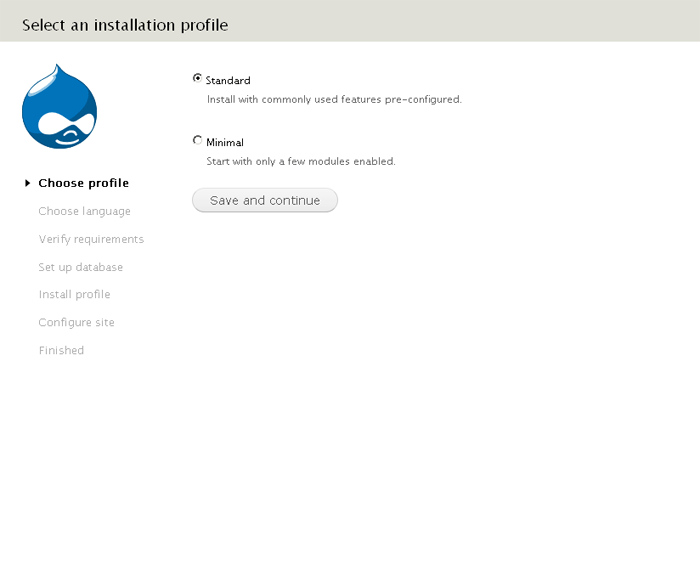
| #41 | install-sidebar.png | 19.42 KB | sun |
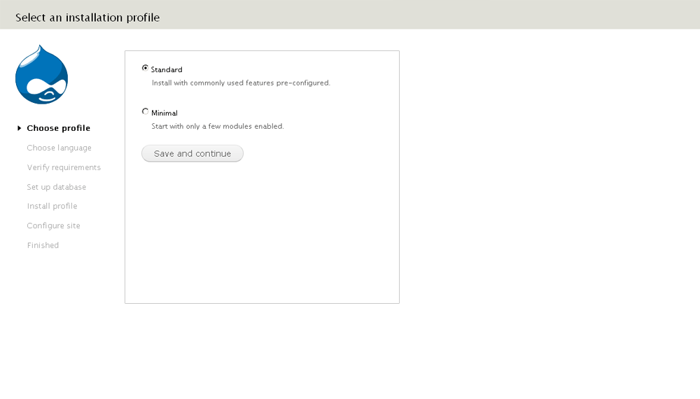
| #36 | mockup_installer.png | 32.36 KB | aspilicious |
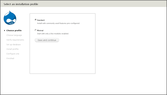
| #31 | D7-misaligned-installation-screen.png | 22.69 KB | David_Rothstein |
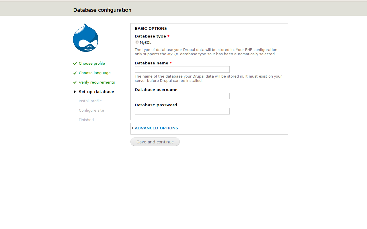
| #31 | D6-installation.png | 41.27 KB | David_Rothstein |


Comments
Comment #1
Gábor HojtsyThe reason it is on the right is that it is less important then the actual forms and other content displayed IMHO. I agree that the Druplicon looking right looks bad at the same time :)
Comment #2
Bojhan CreditAttribution: Bojhan commentedMoving the whole block ? What about just moving the direction of Druplicons face? Still find it somewhat scary to have an alien looking over me installing :P
Comment #3
timmillwoodHere is a patch that moves the sidebar_first region to the left instead of the right in maintenance.
Comment #4
catchDruplicon's face always faces right, I'm not keen on flipping the image. Can we have a screenshot of #3?
Comment #5
Dries CreditAttribution: Dries commentedFlipping the image is not recommended because it could dilute the brand. We always want Druplicon to look in the same direction. I think Tim's patch in #3 is the way to go, however, I haven't taken it for a spin yet.
Comment #6
timmillwoodScreenshot of #3.
Comment #7
timmillwoodAnother screenshot of #3 to give similar context to Dries' screenshot.
Comment #8
chx CreditAttribution: chx commentedWe had it this way in six. So we want to change it back? I kinda support it -- but then again maybe not because of #1. What about just making an animated Druplicon turning around :D
Comment #9
catchWhile I think #1 is valid, the counter arguments are that the left column is the same as left navigation on a lot of websites - which is rarely more important than the main content, but very common, also this means the main content is put further towards the center of the page, which isn't a bad thing at all.
Comment #10
timmillwoodMaybe we put Druplicon on the left and the task list on the right?
Comment #11
Damien Tournoud CreditAttribution: Damien Tournoud commentedI suggest we remove the Druplicon from here. It simply doesn't fit.
Comment #12
Bojhan CreditAttribution: Bojhan commentedI should have added a a smiley to my comment, obviously we can't move a logo around (failed at being funny)
Anyway, seems rather strange to move a whole sidebar over the direction of a face (I agree if this is a highly visual decision) but it seems rather easy. The reason its on the right as clearly explained in #1 is because it should not hold the same visual importance as other stuff we normally put on the right, especially if we continue this pattern into Drupal core (we need to be aware of possible mulitstep forms in core - that would have to be exposed in Seven on the right).
So lets get the wordmark in, I think that was the original goal anyway.
@chx That seems like the best option :D
Comment #13
catchWe can't get the wordmark in the CVS checkout, because that would involve it being GPL-ed. However if it's in the tarball (which is on the cards afaik, but probably needs an infrastructure issue opened), then does this even matter?
Comment #14
Damien Tournoud CreditAttribution: Damien Tournoud commented+1 for putting the wordmark in there. Is there any reason not to release it in GPL? After all, you cannot reliably protect a wordmark anyway.
Comment #15
catchThere's a whole series of posts about the wordmark in #547068: D7UX: use Seven for installation / updates
Comment #16
timmillwoodI guess the advantage of putting the wordmark in is that new users to Drupal will see a similarity between Drupal.org and the product they are installing. Where as Druplicon will be somewhat unknown to new Drupal users.
Although it will be sad not to see Druplicon.
Comment #17
yoroy CreditAttribution: yoroy commented#605710: Decide on if and if so, how to implement the Drupal wordmark in core
Comment #18
chx CreditAttribution: chx commentedAre we going to ban jeans and t-shirts from drupalcons and mandate black tie?
Comment #19
Gábor Hojtsy@chx: the jeans story is discussed in #605710: Decide on if and if so, how to implement the Drupal wordmark in core as pointed out by @yoroy.
Comment #20
rmontero CreditAttribution: rmontero commentedThe Druplicon is such a cool logo that it looks great either way.
One thought though, why not use the one that's looking straight at you?
Comment #21
kika CreditAttribution: kika commented1. Let's drop the idea flipping Druplicon icon. This will not happen (brand dilute).
2. It miiight be considered putting completed steps block to the left. It's in the left in D6. When that decision was made -- was it part of Mark's design?
I am personally indifferent for 2. It does it's work in both cases.
Comment #22
Gábor Hojtsy@kika: Mark's latest design is posted at #605710: Decide on if and if so, how to implement the Drupal wordmark in core (the evolution which you can track at #547068: D7UX: use Seven for installation / updates - originally without the wordmark / Druplicon).
Comment #23
Dries CreditAttribution: Dries commentedCommitted this patch for now, but keeping the status at 'needs review' so we can continue the discussion.
Comment #24
David_Rothstein CreditAttribution: David_Rothstein commentedThe idea here is good, but the implementation that went in seems like it needs work - why are we putting the task list front and center like that?
The attached patch moves it to the left where it is more out of the way. Note: I have only tested it on Firefox, but seems pretty straightforward.
Before patch:
After patch:

Comment #26
Dries CreditAttribution: Dries commentedThat looks better indeed. Now the testbot is back, let's wait for test results.
Comment #27
jbrown CreditAttribution: jbrown commentedHow could a CSS-only patch cause a test to fail?
Comment #28
eigentor CreditAttribution: eigentor commentedWhen I check out drupal, I do not see the outline around the main region, so it looks very disoriented.

The left-aligning looks good on the screenshot, but on a large screen this makes up for a very weird use of real-estate:

Am not a big fan at all of having the list on the left, it felt much more natural on the right side.
Sure the druplicon facing away (with horror of all these amateurs trying to install his beloved system :P )
is not good, for me the information-presentation would be more important.
But I see... Ack ack classical bikeshed-thread, and only because we got our hot new wordmark protected...
So my vote for keeping it centered and getting me to see the outline.
edit -- The outline is visible on some pages, but not on all, especially the first one --
Comment #29
eigentor CreditAttribution: eigentor commentedImage with border for left-aligned version so one can see the limits of the screen.
Comment #30
eigentor CreditAttribution: eigentor commentedonce more, sorry, one cannot edit attachments...
Comment #31
David_Rothstein CreditAttribution: David_Rothstein commented@eigentor, either you didn't clear your CSS cache when you made those screenshots, or something is wrong with the patch on certain browsers.... but your screenshots are missing the key improvement, which is that the headline (e.g., "Select an installation profile") is supposed to align with the main page content, not the task list. That is the key feature shown in #24.
See the first attached screenshot for a particularly bad example (from current HEAD) of what happens when it is not aligned. We really need to fix this :)
I guess you are right that centering this on the page is better than left-aligning it. Ideally what we want is to center the content but have the task list jut out to the left of it, but I'm not sure how simple that is. Worse case, we can center the whole thing (as in D6 Garland - see second attached screenshot), but to my eye that looks somewhat lopsided because the space on the left and right side is not equal.
Comment #32
aspilicious CreditAttribution: aspilicious commentedCan't we close this? I think everybody loves the current situation...
Comment #33
yoroy CreditAttribution: yoroy commentedI'm certainly not happy with the current situation. Druplicon on the right was better, since in general people focus on the left side of the screen, which previously showed them the task at hand but now shows them the static part of the info. Unnecessary focus on the branding instead of the interaction. Also: it's too big and not well-aligned, should align with the text in the list, not the list markers.
Comment #34
eigentor CreditAttribution: eigentor commentedI'm with yoroy on this.
If we have druplicon on the left hand, let's at least align it correctly or be consequent to have a border around the content everywhere and not just somewhere.
Comment #35
yoroy CreditAttribution: yoroy commentedWe don't put outlines around the main interaction of a page. It's a guideline we should probably communicate better :)
Comment #36
aspilicious CreditAttribution: aspilicious commentedSomething like this? See screenshot (I know we can't flip icon, just a mockup)
I don't know... druplicon seems so "alone" then.
About the border, I think we agreed *NOT* using a border in seven theme when it's not necessary, border is used to group regions in seven theme, on some installer pages we only have one set of data so it's not necessary to put an extra border around that set.
Personally I dislike the border very much.
But I learned that mostly others have different opinions.
Comment #37
yoroy CreditAttribution: yoroy commentedNah, there's no reason to make this a 3 column layout.
My preference would be to revert to the initial situation: druplicon and list on the right, then make druplicon smaller and better aligned.
This is the installer, people haven't even succeeded in getting Drupal up and running, so we should get out of the way as much as possible. Right now, druplicon and the list are (more) in the way than in the previous situation.
But we could start with the alignment and sizing first.
Comment #38
eigentor CreditAttribution: eigentor commentedAh, this entire thing brings the discussion up again, why the druplicon is facing away from the content and it is not good him showing such lack of interest. Reversing the Druplicon is even worse and won't get in. Idea for that, yoroy?
I think I can live without outlines :P
Comment #39
yoroy CreditAttribution: yoroy commentedThat's why I'm not pushing too hard to revert this, though I think with a smaller size, this problem will become smaller as well.
I'd like to see a patch that improves alignment with a smaller druplicon.
Comment #40
David_Rothstein CreditAttribution: David_Rothstein commentedWe definitely still need to fix the alignment problems that were introduced here - see #31 for an explanation. I think that screenshot qualifies as a bug that would go into the "major" category, if one existed....
The patch in #24 does that and also has the effect of putting the user's focus back on the main page content, which is where it belongs. A smaller Druplicon might not hurt either :) Otherwise, seems like we just need to fix the issue @eigentor brought up (entire page content should be more centered so it looks OK on big monitors) and we are in good shape.
Comment #41
sunI'd suggest to resolve this issue this way:
Comment #42
Bojhan CreditAttribution: Bojhan commentedI think the actual fix here, is to use the Drupal wordmark.
Comment #43
chx CreditAttribution: chx commentedWe discusses that previously, it's a legal no-go, the wordmark is not GPL and Drupal is.
Comment #44
Bojhan CreditAttribution: Bojhan commentedI'd suggest to just fix the alignment and make it smaller then, as suggested in #39. I feel little for the druplicon in the header (to me it looks totally wierd aesthetically) and moving the wizard (although its possibly sun's huge screen but the steps now feel disconnected).
Comment #45
jhedstromPatch needs a reroll, if this is still being pursued.
Comment #46
cweagansComment #47
LewisNymanThis is fixed right now.