
This patch adds the slate theme that is an initial implementation of some of the D7UX design ideas for the core Drupal admin theme. The theme is best used in conjunction with admin.module module (http://drupal.org/node/484820).
The patch should be applied from the Drupal root. The tarball contains images for the theme and should also be untar'd from the Drupal root.
| Comment | File | Size | Author |
|---|---|---|---|
| #131 | d7-seven-fieldset-bugs.gif | 9.66 KB | Alan D. |
| #120 | u.patch | 1.08 KB | chx |
| #119 | u.patch | 2.17 KB | chx |
| #114 | d7ux_theme_09_testfix.patch | 30.72 KB | Gábor Hojtsy |
| #112 | d7ux_theme_09_testfix.patch | 29.21 KB | Gábor Hojtsy |


Comments
Comment #1
rickvug CreditAttribution: rickvug commentedBig +1 here on both the concept and lightweight theme style provided. I've been using the admin module over the past week and have found the standardized interface a joy to use. I do have a few nit-picks and ideas for improvements that I will file as separate issues for that project (assuming that you are keeping the D7 patch in sync). I have yet to apply this D7 patch.
I anticipate that some may not like the idea of an administration theme in core, considering it bloat. For ordinary users, I think a standard admin interface is an expectation... it maps to their expected front-end/back-end expectations. I also believe this to be a boon to designers as theming the administrative area is laborious and often overlooked, giving end users a sub-par user experience when installing various themes.
Comment #2
Stefan Nagtegaal CreditAttribution: Stefan Nagtegaal commentedScreenshots please?
Comment #4
lilou CreditAttribution: lilou commentedSetting to 'needs review' - testbot was broken.
Comment #5
NaheemSays CreditAttribution: NaheemSays commentedThere are other reasons too. My main problem with an admin theme is that it breaks the flow and consistency of a site - things are no longer where they were before and for me that is enough to make having an admin theme be a bad thing(TM).
(Wordpress is considered very usable by many, but my users refused to take part on the site/content side of things because it confused them. They are very happy with the way Drupal does things. And these are NOT experts!)
Another argument is that If the theme is good enough, it should be added as a generic theme, maybe even with "use on admin pages" ticked by default to cover others, but making it the only option or not allowing the same theme to be used for the rest of the site I would not be a fan of - after all if the theme is good enough for complex pages, it should be good enough for the rest too.
It all depends on where they are coming from and what they want to achieve. I mentioned this in another issue (for the admin header), where I asked where you would show the admin theme.
As an example, creating new content:
- Adding a "site page" - that would be considered backend by most users.
- Adding an article - would be backend if it has a strict workflow with steps to get reviews, approvals etc. On a simpler site however, it would NOT be backend.
- Creating a blog or forum topics - in most cases this would be considered front end tasks.
Do you want end users to be thrown into a different site where everything has been moved around, nothing where they expect it to be?
I think when it comes to usability, a simple question needs to be asked: Are we doing this because it make things easier/better, or because other softwares do it?
Comment #7
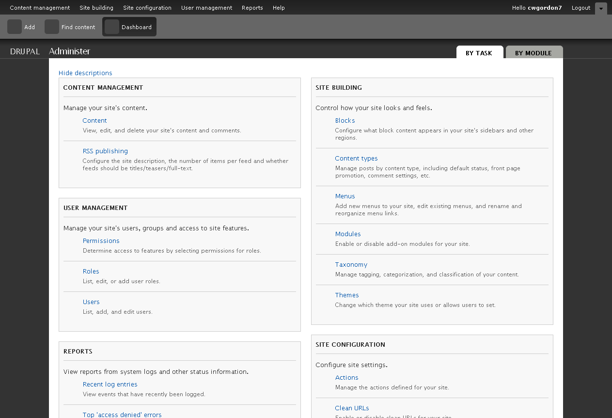
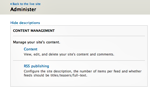
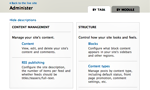
Gábor HojtsyScreenshot on http://drupal.org/node/484820 : http://drupal.org/files/issues/admin_slate.png Also, http://drupal.org/project/admin is a Drupal 6 version of this to test.
Comment #8
xmacinfoCan someone reroll this patch? :-)
Comment #9
mcrittenden CreditAttribution: mcrittenden commentedSubscribe.
Comment #10
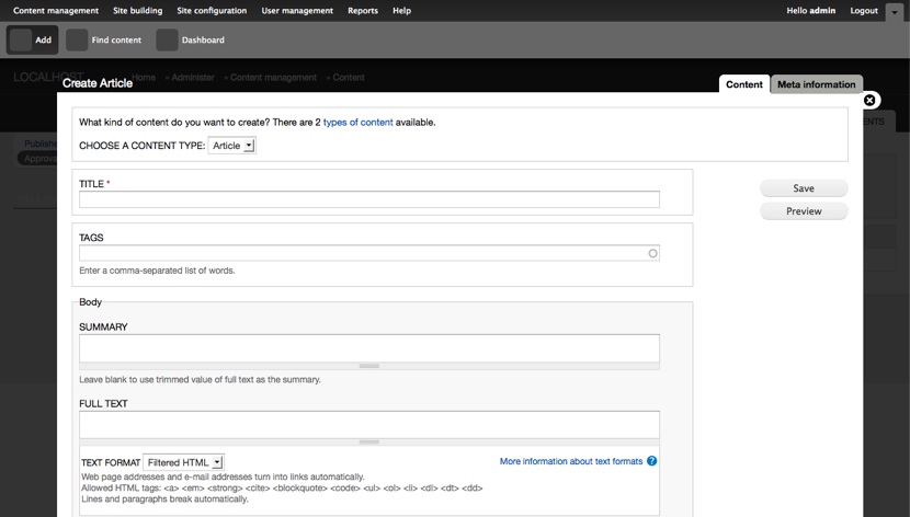
cwgordon7 CreditAttribution: cwgordon7 commentedHere is an updated patch, the images from above are still current. This patch is a combination of yhahn's "slate" theme and Gábor Hojtsy's "overlay" theme, and retains the name "slate". This is a rough attempt, and I welcome feedback (and updated patches!) I also tried to clean up both themes' code to comply with Drupal's coding standards, fixed a few bugs with the slate theme, and discovered several core bugs along the way, which makes me think that even outside of the scope of an admin theme, it would be great to have another theme in core so we can catch bugs in the theming system more rapidly (automated tests would be ideal, but even with automated tests, it is impossible to test everything).
It might also be nice to have another theme in core with example code in it for themers to copy. I supported removing some of the old themes from core because they were outdated and ugly, but a mere two themes in core is a bit minimal - I'd love to see one or two more nice, standards-compliant themes in core to encourage Drupal theming.
I tested the updated "slate" theme on Firefox, Opera, Google Chrome, Safari, and Internet Explorer, all on Windows.
I'm looking forward to hearing your thoughts!
Comment #11
NaheemSays CreditAttribution: NaheemSays commentedThe sidebars are almost unreadable atm and the buttons do not seem to be themed properly either.
Attached is a screenshot of what I see. Is the patch missing some changes or is this how it is supposed to be at this moment in time?
Additionally when the admin menu toolbar is hidden, the top of the theme is is under the admin menu.
Comment #12
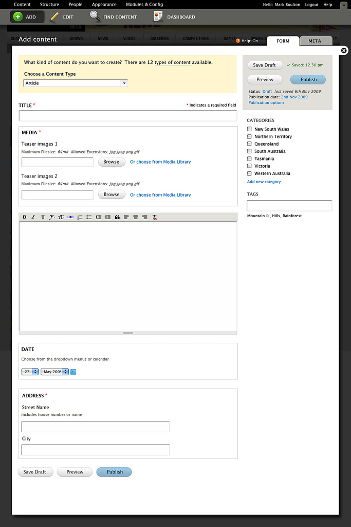
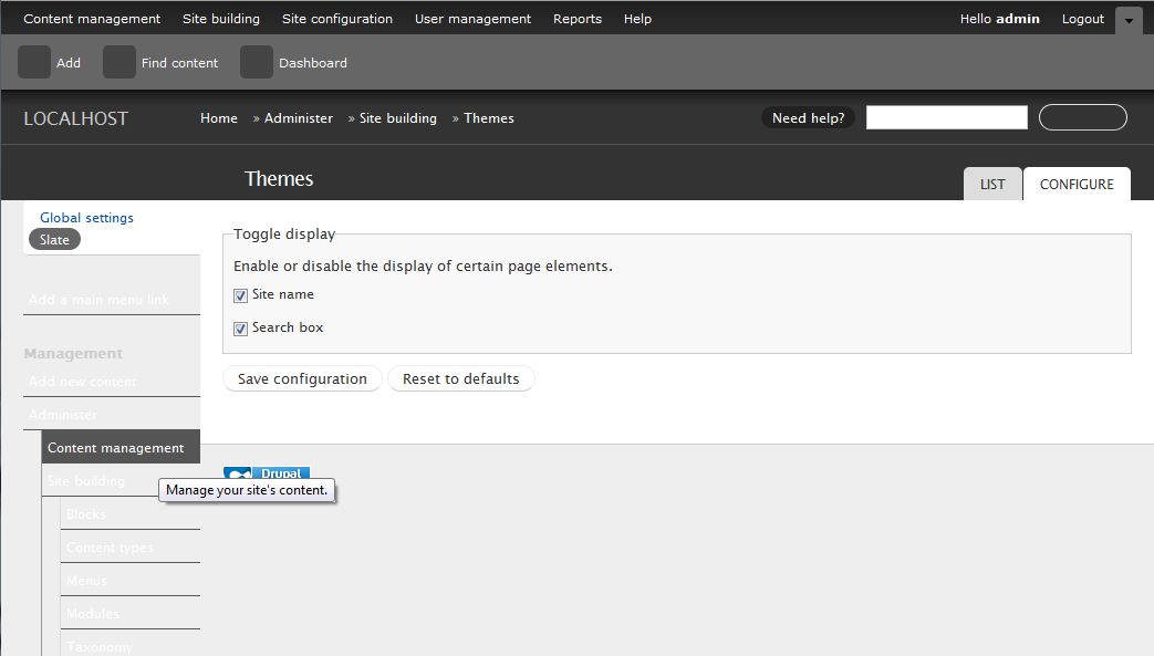
Gábor HojtsySome of how this theme looks was taken from the d7ux.org mockups, but it is not implementing the mockups per say. Putting it in context with our overlay, I've added some styles, so the extra navigation elements are not displayed in the overlay and got this for the node form:
Also, the non-overlay version has little resemblance to the overlay version (eg. tabs look quite a bit different, navigation looks richer which will not have use once the simplifications of the d7ux UI are in place):
Comment #13
Gábor HojtsyHere is the d7ux content mockup as a comparison. Look how the buttons look different, form labels are not only caps but also bold, fields having no extra borders, etc.
Comment #14
Gábor HojtsyAlso, with the current theme, Safari users lack any rounded edges on the buttons. This makes them quite hard to notice even. Rounded edges work on Firefox as demonstrated above.
Comment #15
NaheemSays CreditAttribution: NaheemSays commentedI can't help but notice how the mockup in comment 13 is inspired by Wordpress. (who else would separate tags and categories?)
I would also say that personally I would like the slate theme to be a good useable theme that can easily be used for the full site too - if its good enough for the admin screens, it surely would be good enough for everywhere?
Comment #16
xmacinfoI think we should not duplicate exactly what's done by the D7UX theme. Separating Tags and Categories may work for WordPress, but not for Drupal. We have a much more powerful taxonomy system and we should not limit our users on a mockup.
The D7UX theme also tends to hide information behind tabs and do not offer a quick overview on the main page, like we develop with the vertical tabs.
The D7UX do not grasp the context of users, meaning that some users might see more (or less) content than other users. Instead the D7UX team opt often to create a tab, so a user might see a tab and the other not. The new Drupal.org Dashboard tab is an example.
In typical Drupal site, we do not require to create a tab so show content. Instead, we can display the information using block in context of the user. So a user might see more (or less) information on a single page without needing to do a single click.
I see a lot of good things coming up from the D7UX. But it does not mean we must stick with their design, but rather improve on their's.
As much as we enhance the new Drupal Admin module, as much the "slate" theme must be enhanced from the D7UX theme.
Comment #17
xmacinfoSpeaking of the breadcrumb, did the D7UX theme forgot about it? Did they remove it on purpose? If it is an omission, where should we display the breadcrumb?
I believe that we should keep the breadcrumb on the overlay, at least until we find a better placement. But we must keep it.
Same thing for the admin menu (not the admin menu module). We must keep the menu displayed. If we do not do this, we enter in the click, click and click to do this or that. And power user will instead type directly in the location bar.
Or better yet, the new admin menu will be there for new users, and power user will disable it in favor of the admin menu module.
Comment #18
catchI mis-spoke on breadcrumbs - I'm fine with removing them as long as tabs work (which they currently don't on vocabulary and content types administration, but I don't think breadcrumbs work there either at the moment).
@xmacinfo - nothing stops you from setting up a 'categories' vocabulary in Drupal, alongside the default 'Tags' vocabulary - there's even an issue to do this somewhere which predates d7ux - simply to give an example of the two common use cases for taxonomy module. Those two fields, afaik, should be seen as examples of possible fields which would be shown on the node/add form, not something which has to be there all the time.
As to tabs, we need to fix the permissions issues on admin/content/content and admin/content/content/comments - but apart from those, having comments as a tab makes loads of sense - for example if trying to mass delete posts by a spammer it makes sense to be able to quickly move between those screens.
Comment #19
cwgordon7 CreditAttribution: cwgordon7 commentedHere's an updated patch. This should address Gabor's feedback and the additional feedback of #15-#18. Changes:
- Included more styles to make minor theming details more closely match the mockup.
- Made the theme one column rather than two column - as it's an admin theme, the second column isn't really needed, Gabor argued. I tend to disagree, but I will defer to his judgment on this one.
- Removed the breadcrumb and shifted the rest of the page upwards to remove unnecessary blank space.
- Used images instead of border radius CSS properties.
- More coding standards updates, more images added.
- The idea here is to have the theme be sort of a degraded version of the overlay in the mockup, so the single column is centered to help achieve that.
- The content is no longer hidden when the admin menu is collapsed. (bug fix)
- The javascript is properly added and the help text display works properly now.
- CSS classes are now properly added to the body tag.
No changes to the node form are included to match the mockup - that is almost certainly for a different issue because it will most likely be very controversial.
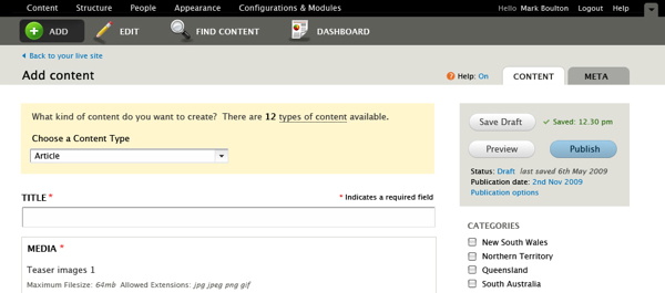
Here's a screenshot showing what the theme currently looks like:
Comment #20
Gábor Hojtsy@xmacinfo et al: we are not implementing the theming for the node submission page here, that screenshot was posted as a generic example of elements on a themed page. We could/should reference the other pages which show tables, etc. and demonstrate how they look. There is a style guide which is about to be posted, but it is not here yet, so we work off the elements shown on the mockpups.
Comment #21
cwgordon7 CreditAttribution: cwgordon7 commentedSlightly updated patch to fix a minor bug, the images above should still work.
Comment #22
Gábor HojtsyWorked on this theme more. There are still various differences between how this implements certain elements and how it is on the d7ux mockups (like help text presentation), but this patch resolves lots of things which were not matching in the previous one, including:
- the color of links
- the extra border around form items
- that form item labels were not bold
- that tables were not styled like on the mockups (including new images to support that styling and wholly clickable table headers for extra convenience)
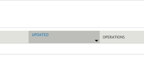
- that pagers were not at all implement how designed (this requires a core patch from #514914: Re-add removed feature of $limit "passing" for themers, which restores a feature Drupal recently lost in Drupal 7) - also added two new images for the pager
- that there were extra JS code on stuff not anymore in the code
- that page.png was there but not actually used anymore; and that the page was #333 text on #333 background by default
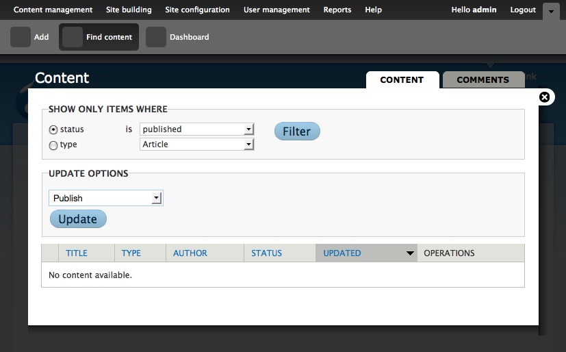
I believe this theme still needs work but is up for review regardless :) This is how the corrected tables styling looks (in the overlay) with the "pager" (note that dblog specific table cell coloring does not work well yet, but the generic table layout/coloring is right).
Comment #23
xmacinfoI still don't know the rationale about removing the breadcrumb and not displaying a menu.
In your screenshot, how do we go from one report to the other? how can the user see at which depth in the interface he is?
Hidding information is counter productive and certainly not user experience friendly.
D7UX are not the Drupal community. They are missing the point on a lot of usability issues, which are well proven. I believe that we must improve on their design and not be stuck with their shortsightedness.
The look is impressive, but not their usability choices.
Comment #24
cwgordon7 CreditAttribution: cwgordon7 commentedI tend to agree with xmacinfo's points - I don't think the left sidebar should have been removed, nor the breadcrumbs. However, Gabor did make a few nice arguments that deserve to be represented here:
- This admin theme is meant to be a sort of degraded version of the overlay, and having the menu/breadcrumbs would be inconsistent with the overlay.
- It's important to use the admin theme for administration pages to create a clear distinction between administrative pages and "content" pages.
- You can use the admin menu in the header to navigate to different pages.
For this third point, however, I would argue that there's no harm in adding more than one method of navigation, but Gabor suggested that we try to keep the interface as simple as possible.
Comment #25
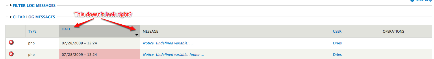
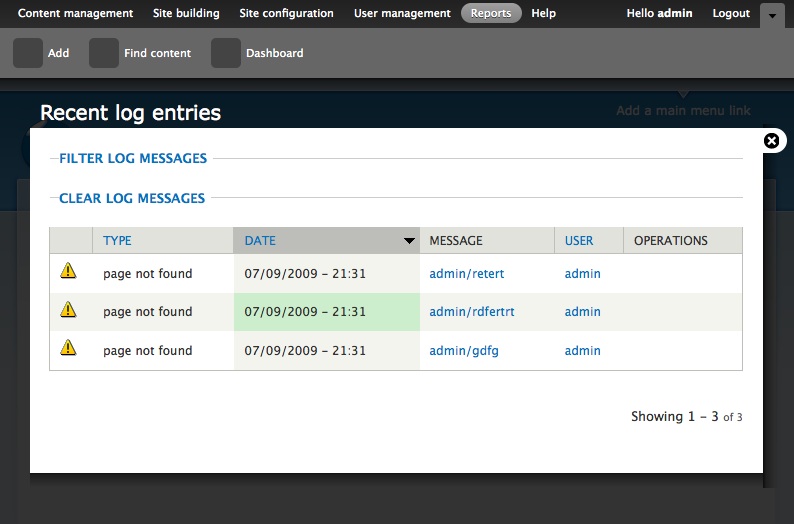
xmacinfoPop-up/overlay content versus main content should be reviewed.
Having content show up in a pop-up is not productive, see the example of the Recent log entries. A typical entry would list 50 or 100 entries per page, not 3.
We should keep pop-up for short form, not full-length form or reports! If we want to use the pop-ups for those full-length pages, we must also duplicate the close button (x) at the bottom of the form.
Are all those pop-ups part of the theme or part of Drupal core?
Comment #26
batsonjayI'm not a D7UX participant. I'm not a D7 coder.
But I'm pretty sure about two things:
To really make a dramatic improvement in Drupal usability, I would think the community would want to embrace a team of UX pros, and give accommodation to what they say - even (especially?) if it seems contrary to what the community's natural approach would be - else we'll be saddled with a similar, technically-centric UX approach (where we are now) for another 2 years.
It is not my intent to actually influence the conversation about breadcrumbs, or whatever. It is not my intent to personally bash xmacinfo; his long-time work on Drupal means he, and his ideas, deserve respect.
But, so do the ideas of D7UX. When I read Jacques' comment, I felt the pain that Leisa must feel on a daily basis. The Drupal community would really benefit from reducing what it takes to earn respect from the community cognoscenti. At the Design4Drupal conference in Boston, it was easy to find designers that said they don't feel very welcomed by the current community because the community only respects people who contribute patches. This isn't healthy (or fair). Work time spent investing in improving Drupal deserves to be equally valued.
My only goals in writing this too-long, and possibly out-of-context and maybe inappropriate post are: (i) To try to minimize the personal attacks ("shortsightedness") on people who really are pretty good at what they do, and who care a lot about getting it right; and (b) suggest that maybe the community's ideas may not be the right way to go -- maybe it's possible that fresh eyes from somebody outside may have better ideas. (E.g. - it's entirely possible that tags are enough for the general case - that maybe the sophistication of Drupal's extensive taxonomy system is only needed in the marginal case. Etc.)
<simmer>Oh, and P.S.: May I ask sincerely: What do UX designers have to do to be called "part of the community?" Haven't Leisa, et. al., spent as many hours doing work on Drupal as many coders have? Their contributions involve just as much competent technical skill as people who have spent equivalent time implementing HTML/CSS/PHP..., and this currency is valid coin for paying dues to enter the Drupal community club. IMHO.</simmer>Comment #27
Bojhan CreditAttribution: Bojhan commentedsubscribe
Comment #28
Bojhan CreditAttribution: Bojhan commentedSlackers, lets keep this stuff tagged.
Comment #29
Gábor HojtsyUpdated patch includes:
- Eliminate unused items which were only in the CSS or images. Including the sprite of which only the list item marker was used.
- Made the single page version look much more like the overlay. Same tab treatment, similar surroundings.
- Moved help into the page to align with how the overlay works. Removed help toggle for now, since that should be implemented in concert with the overlay and should also be an umbrella to dynamically provide toggle for description removal on permissions page and similar pages.
This is how it looks on a single-page and in-overlay output:
Comment #30
leisareichelt CreditAttribution: leisareichelt commentedit's so exciting to see this coming to life!
just a quick note to say that in many ways we feel as though we (Mark Boulton & I) are seeing this properly for the first time as well.
There is a lot of thinking and strategy behind much of the design here that we're happy to point you to if you've not been following the D7UX discussions (as I'm sure many of you have not have the time/opportunity to do) but there are also a lot of things that are going to come out in the wash as the theme is coded and we look forward to working with you to tweak and iterate some of these things until they're resolved.
So, we really see this as still a work in progress from all of our perspectives - we're *really* looking forward to having more of the theme coded and available so that we can start giving it some detailed testing both ourselves and from the various audiences who will be using this interface - yourselves of course but also our Verity's and Jeremy (ref: http://www.d7ux.org/who-is-d7ux-for/)
Comment #31
catchOn breadcrumbs / additional menu I think we need to look at why they're currently going to be conspicuously absent.
If you to admin/content/taxonomy, then click on a vocabulary, then click on 'list terms', then edit a term - you're almost certainly going to require breadcrumbs, the address bar or the back button to get in and out of those various screens. If term administration gets the 'flooded state accordions' treatment, then maybe not - but there's many other places - 'image styles' (imagecache presets), language system, content types not to mention contrib modules which have their own 4-5 screen administration sections with 2-3 levels of depth. At the moment, Drupal's administration interface is about the only place I use breadcrumbs, ever. It'd be nice to have everything in accordions instead - but that still has to degrade, and we can't rely on contrib to do it across the board (CiviCRM and Ubercart for example).
However, I think we can quite happily put the theme in with no breadcrumbs, test it, and post amusing screenshot walk throughs of how broken some of our current interaction patterns are with out them, then decide whether we put them back in or more preferably make all the places where they're required work without them.
I really, really like the idea of having the theme full-width - as we try to make the content/modules screens handle more operations, that width is going to be important. Nothing stops there being a footer/below footer region if someone really, really needs blocks on /admin for various purposes.
Comment #32
xmacinfoIt' nice to see the latest example in page and in overlay.
How will overlay versus in page be decided? Will there be An automated mechanism or will each screen be coded manually through this theme?
Comment #33
webchickSubscribe. And I basically agree with everything batsonjay said. It's totally fine to raise questions/concerns about these concepts, esp. when bolstered by actual data and really especially when combined with alternate suggestions that both address your concerns and keep the overall spirit of the UX work. But we don't need any of this "us" and "them" or "developers" vs. "designers" BS.
We're all one big, shiny, happy (if sometimes slightly dysfunctional ;)) community of people, each putting whatever particular talents/skills/ideas we happen to possess into making Drupal more awesome. Let's not forget that.
Comment #34
Dries CreditAttribution: Dries commentedIn the interest of moving forward, I think we should put this theme in after it passes code review. We can worry about breadcrumbs and/or additional navigation in a follow-up patch. We won't succeed with D7UX using 'big-bang style patches' -- let's just agree to fix the breadcrumb navigation as a follow-up patch (if necessary).
Comment #35
SeanBannister CreditAttribution: SeanBannister commentedSub
Comment #36
Gábor Hojtsy@xmacinfo: the theme is used with the overlay by default (if the overlay module is enabled). If you happen to not have JavaScript enabled or turn off the overlay module, then you get the full page theme experience.
BTW I've been discussing the full page experience with Mark and Leisa, and seems like they suggest we should not make it look like an overlay, so there is no confusion of what mode you are in. I've asked for mockups.
Comment #37
babbage CreditAttribution: babbage commented+1 batsonjay.
Surprised by not making overlays and single page mode look the same—presuming they are offering the same functionality. The transparency would seem to be enough. But bow to wisdom of Leisa and Mark.
Damn, this is going to rock! :D
Comment #38
Linea CreditAttribution: Linea commentedsubscribe
Comment #39
Todd Nienkerk CreditAttribution: Todd Nienkerk commentedThis is great work! Wow. Thanks to everyone who put so much work into this slick, friendly interface.
Dries emailed Aaron Stanush, mortendk, and me to get our input on the implementation of this theme. I don't have the chops to re-roll patches based on additions to DRUPAL--7, so here are notes with line numbers (where applicable) based on Gabor's patch in #29.
From
slate.info:vertical-tabs.csson line 8 could use a comment. It would be useful to remind people that naming a nonexistent CSS file removes it from the stack.From
page.tpl.php:$ie_stylesshould include the IE conditional code (<!--[if lt IE 7]> ...) in its definition intemplate.php. This would allow the theme a bit more flexibility, as all IE styles are currently applied only to versions less than IE7. If someone wanted to create an IE7 or IE8 stylesheet, they would have to override both$ie_stylesandpage.tpl.php.if (!empty($foo))condition. Can this be shortened toif ($foo)? Do we even need a conditional here, since it's just printing a variable? I suggest simplifying this whole line to:<?php print $admin; ?>$titlein an<h2>element. Why isn't<h1>used in this instance? Proper document hierarchy requires an<h1>before any lesser header. Thoughts?From
template.php:clear-block. This was changed toclearfixper #371231: Rename clear-block CSS class to clearfix.<label>element. I don't think this is a valid use of<label>. What's the rationale?slate_node_add_list()is a bit wonky. Why have list items that contain only<label>a<div>elements? This link/description structure is perhaps better achieved using a definition list. Thoughts?From
style.css:0pxcan be replaced with0to save a few bytes.From
reset.css:0pxcan be replaced with0to save a few bytes.clear-block. These should be changed toclearfixper #371231: Rename clear-block CSS class to clearfix.Comment #40
Todd Nienkerk CreditAttribution: Todd Nienkerk commentedFollow-up to my point regarding
vertical-tabs.cssabove: Excluding that CSS file breaks the vertical tabs interface completely. Are there plans to provide different CSS?Comment #41
eojthebraveQuick review of the patch in #29, haven't installed it yet just read through the code.
First word in the sentence needs capitalization in both of these.
+/* remember to highlight inserts somehow! */&+/* remember to define focus styles! */+ * Specifically targets form elements which browsers oftentimes giveneeds a space between often and times
There are a few places in the CSS where we might want to use single line declarations.
could be
margin: 0 0 20px 10px;and
could be
margin: 0 8%;There are others as well.
HEX codes should be consistent throughout. Most are lowercase letters, but there is at least one spot where you use capitals.
+ border: 1px solid #BEBFB9;The property declarations in your CSS should be in alphabetical order.
Not 100% sure about this one, but I think that
+// $Id: template.php,v 1.1.2.1 2009/06/05 05:46:18 yhahn Exp $should just be
// $Id:Also, Subscribe!
Comment #42
babbage CreditAttribution: babbage commentedProposed standards here (proposal status only): http://drupal.org/node/302199
Discussion here: http://groups.drupal.org/node/14421
There doesn't seem to be a consensus yet that CSS property declarations should be in alphabetical order.
Comment #43
Gábor Hojtsy(Note: Wrote a long summary originally just to see browser crash. Eh.)
@Todd: vertical-tabs.css was missing. Now added. All other suggestions implemented, except:
1. the "remember" items in the reset.css are notes to the implementer (Young picked this file up from Eric Meyer)
2. did not migrate node type selection to definition lists; node type selection is still under debate and the d7ux mockups offer a dropdown on top of the node form instead for example
@eojthebrave: comments changed, hex fixed, $Id$ is fine as it is, CVS commit changes it to be right anyway. Did not merge margin and padding specs, since that would require checking whether they depended on inheriting that from another declaration. Also, as said, alphabetic ordering is still in debate, did not change this.
Also implemented standalone page design from Mark Boulton. The idea is that we should not simulate an overlay since that would evoke wrong assumptions. Mark persuaded me to use border-radius for the tabs, which eliminates the images for them.
Mark's design:

As implemented (lacks the help button since that is targeted as a follow up patch once we have the theme committed):

Comment #45
Bojhan CreditAttribution: Bojhan commentedWhere is this mode for?
Comment #46
Gábor HojtsyUhm, patch was not rolled properly, therefore the fails in tests.
@Bojhan: the theme needs to look different in a full page mode and in the overlay. For example, when used in the overlay, the navigation tabs and the title will appear outside the overlay, and there will be a close button which equals the "Back to live site" link in functionality (in that it closes the overlay and gets you back to your live site). For those who would not like to or cannot use the theme in the overlay, this standalone look is what is visible.
Comment #47
Bojhan CreditAttribution: Bojhan commentedPretty useless mode, but if its for those 1% who don't like the overlay but do like the administration theme I am guessing its fine. And for the non JS mode.
Comment #48
xmacinfoThe page version is far from useless since it let the URL be usable again. In overlay you cannot look at the URL to see or edit the path. We cannot dumb down the whole interface and leave out experts.
Comment #49
Gábor Hojtsy@xmacinfo: more then agreed.
Comment #50
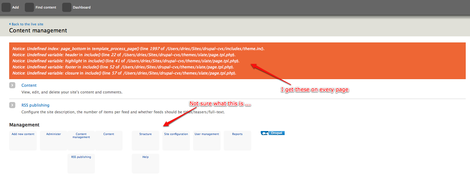
Dries CreditAttribution: Dries commentedCan we clean up the file names a bit? See screenshot.
Comment #51
webchick- This theme is missing a screenshot, unless I missed it above.
- default.profile should set this as the default admin theme.
- Needs a CHANGELOG.txt entry.
- We should add info to MAINTAINERS.txt about who designed this theme.
A few things look very odd, most notably the "Management" menu:
http://img.skitch.com/20090721-m1s77q5ikh9p5jhri5am4a9735.png
and the input format fieldset:
http://img.skitch.com/20090721-c9mbrb4cikmgcwjiqsf56ft54r.png
And pager:
http://img.skitch.com/20090721-jxcapxt9rmmhn7yetcwd3k6ptb.png
Unless this is a weird caching thing on my end but I'm pretty sure I cleared everything?
Code review:
(and throughout reset.css as well)
space between the : and the value.
Is there no way to include the contents of ie6.css in another file? Or is the only way to add conditional styles for IE6 with a separate CSS file?
missing $grddl_profile and all of that other crazy RDFa stuff.
A few lines (like that middle one there) introduce trailing whitespace.
Can we make that a theme variable maybe? That's quite a lot of PHP to toss into a tpl.php file.
I think all regions need to be printed as print render($region_name) ? I could be getting confused tho.
reset.css needs $Id$. Also the formatting of rules are totally inconsistent. Some are on one line, some on multiple, sometimes the } is indented, etc. Can we make this file look much more like Slate's style.css, which does not make me want to cry? :)
Also, do we really care about IE Mac in 2010? :P
Should be just "0"
Should reset.css go into misc/ so it can be called from other themes? It seems like something that might be useful to more than just Slate. Hrm.
Er. Do we really want to add support for proprietary browser extensions? Just regular border-radius doesn't cut it?
Should we maybe do a conditional to make sure we're on an admin path before setting this class? There's nothing that prevents this theme's use on the front end, correct?
$key
Comment #52
Gábor HojtsyLet me just reply to the border-radius issue first, since that one could be a nice bikeshed in itself. If we only use the border-radius property, then no browser will use a border radius, since this propety is not yet supported by any browser (that I know).
Mozilla and Webkit support their quoted properties, which makes this reach Safari and all Webkit based browsers (such as Google Chrome) as well as all Mozilla based browsers such as Safari. Rounded corners via CSS are not supported in Opera or Internet Explorer. They get the non-rounded corners as fallback. Opera developers suggest we use an SVG background image which simulates the radius (http://dev.opera.com/articles/view/new-development-techniques-using-oper...) and IE developers suggest we use tables (uhm) or nested divs with backround images to round corners (http://blogs.msdn.com/ie/archive/2005/06/23/431980.aspx).
We can obviously just sit back and accept that we should not "innovate" with using browser properties existing in Webkit and Mozilla 4 years ago, but use images instead to fully support other browsers playing catch-up, instead of just providing them a "fallback look". This all depends on what kind of looks do we want to provide for Opera and Internet Explorer users.
Comment #53
Gábor HojtsyOn the screenshot, the standard instructions (http://drupal.org/node/11637 - most of which does not apply, but the sizing applied to be consistent with the rest of the screenshots) result in a very bland image. Attached the image based on this process and one which I think is better (shows more UI elements which were not visible in the top right of the page) but does not fit with the other images. Pick one.
Based on instructions:
Not based on instructions:
Comment #54
Bojhan CreditAttribution: Bojhan commentedWhy don't we show the image with the overlay enabled? Won't that be the 80% use case?
Comment #55
Gábor Hojtsy@Dries: images renamed to button-standard-right.png, button-standard-left.png, etc.
@webchick:
Not an issue with this patch:
- pager still requires #514914: Re-add removed feature of $limit "passing" for themers to work as said above, but I missed to include this note with every patch I posted; unless that is committed, the pager in this patch will not work as designed (in fact it will be broken as you've noted)
Solved:
- on screenshots, see above; patch now includes reference of a screenshot.png, pick one
- added default.profile entry; if people know a better way to enable the theme by default, let me know; I think setting up this admin theme for all content entry will open a can of worms (we actually need per content type settings for this, so user contributed content will be submit int he site theme, not in the admin theme)
- added changelog entry
- spaces added after colons in CSS properties in style.css, ie6.css and reset.css
- RDF related variables added; found that $head_title was not printed high enough (a security problem), also fixed
- migrated back to site code to theme variable
- removed trailing whitespace from css and PHP files, hopefully did not forget any
- reset.css got its $Id$, formatting fixed
- admin class addition removed; it was not used in the CSS and Drupal core already adds that when you are on an admin page, so was superfluous
Disputed:
- not sure that Mark Boulton designing the theme makes him a maintainer; I'd guess he will be around for some time to help fix issues with it, but definitely not like "maintainers" otherwise listed in the document
- I don't see the management menu as you screenshot it; I see it as a plain list of links, which does not reflect their tree nature either; due to how this theme is constructed by Young on reset.css, stuff is not stlyed unless specifically done in the theme, so the management menu appears unstyled for me; this theme is not supposed to have any blocks enabled, so we can get rid of some regions if you think that would be worthwile to avoid such issues; also, I have a patch at #511258: Do not enable the management menu by default which would not enable the management menu by default, since except the content creation, it has no usefulness if the toolbar is on
- on ie6.css, a bit below your note, you say we should not include proprietary attributes in CSS; now integrating ie6.css to another CSS files can be done with hacks which you don't like, so the answer to integrating that would be no
- $content is not render()-ed in the Garland theme, you are confused there
- on border-radius, see above
Not solved:
- I see some misalignment in the input format fieldset in Safari, but not to the degree you've seen; needs to be fixed
- caring about IE Mac not removed yet; more feedback awaited
Comment #56
Gábor Hojtsy@Bojhan: I'd suspect to be true to how it works, we'd need to update screenshot as D7 progresses. The admin screen as I've screenshot it would not be in the final D7 as planned currently for example. Most other "sexy" pages like the "Find content" pages do not yet look like on the mockups, so were not a good target to screenshot at the moment.
Comment #58
catchGuessing having the admin theme enabled by default is breaking the custom simpletest script PIFR uses to install Drupal prior to running tests. Might be worth splitting that off into another patch just to keep the bot happy.
Comment #59
Gábor HojtsyShould have a conditional around the admin theme default setting for the simpletest environment or need to fix simpletest itself?
Comment #60
catchI edited my post above to clarify, but before I saw your post.
I haven't looked at why it might fail, but it's likely it'll need a patch to http://drupal.org/project/project_issue_file_review - assuming that's the case it might be worth splitting the profile change into a followup patch so we can co-ordinate test framework changes independently of this main patch. I've also got a bad feeling that at least some of our tests are dependent on Garland - at least things like checking breadcrumbs are likely to break, which would be another reason to do this in a couple of passes.
Comment #61
Gábor HojtsyAttached patch without the default profile change. Same comments still apply as stated above.
Comment #63
Dries CreditAttribution: Dries commented1. I'd recommend that we use the normal pager (i.e. remove the pager stuff from template.php and the CSS) and that we follow-up with a separate pager patch. It seems like we have a weird split-up here -- let's postpone all pager stuff instead of introducing a broken one.
2. reset.css makes me sad, but it is a much bigger problem to solve ...
3. themes/slate/ie6.css makes me sad too. Proprietary CSS properties and browser-specific CSS hacks are ugly (but sometimes required). For example, I'm OK with using older rounded-corner techniques if that helps us make the CSS more uniform and less hacky.
4. vertical-tabs.css still has spacing issues. Example:
background:#fff;.Some of these issues we can't probably solve in this issue because it would take a LOT more work unrelated of the theme.
Comment #64
catchI'd actually support the proprietary CSS for round corners - it saves nested divs, saves having to load the images on the page, saves the developer overhead of maintaining images (what happens if we change the shade of grey slightly down the line due to an accessibility audit or something), and it's a lot quicker than javascript techniques. IMO the advantages of all those outweigh the disadvantages of a couple of extra lines in a .css file. We have IE6-specific hacks in our PHP critical path to prevent XSS as well.
ie6.css is easily solved by #308865: Drop IE6 support in Drupal core, that's not an argument to be had in this issue though.
Comment #65
Dries CreditAttribution: Dries commentedcatch, fair enough!
Comment #66
webchickI'm also fine with the -mozilla-whatever stuff.. the reasoning is pretty sound. I just brought it up since I cut my teeth on web design back in circa ~1995-1997 and back then it was considered un-kosher to support proprietary extensions, as it just encouraged browser manufacturers to not adhere to standards. Apparently now the consensus is that we don't care as long as it's not Microsoft breaking the standards. ;) I defer to people who have done front-end design in the past 5 years, since I haven't. :)
Makes sense to push the default.profile change if it makes PIFR freak out. I was hoping to roll another UNSTABLE release on Friday though, and was really hoping to have this in and enabled by default by then. :(
Fair enough on MAINTAINERS.txt. For some reason I thought we listed designers there but in looking at it again it appears we do not. Can process designer credit in a follow-up issue. I do think it's important.
It sounds like everything else Dries and I pointed out was addressed. I will try and give this another final review tomorrow, unless Dries beats me to committing it first.
Comment #67
Damien Tournoud CreditAttribution: Damien Tournoud commentedNeeds work for #63 (remove pager, spacing issues in vertical-tabs.css).
Additionally:
Index: themes/slate/reset.css^ Any reason not to move reset to misc/ ?
^ You need to use drupal_substr() here.
^ The path can contain a lot of characters forbidden as IDs or classes. It's probably time to introduce the equivalent of zen_id_safe() in core.
^ That requires an explanation about the differences between this implementation and the standard one.
^ You probably forgot a check_plain() here.
^ Any reason for the two loops here? Also, why not using theme('links')?
^ Same remark as above, that requires an explanation.
Comment #68
Everett Zufelt CreditAttribution: Everett Zufelt commentedI'd love to audit the accessibility of this theme. Is there a testing environment setup somewhere that I can gain access to? Or, can someone give me the exact steps to get my fresh install of head working with this theme (are other patches required)?
Comment #69
mcrittenden CreditAttribution: mcrittenden commentedRe: #67:
I'd vote to stick that in a follow-up issue.
Comment #70
catchPatch already in progess for classes and IDs #464862: Add drupal_css_class() to clean class names and rename form_clean_id.
Comment #71
David_Rothstein CreditAttribution: David_Rothstein commentedFor the most part, this theme looks really really neat... great job!
This is not a thorough review, but I did notice a few things while trying this out:
1.
A standalone URL is not an appropriate way to give someone credit for their work; we should either not give any credit at all here (but instead mention the author in the CVS commit message), or give credit more explicitly; e.g., "this stylesheet is based on the XYZ method by So-and-So" and then "See http://..." underneath it.
In general, this whole file could use a lot more documentation to explain what it is doing.
Also, I'm not sure about the coding style of the "========"?
2.
Similar comments here.
3.
In Firefox 3, I am occasionally seeing massive flickering of the tabs when I hover over them and am about to click on them (for example, the "List" and "Uninstall" tabs at admin/structure/modules). However, I can't reproduce this consistently, so I have no idea what's going on :(
Also, for these two tabs in particular (and maybe others?) when I click back and forth between them I see a noticeable change in the tab position - the tabs do not appear in the same place on the two different screens. Not sure what's going on there.
4.
It seems a little limiting to have a core theme that is not designed to work with blocks at all; they are a major part of Drupal's page layout. Probably there could be a follow-up issue for making them look nicer, though (or like Gabor suggested, limiting the regions or something like that). It looks pretty broken now.
5.
Collapsible fieldsets do not seem to work well with this theme; they do not have any kind of arrow icon to indicate that they are "openable", so there is no obvious way for people to know what to do with them.
6.
This doesn't sound right. The equivalent function in Garland has this:
Maybe go with that here too? (I guess "hook_preprocess_page" would not be correct, since this is a theme, not a module?)
7.
I really don't understand what this is for:
As far as I can tell, this is kind of like a really cheap implementation of breadcrumbs, only without the crumbs :) Specifically, here are the things I see wrong with it:
Suggestion: If we keep this at all, at least change the text to something like "Go to the front page". But why not just remove it? It seems like if we want something like this, we should go with actual breadcrumbs - but it was already stated above that breadcrumbs should not be part of this patch but rather left to a followup.
Comment #72
xmacinfo+ $vars['back_to_site'] = l(t('Back to the live site'), '');I do agree with David_Rothstein, we should either remove this or display the breadcrumb here.
If I have a desktop application, I may want to return to the "live" site. This is not the case here, since we are already inside the "live" site, although doing some administrative tasks.
If we want to keep this, it should display:
+ $vars['home'] = l(t('Back to the home page'), '');or
+ $vars['home'] = l(t('Home'), '');Comment #73
erikjohansson CreditAttribution: erikjohansson commentedJust an FYI to make everyone aware of that the "-moz-" and "-webkit-" prefixed properties are not necessarily proprietary. The -prefix-border-radius properties are just vendor prefixed implementations of a spec that hasn't received "candidate recommendation" status yet. So,
-webkit-border-radius:XXpx; -moz-border-radius:XXpx; border-radius:XXpx;
is the recommended way of using it.
More information here:
http://www.css3.info/why-and-when-browsers-prefix-css3-features/
http://www.w3.org/TR/CSS2/syndata.html#vendor-keywords
Comment #74
mcrittenden CreditAttribution: mcrittenden commentedRe: the "back to live site" link, I'd vote to leave it off completely and wait for the impending breadcrumb patch. Like David Rothstein said, a simple homepage link is no replacement for breadcrumbs and I don't think we should plan as if breadcrumbs won't be implemented (which is what we'd be doing by putting a link in place which breadcrumbs will replace).
Comment #75
Gábor HojtsyUpdated patch, wohoo!
@Dries: D7UX pager code and CSS removed. Vertical tabs CSS code style fixed.
@catch, @Dries: since rounded corners via border radius is fine for the tabs, I've backpedaled into Young's original approach of using border radius for the form buttons too. This has the advantage that we can loose converting all buttons from input elements to button elements to be able to add extra markup and that we lost an amazing amount of weight. Granted, the button images were probably not well exported from Charlie's image editor. But the image zip file with this patch is now only 6k, compared to 150k before. Young's colors were not right though, so I've done some tricks to get the right colors from the mockups. Looks right to me.
Here is how it looks in Safari and Mozilla with rounded corners and without rounded corners (for those browsers like Opera and IE which do not support them):
@Damien: I did not move reset.css to misc for a couple of reasons. It includes a selection of Drupal styles to reset, which I'd bet most themers will have nice time arguing about. See below on fieldsets. I'd assume themers would rather select what to override/reset exactly, and not accept a possibly partial blank-slate like this one (which only considers core markup anyway). Also, it is definitely easier to roll the patch this way. However, you are the second to suggest moving reset.css to misc, but no themers chimed in on that yet.
@Damien: on the site name, IDs, localized options and the two foreach, those were actually all dead code, so I'm glad you found problems in them, so I looked and removed them. theme_button() became dead code and was removed after the button radius conversion as explained above.
@David: Fixed attribution in reset.css and removed ======...
@David: Cannot reproduce the flickering and/or the moving tabs in Firefox 3 or Safari either.
@David: Removed all "unneeded" block regions. Only left content, page_bottom and help.
@David: Eliminated resetting fieldset links, so they get the default core looks. Arrows, padding and all that.
@David: Updated the preprocess page docs.
@David, @xmacinfo, et al.: Your comments on back to the live site are interesting. This theme is targeted to be an admin theme. While it can be turned on to be a site theme too, the idea is that it would be used as an admin theme, so "Back to the live site" makes sense in that it gets you back to the home of the actual site. You are right that in general, Drupal does not make a difference in what is "admin" and what is "live". By default, all /admin pages are admin and you can choose whether node submission is admin or not. Drupal 7 needs to have a more granular setting for at least the node submission, so site admins can designate submitting news posts as admin and forum posts as user action for example. That would also result in more granular theme switching.
Now we can put in some magic to try and identify whether we were forced to be displayed by system module as an admin theme, so we should display this "pseudo breadcrumb" only if the theme was displayed because we are on an admin page. This could serve scenarios where you actually turn this theme on for the whole site for some reason, so it would not show up on the front page.
Not sure you actually tried removing this and navigating the admin area without this link, but I think it is pretty important to have some kind of way to the actual website from the management interface. Having a "Home" or "Back to home page" link on the management UI might evoke thinking that it goes back to the Home of the management interface. At least given that it is themed differently, I myself would assume that.
That we ship with a different UI for the administration interface of the site by default makes us suggest that there is a live site different from the admin UI. Obviously this all can be turned off and overriden and nobody is obligated to have a separate admin UI if they don't want to, but we are designing and implementing for one experience while leaving the option to disable this for those, for whom as you explain this would not be the fitting model.
Comment #76
Dries CreditAttribution: Dries commentedI tried the patch and there are still some problems with it. I did a clean install, and enabled the Slate theme globally / site--wide.
1. The problems in screenshot 1 are reproducible on both Firefox and Safari:

2. The problems on screenshot 2 are reproducible on Firefox only:

3. The flicker problem is reproducible on both Firefox and Safari, but it is much worse on Firefox:

Comment #77
Gábor HojtsyUpdated template.php, page.tpl.php, style.css and reset.css to fix issues reported by Dries (which in part echo David's findings). New patch attached with these fixes.
1a. Added now mandatory page_bottom region to fix one of the notices; removed use of other region variables which were only removed from the .info file previously
1b. Removed reset styles for .menu items and used different styles for the admin menus, so that we can keep their style but the management menu would look better in a block. It still does not look sexy, but it is not supposed to be there at all anyway, so we can work on fixing its looks, but it could easily be pointless. See #511258: Do not enable the management menu by default
2. I could not reproduce this on the google repo install or a fresh D7 HEAD install patched up either. My table headers look tight on wide or small browser windows equally.
3. Managed to reproduce this on a fresh install (thanks also David for noticing it) and find a core style breaking our hover behavior. Fixed that by adding more style overrides.
Comment #78
Gábor HojtsyBTW latest patch also fixed some Safari border radius errors on secondary local tasks too and added previously missing margins around help and Drupal messages.
Comment #79
Bojhan CreditAttribution: Bojhan commentedSo my initial review, I was recently able to install it - but I am still displeased that there is still no demo up.
Overlay
1. Certain admin area's have a difference in with, ie content vs user management - its constantly changing.
2. All tabs (meta for example) seem miss aligned.
3. Themes page had a scrollbar (bad patch?)
4. What is up with the secondary navigation on themes configuration, I don't see that in any of the mockups.
5. Site configuration gives me a horizontal scroll bar?
6. Could the height be flexible to the last item? Now you see a difference between content mangement and user management.
7. All text seems somewhat aligned to much to the right.
8. Why is all text capitalized, it looks pretty bad - especially with this font-family. Did Mark have any calls on this? As it seems implemented differently then his mockups.
Table
1. Should be lower case, please conform to current Drupal standards on this one for now.
2. Table header shouldn't have side borders.
3. Operations part could be wider.
4. I have the same issue as Dries, Updated is misaligned on content page.
Form elements
1. Select box has some strange behavior?
2. The loading on add content, when changing content type, should have a loading thing all over the screen - not just a tiny autocomplete one.
Messages
1. All messages should have a more distinct border. (Green one does it somewhat better).
Drupal 7
1. The checkout on SVN, is a pretty old version of Drupal, update to the last Unstable if possible.
Comment #80
Gábor Hojtsy@Bojhan:
- your feedback on the overlay is welcome at http://drupal.org/node/517688 this issue does not deal with the overlay; replying to your questions related to the them on the following points
- secondary nav is required, since Drupal is not yet secondary-nav-less and if we don't have it there, some admin pages cannot be accessed currently
- Mark designed labels and table headers to be all capitalized; please elaborate on what is capitalized beyond that that you think is excessive
- Side borders on table headers we can only eliminate if we override some table theming functions, since there is a lack of classes to get first and last table header cells remove those borders. Can be done :)
- Operations is as wide as its content, just like all other columns. Mark did not design an Operations column BTW with the assumption of accordions.
- Issues reported by Dries were fixed in the latest patch. Are you still seeing them? Not sure what you mean by "Updated is misaligned on content page"
- "some strange behavior" is not too descriptive for me to understand, sorry
- the dynamic content type selection is not yet in core and is even in a different patch anyway: http://drupal.org/node/493310
- concrete suggestions welcome on the border colors for messages, please don't make engineers pick matching colors ;)
- I've updated the google checkout a couple hours ago, so you probably checked out before that
Action item I can actually act on: fix table borders. Others need more info.
Comment #81
Bojhan CreditAttribution: Bojhan commented1. I know, secondary nav is in Drupal - but it wasn't designed like that. Or at least shouldn't be, did Mark not supply any pointers on that?
2. I know mark did, but it doesn't look good at the moment. You will need to converse with him about this, but it isn't looking good atm. Onto the other things capitalized, suddenly - Default country , Locale for example in Regional settings is capitalized.
3. Operations should be wider, accordions is not going in anytime soon.
4. I am still seeing them, see attached image - regarding misaligned update column.
5. Strange behavior, see screenshot.
6. Oke, I will see the other patch.
7. I thought the messages, where just implemented wrong - I will take a look at it.
8. I checked out, only 10 minutes before I made the comment. I saw content types, which weren't change - and have been about a month ago.
Comment #82
Gábor Hojtsy@Bojhan:
1. Well, Mark designed so that Drupal would not need secondary tasks. Until all of Drupal is modified to not have secondary tasks, we either have a broken theme or support them somehow.
2. I assume you meant admin/settings/regional-settings which looks "as designed", the labels are uppercase. Mark did not design forms with fieldsets, so it is hard to tell whether it should look like this exactly.
3. I'm unsure how to make operations wider. On my /admin/reports/dblog page, I have no log entry which would have an operation, so making this nice empty column even wider then what it is sounds pointless. If there are actual operations, they make out their space. We can set up a percentage of the table for the width of the operations column, but we cannot tell whether this column appears in a 3 column table or a 10 column table, so no idea how wide we can set it in percentage. We can set up a fixed pixel width, but we have no idea about the width of the browser window, so most other actually useful information would be easily lost if this becomes too wide.
4. Actual debugging help would be appreciated here, since I still cannot reproduce this either on the google repo or an actual Drupal HEAD checkout and the patch applied.
5. Cannot reproduce this on Mac Safari 4 or Firefox 3 either.
6-7. Cool.
8. The google repo's d7ux install profile was outdated in terms of the code copied from the defualt profile. I've updated that code. All of Drupal core was up to date, so this should not have affected your testing.
Comment #83
Bojhan CreditAttribution: Bojhan commented2. So this is basically an opinion thing, I don't think it looks good - others might think it looks good.
3. I don't know either, but the current content vs operations ratio is a bit weird. It should be like 75% content and 25% operations, but its more likely 85% and 15% operations.
4. Not sure how I can debug.
5. Seems windows related, did you set a hover effect?
Comment #84
Dries CreditAttribution: Dries commentedAlmost all of Bojhan's comments feel like "minor polish often subject to personal taste" -- this is a good thing because it means we're in good shape, especially combined with the in-depth code reviews that we have gotten before.
Some of Bojhan's comments feel "inactionable" at this point and could use some input from Mark. I don't think we should block on Mark's input, we can refine the theme after the initial theme was committed. Remember that Mark just mocked things up in Photoshop -- he has not really seen the theme in action on a real Drupal site yet. Given that, I'm sure a 'refinement phase' is in order either way. There are probably a dozen things that could use some tweaking. We can leave that for a follow-up issue -- it is actually going to make it easier for all of us to do testing and refining.
Comment #85
Bojhan CreditAttribution: Bojhan commented@Dries - Well of course its design, so its all of personal state.
I don't think it should be disregarded as minor polish, the details is what makes the design. Regarding that as minor polish of personal taste sounds rather discouraging for attention to details. If we do not fix the details in either this patch or a series of follow ups, this theme is going to look bad as a whole.
It seems most of the issues are really in the overlay, not so much in this patch anymore. So indeed lets keep moving - I think we require quite some code reviews, but the design fundamental seems good.
Comment #86
xmacinfo@Gábor - the fieldsets labels in blue? All those uppercases labels are clashing one on the other. But if the fieldsets labels would be blue (using a color already used in the theme), there would be no clashing and we would gain clarification on large forms where there are many fieldsets.
Comment #87
Gábor Hojtsy@xmacinfo: the fieldsets already have a blue label when the fieldset is actually collapsible, since that is part of how this actionability is communicated (because it is an actual link). If we make it blue in other cases too, that could lead to confusions IMHO.
Comment #88
xmacinfo@Gábor - There are other colors in the theme color palette that could be used, I guess. Did you try one of the dark slate colors? Blue was the first color that came to my mind.
Comment #89
Bojhan CreditAttribution: Bojhan commentedOperations
I discussed the operations with leisa, and she shares the opinion that it should be far wider. It should align on the menu's page for example with the first tab.
leisa: http://drupal.org/files/issues/menu_11.png - I was wondering whether we should persue 75% for content and 25% for operations.
leisa: now its more 85 vs 15%
Bojhan: first time I've seen this page but my initial reaction is that yes, the ratio is all wrong and the operations are too far from the content they refer to - my eyes get lost in the white space
Bojhan: I'd consider pulling them across so that they the start of the first column of operations is in alighnment with the beginning of the first tab
leisa: yhea, about 25%
leisa: great.
Bojhan: then there is space to make those links one line rather than two
Comment #90
xmacinfo@Bojhan - This issue have already been discussed at large at #402226: Menu admin page uses inconsistent formatting - should use a table like other editable lists.
We must not forget translations. Forcing column width percentage will have an adverse effect on translations. And there are other issues as well.
Comment #91
Bojhan CreditAttribution: Bojhan commented@xmacinfo I am fully aware of the legacy, and I am also fully aware of the design trade off we are making on it. And I am deciding the latter is more important.
Comment #92
Gábor Hojtsy@Bojhan: once again, the operations columns can appear in tables with arbitrary number of columns. We can pick some core tables and set up wider operations columns, but we cannot generally solve this problem for any table having an operations column, because we don't know whether that column appears in a 3 column table or a 10 column table. Are you advocating setting widths for some core tables and leaving others in the cold (up to the contrib maintainers to set similar widths)?
Comment #93
Gábor HojtsyA. As said on #80, to fix table borders, we need changes to how Drupal outputs tables. We can either copy the monster theme_table() function for a few line changes, or get these generally useful classes to theme_table() itself. Opened #534204: Add first and last classes to table header cells for this request. Until that is resolved, I cannot go and fix table header borders.
B. I still cannot reproduce the problem with table header text and image alignment seen by Dries and Bojhan. Neither on Firefox 3, nor Safari 4. Would be good if someone who can reproduce this can chime in with their firebug voodoo. Or tell me if there are any special circumstances which I should recreate to be able to reproduce, so I can pull off my firebug.
C. @xmacinfo: I'd rather not play color picker when I do not agree with the suggestion and this widget was not designed for at all, so we don't have a reference guideline.
D. @Bojhan: I played around with these operations columns. To be able to size them, we'd need to identify what an operations column is and then pick widths appropriate per each table in core as said above. In the comment summary table for example, setting the column 25% actually *reduces* its width, not increases it on a full width screen on 1440px. Setting it 25% on the menu overview only aligns it with the three tabs (which will not be there in the final D7.0 as far as I'm informed on the reorganization plans) on full screen 1440px. Not sure whether aligning with the tabs was a metric we can talk about or a place where it should be put.
While the menu and the content types tables have only 2 columns, the comment table has 5, the content and users tables have 7, the watchdog table has 6, the actions, blocks and taxonomy tables have 3. I probably missed others... The operations column in the taxonomy vocabulary table took up more then 1/3rds of the screen, while on watchdog, it is more like 1/8th (re: 3 vs. 6 columns) on my screen. Also, the contents of the taxonomy vocabulary table is much less heavy compared to the granular log message details in the watchdog table, so the logical weight of the operations is not the same. The role of the taxonomy vocabulary table is to present a "menu" of vocabularies for you to do operations on, while the log messages have their primary role to inform you and you only need operations if you really need more information (less likely).
So seems to me that both the number of columns and the relative weight of the operations in a given table dictate that we do not have an overall rule for the width of operations columns. In the log messages view, it would be pity to let operations overrule the actual useful log message display. I don't think this discussion should be elaborated on here.
Comment #94
Dries CreditAttribution: Dries commentedQuick question: do we stick with the name Slate? There is already a theme called Acquia Slate so that might be slightly confusing.
Comment #95
Gábor HojtsyI've opened #534322: Tests cannot be run with a different theme in the PIFR issue queue on the admin theme switch making us unable to run tests. Until that is resolved, it looks like we cannot enable this as the default admin theme and still keep using tests.
Comment #96
Bojhan CreditAttribution: Bojhan commented@Dries We can always rename Acquia Slate :D. I don't know, no strong feelings about this - but we should probably open a new issue and let the fun begin.
@Gábor - No strong feelings about the implementation, lets talk about this table in a side-issue.
Comment #97
Bojhan CreditAttribution: Bojhan commentedAdministration Theme Name
Do not comment here, please go to.
#534402: Administration theme name
Comment #98
annmcmeekin CreditAttribution: annmcmeekin commentedSubscribe.
Comment #99
markboulton CreditAttribution: markboulton commentedJust jumping in here as I'm catching up.
Bojhan, can you please provide a little more rationale re your comment (http://drupal.org/node/484860#comment-1861992)? *Why* do you think it's not working? I certainly don't think we should be debating every pixel - why we should use a particular weight of typeface at a particular time etc. That said, it's important to know - if you don't think it's working - why that is. Otherwise, of course it can be seen as subjective.
Personally, I agree with Dries. At this stage in the game, stylesheet changes, tweaks to the form design based on a living, breathing Drupal site can, and arguably *should*, be done at a later time - otherwise we'll still be fiddling around in 2012. The typographic and visual design fundamentals are in place, as is most of the tweaking. That's not to say tweaking is unimportant - as you rightly say, the devil is in the detail.
Comment #100
Bojhan CreditAttribution: Bojhan commented@markboulton I just send you an e-mail. But let me repeat my reasoning here. I completely agree on the large discussion, about focusing on the big picture - and leaving the tweaking in follow ups. As stated before, I think the fundamentals are good and we can probably move forward.
It was my first actual review of the implementation, so I am a bit surprised at the backslash over it being just details.
1. Uppercase
The current implementation is using uppercase for Locale, Default Country ect. I am wondering if this is the right implementation. I am not much of a fan for using uppercase in interfaces, since it implies to much emphasis - where instead the emphasis should be on the option, not the given label.
I think the complications are minor, but worth mentionable.
- It will make translations more difficult, where capitalization is used in the language in dutch for example this evening is s'Avonds. And I know in german there are many more cases, even in normal labeling. Do they all need to change to lowercase?
- Contribs will need to take over this pattren, and I am not sure if thats a right direction. There are quite some contribs, which have forms within forms and complex interfaces - they might not want to adapt this pattren. But this will mean the overall Drupal interface will become inconsistent.
- The choice has been made before to go for lowercase, and it seemed to have rolled out quite nicely. I don't think going for Uppercase, gives us an major advantage over lowercase.
2. Operations table, needs to be fixed - lets just do this in a separate issue.
Almost all of the other issues seem browser related, I haven't been able to track down the issue with hover on selection.
Comment #101
saltcod CreditAttribution: saltcod commentedI happen to love the UPPERCASE-ness of Slate as I use it now. I think it separates perfectly and defines elements really well without adding more bolds and bigger fonts. However, Bojhan is making some excellent points that need consideration.
As long as they don't interfere too much with Local, etc, I think they're a great addition.
Comment #102
xmacinfoAs a typographer and translator of interfaces, I agree 100% with Bojhan on uppercases. Too much is too much. :-)
Comment #103
Stefan Nagtegaal CreditAttribution: Stefan Nagtegaal commented@Dries, markboulton:
“It's the little details that are vital. Little things make big things happen.”
At the moment the administration isn't getting a lot of "Ooohhh" and "Aaaahhh" when we talk about it's overall look.
A lot of things could be tweaked further, small amounts of detail that could make it kick-ass!
A small but very important difference between the mockups and the current inplementation is the white-space, which is used in the mockups. In Photoshop or Illustrator it's so simple to just properly align things, but currently in drupal it is not due to all the default margins/paddings and several implemented line-heights.
I read through the whole code (XHTML/CSS) and did a small design review.. There are really a lot of things that needs to be fixed before this should be committed, although I could understand the urge todo so.
Some are big things, others not.. But after some while I realised that the toolbar wasn't part of this patch at all. Allthough, It doesn't either reflect the mockups Mark Boulton made.
Now, I'm willing to build further on this patch and improve some aesthetics a bit but I need to kneow what you guys are planning on doing?
Is it going to be committed and then improved? Or (as every patch I could remember of) first polish things up before commit?
Comment #105
Everett Zufelt CreditAttribution: Everett Zufelt commentedWondering if someone can provide me with a list of functionalities / actions in this module that are identified by colour alone. For example expanding / collapsing fieldsets?
If functionality, or any information for that matter, is communicated by colour alone then this module will not be as accessible as is desirable.
Resources:
G182: Ensuring that additional visual cues are available when text color differences are used to convey information | Techniques for WCAG 2.0
- http://www.w3.org/TR/WCAG-TECHS/G182.html
Comment #106
Bojhan CreditAttribution: Bojhan commented@Everett I will go trough them with you on IRC. I know the drupal_set_message is an issue - but that has always been one.
@Stefan I think you can just go ahead, and make fixes. If they end up creating to much discussion or regression on this thread we can always decide to turn them into followups. There is only 4 weeks left, but you can also say - there is over 3 weeks left! Let's fix the most impacting whitespace issues.
Comment #107
Gábor Hojtsy@Everett Zufelt: the collapsing fieldsets are identified by (1) color (2) an icon showing their collapsed or collapsible state (3) that their labels are HTML links. I think this is far from just color ;)
Comment #108
Stefan Nagtegaal CreditAttribution: Stefan Nagtegaal commentedDries, go ahead and commit it.
I'll try to make some followup patches to make things better..
Comment #109
Gábor Hojtsy- Rerolled the theme with the name "Seven" as decided by Mark Boulton.
- Also, fixed remaining 0px issues that Stefan identified in vertical-tabs.css.
- Updated page_top to not have wrapper markup, just like other core themes.
- Added back default enabling code and adding default blocks. If this turns out to be fine, it would be best (I was alerted that the patch which tried to include this did not actually enable the blocks). If not, I can remove it in a quick follow up.
- Fixed CHANGELOG line. Somehow the line already crept in, so we need to fix that.
No other changes. Suggested screenshot from above attached and images to put into the images directory of the theme attached.
Comment #111
Gábor HojtsyOk, so now that we see clear on all the test failures when enabling the theme, I could go ahead and fix those:
- help test was assuming a title wrapped in h2, which is not there (this admin menu uses h1 with a class, so was better to remove this); help test also assumes breadcrumbs on admin pages, which are not there
- block test was assuming only Garland has blocks, but now Seven has blocks too, so include that as well in initial premise
- system test was trying to look for user blocks on /admin, which are not there; /search was a better path, it uses the site theme so has the user blocks
- blog tests again assume breadcrumbs on the help admin pages and on the node edit page
- forum tests again assume breadcrumbs on the help admin pages and on the node edit page
- user tests were dependent on a login block on admin paths, so used the search path again
Other parts of the patch are untouched.
Comment #112
Gábor HojtsyAfter tinkering with the idea that /admin pages will never have a user login, I must say I do not agree with that, so instead of letting that happen, I'd leave those tests unmodified and add a user login block by default. Since blocks in the content bottom area don't look especially sexy, this will hopefully not be a final solution, but still better then no login on /admin. Should hopefully still pass all tests.
Comment #114
Gábor HojtsyThe two new issues were:
- The user blocks test assumed a "Log out" link, while the admin theme itself does not have that. The toolbar has that, but even that is "Logout" (notice the lack of whitespace). So better look for the nonexistance of the login block title and log out via simpletest. This is not a logout test, so no reason to rely on Drupal here.
- The blocks test had a new issue revealed now that I fixed the previous one. The blocks verified for the other theme included "seven" blocks, while only blocks from the default theme are copied. So added garland as a check.
Comment #115
Dries CreditAttribution: Dries commentedCommitted to CVS HEAD! Yeaha! Looking forward to the follow-up patches to add more polish.
Comment #116
xmacinfoCongratulations to all.
I don't like the navigation if the combination of the Admin Toolbar and this theme. Gratefully Admin Menu solves this problem. :-)
Comment #117
xmacinfoNow that this theme landed, here is a follow up for system messages
#193482: Styling status messages in system.css was blocked by Garland. Now we must take into account Seven.
@Gábor, could you take a look at this bug and see if we can implement this in Seven as well? If so, we would need to commit the messages changes before and adjust Seven later.
Comment #118
Bojhan CreditAttribution: Bojhan commentedBugs
#536956: Alignment of active column sort markers and text
#536958: Operations column too slim on some screens
#536966: Selection on dropdown lose design
#536984: Unwanted borders on version items on Updates page
By design?
#536968: Useage of uppercase in admin theme
#536974: Min-height and bottom border in administration theme
#536982: Alignment of blank-icon in listings
Unfinished
#536960: "Add content" link in Seven theme
Comment #119
chx CreditAttribution: chx commentedComment #120
chx CreditAttribution: chx commentedDOH!
Comment #121
Dries CreditAttribution: Dries commentedCommitted.
Comment #122
Bojhan CreditAttribution: Bojhan commentedSee #118
Comment #123
Gábor Hojtsy#538646: Screenshot missing from Seven theme
Comment #124
Gábor HojtsyRecomponentize.
Comment #125
Gábor Hojtsy#538788: Implement Seven pagers as designed (also, since we have a nice Seven theme component, I'm not sure we should keep this issue on needs work).
Comment #126
Gábor HojtsyAlso popped up now that we have more then one theme enabled by default: #538838: Kill user multitheme support or make it a setting.
Comment #127
kika CreditAttribution: kika commentedSubscribing
Comment #128
XanoOne more note about breadcrumbs. Catch is right. With the current menu structure of pages more than one level deep Toolbar is not sufficient. If one wants to go to a sibling page, one either has to hit the "Back" button in his browser or go to the top level item in Toolbar and work his way down from there. I have been working with Seven and Toolbar for a week now and the first two days I felt something was wrong, because every time I had to go somewhere I had to click the top level item and traverse down, adding extra page loads just go to to another page. Only later I realised this was because the breadcrumbs weren't there anymore.
Comment #129
xmacinfoSeven is cute, but a pain in the a... to actually use. On a production site, in its current state, I will not enable Seven, but switch to Garland for all administration pages.
Of course the other solution is to add the admin menu module.
I am not sure that adding the breadcrumb in Seven will help. There are so many changes in the menu structure that the breadcrumb might display only one or two levels down. However, removing the breadcrumb is a big oversight. Please add the breadcrumb.
Comment #130
Everett Zufelt CreditAttribution: Everett Zufelt commentedRe: breadcrumb. If this is going to be added to Seven, can we please make sure that there is some way, other than the chosen separator characters (e.g. ">") for screen-reader users to know the purpose and role of the links?
Comment #131
Alan D. CreditAttribution: Alan D. commentedI haven't traced the patch queue, so this may be resolved, but the fieldsets on IE8 & IE8 in IE7 mode are all messed up. The following screenshots show this. The autocomplete was a cut n paste from taxonomy module into the dblog module.
Running windows xp sp3 / drupal 7 straight from head 13-08-2009. They appear fine in FF3.5
Comment #132
Gábor HojtsyAlan D.: You'd probably want to reopen #539724: Make Seven legends look like on the mocks with "needs work" and hopefully also get some patch suggestions there. Thanks!
Comment #133
Alan D. CreditAttribution: Alan D. commentedThanks Gábor, I've updated/reopened that issue
Comment #134
quicksketchI think it's fair to close this issue, we've got a list of all the Seven-related bugs/fixes (much more than what's listed in #118) at http://drupal.org/project/issues/drupal?component=Seven+theme