
 Support for Drupal 7 is ending on 5 January 2025—it’s time to migrate to Drupal 10! Learn about the many benefits of Drupal 10 and find migration tools in our resource center.
Affected Environments:
--------------------
Windows7 - Internet Explorer11
iPad2 - Only while rotating the device
NOTE: This does not appear to affect Macs in General or Windows 10 (IE or Google Chrome)
Steps to reproduce:
-----------------
Install the latest version of Drupal
Using the Bartik theme (not sure if it applies to others)
Switch to a Windows machine (I was using Windows 7 and IE11)
Log in
Create a long piece of content
Scroll down
Resize your window
Scroll up
Notice that the body element now has inline css of "padding-top: {some_crazy_huge_number}"
NOTE: This does NOT happen on a mac using Safari, Chrome, or Firefox, so I am leaning towards some JS somewhere is going wonky.
Expecting:
---------
I was expecting that the padding would be a normal size and I wouldn't see a very large toolbar
Bug:
----
The padding goes crazy and if you had a long article it doubles the length of the body you were looking at. See gif below:

More Info:
---------
I am going to let someone else who is a heavy Windows user solve this one, I am a heavy mac user. Just needed to do some testing on another issue.
| Comment | File | Size | Author |
|---|---|---|---|
| #20 | body_padding_too_large-2751643-20.patch | 775 bytes | snte |
| #15 | body_padding_too_large-2751643-15.patch | 775 bytes | snte |
| #14 | 2751643-chrome-placement.png | 256.17 KB | snte |
| #14 | 2751643-ie-placement.png | 661.49 KB | snte |
| windows-js-problem.gif | 1.3 MB | ccjjmartin | |


Comments
Comment #2
Chernous_dn CreditAttribution: Chernous_dn at FFW for FFW commentedI think problem with this
core\modules\toolbar\js\views\BodyVisualView.jsBut I dont found a solution yet. Have any suggestions?
Comment #3
ccjjmartin CreditAttribution: ccjjmartin as a volunteer commentedUnfortunately, it looks like this occurs while rotating an iPad too. So far I have been able to reproduce this in Windows 7 and IE11 and on a simulator for an iPad 2 after rotating the device from landscape to portrait (NOTE: you must be scrolled down on a long page and then scroll back up)
Comment #4
ccjjmartin CreditAttribution: ccjjmartin as a volunteer commentedComment #5
droplet CreditAttribution: droplet commentedSimilar to this issue I bet
#2779317: Toolbar Anti-flicker adds height=400px on Boostrap theme causing a very large spacing at top of page
Comment #6
pashupathi nath gajawada CreditAttribution: pashupathi nath gajawada as a volunteer and at Melity commentedIm looking into it.
Comment #7
droplet CreditAttribution: droplet commentedAlso, it seems you using other modules or hacked the Drupal Core. the toolbar isn't sticky on top in my testing
Comment #9
vivek.addweb CreditAttribution: vivek.addweb at AddWeb Solution Pvt. Ltd. for Parallax Information Technology commentedYou can solve this issue by using CSS:
Try below CSS code
Note: Replace selector if gap appear in other div.
Hope this helps you.
Comment #10
ccjjmartin CreditAttribution: ccjjmartin as a volunteer commentedComment #11
ccjjmartin CreditAttribution: ccjjmartin as a volunteer commentedI confirmed this is still an issue in the latest 8.2.x branch in the affected environments (Win7 and iPad). To address #7 my version of core is very vanilla other than having the devel module installed and services.yml with twig debug set to true neither of which should be causing this. I agree with Chernous_dn in #2 as to what the problem is.
Since it appears we have narrowed this down to an expected line of code causing the issue I am going to mark this as novice. We should probably update our testing to use the latest 8.3.x branch though.
Comment #12
protitude CreditAttribution: protitude as a volunteer commentedI'll take a look at this at DrupalCon Dublin 2016. Unassigned as it's been assigned for 2 months.
Comment #13
protitude CreditAttribution: protitude as a volunteer commentedI've been able to replicate this issue in the MacOS simulator using 'Ipad Air 2' and I'm still struggling to find a good solution. This indeed happens when the padding is set via javascript. I tried to create a div and set the height instead, but this issue is continuing to happen. I think it may be related to how javascript is rendering in this browser. Perhaps a different way to calculate the height than is currently being used?
Going to stop working on this for now.
Comment #14
snte CreditAttribution: snte as a volunteer commentedI can confirm this behaviour on IE10 and IE11 on Windows 7 to 8.1 (tested on Browserstack).
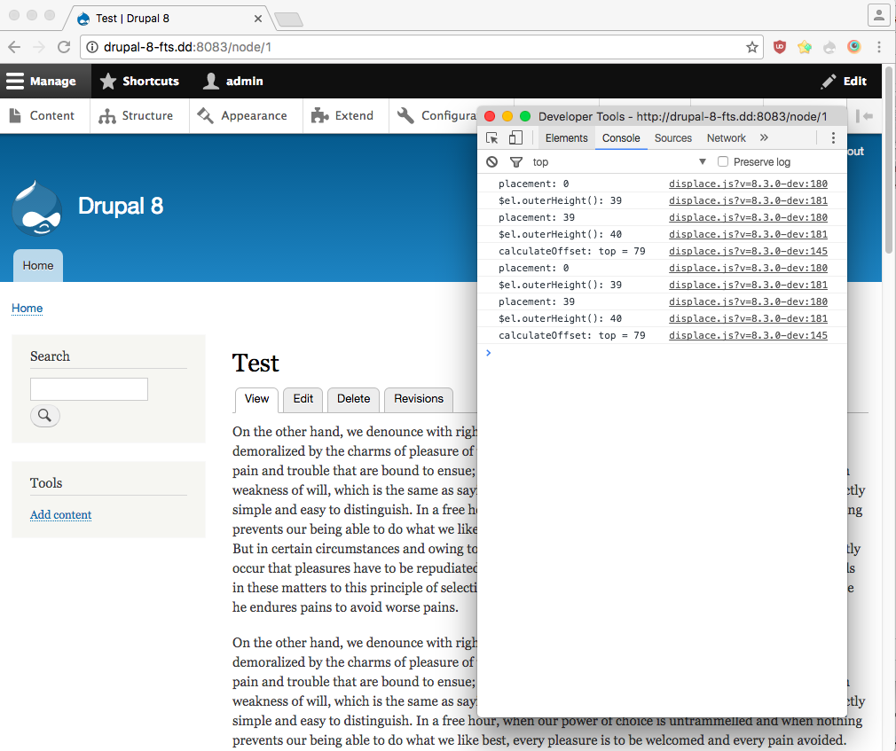
The values calculated for
this.model.get('offsets').topincore\modules\toolbar\js\views\BodyVisualView.jsare not consistent for e.g. Chrome and the above mentioned Browsers.The calculation of this value is done in
core\misc\displace.jsinfunction getRawOffset(el, edge)(Line 159). The final value is built fromplacement(not consistent, see attached screenshots) and$el.outerHeight()(consistent).Since
placementis somehow wrong built by IE11 (and maybe iPad2?), these line(s) in displace.js (near line 159) should be where to look for:According to developer.mozilla.org window.scrollY is not supported in IE (except Edge):
(a work around is provided on that page).
I will try to create a patch for this.
Comment #15
snte CreditAttribution: snte as a volunteer commentedPatch with window.pageYOffset instead of window.scrollY (window.pageXOffset instead window.scrollX respectively). Tested in IE, could not test iPad.
Comment #16
snte CreditAttribution: snte as a volunteer commentedSince it is in
core/misc/displace.jssetting Component to javascript.Comment #17
joelpittetI was able to reproduce the bug on IE9 on Windows 7 in a VM with simplytest.me. The header had to be in the fixed position to reproduce the issue. I tested in chrome 53 and firefox 49 to see if there were any adverse side-effects and there doesn't seem to be any.
Great work all!
Comment #18
joelpittetIt's not possible for this to be tested automatically due to the specific browsers on this issue.
Comment #19
kristofferwiklund CreditAttribution: kristofferwiklund at Websystem commentedIsn't this kind of the same problem as #2702891: Internet Explorer adds excessive padding to body when toolbar present and page resized after scroll
Both are changing same row but a bit different.
Comment #20
snte CreditAttribution: snte as a volunteer commentedThanks for the review and the hint at the related issue! I suggest to combine both, this should be safe and more compatible, since window.pageYOffset has wider browser support than window.scrollY and element.scrollTop. And fixing the tenary wrapping as done in the related issue is still a good idea.
This should fix this for IE, but maybe someone can test on (real) iPad?
Comment #21
droplet CreditAttribution: droplet commentedI believe we didn't need the fallback since we remove the IE8 and below in D8.
https://github.com/jquery/jquery/blob/master/src/offset.js#L77
Comment #24
ccjjmartin CreditAttribution: ccjjmartin as a volunteer commentedThe related issue was closed (they were actually the exact same issue) so I am marking this one as "Closed (duplicate)". Thanks for the hard work all that is another bug down.