
Problem/Motivation
The UI for filters and bulk operations on listings (content, files, comments, users and more) are inconsistent and not very pretty.
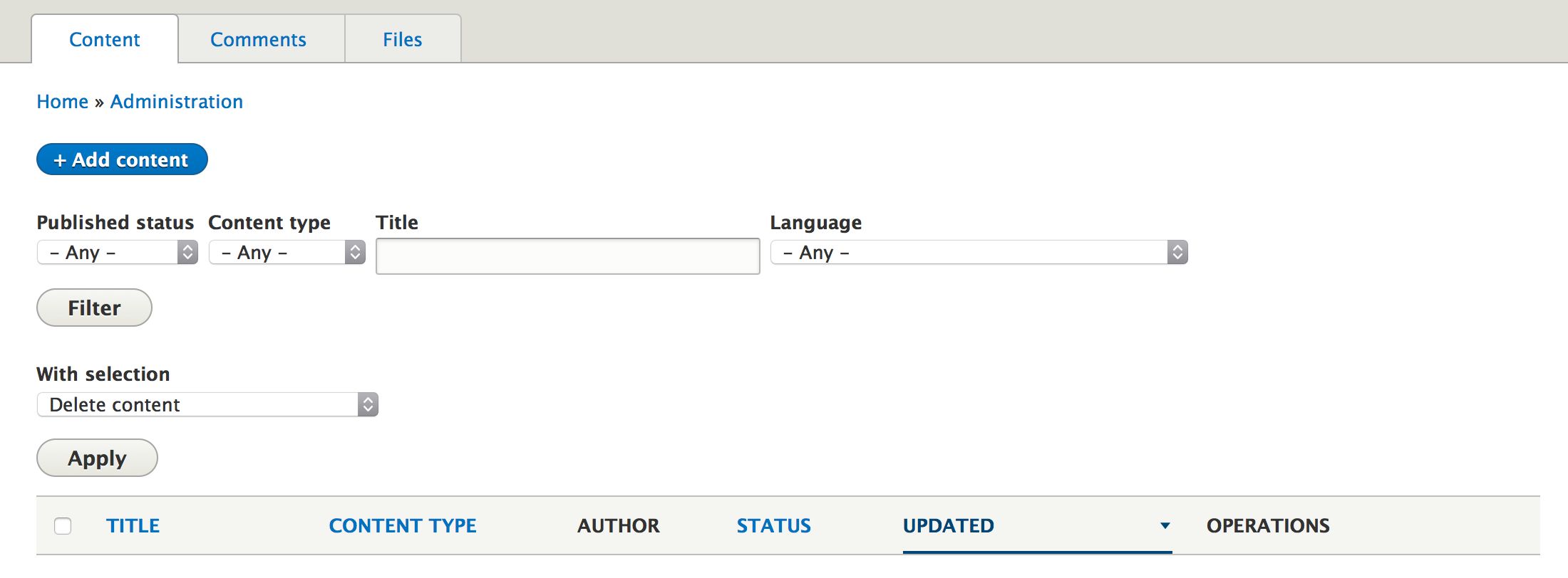
Content:
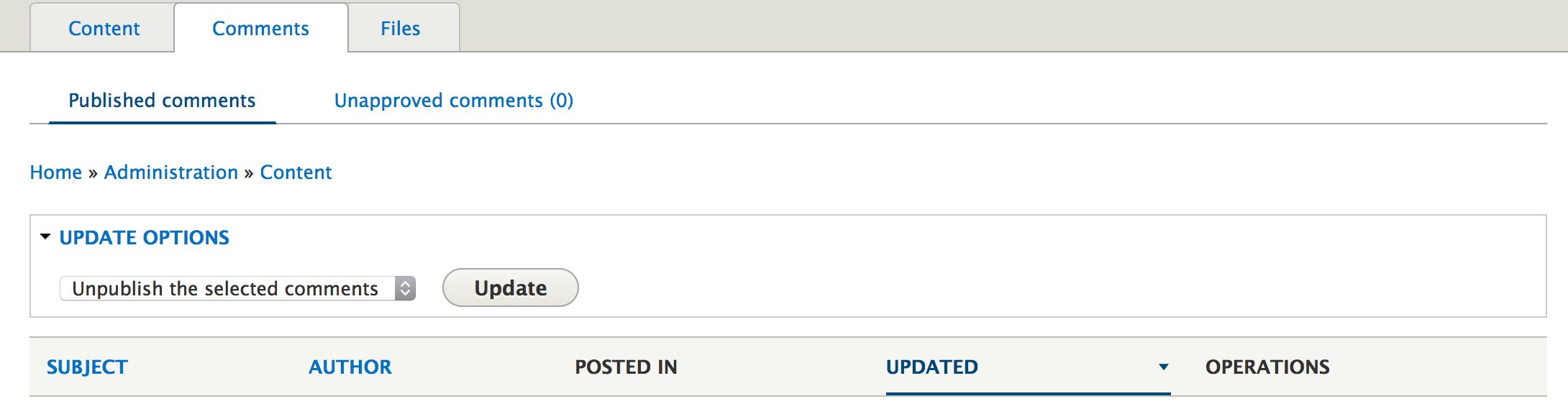
Comments:
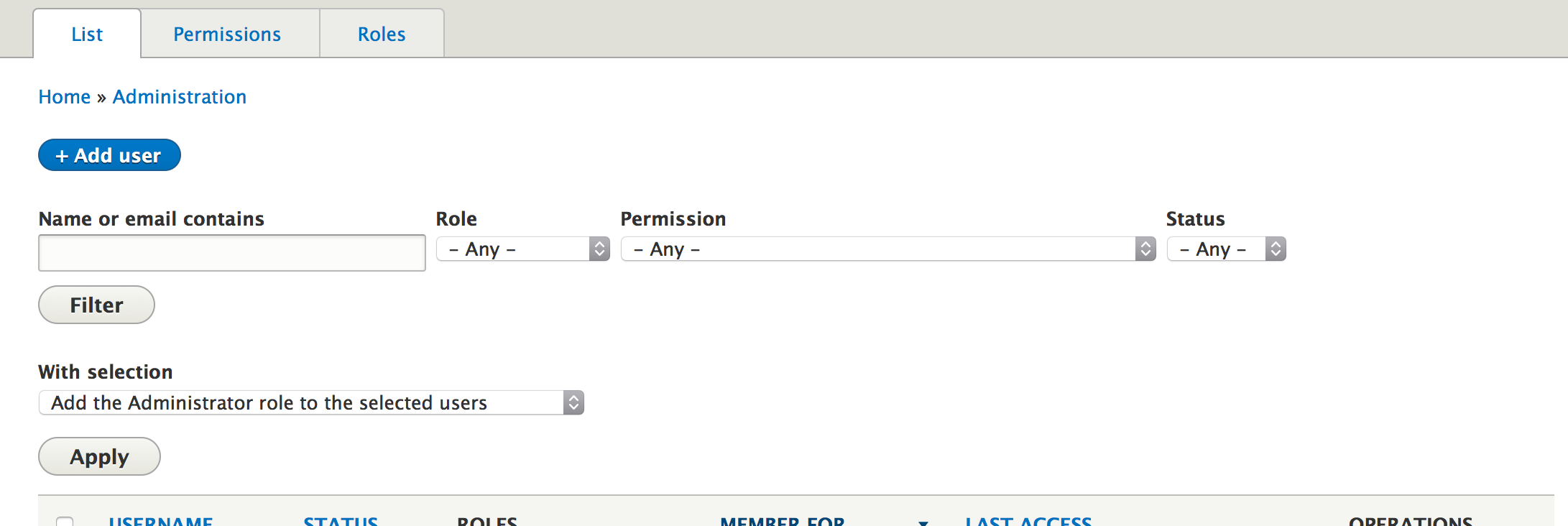
Users:
Proposed resolution
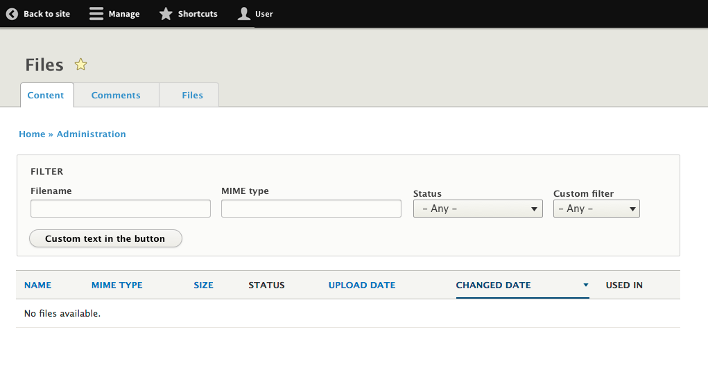
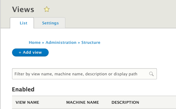
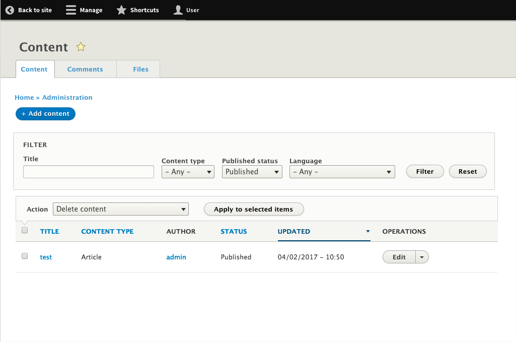
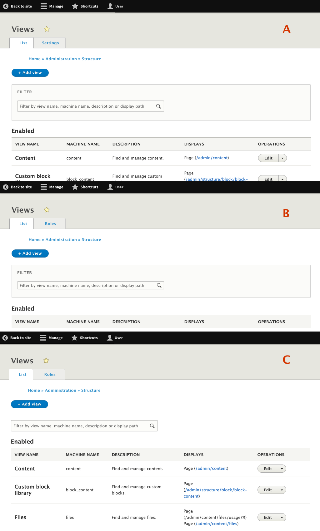
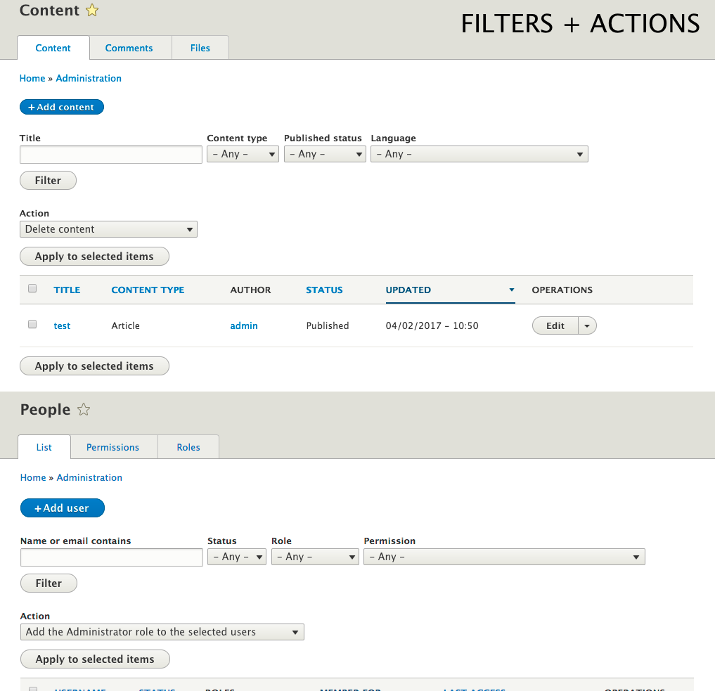
1. View with filters + actions
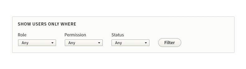
By default, the only view with both filters and actions is People page:
- People (/admin/people): #2023683: Improve the layout and usability of the admin/people exposed filters and actions
Proposed design:
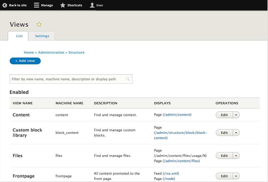
2. View with filters.
The rest of the views that have several filters in a fieldset. The proposed design follows the style guide (https://groups.drupal.org/node/283223#Fieldset).
- @TODO: Decide label for the field set to suit both filters and sort options.
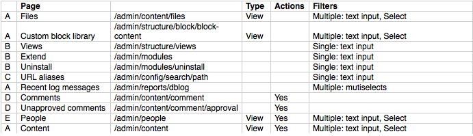
List of places in core where it can be found:
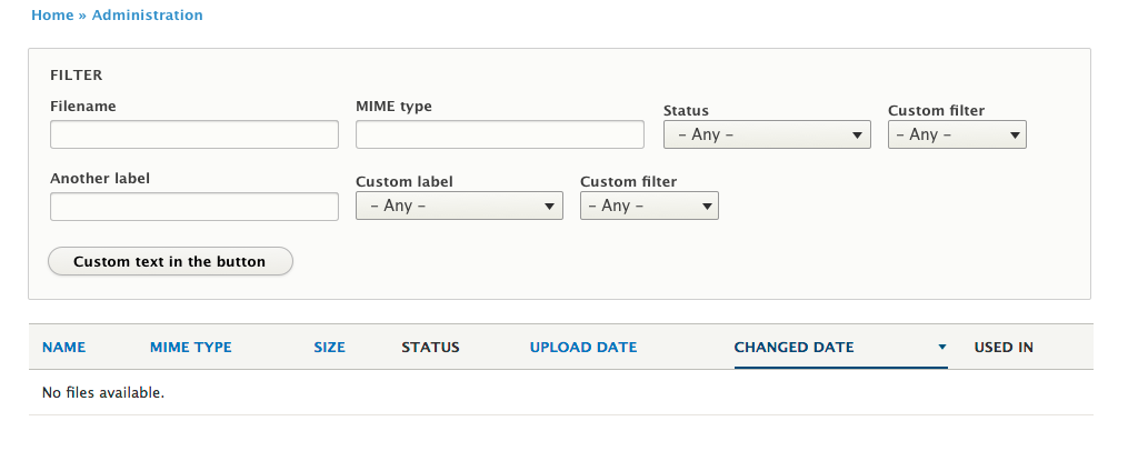
- Content (/admin/content) #2521808: Visually encapsulate the content listing filter to distinguish it from the 'add content' action link
- Files (/admin/content/files)
- Custom block library (/admin/structure/block/block-content)

In case there are several lines of filters, they should be nicely placed in several lines: #2711337: Too many exposed filters and operators create weird view.
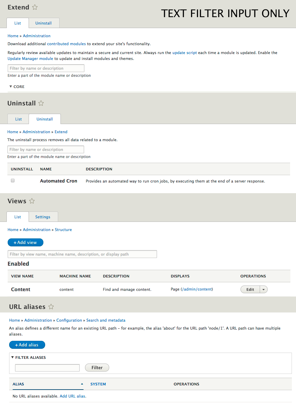
3. Single text filters (filtering in-page).
This one is a single filter used to filter elements in the current page. A new design have been created with a bigger input and a magnifying glass to make it clear what is its purpose. List of places in core where it can be found:
- Views (/admin/structure/views)
- Extend (/admin/modules)
- Uninstall (/admin/modules/uninstall)
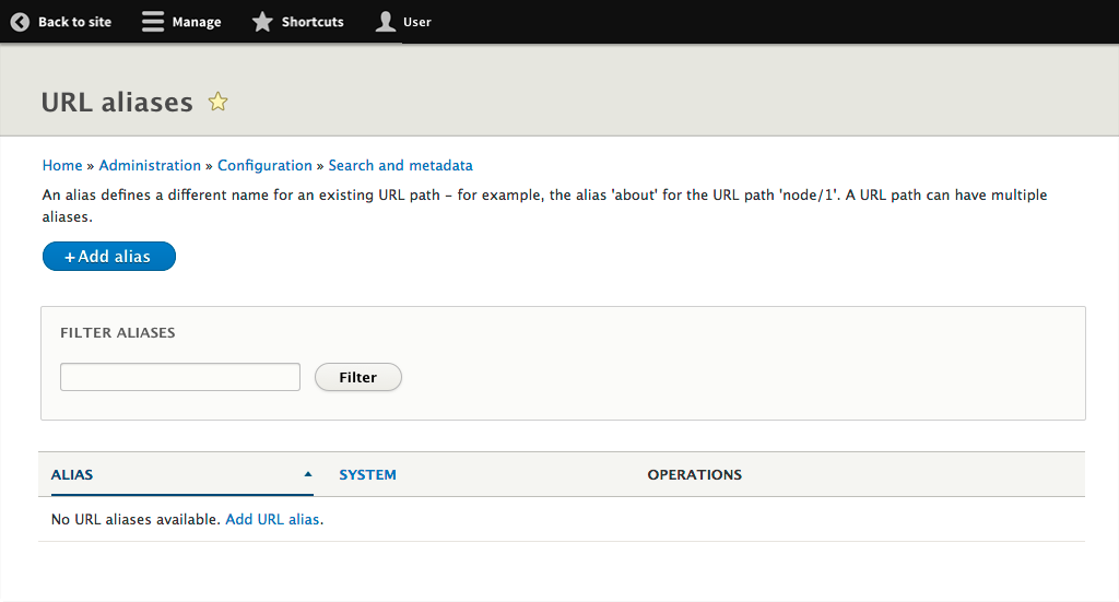
4. Single filters with button (paged list).
A single filter appearing used to filter elements in several pages. In this case the single filter should be envolved in a fieldset and a button will be placed inline, following the current design in the styleguide (https://groups.drupal.org/node/283223#Fieldset).
List of places in core where it can be found:
- URL aliases (/admin/config/search/path)
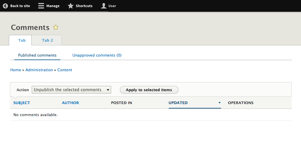
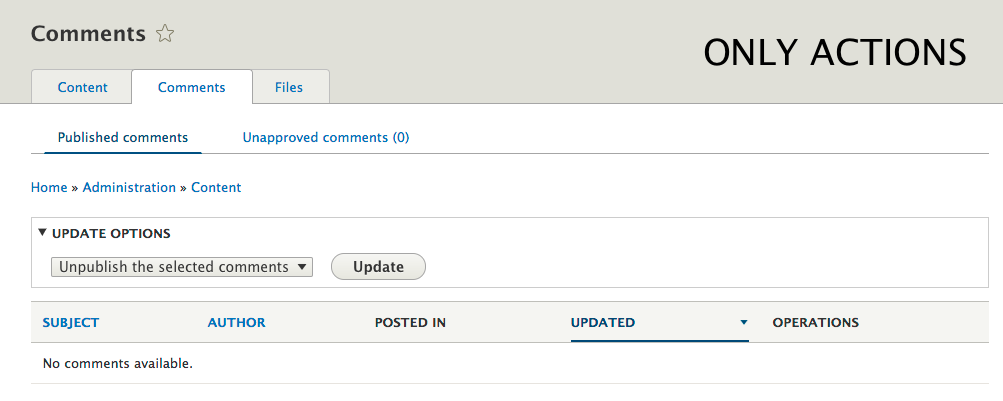
5. Only actions.
The design to use should be the same used for People view page.
List of places in core where it can be found:
- Comments (/admin/content/comment)
- Unapproved comments (/admin/content/comment/approval)
Explore visual design optionsDecide on a direction- You are here: Implement:
- #2023683: Improve the layout and usability of the admin/people exposed filters and actions
- #2521808: Visually encapsulate the content listing filter to distinguish it from the 'add content' action link
- #2711337: Too many exposed filters and operators create weird view
- @TODO: Create issue for single filter in-page (Filters 3)
- @TODO: Create issue to fix styles in URL aliases (Filters 4)
- @TODO: Find related issues or create a new one for styling system actions in comments (not views) (Filters 5)
User interface changes
Pretty & consistent UI pattern and design for filters and bulk operations on listing pages.
API changes
?
Data model changes
?
| Comment | File | Size | Author |
|---|---|---|---|
| #27 | select-all-grid.png | 159.18 KB | ckrina |
| #22 | 4filters.png | 60.39 KB | ckrina |
| #22 | 3filters.png | 61.59 KB | ckrina |
| #22 | 22filters.png | 45.18 KB | ckrina |
| #22 | 2filters.png | 32.53 KB | ckrina |


Comments
Comment #2
yoroy CreditAttribution: yoroy at Roy Scholten commentedComment #3
yoroy CreditAttribution: yoroy at Roy Scholten commentedComment #4
yoroy CreditAttribution: yoroy at Roy Scholten commentedComment #5
yoroy CreditAttribution: yoroy at Roy Scholten commentedComment #7
yoroy CreditAttribution: yoroy at Roy Scholten commentedComment #9
ckrinaFor now, the closest thing that I've seen in the Seven Style Guide is this for fieldsets. So I'll try to work in that direction during Drupal Dev Days in Seville.
Comment #10
ckrinaIt looks like there are several issues regarding a new design for filters and bulk operations. So I'll try to do a quick summary here:
A. This ones are active but working on isolated elements. Perhaps a design decision has been made without taking into account all the elements, so I created an image where we can see all elements playing together.
B. This other ones have completely different proposal for this pattern.
I'd suggest we decide first a design taking into account all the elements on top (main action button, filters, VBO and results list) and the other design solutions. Once we agree we could close the older issues and continue working on the small pieces. We could talk about it during the next the Usability meeting.
Comment #11
xinyuma CreditAttribution: xinyuma as a volunteer and commentedBesides the visual elements, I am actually thinking of the placement of these two functional areas.
For filters, it is logical to place it at the top, since in most of the cases, people first decide what they want to see then see it.
For bulk actions, users normally first select the items then perform the action, maybe it should be place below the content overview?
Comment #12
ckrinaIn the last UX meeting we agreed that the 2 designs approaches are good and play well together, but some adjustments are still needed (like margins, etc).
Also we needed to know the different situations we need to give a solution to. After looking around an standard profile with Seven I found 3 general situations:
- Pages with filters + operations
- Pages only with operations
- Pages only with filters. Inside this, we have:
- Several filters
- Standalone filters
Another thing discussed during the call was to find the minimum filters needed for each situation and maybe remove some of them. The reason is that we would simplify the UI and if someone wants those filters they can easily add them again because they're views now. So I'll create a list with all this pages and its filters to we can review and decide for each situation if we really need to remove or not any filters.
Next step will be to find a general and unified design solution for this 3 situations. I'll work on that.
And thank you @xinyuma for your feedback. I agree that in long forms having the submit button below has sense, but we don't always have long forms. Right now I'm not sure what's the best solution so I'll do some research.
Comment #13
tacituseu CreditAttribution: tacituseu commentedComment #14
yoroy CreditAttribution: yoroy at Roy Scholten commentedComment #15
yoroy CreditAttribution: yoroy at Roy Scholten commentedComment #16
ckrinaProposal for standalone filters.
I think that if we have only one text filter it would be better to give it more importance. We can do it by adding a fieldset around it (A or B) or by making the input itself bigger and more obvious (A and C). Adding the loupe to it will also help to identify its use. I would go for adding this new component because it can be easily reused in other places.
What option do you prefer? I would go for option C.
Integrated Actions + Filters
I’m adding the content example image. From the previous issues, I would try to make the space between filters bigger, as suggested in the styleguide. The reason is that it helps identifying each of them if they are more separated.
Minimum filters needed.
I would try, in general, to mix filters in search/text inputs so we only have one single input as we have in Views. Do you agree? I'll try to make a list so we can discuss further.
Comment #17
yoroy CreditAttribution: yoroy at Roy Scholten commentedLink to the recording where we discuss this: https://youtu.be/tKm4-MCUzSg?t=16m5s
Spoiler alert: we decided to go for option C for the filters. Design for more filters + sorting options also needs to take in account those versions that people can build themselves using Views exposed filters and sort options.
Comment #18
ifrikI think I was asked during the last UX for some examples of how a page like the Content page can looks when it's customized, for example when exposed sorting is added.
Example of the Content page, customized with additional exposed sorting and a changed "Apply" button
If I get it correctly, we have three different set of admin pages:
Because they are views, they can easily by changed by users. This includes exposed filters and exposed sorting. These two options have one button to apply whatever action to them.
By using Views for such admin pages we gained an enormous amount of flexibility that allows users to customize these pages and create new ones while maintaining a consistent look across the site, no matter whether a page comes from core, contrib or the user.
Unfortunately, Views doesn't have an option to provide placeholder text for the exposed filters. (There's a patch for the Better Exposed Filter module to do so.)
So if we somehow configure pages like Content or People to look more appealing then we need to take into account that users need to be able to change them.
And we can't really do things to a views page that users can't do with Views themselves. If users clone a page then it should look the same, otherwise we set them up for an endless struggle in finding out why that page looks different (and how to explain that to others.)
Comment #19
ifrikAnother point to take into account:
Once a filter is selected, there a Reset button appears.
Comment #20
ckrinaThank you @ifrik, we really have to keep in mind all you said. So here is a list of the filters I've found right now in Core:
Some proposals for each of them:
A. Filters coming from views:
- Must have a label
- Can’t have placeholder
Filters filtered:

Several filters, so it jumps to another line.

B. Standalone text filters (in-page):

- Filter in page will go with the bigger input proposed in C in comment #16 because we don’t need the prominence of a fieldset.
- We’ll use the magnifying glass icon, but we’ll try to make it lighter like the throbber #2775725: Update throbber icon.
- @TODO: Animation
C. Standalone filters with button. This that need a button because the search is not on the same page:
- We can’t use the bigger input because the button would be too small.
- We should try to use the defined fieldet from the styleguide, with its margins and background color.
D. Only actions:
- Implement the design from #2785051: Improve usability of Views bulk action form in Seven theme
E. Filters + actions in a view. They could keep the same design from A and D, taking into account the space between them.
I will work on the animation for the standalone filter in-page.
Comment #21
ckrina1) Option A. Revisiting the filters I’ve realized that the filter for Files doesn’t have enabled the Reset button in views. Should we keep the same pattern as in Content or People and enable it?
2) Option B (Standalone filter) revisited. We probably won't animate it. I've changed the color for the magnifying glass. What do you think?

3) Option C. I’m going to create an issue to suggest a design change for the URL aliases page, to keep the fieldset styles closer to the style guide. I'll check if there's already one and update this comment with the link.
4) Option E. Filters + Operations. In previous meetings there was the suggestion to decrease the number of filters for some view pages where the users could add them later just changing the default view. From my quick research, the only pages where it has sense are People and Content:
- For People we agreed on the last UX meeting than we could remove the permission filter. It is big and probably not really used. I'll check if there's already one issue or create a new one, and update this comment with the link.
- For content we agreed on removing the Language filter on sites where there’s only one language. This one is already being addressed here #2473989: Lack of dynamic language field / filter makes shipping core views hard to be both compatible with mono and multilingual.
5) Another thing pointed by @ifrik is that the fieldset label should change from “filter” to something else when there are Filters and Sort options. I am not sure if it can be done dynamically, so maybe looking for a common label would make sense. Any suggestion for it?
Comment #22
ckrinaComment #25
ckrinaUnassinging in case anyone else wants to work on this.
Comment #26
ckrinaAdding a proposal for the bulk operations: convert the checkbox for select all/unselect all from the tables to a button on grids visualizations that toggle depending on the need:
Comment #27
ckrinaSorry, uploaded the wrong file.
Comment #28
andypostComment #30
PanchoToo bad there's not been any progress for a while.
In the meantime #2711337: Too many exposed filters and operators create weird view goes another route, particularly in order to visually group exposed operators with their value fields.
However, both designs may be easily combined. We only need visual grouping for operator and field, if on a page there is an exposed operator at all.
Comment #34
andypostNew designs happens in #3070558: Implement bulk operation designs
Comment #35
andypostComment #40
longwaveThe Seven theme has been removed from Drupal 10 core. I confirmed that this issue only affects Seven and no other themes included with Drupal core, so I am moving this to the contributed Seven project.