
 Support for Drupal 7 is ending on 5 January 2025—it’s time to migrate to Drupal 10! Learn about the many benefits of Drupal 10 and find migration tools in our resource center.
Problem/Motivation
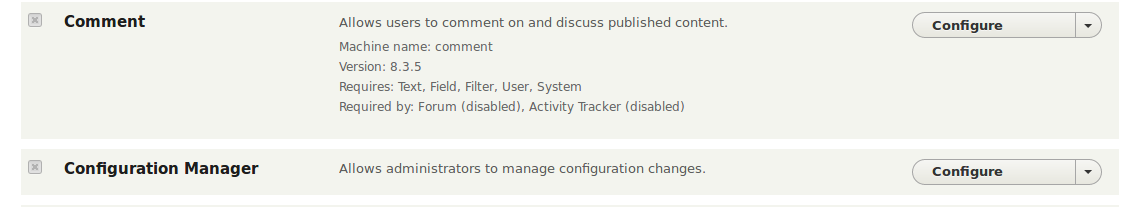
The modules page used to have the action links for Help, Configuration and Permissions directly visible. In Drupal 8, these are now hidden in the collapsed module information, and are impossible to use in screens smaller than 60em.
Proposed resolution
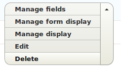
Create a dropbutton with the action links, so that it's possible to use in all screen sizes, and doesn't require the manual uncollapse of the summary to check if the operations exist.
Remaining tasks
Review and merge.
User interface changes
The modules page will now have the action links visible by default, as a dropbutton.
Before Desktop:

After Desktop:

Before Mobile:

After Mobile:


API changes
None.
Data model changes
None.
| Comment | File | Size | Author |
|---|---|---|---|
| #83 | Screenshot 2022-04-08 at 16.33.38.png | 94.71 KB | Wim Leers |
| #83 | Screenshot 2022-04-08 at 16.29.40.png | 13.49 KB | Wim Leers |
| #82 | 2574721-82.patch | 8.94 KB | Wim Leers |
| #79 | 2574721-79.patch | 10.45 KB | djsagar |
| #77 | 2574721.77.patch | 10.45 KB | Suresh Prabhu Parkala |


Comments
Comment #2
jcnventura CreditAttribution: jcnventura at Wunder commentedMajor, because this was a terrible usability regression in D8.
Comment #3
Bojhan CreditAttribution: Bojhan as a volunteer commentedI will review this later.
Please keep in mind that stating its "major" needs either some empirical evidence or community consensus. Since this has not come up before, I am marking it back down - I hope you can be mindfull that your gripe, is not necessarily everyones gripe.
Comment #4
jcnventura CreditAttribution: jcnventura at Wunder commentedIt did come up before: https://www.drupal.org/node/2372183#comment-10325107. I only created the issue now.
And yes, I do understand, even though I'm 99% convinced that U Minnesota users would spend 30 minutes uselessly looking for these.
Comment #5
LewisNymanHi, thanks for working on this. It would be great if this issue only moved the configure link to be visible all the time. I think that configure is an 80% use case and the other two aren't as commonly used. What do you think?
This would also make it possible to keep each module on one line, which is good because the module listing page is already long, we are effectively doubling the length of the page here.
Comment #6
yoroy CreditAttribution: yoroy at Wunder commentedIt does seem we went a bit overboard here and put away too much behind the little triangle, so I support this proposal. And immediately have additional considerations: Why did we add icons? Why are the links in this order? I'd expect 'Configure' to be the first. Should the links be blue?
@lewisnyman: not sure about singling out the configure link. If there are permissions, it's quite likely you need to set those up as well.
Comment #7
Bojhan CreditAttribution: Bojhan as a volunteer commentedI am not that convinced we want to go to two lines here again. Will make the module page a lot taller.
Comment #8
jcnventura CreditAttribution: jcnventura at Wunder commentedSo you'd support a third column on that table with the links? Should they be organized vertically or horizontally? Also, and taking into consideration that the usability studies have shown that anything on the right seems to be ignored, do I insert the new column in the middle?
I'm also not totally happy that this makes the module page taller. But honestly that is a very small price to pay for the huge usability bonus that having these links visible provides.
In my view, a third column would probably result in some cases having three rows (vertical links), or having such little space for the module details that that would wrap into multiple lines in most cases (horizontal links). I haven't actually measured it, but I feel my proposed solution is the one that best balances all the needs.
And I second yoroy's statement that the permissions link is equally as important as the configure link. We could put the help link back into the collapsed area, but the ultimate corollary of that chain of thought would have us remove the help system completely. We go to some pains to document these modules, and then we hide the link to it in a locked chest in the basement?
Comment #9
jcnventura CreditAttribution: jcnventura at Wunder commentedPostponing on #2151109: Convert theme_system_modules_details() to Twig
Comment #10
jcnventura CreditAttribution: jcnventura at Wunder commentedRe-creating the patch from scratch following #2151109: Convert theme_system_modules_details() to Twig.
@LewisNyman #5: I'm leaving the 3 links outside. I don't think it makes sense to hide the help link.
@yorou #6: Agree with leaving the links blue.
@Bohjan #7: Just tested with adding a third-column. I had to adjust the CSS in order to not have horizontal scrolling, but there's basically no difference between the two options.. As such, I'm leaving the second line as depicted in the screenshots in the issue summary.
Comment #12
jcnventura CreditAttribution: jcnventura at Wunder commentedCrazy test bot.. This patch can't in any way create 427 fails and 22 exceptions.
Comment #15
Himanshu5050 CreditAttribution: Himanshu5050 at Publicis Sapient for Publicis Sapient commentedThanks for patch, It is working fine.
Can we provide better visibility by just hovering on module link and it will show all action links associate with module.
I think it will be effective to avoid making module page taller.
Comment #16
jcnventura CreditAttribution: jcnventura at Wunder commentedI don't think that helps a lot. The current scenario, is that to find out if a module provides a configuration page, you must open the collapsed region. Which is pretty annoying, IMHO.
The proposed 'hover' solution would still require to move your mouse over it. I believe we should be able to see it without having to move the mouse.
Comment #17
Bojhan CreditAttribution: Bojhan as a volunteer commentedWhat about doing something like the following? Its going to break with our idea of not having loads of variating stuff on this screen - but I don't see an alternative solution, that doesn't completely double all of our elements.
Comment #18
jcnventura CreditAttribution: jcnventura at Wunder commentedIt's a possibility, and looks almost what we have in D7 now.
Honestly, it looks strange the way you propose it. If we do this, we should clear the operations area (i.e. add a third column). That RDF description invading the area looks confusing in my view. And let's leave the links blue, as suggested by yoroy in #6, same as they are in D7.
Also, why hide the help link? If a module has an help page, we should make it visible, not hide it under the rug.
I've actually tested with adding a third column in the meantime, with the 3 operations. Laying them horizontally makes the center column so small, that it simply looks ugly. Laying them vertically, defeats the purpose by transforming most of those hideous two-liners into three-liners.
I see two realistic options here:
The big bonus for option 2 is that we might be able to provide this button in smaller screens. At the moment, on screens smaller than 60em these operations are removed from the display together with the rest of the column where they reside. I'm upping this to major, as this transforms an annoyance into a potential block to the admin users from configuring an installed module.
Comment #19
Bojhan CreditAttribution: Bojhan as a volunteer commentedGive drop button a try and see what it looks like. It's a bit messy - since then we don't need the > but then again do - to display the machine name.
It's quite hard to do this cleanly, not displaying them was a design choice by default - retrofitting them in is a challenge. Without sacrificing core design qualities. You are right the page is long, but your proposal makes it 50% more longer. I prefer ease of finding and enabling modules, over any of the other benefits.
I am not sure, what constitutes the change - there is nothing that changed. Your simply restating your original arguments in a different manner. There is no empirical evidence, or significant community feedback that this is a big issue in either the original design issue or this issue. So moving it back.
Comment #20
jcnventura CreditAttribution: jcnventura at Wunder commentedI marked this major, because on small screens (<60em width), the operations are IMPOSSIBLE to access. If that's not a major problem with the current implementation, I don't know what is. Core modules usually have other ways to access those operations, but in contrib-land, people are sometimes creative, and I've seen modules where without these links, you'll be typing the URL by hand.
Bojhan, I respect (highly) your position in the community, but your failure to see the severity of this problem confuses me a lot. I'd like to see more than the two of us on this issue, and marking it major has the dual effect of both marking it at the importance I place on it, and bringing some more attention to it. And FYI, there's a lot more behind those collapsed details other than the machine name.. There's also the "requires" and "required by" info, which on a production site need not be visible all the time and are by far the largest waste of space on the D7 page.
Comment #21
jcnventura CreditAttribution: jcnventura at Wunder commentedRe-write of the patch using the dropbutton in order to provide these operations also in small screens. It looks terrible, as it needs some styles applied to make the new column always use around 12em, and to make the new dropbutton always the same size. Also, I've hardcoded the dropbutton classes and multiple divs in the template. There must be a better way of wrapping this from Twig...
Skipping the interdiff, as this is a fresh start, using option 2, of my comment in #18. The previous patches used option 1, which does not solve the problem in small screens.
Comment #23
jcnventura CreditAttribution: jcnventura at Wunder commentedThis one should apply.
Comment #24
jcnventura CreditAttribution: jcnventura at Wunder commentedTests passed. Setting to needs work, because this is far from ready. Current problems:
1. The dropbuttons have different sizes, they should all be the same size.
2. The module table has now 4 columns, with the following CSS width specs: 4%, 25%, "expand" and '' (this new one). It would be good to set some kind of fixed width, using basically the button size.
3. The dropbutton classes from dropbutton-wrapper.html.twig are duplicated in system-modules-details.html.twig. Is there a way to call the former from the latter?
Comment #25
jcnventura CreditAttribution: jcnventura at Wunder commentedOK. New version of the patch, fixing all the problems I had identified in #24. Thanks @LewisNyman for telling me about the Twig include directive.
I tried to also include item-list.html.twig, but it wasn't that trivial to convert the module links into a value hash in the items array that that template requires. Anyway this solution looks cleaner.
The interdiff was larger than the patch, so I'm skipping it.
Comment #26
jcnventura CreditAttribution: jcnventura at Wunder commentedBetter title
Comment #28
jcnventura CreditAttribution: jcnventura at Wunder commentedComment #29
jcnventura CreditAttribution: jcnventura at Wunder commentedComment #30
dawehner@jcnventura I'm a bit confused why this patch doesn't create a dropbutton in PHP and then just render it inside the template?
Comment #32
jcnventura CreditAttribution: jcnventura at Wunder commentedThis needs a reroll after #2575737: Copy templates, CSS, and related assets to Stable and override core libraries' CSS. Also, targeting it to 8.2.x since it may be late to get this into 8.1.x even though it breaks functionality in mobile screens.
Comment #33
jcnventura CreditAttribution: jcnventura at Wunder commentedRe-rolling of the patch, changing also the stable template, and building the dropbutton in PHP as suggested by @dawehner.
The interdiff is to #25, no new screenshots were taken as the visual aspect is kept.
Comment #34
dawehnerIs there a way to get rid of the
!importanthere? It doesn't really feel right.Comment #36
jcnventura CreditAttribution: jcnventura at Wunder commentedTesting if there's any content in $row['links'] should get rid of all the test failures.
@dawehner: Those !important tags were overriding a "width:auto!important" that is set in that case by "seven". I've added a new line to the "seven" CSS with the !important tag, and removed it from the system and stable CSS.
Comment #38
jcnventura CreditAttribution: jcnventura at Wunder commentedThe fail was correct. The test was wrong.. It was testing if the link title attribute contained a string, and there's no such concept in the dropbutton links.
Comment #42
jcnventura CreditAttribution: jcnventura at Wunder commentedRe-roll the patch against 8.4. No interdiff because the changes are because of short-array syntax in existing code and move of Form/ModulesListFormWebTest.php from core/modules/system/src/Tests/Form to core/modules/system/tests/src/Functional/Form.
Comment #43
jcnventura CreditAttribution: jcnventura at Wunder commentedComment #44
jcnventura CreditAttribution: jcnventura at Wunder commentedComment #46
jcnventura CreditAttribution: jcnventura at Wunder commentedComment #47
jcnventura CreditAttribution: jcnventura at Wunder commentedAfter some discussion at Seville Drupal Dev Days, I removed most of the CSS changes to make the buttons be the same width, as these sizes will probably only work in English.
To address the failed test from #42, I changed the way links were built. As a result, the link attributes are now applied, including the link classes, causing the operation icons to appear inside the dropbutton. This was seen by others as breaking the UI, as no other dropbuttons have icons before the links. To solve that problem, I removed the CSS that adds those icons as background to the links.
Comment #48
ifrikI've reviewed this during DevDaysSeville.
As a starting remark: I think the current usability of the Extend page is bad to start with. Neither the module name nor the description are clearly links. Clicking on the name ticks ticks the tickbox, while clicking on the description extends it on reveal additional information (machine name, version, requirements). Once a module is enabled, clicking on the description also displays links to help, permission and configuration pages, but nothing indicates to users that any of that functionality is there.


On a small screen, the description is not visible, therefore it cannot be expanded, and users can't get to the information and links.
Before
The patch moves the links for enabled modules into a dropdown list which is visible at all times, and also on small screens. This dropdown list is also consistent with functionality at other places where an item has several options (such as editing an entity type).


We discussed a fixed width for buttons for a cleaner look, but this is likely to break with interface translations where the words are longer.
So this is certainly a usability improvement, and probably also better accessibility.
After
However, so far if a module description is very long, it just affects that one text that either breaks off or that the user needs to scroll sideways to read. But with this patch, the dropdown buttons are placed on the right side of the longest text, which means a single over-long module description moves all buttons of that section out of view.

Is there any way of fixing that? For example by forcing too long lines to wrap?
After - with a too long module description.
Comment #49
jcnventura CreditAttribution: jcnventura at Wunder commentedI've disabled the nowrap setting that was forcing the page to create those horizontal scrollbars, and also the "hyphens: auto" which was adding hyphens to the lines now being wrapped.
Comment #50
ifrikThanks, that looks much better. Personally, I much more prefer too long descriptions to wrap anyway instead of to force me to scroll side ways.
But something goes wrong there if in a section the enabled modules only have "Help" as an option: Then the button is off too far to the right. Once there is one module with "Configuration" then everything is fine again. See screen shots.

only Help
Help and Configuration

Comment #51
jcnventura CreditAttribution: jcnventura at Wunder commentedI've added back the minimum size of the operations column.
Multiple dropbuttons provide some padding-right and margin-right that total 12em. In #47, I removed this 12em width together with the CSS that made all dropbuttons the same width. It's clear that that CSS will have issues when the multiple dropbutton 'text' exceeds 10em, but that's clearly outside the scope of this issue.
Comment #52
ifrikThanks,
if other buttons like this have the same padding/margin then it's fine to use this here as well. If it needs fixing then it would need fixing in general.
The patch works. Drop-down buttons are available for the enabled modules. Users are therefore able to access the action links at any screen size. Without the patch that information is totally inaccessible. So this is a great improvement.
The drawback is that the module description text now breaks off at a certain point, and users only can read the end of the text once they have click on the description to expand that part. On small screens the text is not available anyway so we don't loose anything.
In practice, texts that are too long are not fully visible on the screen anyway, as it requires scrolling sideways.
So basically the patch changes one problem (scrolling sideways) with another (text breaks off), but the gains of accessible actions links outweighs this in any case.
So, for me this is an overall improvement.
Comment #53
jcnventura CreditAttribution: jcnventura at Wunder commentedComment #54
ifrikDiscussed at UX meeting on 2 May:
The cutting off of the text is less of an problem because when the text becomes too short to be useful, it is hidden anyway as a low-priority column.
(Other tables have a link to toggle between "Show all columns/Hide lower priority columns" on smaller screens, but this is not displayed on the Modules page, probably because there are several tables on the page and not just one.)
Concerns are about varying width of the buttons. On other tables all buttons have the same options are therefore the same width, even if they then change their width when the users clicks on them. Maybe this can be helped with a minimum width?
There's also something wrong with the theming of background of the active option, that doesn't go over the whole width. See screenshot comparing it to a similar dropdown on the content types page.
Modules page:

Content type page for comparison:

Comment #55
yoroy CreditAttribution: yoroy commentedLink to the recording: https://youtu.be/tKm4-MCUzSg?t=53s
Comment #56
yoroy CreditAttribution: yoroy at Roy Scholten commentedAbout the change in general: yes, looks like we over-designed this and hid important links. The dropbuttons aren't pretty, but the current situation with the links simply not present on small screens needs to changed.
## Review:
On smaller widths the buttons should still be floated(?) to the right side:
---
This is still the case. Maybe needs a width:100% on the anchor tag there.
Comment #57
jcnventura CreditAttribution: jcnventura at Wunder commentedMade all the buttons the same size as hinted in #54. Also tested RTL screens.
Talking with @yoroy in Frankfurt, it seems it might be useful to give up on fitting it all in the minimum space (15em if you turn off Javascript), and simply do like all other admin forms and use something way larger than 25em.
Comment #58
ifrikI would say that works - and most importantly: it gives users access to these operations.
The attached screenshots show the operation links on a large and smaller screen, with the description text expanded, and also in a right-to-left language.
Comment #59
ifrikComment #60
rootworkI've updated the issue summary with ifrik's most recent screenshots (thanks ifrik!)
Comment #62
ifrikTest had failed, but then run again and passed, so I put it back on RTBC
Comment #64
rootworkYeah, I thought it might.
Too bad this didn't make the 8.4 deadline, but let's make sure it gets in to 8.5!
Comment #65
star-szrThanks everyone for the work so far on this issue. I agree it's an important change.
I think this may need more thought as far as backward compatibility goes, I'm wondering for example what an admin theme would need to do to compensate for this. We would at least need a change record if we're changing the structure of this page.
What we could do here is leave stable and classy alone (don't update the templates to print module.operations) and change the core (core/modules/*) markup and CSS as well as Seven (and Bartik if we want too). That should make this no longer a breaking change for third party admin themes, and those themes can still choose to adopt this pattern if they haven't already by printing module.operations and styling as they wish.
Minor: Unless there's wrapping markup or similar, this type of
ifblock is not needed. https://www.drupal.org/docs/develop/coding-standards/twig-coding-standar...Comment #67
jcnventura CreditAttribution: jcnventura at Wunder commentedUnless someone cares, we can do this in Drupal 9, where we don't need to worry about backward compatibility, making this RTBC-able again.
Comment #68
ifrikWe should still work on this for Drupal 8.
Comment #69
xjmThis still needs to address the BC issues in #65. Thanks!
Comment #75
jcnventura CreditAttribution: jcnventura commentedFrom what I understand, in Drupal 10 we can simply change classy, and the BC issues identified in #65 are not applicable.
Comment #76
catchDoesn't apply to 9.2.x
Comment #77
Suresh Prabhu Parkala CreditAttribution: Suresh Prabhu Parkala at Specbee commentedA re-rolled patch against the latest 9.2.x.
Comment #79
djsagar CreditAttribution: djsagar at OpenSense Labs commentedRe-rolled patch for drupal 9.2.x as patch 77 getting error.
Comment #80
djsagar CreditAttribution: djsagar at OpenSense Labs commentedComment #81
dwwI've been working on #3012004: Add a link to the module's drupal.org project page in the module admin page, merged into #2906547: Add links to Drupal.org project pages to module listings in /admin/modules, and found this as a related issue. Sounds important. Tagging for Bug Smash. Will see if I can find time to move this forward again.
Comment #82
Wim LeersConflicted with #3216341: Provide a module-specific permissions form. Rebased.
Comment #83
Wim LeersThis seems like a massive usability improvement 🤩
It looks a bit odd visually, but I think this is a case where it's reasonable to decide that usability should trump aesthetics:

Review
classyandstable, which means we could do this right away!Comment #84
simohell CreditAttribution: simohell commentedThis has been discussed in usability meeting on 23 Sept 2022 as part of another issue #2035079: [PP-3] Figure out what to do with the install/uninstall modules page and I made a mockup how it would look like in Claro. We didn't revisit the issue after that.
These images are from the other issue I linked here
Comment #85
mgiffordThink this could be WCAG SC 1.4.4 Resize Text & 1.4.10 Reflow. Running with 1.4.10 for tagging.