
 Support for Drupal 7 is ending on 5 January 2025—it’s time to migrate to Drupal 10! Learn about the many benefits of Drupal 10 and find migration tools in our resource center.
Problem/Motivation
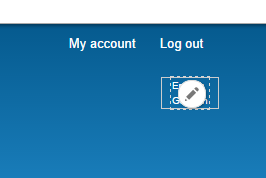
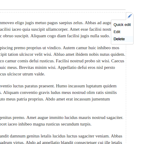
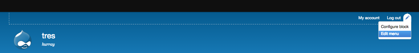
If you enable more than one language and add the language switcher block to the header in Bartik the top 2 languages are not clickable. The edit mode icon overlays the block and does not allow you to click the language links.
Proposed resolution
See if Bartik has any CSS in place for blocks in the header.
Add fixes to allow users to click on languages in the block with contextual links enabled.
Remaining tasks
| Task | Novice task? | Contributor instructions | Complete? |
|---|---|---|---|
| Discuss solution options | |||
| Create a patch | Instructions | ||
| Manually test the patch | Instructions | ||
| Add steps to reproduce the issue | Instructions | ||
| Embed before and after screenshots in the issue summary | Instructions | ||
| Review patch to ensure that it fixes the issue, stays within scope, is properly documented, and follows coding standards | Instructions |
User interface changes
Yes.
API changes
None
| Comment | File | Size | Author |
|---|---|---|---|
| #38 | contexual links concept in mobile devices.png | 26.3 KB | syamnath |
| #36 | icon-no-border.png | 30.02 KB | emma.maria |
| #36 | mobile-cut-off.png | 54.58 KB | emma.maria |
| #36 | mobile-cant-see.png | 52.73 KB | emma.maria |
| #36 | Screen Shot 2016-04-21 at 12.44.25.png | 1.3 MB | emma.maria |


Comments
Comment #1
hass CreditAttribution: hass commentedComment #2
hass CreditAttribution: hass commentedComment #3
hass CreditAttribution: hass commentedComment #4
Wim LeersComment #5
YesCT CreditAttribution: YesCT commentedComment #6
emma.mariaComment #7
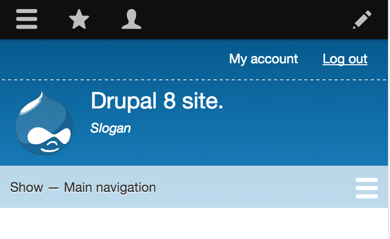
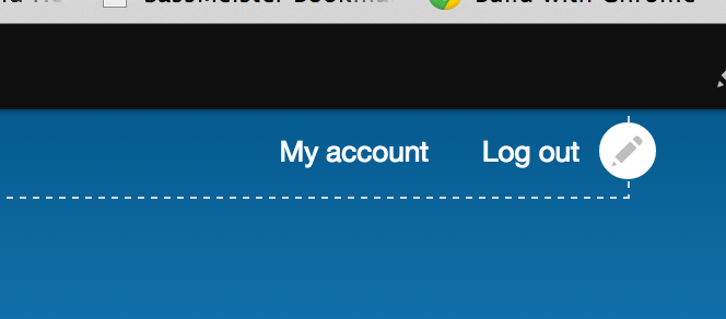
emma.mariaAfter some investigation I found that the CSS styles for the language switcher are not in use anymore as the class is currently different to what it used to be. Changing the class makes the menu print horizontally which is a good start. But with very short languages eg. Lao, you can still only click on them if you are very very precise at it.
I am hesitant to add contextual link overriding styles just for Bartik or even just for the language switcher block, it seems like a scrappy fix. But the focus border around the block and the icon on hover do not look good in the header region just for Bartik and this problem will happen for any short text in a block added to the header.
Please can I have usability expert point of view on this, thanks :)
Comment #8
Bojhan CreditAttribution: Bojhan commentedHmm, that looks pretty bad - but to be expected. Contextual links don't really work well on small individual elements. Can we possibly redesign this block? For example, have some spacing on the right?
Comment #9
Wim LeersOr, alternatively, we could make Contextual Links smarter, to work better with small elements. If you have suggestions on how to do that, I'm happy to help. Specifically, it seems tricky to make the contextual link pencil icon appear *outside* the hovered area, because upon leaving the hovered area, it would disappear.
Actually, having done a quick prototype … is there any good reason to insist on putting the contextual links *inside* the affected element? Why can't we put it partially outside? That even looks kinda nice, and AFAICT is close to a solution for this problem:

Comment #10
Bojhan CreditAttribution: Bojhan commentedThe problem is a little bit more difficult. The reason it is in the ---- line, is to make it easy for people to understand what the pen icon relates to. This is a fundamental aspect of this pattern, and we did consider the problem it creates with small elements (we decided to not take it into account). For most occurrences this pattern is just fine - it overlaps perhaps 10/20% of the time on your ordinary website. Aesthetically it also "aligns" with the corner of a context pane.
However as we move this pattern to more and more elements, and specifically smaller and smaller elements. We run into the limits of this pattern. We can move it outside of the area, but it decreases the ability to associate with the context object.
Before we make such a drastic change, I wonder if we can be more smarter about it? For example when the width is too small or if its overlapping with other elements (though I doubt thats measurable).
Comment #11
Wim LeersIn any case, that's going to be impossible front-end performance wise.
Why do you consider #9 to be though? It's still overlapping with the element, so I'd say it's still a very clear, very strong association?
Comment #12
LewisNymanWe could just pick a width and calculate this after that page has loaded? It wouldn't' cause a reflow as it only affects hovered elements. I don't think that's impossible. Is that a suitable fix?
Comment #13
hass CreditAttribution: hass commented@Wim: Why have you changed this case to bartik theme?
This is a general issue in contextual links module. Every other custom contrib module has the same problem and I think this should be applied to all. Only themes having a problem with these default should override.
Comment #14
YesCT CreditAttribution: YesCT commentedtaking out the novice notes in the issue summary since the path forward is not yet clear.
https://www.drupal.org/core-mentoring/novice-tasks
Comment #15
YesCT CreditAttribution: YesCT commentedactually taking out novice.
Comment #16
Wim Leers#12: Then I'm not sure how you're "just going to pick a width"? But if that's possible, then that'd be okay of course.
Comment #17
emma.mariaSwitching this to be for the Contextual module.
I think this is a valid issue that should be fixed. This issue will affect any frontend theme that has small width/height elements.
Comment #18
Wim LeersLewisNyman & emma.mari: do you have thoughts about my proposal in #9?
Comment #19
LewisNymanYes, let's do it, we might need to tweak the rest of the visuals so it doesn't look strange.
Comment #20
emma.mariaUpdated the issue title to reflect the direction we are going with this issue now.
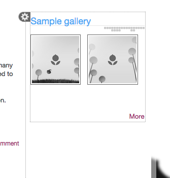
Also here is a concept patch for #9.
And some screenshots to show it in use...
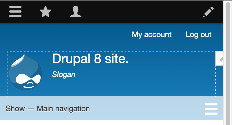
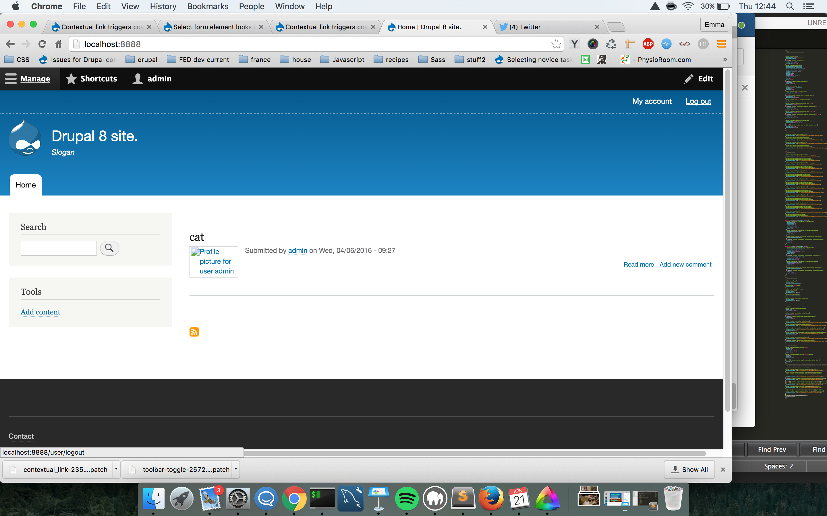
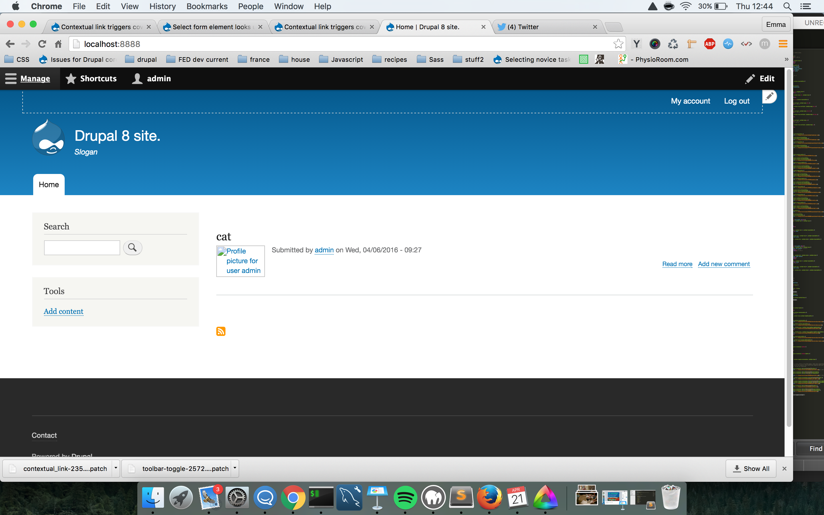
Using Bartik as an example I found that when screens get narrow and the regions become the full width of the screen, the icon will obviously get cut off as it straddles the border of the region, see below...
Comment #21
hass CreditAttribution: hass commentedCan we have a screenshot of language switcher block too, please?
Comment #22
emma.mariaHere you go, it still covers part of the element (please note that the font is far too small and needs to be fixed in Bartik along with what I said in #7 where the fix is being taken out of this issue). I also purposely picked short languages to give the worst case scenario :)
Comment #23
Gábor Hojtsyhttps://www.drupal.org/project/contextual-flyout-links is what Drupal Gardens uses to place the contextual trigger at the right place. It has JS as well as CSS. While it has not been touched for some time, it may still be a good one to look at.
Comment #24
hass CreditAttribution: hass commented#23: That looks like a very good idea to me, too.
Comment #25
Bojhan CreditAttribution: Bojhan as a volunteer commentedThis looks like quite a good approach :) Happy to move this forward.
Comment #26
adam_ CreditAttribution: adam_ as a volunteer commentedI applied the patch #9 and noticed that many edit icons on the screen are almost completely on the right border. In order to not extend past the page content they'll need to be cutoff. In order to keep the pen icon we would need to push it left into the content area, but that would have the same issue if a small area was located along that border.
Comment #27
emma.mariaA new implementation for the idea in #23 needs to be implemented so I'm setting this back to Active.
Comment #28
Wim LeersComment #29
syamnath CreditAttribution: syamnath at Zyxware Technologies commentedHi I have created a patch on the above issue also included a screenshot image with it
I request to kindly review my patch.
After patch screenshot

Comment #30
syamnath CreditAttribution: syamnath at Zyxware Technologies commentedComment #31
Wim LeersAssigning to Emma for review.
Comment #32
emma.mariaThanks @Wim Leers for making me aware of this issue again :)
As this is a design change within Core I am un-assigning myself. I will closely follow the progress and please feel free to assign back to me if/when a CSS review is needed.
I'm Tagging the Usability team in!
Comment #33
Bojhan CreditAttribution: Bojhan as a volunteer commentedI am going to defer the conceptual good/bad to Wim. Looks like we don't have suitable alternatives. I would be fine with moving it to the side - conceptually this feels to me like a good idea. But I am not sure if this works in all scenarios.
I am not a very big fan of having a sharp corner on the top left in #29. Can we have a GIF that shows the interaction?
Comment #34
droplet CreditAttribution: droplet commentedwhat if a site didn't have right padding?
Personally, I like the "hover edit" is deactivated by default. Toolbar Edit button toggles it enables. It's less annoying (and provided a chance to optimize it for better Page Loading & JS performance also.)
Comment #35
syamnath CreditAttribution: syamnath at Zyxware Technologies commentedHi I have created a gif capture of the contextual link in action

Please refer below gif
Comment #36
emma.mariaI did some manual testing on #29.
This solution does not account for designs where elements will be touching/very close to the edge of the browser window. This can be reproduced in Bartik and a typical small screen design will have full width blocks of content etc.
When there is no space on the right of the screen, the icon is sitting off the page or cut off. This is a regression we definitely cannot have.


Also the contextual link icon usually shows before the border that highlights the item displays and the straight left edge looks a bit odd in these cases.
We still need to add the suggestion in #23 of making the contextual link aware of space around it so it won't end up off the screen.
Comment #37
Wim Leers#36: Thanks for pointing that out! I remember having this exact same discussion and remark several years ago, when we worked on revising the design of Contextual Links.
Comment #38
syamnath CreditAttribution: syamnath at Zyxware Technologies commentedI was thinking how to resolve that issue. While I was playing around with the conceptual links got two ideas . I just created a mock up and i will share. The concept is to show this overlay when clicking over those blocks ** only on mobile devices large devices the previos solution works fine.

I will share the next solution as next comment , kindly review.
Comment #39
Manjit.Singh@syamnath_zyxware Thanks for sharing the mockup. But to show the buttons on overlay is looks like not a good User Experience. :(
Comment #51
larowlanI think we should postpone this until container queries are a thing.
Then we can position the pencil outside the container when the container is too small.