
More Seven Theme issues: #1986434: New visual style for Seven
Problem/Motivation
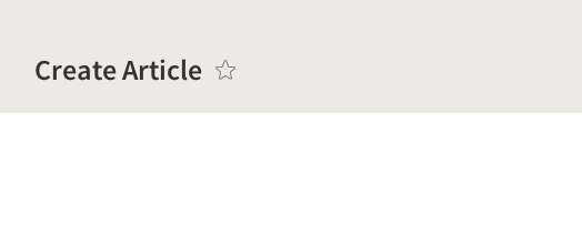
We've designed an update for the content header in Seven. The color and spacing changes bring it inline with the rest of the new style guide. The new "Add to shortcuts" icon has a stronger association with the task. More controversially, the breadcrumbs have been removed.
We developed Proposal: A Style Guide for Seven.
To quote the rationale provided:
In D7, the “add to shortcuts” icon is a circled plus symbol. This symbol is commonly associated with an add or create action, but there is nothing to indicate the connection to shortcuts. We propose using the star icon globally for shortcuts in Seven to make it more recognizable and understandable to a wide audience. Most people will be familiar with the use of the star icon for bookmarks/favourites from their web browser (IE, Chrome, Firefox) and from popular services such as Twitter.
Proposed resolution
In #1938418: Add Content Header component we laid the ground work for this change.
Remaining tasks
- Make a patch
User interface changes
This proposal removes the breadcrumbs from the admin interface. With the new toolbar, which stays open between page loads, it's possible for users to traverse back up the navigation tree.
API changes
No API Changes
Related Issues
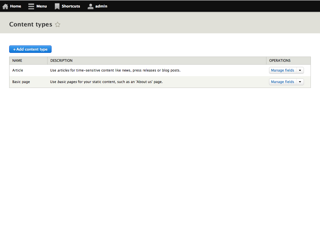
| Comment | File | Size | Author |
|---|---|---|---|
| #47 | content-header-2022695-47.patch | 18.67 KB | LewisNyman |
| #47 | interdiff.txt | 894 bytes | LewisNyman |
| #33 | shortcuts-overlay.png | 6.31 KB | idebr |
| #33 | shortcuts-alignment.png | 28.13 KB | idebr |
| #27 | interdiff.txt | 741 bytes | LewisNyman |


Comments
Comment #1
LewisNymantaggin
Comment #2
LewisNymantags
Comment #3
LewisNymanOk, here's the look and feel implementation for the content header. It's clear that this implementation breaks the current tab styling. This issue is reliant on #1490402: Redesign tabs and the content header. I'm working on getting them together in a sandbox.
Comment #4
LewisNymanHere's a picture of the content header patch working with the latest patch from #1490402: Redesign tabs and the content header.
Comment #5
enginpost CreditAttribution: enginpost commented#3: content-header-2022695.patch queued for re-testing.
Comment #7
enginpost CreditAttribution: enginpost commentedRerolled the patch. I hope I was able to incorporate all of the right modifications.
Comment #8
rteijeiro CreditAttribution: rteijeiro commentedThis patch removes the
core/modules/shortcut/images/shortcut-add.pngimage but doesn't add the referencedcore/modules/shortcut/images/favstar.svgimage.Comment #9
tkoleary CreditAttribution: tkoleary commented@enginpost
Looks like this patch is failing now since it's probably out of sync with changes to head. Could you re-roll it? I'd really like to test it out.
Comment #10
LewisNyman#7: content-header-2022695-7.patch queued for re-testing.
Comment #12
LewisNyman#7: content-header-2022695-7.patch queued for re-testing.
Comment #14
LewisNymanAttempt at a re-roll.
Comment #15
Bojhan CreditAttribution: Bojhan commentedThis smells RTBC.
Comment #16
tkoleary CreditAttribution: tkoleary commentedLooks great.
Comment #17
Bojhan CreditAttribution: Bojhan commentedComment #18
LewisNymanSorry! Now that #1963886: Use HiDPI icons in the toolbar has paved the way we can add the icons using the same technique.
Comment #19
LewisNymanI've re-rolled and re-implemented the icon in line with the implementation in #1963886: Use HiDPI icons in the toolbar
Comment #21
Bojhan CreditAttribution: Bojhan commentedBack to RTBC
Comment #22
Bojhan CreditAttribution: Bojhan commentedThis kind of messes up tabs, is that intentional?
Comment #23
LewisNymanI think so, the tabs patch has to accommodate the changes to the content header, so it should look correct when the two patches are applied together.
Comment #24
yoroy CreditAttribution: yoroy commentedReviewing styleguide issues with webchick: Just another cross-reference to #1490402: Redesign tabs and the content header then.
Comment #25
Bojhan CreditAttribution: Bojhan commentedPostponing this after discussion with webchick, we can put it back to RTBC when Redesign tabs is RTBC.
Comment #26
LewisNymanI noticed we are missing the hover icon on rtl.
Comment #27
LewisNymanComment #28
Kendall Totten CreditAttribution: Kendall Totten commentedI applied the patch, tested by clicking the favorite icon on an admin page, and then unfavoriting admin pages. Checked the hover state as well.
RTBC on RTL and LTR in Chrome & Firefox.
Tested as part of the #dcATL code sprint.
Comment #29
alexpottSetting back to be postponed on #1490402: Redesign tabs and the content header
Comment #30
LewisNymanLet's add the breadcrumbs back below the secondary tabs for now.
See https://drupal.org/node/1953374#comment-8014161
Comment #31
LewisNymanI'd added back the breadcrumb but under the secondary tabs
Comment #32
LewisNymanComment #33
idebr CreditAttribution: idebr commentedComment #34
LewisNymanThanks, I've applied the vertical alignment using pixels, I think it's a lot more reliable than the keywords.
Comment #35
Bojhan CreditAttribution: Bojhan commentedComment #36
webchickI'm going off the issue summary, which says this has to do with the shortcut icon.
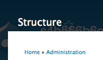
However, in all of my browsers, as well as simplytest.me (to hopefully rule out any weird caching issues), this is what I see:
When looking at a page like e.g. Structure, the shortcut link is completely imperceptible against the background of Overlay:
On a page like Content (which is already in Shortcuts) it does work, but the alignment seems very off:
And then in hover state, the +/- symbol once again seems like it's in a really weird place, and again really hard to see against Overlay:
It's possible this is because we need another patch in first, in which case we should postpone this on that, but atm this doesn't look committable, sorry. :(
Comment #37
webchickAlso, unless I missed it, we seem to have lost the hover text to explain what the star is for. I don't think it's intuitive enough to go without that. It's fine if it's a title attribute or whatever, rather than custom styling.
Comment #38
Bojhan CreditAttribution: Bojhan commentedSo we do need the other patch to go in, darn I probably should have put it on postponed.
However this review is really nice, there are things that we should address. We should probably keep the text upon hover.
@webchick Actually the biggest thing this patch does is make the spacing and typography nicer :)
Comment #39
LewisNymanYes this does break overlay I don't think it's specific enough that this patch only covers the non-overlay page. Webchick also raises a good point about the semantics of the icon.
Part of the justification of the star icon is that it has already gained a semantic meaning from browsers and other web services for many years. With this in mind I think there is as much semantic meaning as there was before. Both the old and the current solution still don't inform the user of where these shortcuts sit, but that is another issue.
Comment #40
webchickI've seen the star before, but in the context of "liking" something. (At least on Twitter.) In Google Code's issue tracker, it's a synonym for "Follow this issue." I've never really seen it used in the context of "shortcuts," although now that I say this I laugh as I see in my address bar in Firefox there's a star on the far right there that I've never noticed before that is indeed blue on a page that I have bookmarked. Sheesh.
Anyway, given that the star symbol seems ambiguous in at least 3 ways, specifying which way we mean it can't hurt. :)
Comment #41
LewisNymanIt could be ambiguous, but we tend to go overboard in Drupal with helper text just incase, which adds a lot of noise. I guess this would only show up on hover though? How about something as simple as a title attribute? The old styling was kind of fragile on narrower screens.
Comment #42
manooh CreditAttribution: manooh commentedI'm having a look.
Comment #43
Bojhan CreditAttribution: Bojhan commented@Lewis I am not sure if its that weird. Most browsers show a "Selection" dialog when pressing it, we do nothing. I don't necessarily like relying on a title element to communicate purpose. But obviously would be upon hover.
Comment #44
webchickAs I said in #37, I think a title attribute would be fine, at least for the purposes of this issue. We could always explore other options later.
Comment #45
webchickAnd FWIW, a "title attribute"-like behaviour is what Firefox, Chrome, etc. does when I hover over its star.
Comment #46
Bojhan CreditAttribution: Bojhan commentedCan anyone update the patch using the title attribute? I dont really know how to solve this elegantly otherwise, because on mobile adding loads of text is pretty much unpossible.
Comment #47
LewisNymanOk, I've added a title attribute. I don't think this will causes an accessibility regression but it's worth checking.
Comment #49
LewisNyman47: content-header-2022695-47.patch queued for re-testing.
Comment #50
LewisNymanMerging this issue together with #1953374: Implement Seven style guide for core overlay