
 Support for Drupal 7 is ending on 5 January 2025—it’s time to migrate to Drupal 10! Learn about the many benefits of Drupal 10 and find migration tools in our resource center.
During progress of #1261002: Draggable tables do not work on touch screen devices it became clear that although we can redesign drag and drop interactions just for touch devices, this level of segregation runs us into trouble on devices that support multiple inputs (touch and mouse). This is a common problem in the wider web design industry, causing some to say that all desktop designs should be touch friendly.
Because our drag and drop interaction pattern is so tightly bound to nested items in menu structures, I'm proposing we redesign those in tandem. On sites with large and complex menu structures, the current design struggles to hold up. On smaller screen, it can't really handle any menu structure.
Game plan
We are creeping close to code freeze, so this requires significant effort soon. We need to research modern, elegant solutions to these problems on touch screen devices and on small screens. As it happens, I did some research, and even a prototype of drag and drop in nav.d8mux.org. If we get a design direction soon I think we can fold this implementation work into the new style guide implementation
| Comment | File | Size | Author |
|---|---|---|---|
| #10 | todoist app dragn drop.png | 124.32 KB | dagmita |
| #10 | Google authenticater dragn drop active.png | 71.19 KB | dagmita |
| #10 | todoist app dragn drop.png | 124.32 KB | dagmita |
| #10 | todoist app.mov | 6.26 MB | dagmita |
| #7 | drag'n drop google authenticator.png | 65.52 KB | dagmita |


Comments
Comment #1
nod_Previous issue with some details and discussions #1524414: Rewrite tabledrag.js to use jQuery UI.
Comment #2
nod_Reality check :)
Comment #2.0
nod_Added nav.d8mux.org info
Comment #3
catchComment #4
LewisNymanComment #5
dagmita CreditAttribution: dagmita commentedLewis gave us this ticket and approved us working on this. We will work out a drag and drop concept and will give examples. We have already identified some options in native apps. We assume that javascript solutions are possible.
Comment #6
Alvaro Pozo CreditAttribution: Alvaro Pozo commentedSpanish: Tengo una duda. Larry Garfield dijo ayer en Drupal con que drupal 8 puede funcionar con 0 línea de código javascript . Por otro lado, Jakob nielsen también ha considerado como la mejor práctica, en la medida de lo posible, reemplazar javascript por html5 y css3 por diversas razones.
¿La solución a este problema debiera hacerse con herramientas HTML 5 y css3 o se puede suponer utilizar javascript?
English:
I have a question. Larry Garfield said yesterday in Drupalcon that drupal 8 can operate with 0 line of javascript code. Furthermore, Jakob Nielsen also considered best practice, as far as possible by replacing javascript for html5 and CSS3.
The solution to this problem should be done with HTML 5 and CSS3 tools or can be assumed using javascript?
Comment #7
dagmita CreditAttribution: dagmita commentedIntro
I have done some research and found solutions with a great user experience. The goal is to provide the user with an option to drag and drop items. At the same time the solution should avoid that unwanted changes can happen by accident.
Examples:
I was looking at the following drag and drop solutions:
- Google authenticator app (iOS)
- Todoist app (iOS)
- WeatherPro app (iOS)
- xe Currency converter app (iOS)
- Google maps app (iOS)
- the preinstalled calendar app (iOS)
Recommendations
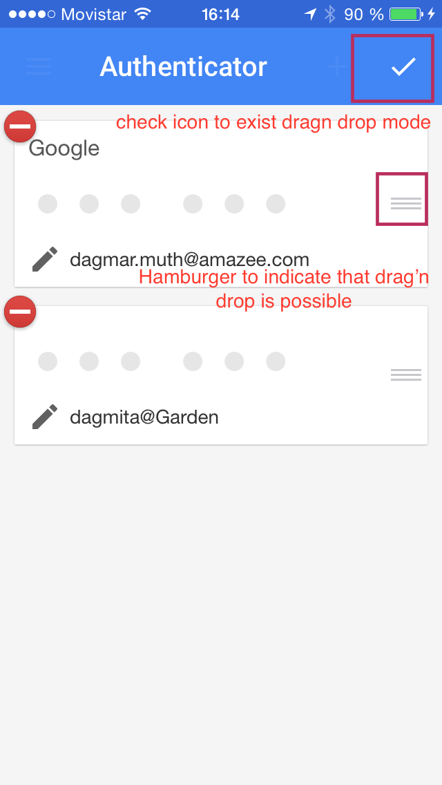
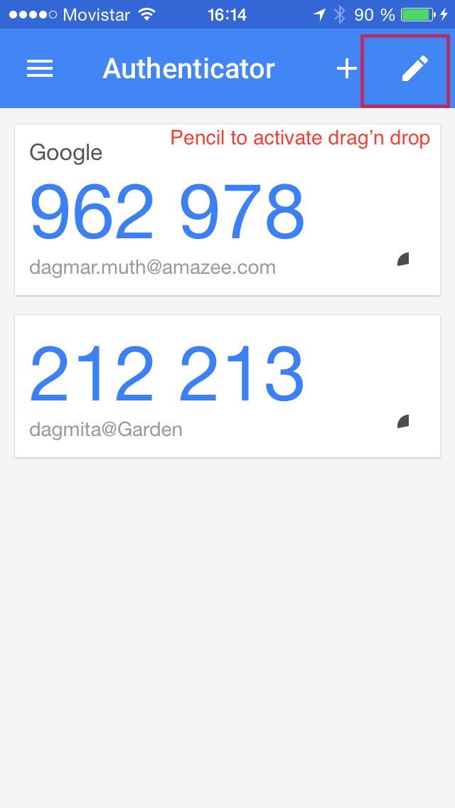
1) Activating the drag'n drop functionality with a clickable icon.
I think the drag'n drop functionality should be activated. If it would be activated by default users my do changes by accident while scrolling.
I like the idea of activating with a clickable pencil icon as it is already part of the tool set of Drupal and implies that a user can edit.
In the activated state the pencil changes into a check icon so that it is clear for the user that the check saves the changes. Also a little hamburger icon appears on each item which implies that this item can be moved up or down. I saw that in different apps and think that this is becoming a web standard. Personally I find it a bit strange because a hamburger is for me the icon for the mobile navigation. I would recommend keeping the cross that we are already using on desktop.
See the images below for explanations or watch the video: https://www.drupal.org/files/issues/Google%20authenticator%20app_1.mov
Drag'n drop inactive:

Drag'n drop activated:

2) Drag'n Drop functionality itself
There are two ways a user can move an item:
a) vertically: indicated reordering a list with drag'n drop. When touching an icon for 1sec, the drag'n drop gets active and then the item can be moved up and down and inserts itself between items. On the design side there needs to be indications when a user is moving an icon (colour change, shadows etc.)
b) horizontally: reveals additional functionalities. Revealing new features with a swipe is not part of this ticket but still can be considered in future. For now, I will not go into more detail.
Here is an example that I found user-friendly:
see as movie: https://www.drupal.org/files/issues/todoist%20app_1.mov
Comment #8
Alvaro Pozo CreditAttribution: Alvaro Pozo commentedI do not know how to report it. But early testing from a mobile iphone 4 from simpletest.me using the latest version of Drupal 8 found that the interaction "drag and drop" is broken for IOS, but this work for Android
Comment #9
LewisNymanThanks for working on this @Alvaro Pozo and @dagmita.
The fallback we have for no Javascript is to manually edit the weights dropdown, so we can build a good UI on top of this with Javascript if we need to, we don't have to hold ourselves back on the solution so it only works in HTML and CSS.
Comment #10
dagmita CreditAttribution: dagmita commentedComment #11
nod_So what's the scope here? Are we talking about having a d&d for reordering: non hierarchical taxonomies, views field reordering, fields on display mode admin page. And we'll worry about menus, hierarchical taxonomies later?
I tried to make a prototype back in munich I believe, the whole thing with hierarchical support and all. Spent pretty much a whole day on it and it sucked, was based of jQueryUI and it did not go well. I'll write down what I learned, hopefully that'll help out.
The situation back then (may have changed but I'm not hopeful):
trelements, it does work but there is no telling what kind mess we're exposing ourselves to. We dropped IE8 so may not be that bad.Drupal special sauce making this whole thing difficult:
The demos and examples I ran into were pretty and nice because they didn't have hierarchy and no constraints. Let me know if you need help.
Comment #12
Alvaro Pozo CreditAttribution: Alvaro Pozo commentedHola, vengo llegando desde la Drupalcon Latinoamerica en Bogotá a mi país, Chile. Tengo muchas ganas de compartirles la reflexión que me provocó este encargo de Lewis Nyman en los Sprint y poder contribuir a la mejora de Drupal. Aclarar, esta es una perspectiva desde investigación y estrategia UX, no es desarrollo.
Más abajo logré traducir mi texto a inglés
Comment #13
Alvaro Pozo CreditAttribution: Alvaro Pozo commentedHello, I come from Drupalcon latinamerica. I really want to share a analysis relative to assignment of Lewis Nyman on Sprint in Bogotá, for de purpose of to contribute to improving Drupal. To clarify, this is a UX research and strategy perspective, not of development.
Scope
First, I was thinking about the scope of the problem. For me it is clear, the purpose is satisfying the need to manage a hierarchical menu structure of a sitebuilder with a user experience for all devices is required. Namely, the object is we achieve a standard of intuitive, simple and user-friendly experience when modify the order and depth of a hierarchy of menus in Drupal, and at the same time work on all screen size.
However, in trying to address the problem, many questions and concerns about global strategy for Drupal 8 UX I came and I also born some ideas that have the desire to contribute to improving Drupal user experience.
Discussion of UX strategy
To address the specific problem, my first thought is that the challenge is complex, and that to solve it is necessary to explain the background for core Drupal 8 digital strategy. I would like to ask for help on where to find the digital strategy and policy to improve the user experience for Drupal 8 and tactics for regulating mobile site and can resolve these usability problems. I was looking for and I could not find. Where is? I am eager to read it. I even asked to Dries Buytaert at the opening session of the Drupalcon, but i think he misunderstood my question because I spoke in spanish.
however, I can assume that a strategic guideline for Drupal 8 is to provide the best experience for builders of websites on all devices. There is agreement on the importance of this objective, but there are different perspectives on how to get it: Mobile first? ¿Responsive Design? First Desktop? ¿native Apps Smartphone? Independent Mobile site?.
Clearly, there are several perspectives and some are longer trend. One is the focus "Mobile First", which tends to generate a user experience essential and very focused providing value for all screen sizes. He has exported good practices from the small screen to the desktop. Too, the Responsive Design helps achieve a transverse extent experience across devices, reducing training costs to the user, getting cover a much larger number of potential users while also means a cost optimization for the development. It is known by many people the value of these strategies and will not deepen over them.
However, there is another perspective sustained by Jakob Nielsen, who recommended design the desktop site interface and website mobile of way independently. Even recommends starting with designing native applications smartphones. In part, I feel it is not a completely antagonistic to the "mobile first" or "responsive design" idea, but it is a complementary angle that can help address usability issues in their entirety.
The detail of what is proposed Nielsen may be found on their reports, but his conclusion based on the research is that to get the best user experience for mobile site is different than necessary to meet the desktop design is required. He said in part is not contradictory, since while planning the design is required separately to best meet the needs of each environment, can also make cross crosslinks "from Mobile" or "from the desktop" and also allows the deployment of "breakpoints" responsive design more Server Side Components (RESS).
General Recommendation
For the specific case of managing the structure of a menu hierarchy of multiple levels deep, it seems that the current user interface for desktop operating satisfactorily and no urgent reason to change. But for the mobile version is just and necessary to plan the user experience itself, considering different contexts of use and the limitations of screen space to operate, for example there is a limited number of admin menu items that can hold the mobile space for drag and drop.
This is true for the administration of hierarchical menus, but its scope would extend it as a design recommendation for various components of the interface of Drupal 8. That is, it requires unifying experiences in small and big screen, but never forget that not all components can meet equally the mobile and desktop.
In fact, there are some critical elements in the current interface Drupal 8 I think they are halfway to meet the mobile user and the desktop, forcing a desktop experience of a small screen, but not completely satisfying the needs for either type of screen size.
This is the case of the D8 admin menu, which achieves a similar and transverse experience in all screen sizes but is not optimal when satisfy the need of a builder website user desktop. (I like to write and elaborate on this in another post given the critical importance of this element of the interface).
Specific recommendations to this problem
On how to implement this recommendation design, it seems very successful examples showing @Dagmita for thought for mobile design independently, in fact she sample native apps smartphone instead of mobile websites.
I Rescued two good practices that show us the direction where to go in the design. One of the imitable elements is the idea of activating and confirm Drag and drop function as a key issue, given the fragility and less accurate finger on touch interactions. The other interesting line is the reference to Drag horizontal, which would deploy new hidden features.
As a second specific recommendation for the design, it is important not display all features that are present on the desktop on the same screen, allowing improved user experience. This also allow "drag and drop" on a single larger object, and not on an icon mouse pointer led to the current situation, to avoid known problem of "fat finger" present in this case.
Clearly, further complicating things in this "drag and drop" is the possibility of changing the sequential order of the elements and their level of depth in the hierarchy at the same time.
To do this, again with the idea that the most satisfactory solution for the mobile user happens to forget about the current way of solving the problem desk.
Given the limited number of pixels in a mobile, I recommend that the menu can be seen in one level deep at a time, as the menus are in mobile environments. For example, it is distressing to see the "Admin menu" with all levels of depth on a mobile screen. Show only the first level of hierarchy depth for much help from Mobile Usability.
Also, and significantly, so that it is possible to drag items without confusion only up and down, ie, show a hierarchy level at a time would use code already invented to do this, not complicate mobile interaction. The idea is never collapse the small screen, and thus not reinvent the wheel.
How I can see the deep levels of the hierarchy? Showing all nested children of an element to the extent that the user expand, for example through an "accordion" that allows to show and hide one level deep, but always showing a level of hierarchy at a time, ie if I expand an menu item closes the other. With drag and drop functionality only vertically and always with a visible depth level of hierarchy, we maintain a simplified experience.
How to solve the problem of changing the depth of a menu item? Using drag horizontal, drag left and right to the functions of depth in the hierarchy. For example, if you drag an item to the left, this would rise to the next level of depth, losing their status as child of the parent element. Conversely, if you drag to the right, the effect could be that this element becomes child of the element which is right above it.
It might be easier create prototype to explain these design recommendations, but if you give me time to coordinate something with my local community to prototipear and then test this proposal could do within the next days.
regards,
Álvaro Pozo
Comment #14
LewisNymanThanks for the work here, there are a lot of exciting improvements we can make. I think the next step may be to create a prototype, which makes it really easy for members of the community to understand the design changes, post feedback, and get excited. I still think that we shouldn't worry about implementation issues yet, just verify that we are on the right track.