
 Support for Drupal 7 is ending on 5 January 2025—it’s time to migrate to Drupal 10! Learn about the many benefits of Drupal 10 and find migration tools in our resource center.
I've noticed that the form items are quite small on mobile device.
In Seven we increased the width on narrow devices:
#1751150: Improve usability of forms on touch screen and small screen devices
I think we should do the same here, it's a nice usability win for touch devices.
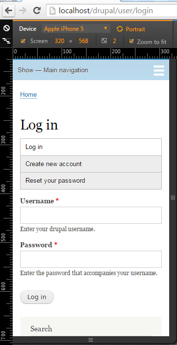
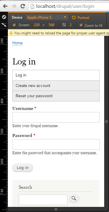
Screenshot showing vanilla 9.0.1 on mobile with the user login block added to the sidebar first region:

Remaining tasks
Write a patch that changes all form items similar to #1751150: Improve usability of forms on touch screen and small screen devices
Review
| Comment | File | Size | Author |
|---|---|---|---|
| #101 | after_patch.jpg | 20.67 KB | gaurav-mathur |
| #101 | before_patch.jpg | 11.31 KB | gaurav-mathur |
| #99 | After-Patch-1955268-98.png | 31.46 KB | Manibharathi E R |
| #99 | Before-Patch-1955268-98.png | 30.6 KB | Manibharathi E R |
| #98 | beforepatch.png | 292.66 KB | djsagar |


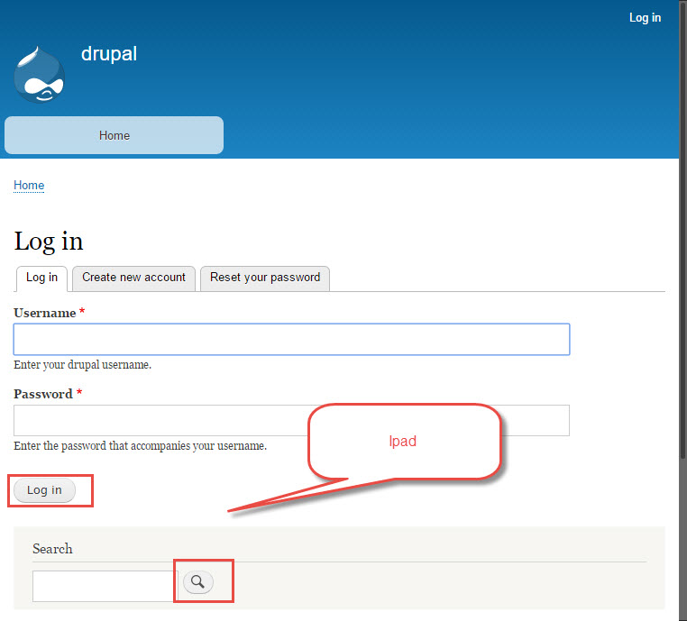
Comments
Comment #1
LewisNymanTagging
Comment #2
eatingsHow wide, and for what viewport range?
The simplest solution would just have go with
width: 100%for allinput[type=text]etc. below a certain viewport size, but there is a reasonable use case for letting form elements retain their HTML-specificed width, eg. numeric fields that have specific length requirements spanning 100% of a div might break the visual indication for length.Comment #3
BrightBoldComment #4
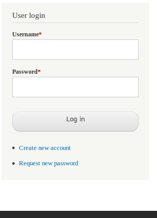
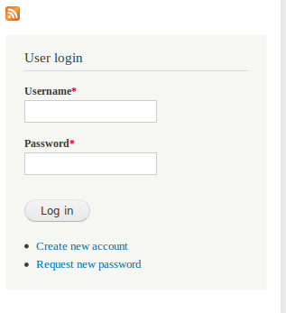
BrightBoldI've used some of Lewis's styles from Seven with the addition of min-heights on the form elements. Screenshots below:
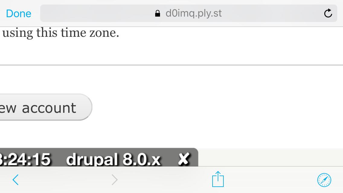
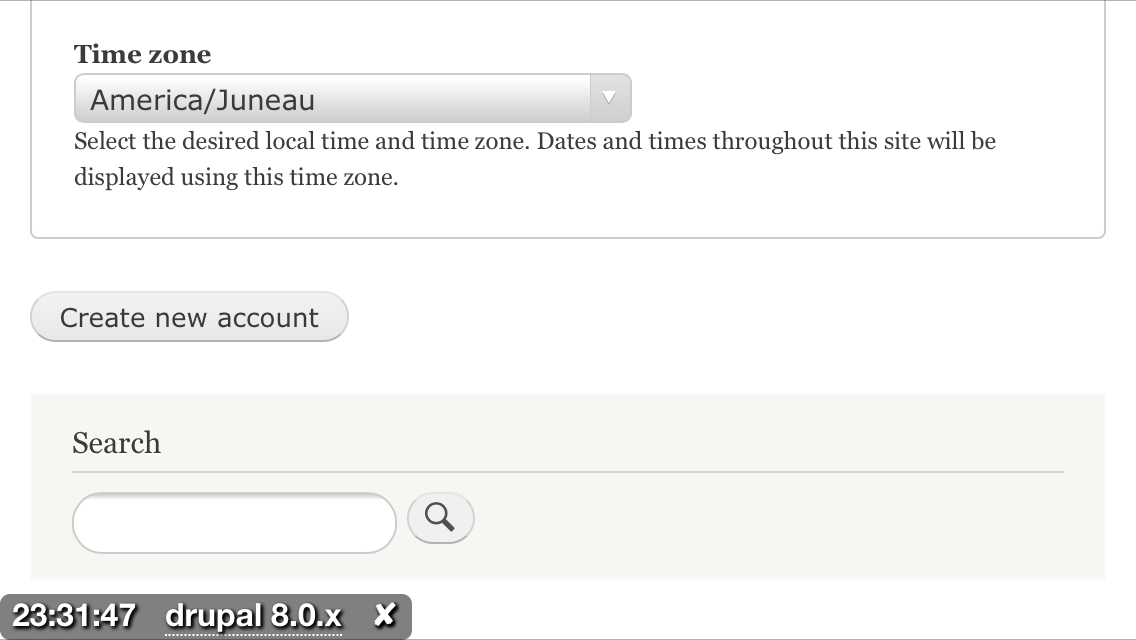
Comment #5
BrightBoldThe attached patch applies larger form element styles to the Login, Registration, and Password Reset forms for device widths below the Bartik mobile breakpoint.
Comment #7
BrightBold#5: bartik-mobile-form-styles-1955268-5.patch queued for re-testing.
Comment #8
echoz CreditAttribution: echoz commentedBartik is using unecessary qualified selectors, so besides in need of a cleanup, the ID selectors needed here raise the specificity enough to not need qualifying with the input element, and for the button, we also have a single class to target.
Comment #9
BrightBoldThanks echoz! Also, aren't we removing vendor prefixes per #1422614: Drop Firefox 3.6 support in Drupal core? I think both the -moz and -webkit prefixes should go, so a new patch is attached. Also, I reordered the properties to group all the box-model ones together.
Comment #10
LewisNymanThanks guys! The looks code looks good to me and the inputs are a decent size.
However when browsing I realised that we could probably give a little bit of love to the account links (create, request password). I think it would be worth adding a little padding to the links
Comment #11
echoz CreditAttribution: echoz commentedOn vendor prefixes, I just submitted #2005520: Remove remaining prefixed border-radius and box-shadow from core but not dropping them for box-sizing.
http://caniuse.com/css3-boxsizing
Comment #12
BrightBoldOK I'll take another pass at this to address both those comments.
Comment #13
eatingsOkay, took a stab at this since BrightBold hasn't touched it in a while. :)
-moz -box-sizingproperty.Comment #14
echoz CreditAttribution: echoz commentedLooks good. This is the first time afaik that we are omitting the webkit prefix with box-sizing, and that seems ok. http://caniuse.com/#feat=css3-boxsizing
Comment #15
LewisNymanProbably the most nit picky of things but I don't think we need a blank line between declaration blocks here, if I'm interpreting the standards correctly.
We could go further to increase the reusability of the styling but I think it's expanding the scope of the issue too much.
Comment #16
echoz CreditAttribution: echoz commentedThanks Lewis, blank line deleted.
Comment #17
LewisNymanGood work guys! Big win.
Comment #18
catchWhy only the user login form?
Comment #19
LewisNyman@catch
#5
#2
We had a discussion over the table at the Portland sprint. We decided that it would be overreaching to apply this to every form element, because we are completely unaware of the use cases of forms in Bartik (unlike Seven)
Comment #20
BrightBoldApologies for failing to follow up with this. Thanks @eatings!
Comment #21
LewisNymanKnocking this back the RTBC.
Comment #22
webchickHm. How will this work with a module that adds extra text-ish fields (e.g. tel) to these forms via hook_form_alter()? Is there any way of making these selectors more general?
Regarding #2, does CSS have some way to write a rule that's like:
"Do 100% width on all form elements, unless they specify a size attribute"
...because if so, I think that'd address the problem.
Feel free to mark back to RTBC once these questions are addressed.
Comment #23
LewisNymanThis is a good point and the short answer is "not yet". In #1986418: Update textfield & textarea style Ry5n suggested that we add a more generic class to form elements that should look like text inputs. If we get that in core, then we could use that here.
This is possible and support is good:
:not([size])The only problem is that the user login form does have size applied. hm.
Comment #24
brahmjeet789 CreditAttribution: brahmjeet789 commented#16 working fine for the theme .
Comment #25
brahmjeet789 CreditAttribution: brahmjeet789 commentedComment #26
webchickBack to needs review, because I don't know what Lewis's "hm" means. :) Does that mean we should adjust the patch here to add them?
I also am really concerned about how brittle this is due to the specificity. Can we get a cross-link here to the issue to add a way to style form elements consistently and probably add a @todo and/or postponed on that?
Comment #27
LewisNymanI think we might be overthinking this patch. If we really think that the size attribute has a specific importance on mobile we should always honor it. I don't think it does for the 80%. If someone really wants that behaviour they are welcome to sub-theme Bartik.
Opinions?
Comment #28
LewisNymanThrowing back to needs work because it doesn't look like anyone else has an opinion
Comment #29
LewisNymanConsidering we will be moving most size attributes from core, let's assume that the size attribute will have a decreased significance going forward. #2193271: Remove default #size attribute from core
Let's just copy what we do in #1751150: Improve usability of forms on touch screen and small screen devices
I've updated the issue summary.
Comment #30
ekl1773This seemed to need a quick reroll, so here's an updated patch for starters...
Comment #31
jhedstromSeems like a reasonable approach, although the more generic targeting of form elements has not been addressed (but perhaps it doesn't need to be).
Comment #32
emma.mariaKnocking this back to Needs Work.
A patch with new work needs to be created based of the updated issue summary and what was discussed in #29.
Comment #33
mherchelPatch submitted. Narrow viewport image attached.
Comment #36
mherchelComment #37
idebr CreditAttribution: idebr commentedThanks @mherchel, this is certainly a move in the right direction!
input.form-submit has no float by default, so this attribute can be removed.
Comment #38
emma.mariaWe also need to make sure we are not distorting the buttons and links too much.
The button needs to keep the round corners and the dotted underline needs to stay close to the text.

Comment #39
Bojhan CreditAttribution: Bojhan commentedNice catch, is this the only form element we should be looking at. What about the content creation page, people have that in bartik all the time.
Comment #40
emma.mariaComment #41
prashantgoel CreditAttribution: prashantgoel as a volunteer commentedHey Everyone,
I tested the block forms(i.e login block, custom form block) after applying the patch.
Here are my 2cents on this:
1. This patch fixed the user login block theming.
2. This patch distorted the custom form block which was created for the testing purpose.
This patch should be changed so that it works site wide and we should not only focus to the login blocks.
Please add if you feel I missed on something. Hoping that my comment helps.
Thank You
Comment #42
emma.mariaComment #43
wafer CreditAttribution: wafer commentedComment #44
wafer CreditAttribution: wafer commentedComment #45
swati_qa CreditAttribution: swati_qa commentedReviewed the patch 1955268-wider-form-fields-mobile-34.patch mentioned in #43.
Steps for Testing:
1. Navigate to Login page and verify the page on Mobile device.
2. Verify the font sizes.
3. Apply the patch.
4. Repeat steps 1 and 2.
Font sizes are not consistent across Login, Create new Account and Reset Password pages and also varies across iPhone5, iPhone6 and Nexus10. Screenshots are attached for reference.
Comment #46
swati_qa CreditAttribution: swati_qa commentedComment #47
star-szrHmm @swati_qa I'm a bit confused you said it's not consistent then set to RTBC? Can you explain your reasoning more?
@wafer can you please explain your approach? Also there is a white space error introduced, there needs to be a blank line at the end of the file per https://www.drupal.org/coding-standards#indenting.
Comment #48
swati_qa CreditAttribution: swati_qa commentedSorry, got confused with status, it should be "Needs Work", Thanks for updating.
Comment #49
star-szr@swati_qa no worries thanks for clarifying :)
Comment #50
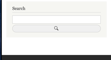
finnsky CreditAttribution: finnsky at Skilld commentedi fixed patch but found more issues with it. Search form broken and checkbox goes 100% width
Comment #51
finnsky CreditAttribution: finnsky at Skilld commented1) fixed checkboxes using :not() http://caniuse.com/#search=%3Anot
2) pretty crazy fix for search form:) i'm not sure hot exactly it should look
Comment #52
finnsky CreditAttribution: finnsky at Skilld commented1) fixed checkboxes using :not() http://caniuse.com/#search=%3Anot
2) pretty crazy fix for search form:) i'm not sure hot exactly it should look
Comment #53
swati_qa CreditAttribution: swati_qa commented@finnsky: I tried to apply the patches mentioned in #50 and #51, but both these failed to apply.
Please see the attached screenshots for reference.
Comment #54
swati_qa CreditAttribution: swati_qa commentedComment #55
star-szr@swati_qa I can't reproduce that, for me it applies to 8.0.x, 8.1.x, and 8.2.x. Perhaps your branch is out of date.
Comment #56
jaspreetsingh31 CreditAttribution: jaspreetsingh31 at Axelerant commentedI have verified patch :1955268-51.patch on multiple devices like Iphone5, Iphone 6, Iphone 6s, Nexus7, Ipad, HTC- One X etc and still there are issues exist. Please find the attachments for sake reference.
Thanks
Jaspreet singh
Comment #57
kostyashupenkoI checked all bugs from #56 and fixed issue with too wide selectboxes on small screens. Now should be ok on all devices (check screens before&after). About another bugs - i guess here is an issue, that related to specific devices. We have mobile styles, that was added in #51 by @finnsky for the width of screen less than 400px, but all tablets and in particular iphone 6s (i have this device and had tested this issue from my phone) has screens more than 400px. That's why we can't see mobile styles on those devices. But on iphone5 (1st bug) - no questions. I can reproduce it on iphone 5, anyway 1st bug is fixed.
So the question now is about what exactly breakpoint we need to use? For now it's 400px as i said, but better to increase it a bit, what do you think? Or any ways?
before


after
Comment #58
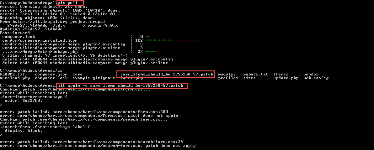
jaspreetsingh31 CreditAttribution: jaspreetsingh31 at Axelerant commented@kostyashupenko, I am getting error while applying your patch : form_items_should_be-1955268-57.patch.
For sake reference, please find the attachment.
Thanks
Jaspreet singh
Comment #59
kostyashupenko@jaspreetsingh31, please re-test it. On my side all is ok. Use 8.0.x branch

Comment #60
jaspreetsingh31 CreditAttribution: jaspreetsingh31 at Axelerant commented@kostyashupenko, I am sorry to say but i am still getting error while applying patch.
Please have a look to the screenshot.
Thanks
Comment #61
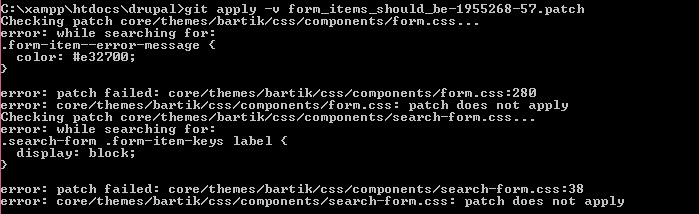
swati_qa CreditAttribution: swati_qa commentedTried to apply patch form_items_should_be-1955268-57.patch as mentioned in #57.
Patch failed to apply for me too.
Please refer screenshot.
Comment #62
prateekS CreditAttribution: prateekS as a volunteer and at Srijan | A Material+ Company commentedComment #63
prateekS CreditAttribution: prateekS as a volunteer and at Srijan | A Material+ Company commentedComment #64
mahalingam_cs CreditAttribution: mahalingam_cs at TATA Consultancy Services commentedAble to apply the patch successfully and tested the scroll bar and drop-down issue in iPhone 5 ,iPhone 5s , iPhone 6 ,iPhone 6 Plus and Nexus 5X. Attached the screen print for the reference. The issue is tested and its fixed.However found that when the device is turned form vertical view to Horizontal view after changing the value in drop-down, the layout breaks ( Issue_Horizontal_view.png).
Comment #65
Amruta_Nadgouda CreditAttribution: Amruta_Nadgouda as a volunteer and commentedlooks good now. issue resolved.
Comment #66
Amruta_Nadgouda CreditAttribution: Amruta_Nadgouda as a volunteer and commentedComment #67
star-szrThanks. Based on #57 and looking at the intent of the issue summary, most current devices have screens larger than 400px wide so to me it doesn't make sense to limit this better UX to <400px.
Based on a quick test it looks like Seven uses ~600px as the cut-off for full-width form elements, and that seems reasonable to me.
The full-width search button looks a bit funny to me, that's probably something I'd like @emma.maria's opinion on.
Comment #68
drintios CreditAttribution: drintios at Skilld commentedit is a good approach to make use of dimensions breakpoints to display mobile styles, but it would be better if you combine it with orientation breakpoints (orientation: portrait ) and (max-width: 600) seems like a good combination.
Comment #69
kostyashupenko@Cottser, i've checked too seven theme and there is 600px breakpoint. So i've changed breakpoint for bartik from 400 to 600px too.
new 600px breakpoint

About fullscreen search button - waiting for the offer
Comment #70
kostyashupenkoSorry, wrong patch and interdiff in #69. Re-added new
Comment #72
shaune CreditAttribution: shaune commentedI will be working on this during the sprint.
Comment #73
shaune CreditAttribution: shaune commentedNot sure what "waiting for the offer" means. I confirmed this works in 8.1.x, however it does not work in 8.2.x. See screenshot.
Comment #74
shaune CreditAttribution: shaune commentedAlso noticed that on the iPad the search box and button are not full screen on 8.1.x. This may be more subjective, but related to the original issue. Is this a common practice on tablets? Regardless, it looks a bit strange to have the search box not lining up with the other text fields.
Comment #75
shaune CreditAttribution: shaune commentedComment #76
shaune CreditAttribution: shaune commentedComment #77
joelpittetThanks for working on this during the sprint @shaune.
I'm adding a related issue to the search input. #2207717: Add a search/input group component
Comment #84
pankaj.singh CreditAttribution: pankaj.singh as a volunteer and at Srijan | A Material+ Company for Drupal India Association commentedComment #85
pankaj.singh CreditAttribution: pankaj.singh as a volunteer and at Srijan | A Material+ Company for Drupal India Association commentedTested on 8.8.5, the issue with the search field and search button still exists. A similar issue can be reproducible on 9.1.x.
Also, I tried to apply the patch given in #70 but it's failing for 8.8.5.
Comment #87
pameeela CreditAttribution: pameeela commentedI have added an updated screenshot of the current state to the IS but also tagging for issue summary update, as it needs more clarity around what is being proposed and how to achieve it.
Comment #88
pameeela CreditAttribution: pameeela commentedRemoving the screenshot and testing tags as that won't be needed until there is an actionable plan and a patch.
Comment #89
pameeela CreditAttribution: pameeela commentedComment #90
komalk CreditAttribution: komalk at Srijan | A Material+ Company for Drupal India Association commentedReview the patch attached screenshot for the reference.
Comment #92
komalk CreditAttribution: komalk at Srijan | A Material+ Company for Drupal India Association commentedComment #93
djsagar CreditAttribution: djsagar at OpenSense Labs commentedHi komalkolekar,
Patch is applied successfully, Thank for give valuable time.
Comment #94
pameeela CreditAttribution: pameeela commentedThanks for the patch!
The issue summary needs an update to explain the approach behind the changes. It’s also not clear that the CSS has been reviewed, as the RTBC comment just says the patch applies, but there’s more to it than that.
Once the summary is updated the tag can be removed and set this back to needs review for a check of the CSS.
Comment #98
djsagar CreditAttribution: djsagar at OpenSense Labs commentedI applied patch #90 and rerolled the patch with screen shorts.
So we can change the status of the issue.
Please review the patch and share feedback.
Thanks!
Comment #99
Manibharathi E R CreditAttribution: Manibharathi E R at Srijan | A Material+ Company for Srijan | A Material+ Company commentedPatch #98 Applied successfully on Drupal 9.4.x and form-Items also looks larger in the UI.
Before patch:

After Patch:
Comment #101
gaurav-mathur CreditAttribution: gaurav-mathur at Dotsquares Ltd. commentedApplied the patch #98 in the drupal version 9.5 successfully and its working fine.
Refer to screenshot.
Thank you
Comment #102
sharayurajput CreditAttribution: sharayurajput at QED42 for Drupal India Association commentedPatch is applied successfully and working good LGTM so moving to RTBC
Comment #103
pameeela CreditAttribution: pameeela at Technocrat commentedComment #104
pameeela CreditAttribution: pameeela at Technocrat commentedMoving to contrib since this is specific to Bartik, which has been removed from core in D10.