 Support for Drupal 7 is ending on 5 January 2025—it’s time to migrate to Drupal 10! Learn about the many benefits of Drupal 10 and find migration tools in our resource center.
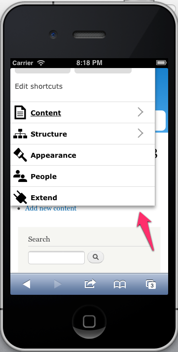
On mobile devices, the toolbar tray doesn't extend to the bottom of the screen when the content is longer than the toolbar. I've been looking at m.facebook.com for inspiration, but unlike a dedicated web app, our implementation has to take into account an unstable DOM environment that any module can alter. I'm still spinning on the best way to approach this. Input would be great.

| Comment | File | Size | Author |
|---|---|---|---|
| toolbar-mobile-phone-not-high-enough-2.png | 104.89 KB | jessebeach |


Comments
Comment #1
jessebeach CreditAttribution: jessebeach commentedTagging.
Comment #2
Bojhan CreditAttribution: Bojhan commentedI'd consider this major, it basically doesn't allow us to evaluate how useable configuration is.
Ocassionally you can get into configuration, I noticed. But its extremely buggy.
Comment #3
jessebeach CreditAttribution: jessebeach commentedBefore we can invest more time in fixing issues with the current design, we must first reach agreement that the design represented here is the one we want. Devoting time to resolve bugs in a design that may change will be time wasted.
Comment #4
webchickYep.
Postponing on the outcome of #1137920: Fix toolbar on small screen sizes and redesign toolbar for desktop.
Comment #5
Gábor HojtsyThis issue seems to be already fixed.