
 Support for Drupal 7 is ending on 5 January 2025—it’s time to migrate to Drupal 10! Learn about the many benefits of Drupal 10 and find migration tools in our resource center.
Problem/Motivation
In order for legacy desktop-based websites to work in mobile devices, mobile browsers implement a virtual viewport that is much larger than the actual dimensions of the device. If you just use media queries to create CSS layout to be used for different device dimensions, the mobile browsers will ignore the media queries that match the actual device dimensions (because they are using a virtual viewport.)
In order to get mobile browsers to ignore their default virtually-large viewport and instead use the actual device dimensions for the viewport, you have to set some special meta tags. These meta tags are documented, but not standardized. Lewis gives a quick summary in the original issue description below.
The best meta tags for broad-device support, usability and accessibility are:
<meta http-equiv="cleartype" content="on" />
<meta name="MobileOptimized" content="width" />
<meta name="viewport" content="width=device-width, initial-scale=1" />
<meta name="HandheldFriendly" content="true" />
Since Drupal 8 will be released in 2013 and could have a 3 year lifetime, we really need to assume that 99% of sites built then will be responsive. So adding this tag should be the default, but still overridable for the 1% use-case.
Proposed resolution
So how do we add these meta tags to core? And who are the developer groups that need to work with these meta tags?
- Theme developers creating a new theme and who are fine with the defaults. They could potentially copy/paste PHP snippets (though we'd like to avoid this).
- Theme developers creating a new theme who want to tweak the defaults.
- Module developers that want to provide a configuration for these tags or need to alter these tags for other reasons.
So let's step through the problem:
- If we put the meta tags in each theme's template.php via drupal_add_html_head() or #attached, then:
- For themers who like the defaults, they have to manually copy the PHP snippet examples from core themes and create their own template.php. — SAD PANDA
- For themers who don't like the defaults, ditto above — SAD PANDA
- For module developers, they'll use the hook_html_head_alter() as normal — WIN
- If we put the meta tags in system.module via drupal_add_html_head(), then:
- For themers who like the defaults, they are already available without any work — WIN
- For themers who don't like the defaults, they'll have to use implement hook_html_head_alter() in template.php and change a render array — SAD PANDA
- For module developers, they'll use the hook_html_head_alter() as normal — WIN
- If we hardcode the meta tags in system's html.tpl.php, then:
- For themers who like the defaults, they are already available without any work — WIN
- For themers who don't like the defaults, they can override html.tpl.php as normal and make their changes — WIN
- For module developers, they'll be unable to alter the meta tags without hook_theme_alter() hackery. — SAD PANDA
- If we add
<?php if ($default_mobile_metatags): ?>around these specific meta tags in system's html.tpl.php file:- For themers who like the defaults, they are already available without any work — WIN
- For themers who don't like the defaults, they can override html.tpl.php as normal and make their changes — WIN
- For module developers, be able to set the $mobile_metatags variable to false and then they'll be able to use drupal_add_html_head() or #attached as normal — WIN
#4 is a compromise, but its still a win for all types of users of these tags.
apple-mobile-web-app-capable removed based on comment at #50
We can't include the "apple-mobile-web-app-capable" tag by default.
When a page gets added to the home screen this tag removes Safari's toolbar. It a good idea for 'single page' web apps but for a collection of pages it has a detrimental effect. This can't be a good default.
Remaining tasks
- Patch review
- Simple tests — Add tests to check that setting $mobile_metatags to false turns off the meta tags.
User interface changes
None.
API changes
Adds a $default_mobile_metatags variable that's available in HOOK_preprocess_html().
Original report by lewisnyman
Common tags include:
// W3C best practice http://www.w3.org/TR/mwabp/#bp-viewport
// Supported by: iOS, Android, Palm Pre, Blackberry, Windows Phone 7
<meta name="viewport" content="width=device-width, target-densitydpi=160dpi, minimum-scale=1.0, maximum-scale=1.0, user-scalable=no">

//Non standard
<meta name="HandheldFriendly" content="True" /> //For older dumb phones. Palm and Blackberries.
<meta name="MobileOptimized" content="320" /> //Older "Windows Mobile" Phones
<meta name="apple-mobile-web-app-capable" content="yes"> //iOS only, runs in full screen mode when added to the home screen. https://developer.apple.com/library/safari/#documentation/appleapplications/reference/SafariHTMLRef/Articles/MetaTags.html
<meta http-equiv="cleartype" content="on" /> //Enable clear type for Windows http://www.microsoft.com/typography/whatiscleartype.mspx
The only controversial one is "user-scalable=no". I think it makes sense for and 'app' theme but not for a content focused theme. I'm happy to leave it out for now if it means we can get this in sooner.
| Comment | File | Size | Author |
|---|---|---|---|
| #92 | photo2.jpg | 58.76 KB | mgifford |
| #92 | photo1.jpg | 56.83 KB | mgifford |
| #91 | mobile-meta-tags-1468582-91.patch | 1.71 KB | LewisNyman |
| #76 | viewport-initialscale-1468582-76.patch | 1.22 KB | mgifford |
| #64 | mobile-meta-tags-1468582-64.patch | 4.49 KB | janusman |


Comments
Comment #1
LewisNymanI've gone and made a patch! Let's see what happens....
Comment #2
LewisNymanI've removed the white space errors.
Comment #3
LewisNymanComment #4
Bojhan CreditAttribution: Bojhan commentedSomething for John to take a look at.
Comment #4.0
LewisNymanAdded explanation comments
Comment #5
LewisNymanI've created a new patch with explanation comments in the code.
Comment #6
dcmouyard CreditAttribution: dcmouyard commentedFor the viewport meta tag, I prefer to use the following:
width=device-width, target-densitydpi=160dpi, initial-scale=1Users should be able to zoom, hence I don't use minimum/maximum.
Comment #7
LewisNymanFor anyone who is unaware there is a bug in iOS where the zoom does not get reset when switching orientation. This creates a disorienting experience. There are three options:
I think it's essential we get the other parts of the viewport tag in soon, so we can begin creating a better mobile experience. I'm going to resubmit the patch going along with option one. I think we should come back to this orientation issue down the line. This bug might not exist a year from now.
Comment #8
dcmouyard CreditAttribution: dcmouyard commentedI agree with lewisnyman in choosing option 1.
I personally use option 3, but to implement it for core requires including the iOS orientationchange fix script, and we run into the same issue as before when including third-party scripts. I propose we deal with option 3 together with including respond.js and other scripts into specific themes.
I prefer
<meta name="MobileOptimized" content="width" />so that it benefits older devices with screens sizes other than 320px.The other meta tags in patch #7 look good to me.
Comment #9
JohnAlbin@see.Nice job, Lewis!
Comment #10
LewisNymanBrilliant. Thanks John. Here's the updated patch based on your comments.
Comment #11
JohnAlbinI was reminded of this issue when I came across this note in normalize.css:
Interesting, no?
Lewis, I'll review the patch this weekend if someone doesn't beat me to it.
Comment #12
dcmouyard CreditAttribution: dcmouyard commentedJust fixed a few minor coding style issues.
Comment #13
switzernI've tested the most recent version of this patch and everything looks to be working properly. Tested on desktop, iOS and Android browser.
Comment #14
Schnitzel CreditAttribution: Schnitzel commentedjust one small thing I found during testing this issue: #1488754: Add mobile friendly meta tags to the Stark theme
for some older Android Browsers, if you zoom it triggers also a resize of the viewport, so this means it could load another layout. Which is kinda strange, because on the iOS it only really zooms and not triggers a viewport resize.
Interesting is, that the Android 2.3.5 Browser tries to guess to which area the user tries to zoom and then still changes the viewport, but automatically jumps to this area.
Tested also with newer Android 4.0 and there it looks that it works like the iOS zooming
There is also an issue for this for desktop browser: http://alastairc.ac/2012/01/zooming-bug-in-webkit/
A fix for this would be to disable zooming with "minimum-scale=1.0, maximum-scale=1.0, user-scalable=no" but this you already discussed to remove this from the code.
But I would leave as it is.
So also an RTBC by me
Comment #15
mjohnq3 CreditAttribution: mjohnq3 commentedRegarding the target-densitydpi setting for the viewport meta tag, the following article discusses it in great detail. The author recommends against its use based on his testing. http://sunpig.com/martin/archives/2012/03/18/goldilocks-and-the-three-de...
Comment #16
dcmouyard CreditAttribution: dcmouyard commentedmjohnq3 brings up a good point, and the article he linked to convinced me not to include target-densitydpi.
I'll create a new patch for this change.
Comment #17
dcmouyard CreditAttribution: dcmouyard commentedComment #18
JohnAlbinIn that article, they discuss why
target-densitydpi=device-dpidoesn't work how you might hope. And then they conclude that you should never usetarget-densitydpiat all. But there is no discussion about usingtarget-densitydpiwith a specific dpi setting, liketarget-densitydpi=160dpi.So, I don't see how that article convinced you not to use
target-densitydpi=160dpi. Using a specific pixel density allows for a more consistent apparent font size across different devices with different densities.Comment #19
LewisNymanIt's also important to scale the touchscreen targets. We don't want them getting any smaller on high dpi android devices.
Comment #20
dcmouyard CreditAttribution: dcmouyard commentedI missed the part where they were only testing
target-densitydpi=device-dpirather thantarget-densitydpi=160dpi.I believe most mobile devices default to 160dpi, but it's better to specify it in case there are any that don't.
The patch in #12 is probably the one to go with, but it would be great if anybody could test it in various devices just to be sure.
Comment #21
dcmouyard CreditAttribution: dcmouyard commentedAlso, catch brought up an interesting point in #1488756: Add mobile friendly meta tags to the Bartik theme on whether we should use
hook_page_alter()orhook_preprocess_html()instead ofhook_html_head_alter().Comment #22
Schnitzel CreditAttribution: Schnitzel commentedso I did some research with the target-density setting.
The
target-densitydpiSettings define the browser how to render the Pixels in the Browser.If you set it to
target-densitydpi=device-dpiit uses the native Pixels which can lead into really small texts on highdpi screens.Interesting is that Android and Opera have an setting for zoom, in the normal Android Browser it is called "Default Zoom" and has Settings for:
- Far
- Medium
- Close
In an Opera you can set Percentage from 100% to 300%.
Now this settings act exactly the same as the setting of
target-densitydpi, it "zooms" the site for the user, but also with an viewport change, so a bigger zoom will also call a new mediaquery.If you set now
target-densitydpi=medium-dpiortarget-densitydpi=160dpithis is the same and it is shown also the same way on a normal configured Browser, becausemedium-dpiis the default setting.But the fun stuff happens if you now change the configuration of the Browser. Then in the normal Android Browser with "Default Zoom" -> Far it shows you the screen as you would set
target-densitydpi=high-dpi, so the User still has the possibility to change the size of text, etc if he needs it (accessibility for example).The Problem ist with Opera Browser, if
target-densitydpi=medium-dpiis set, the setting for zooming is still there, but it does not work anymore (it works just after changing the setting, but after a refresh of the browser it jumps back to the setting). I think this is bad, because the zoom setting can also be used as accessibility for people with eye problems.And because
target-densitydpi=160dpiis the default in both Browsers I would suggest to remove the setting completely.With this, people which need another zoom can use it.
So for me #17 is the way to go
Comment #23
Schnitzel CreditAttribution: Schnitzel commented#17 is RTBC
Comment #24
JohnAlbinSchnitzel did another great review! And he addresses my concerns from #18. I'm fine with removing that property as long as we understand why we're removing it.
Comment #25
JohnAlbinJust had a huge in-person bikeshed because of catch's comment in #3 of #1488756: Add mobile friendly meta tags to the Bartik theme. But we figured out a much better implementation. I'm going to write up a new issue summary while Schnitzel works on a new patch.
Comment #26
JohnAlbinUpdating title.
Comment #27
Schnitzel CreditAttribution: Schnitzel commentedhere is a first Version.
- Added the Metatags to html.tpl.php
- Added variable to theme.inc template_preprocess_html()
- Wrote a test which checks if the tags are actually shown
ToDo:
- Writing a test which checks if the tags can be hidden or overridden
let's hope :)
Comment #28
Schnitzel CreditAttribution: Schnitzel commentedComment #28.0
Schnitzel CreditAttribution: Schnitzel commentedMissing http://
Comment #28.1
JohnAlbinExpand issue summary
Comment #29
Schnitzel CreditAttribution: Schnitzel commentedSecond Version:
- forgot one tag
- changed from "mobile_metatags" to "default_mobile_metatags"
- added documentation on top of html.tpl.php
Comment #30
alanburke CreditAttribution: alanburke commentedSlightly updated docs.
Changing to system component - we're going in...
Comment #31
alanburke CreditAttribution: alanburke commentedComment #32
Schnitzel CreditAttribution: Schnitzel commentedNew Version
- Added a new test which also checks if a module/theme can remove the Default Mobile Meta Tags via hook_preprocess_html()
- To be able to do this I also added a helper module to system module.
- Fixxed whitespace issues
- Some better Naming
Comment #33
alanburke CreditAttribution: alanburke commentedSome whitespace fixes
Comment #35
Schnitzel CreditAttribution: Schnitzel commentedoops, looks like I missed the whole helper module to add in the patch.
Let's try this one, also added the patch from alan.
Comment #36
Schnitzel CreditAttribution: Schnitzel commenteddoublepost
Comment #37
JohnAlbinOverall, the approach is good. I just have nit-picky documentation and code style fixes.
Streamline the code comment. How about: Display the html.tpl.php’s default mobile metatags for responsive design.
I don't think we need to capitalize responsive design either.
Let's make the docs more consistent with flags set in page.tpl and node.tpl: - $default_mobile_metatags: TRUE if default mobile metatags for responsive design should be displayed.
Code comment is wrong here.
We should put these in the same order as in html.tpl.php.
Needs a period. Also shorten to just: “Verify that the default mobile meta tags can be removed.” Since anything can change it, no need to list some things that can change it.
How about "displayed properly" and "removed properly"? Also, the PHP string concatenation operators (.) need spaces around them.
Need to add a newline to core/modules/system/tests/system_module_test.module.
Comment #38
alanburke CreditAttribution: alanburke commentedSo I bumped into Emma Jane and Morten and got to chatting about this patch.. as you do...
They made the valid point that the variable check isn't necessary.
A module doesn't need to decide whether a theme is responsive or not.
I couldn't come up with a use case either.
That's a theme layer decision.
So we can remove the variable, and the check.
If a site wants to be 'non-responsive', the system html.tpl.php can be copied to the custom theme,
and the metatags removed.
Comment #39
Schnitzel CreditAttribution: Schnitzel commentedA module doesn't need to decide whether a theme is responsive or not.You are right if you don't want to be responsive you should remove the metatags. But what about this:
A Theme want's to change the Metatags (for example max-zoom:1). With the Setting it could make this:
Set default_mobile_metatags to FALSE, add his own metatags to the HEAD via hooks.
If we don't have the default_mobile_metatags check, the only possibility for the theme would be that it has to ship the html.tpl.php in the theme, which I don't like so much.
But in the end, in both cases a Theme has a full control.
Another thing is: If you want to use for example Bartik (which will be responsive) but you want to disable responsiveness. The only possibililty would be:
- hack core and change the html.tpl.php
- create a subtheme which only changes this (realy hard for non themer/devs)
With the default_mobile_metatags Setting, Bartik could ether provide a setting for this, or a contrib module can implement a setting for this.
btw, check the issue summary, it has all this things in =)
Comment #40
Schnitzel CreditAttribution: Schnitzel commentedupdated the patch with Johns inputs. thx!
Comment #41
tstoecklerTrailing whitespace.
Since I'm already posting, I might add that I also think killing the variable would be a good idea. That seems a perfectly good use-case (one of the few, probably) for overriding html.tpl.php. My two cents...
Comment #42
Schnitzel CreditAttribution: Schnitzel commentedfixxed whitespace.
Regarding the variable I leave the decision to John.
Comment #43
tstoecklerAhh, dammit, I found one more thing. I agree that the variable/no-variable issue can be handled in a follow-up.
We don't do concatenation inside of t(). Either use @name or simply omit the t() per #1380620: Remove t() from test assertions.
Comment #44
tstoecklerWell I might as well fix this myself.
This is RTBC, but I'll let someone have another look at it. It seems JohnAlbin is cool with this (#37).
Comment #45
tstoecklerSorry, forgot the patch.
Comment #46
Schnitzel CreditAttribution: Schnitzel commentedReviewed, looks good! Go RTBC go!
Comment #47
yoroy CreditAttribution: yoroy commentedWhat a lovely productive issue this is. Schnitzel: did you already post that photo of all the devices you tested on during mobile sprint? :)
Comment #48
Schnitzel CreditAttribution: Schnitzel commented@yoroy
yes, here: http://twitpic.com/8yngav :)
Comment #49
edward_or CreditAttribution: edward_or commentedHate to step in when we have reviewed & tested by the community but I am not sure about 'initial-scale=1.0'. HTML5 boilderplate recently removed it (see https://github.com/h5bp/html5-boilerplate/issues/824). To summarise the reasons from there
1.) it means messy JS hacks like the meta viewport JS fix are not needed.2.) we stop seeing lots of sites that either a.) break on rotate/zoom b.) fail to pinch/zoom until the second gesture occurs
3.) it lets iOS perform it's default system behaviour, keeping in-line with user expectations.
I have been doing it in recent projects and it works well and the experience in ios is much nicer.
Comment #50
LewisNymanWe can't include the "apple-mobile-web-app-capable" tag by default.
When a page gets added to the home screen this tag removes Safari's toolbar. It a good idea for 'single page' web apps but for a collection of pages it has a detrimental effect. This can't be a good default.
Comment #51
JohnAlbinRemoving it sounds good to me.
It's been so long since I added that to my pages, I don't remember why its there. :-\ Removing that will mean we need to retest in various mobile devices.
Comment #52
Schnitzel CreditAttribution: Schnitzel commentedagree, could lead into behavior a sitebuilder would not expect.
If it fixxes a bug in iOS we should remove it, But I'm not 100% sure if the responsive design would still work the same. Definitely have to retest. I hope I find some time next week.
Comment #53
LewisNymanHere's the concurrent issue from HTML5 boilerplate.
We should rip it out.
Comment #54
dcmouyard CreditAttribution: dcmouyard commentedComment #56
tstoecklerThe patch is missing system_module_test.module and system_module_test.info that were added in previous patches.
This should also be removed. It was removed properly from the tests, but not from the actual template.
Comment #57
dcmouyard CreditAttribution: dcmouyard commentedComment #58
tstoecklerLooks good code-wise, but I can't judge the actual tags, so leaving for someone to give this a final lookover before marking RTBC.
Comment #59
LewisNymanTest Pages:
Stark - Home page
Seven - /admin/structure
Bartik - Not tested because it is still fixed width.
Expected behavior:
Page fills the whole of the mobile screen without horizontal scrollbars.
Pages are zoomable.
No weird orientation bug on iOS devices
Tested in:
iOS Simulator Safari (4.3.2)
Opera Mobile Emulator (HTC Desire presets)
iPhone 3GS Safari (iOS 5.1)
iPhone 3GS Opera 7
iPhone 3GS Dolphin
Ripple Emulator (Blackberry Curve 9300)
Nokia N900 Maemo default browser (Gecko based)
Nokia N900 Maemo Firefox
iPad 3 Safari (iOS 5)
All these tests passed. Sadly my Android test unit has bitten the dust so if anyone could help out there we should be good to go.
Comment #60
Zgear CreditAttribution: Zgear commentedJust tested with lewisnyman on Android 2.3, there was no styling, but it did follow the expected behavior that he listed.
Comment #61
LewisNymanOk my Android came back to life and worked great:
Sony Ericsson X10 Mini (Android 2.1)
Comment #62
Tor Arne Thune CreditAttribution: Tor Arne Thune commentedNot necessary.
Should start with Verifies...
Same.
Also all modules and themes now need to be in its own directory (see #1299424: Allow one module per directory and move system tests to core/modules/system), so it should probably be moved to its own directory
core/modules/system/tests/modules/system_module_test/, like the other system test modules.Otherwise, this looks good and well-tested!
Comment #63
JohnAlbinTor's comments are code formatting. If someone can re-roll with those changes, I can verify and then mark RTBC. We don't need to test on devices again since Lewis's and Zachory's reviews were excellent.
Comment #64
janusman CreditAttribution: janusman commentedRolled new patch.
Comment #66
Tor Arne Thune CreditAttribution: Tor Arne Thune commented#64: mobile-meta-tags-1468582-64.patch queued for re-testing.
Comment #67
Tor Arne Thune CreditAttribution: Tor Arne Thune commentedThanks, looks good!
Comment #68
Dries CreditAttribution: Dries commentedCommitted to 8.x. I think it can have interesting effects between now and when 8.x. is released.
Comment #70
webchickThis patch introduced a HTML5 validation error: #1717090: Remove the http-equiv="cleartype" meta tag.
Comment #70.0
webchickImprove formatting.
Comment #71
JohnAlbinIssue tags aren't Twitter hashtags. :-)
Comment #72
LewisNymanFollow up issues:
#1892078: Add mobile friendly viewport CSS
#1887800: Add mobile friendly meta tags to the maintenance page
Comment #73
hansrossel CreditAttribution: hansrossel commentedThis patch has been removed, so the meta tags are no longer present currently in html.tpl.php, searching for the issue where that was done.
Comment #74
BrightBoldThe metatags are still present, although the code no longer looks like it did in the patch above (particularly after the twigification of the templates).
Comment #74.0
BrightBoldupdated problem motivation: apple-mobile-web-app-capable removed based on comment at #50
Comment #75
mgiffordOn comment's #49 & #51, I wanted to add some docs about initial-scale=1.0
Apple's has some docs on Viewport definitions.
But there are a few blogs talking about the importance of properly setting the Viewport so that users can continue to control the Zoom on their device. Viewport : adieu width=device-width and Five Fundamentals of Accessible Responsive Web Design.
The optimal RWD code looks like this:
<meta name="viewport" content="width=device-width, initial-scale=1.0" />Comment #76
mgiffordThere was no discussion about why this was dropped, so I'm adding back in. If this should be a new issue, do let me know.
This is also consistent with what is in core/vendor/phpunit/php-code-coverage/PHP/CodeCoverage/Report/HTML/Renderer/Template which may be irrelevant, but found while grepping around.
Comment #77
LewisNymanI'm happy with this change. I'll for some others to weight in before RTBC.
Comment #78
malc_b CreditAttribution: malc_b commentedIf you run a web page with these meta tags, MobileOptimized, etc. through W3 validator at http://validator.w3.org these tags give an error -
Keyword mobileoptimized is not registered.
The error report helpfully says
"You can register metadata names on the WHATWG wiki yourself."
So I'd suggest someone who knows the details of these tags does that to stop pages failing validation.
Or are these in fact the right keywords to use?
Comment #79
mgiffordI haven't found that the W3C's validator is well supported. This is already in Core
<meta name="MobileOptimized" content="width" />Similar issue with
<meta name="HandheldFriendly" content="true" />This is not part of the patch in #76. It's also being questioned here:
http://stackoverflow.com/questions/13871836/html-meta-tags-for-mobile-de...
http://stackoverflow.com/questions/1988499/meta-tags-for-mobile-should-t...
But my assumption is that the issue is with the W3C. Their HTML5 setting is still marked as experimental after all.
They have another validator here:
http://validator.w3.org/mobile/
Probably all based on W3C Recommendation 29 July 2008:
http://www.w3.org/TR/mobile-bp/
Comment #80
sghoweri CreditAttribution: sghoweri commented@LewisNyman and @mgifford - I also agree with the decision to add back in the "initial-scale=1.0" attribute to the viewport meta tag.
There was a previous IE10 for Windows Phone 8 bug which had previously been causing issues in landscape mode (chopping off a decent chunk of the screen), however this has since been resolved with a recent updated pushed to Windows Phone 8 devices (see http://mattstow.com/responsive-design-in-ie10-on-windows-phone-8.html#th... for more info).
The benefits of adding this back in will significantly improve the usability and experience on the admin side in landscape orientation, especially on iOS devices.
Before:
iPhone 5 - Landscape - Without Initial Scale Set
After:
iPhone 5 - Landscape - With Initial Scale Set
Comment #81
makokis CreditAttribution: makokis commentedhi all,
I'm using Commerce Kickstart (commerce_kickstart-7.x-2.12) than is responsive template.
Looking in Google Webmaster Tools it says I have to configure Viewport for mobile devices and tell me this instructions to proceed:
"Recommendations
Pages optimized to display well on mobile devices should include a meta viewport in the head of the document specifying width=device-width, initial-scale=1.
"
I'd tried with an iPhone 4 but everything looks and works fine.
Must I use this patch #76 viewport-initialscale-1468582-76.patch, 1.22 KB, mgifford?
thanks in advance
PD: sorry I mistake posted it here where you are talking about drupal 8 :(
Comment #82
mgifford76: viewport-initialscale-1468582-76.patch queued for re-testing.
Comment #83
mgiffordNice to see that Google seems to agree.
You don't have to, but it is a best practice. It all depends if you want to allow users to continue to control the Zoom on their device or not.
Comment #85
LewisNymanInitial scale does allow for zooming. It's the min/max scale values and user-scalble that disable it.
Comment #86
BarisW CreditAttribution: BarisW commented76: viewport-initialscale-1468582-76.patch queued for re-testing.
Comment #87
deanflory CreditAttribution: deanflory commentedIn regards to this tag that hides the navigation in iOS Safari:
Found this info here (haven't tested to verify):
http://stackoverflow.com/questions/6582732/what-does-apple-mobile-web-ap...
Then there is styling the app status bar:
https://drupal.org/node/2225153
And, setting a startup image for iOS Safari:
https://drupal.org/node/2225151
Just some thoughts, but it might be nice to set a standard for Drupal out-of-the-box, and then allow users to customize whether these are added and in the case of the app status bar style, there could be a 3 item select dropdown for default, black, black-transparent.
Comment #88
LewisNyman76: viewport-initialscale-1468582-76.patch queued for re-testing.
Comment #90
quicksketchI saw the most excellent presentation by Peter-Paul Koch (the quirksmode.org guy) at HTML5 DevConf on exactly what the intialscale meta tag did on different devices. Unfortunately, the video for his presentation is not yet online, it would be at https://www.youtube.com/playlist?list=PLAIXSzgkhDs6K1VjhryO4iGw5FKHgJ6lK, so keep an eye on it for it to be published later. The talk was called "Mobile Viewports" I believe. The closest thing I could find for reference was a recent blog post at http://www.quirksmode.org/mobile/metaviewport/.
I unfortunately can't recall all the details, but the short story is that you should use both device-width and initial scale (as recommended by the patch in #76).
In an attempt to summarize, basically "device-width" will only give you the portrait size "ideal" width on iOS devices but will give you the ideal width of whatever orientation you're in on others. This is why having device-width alone on an iOS device causes the page to render at the wrong zoom when in landscape mode.
However, if you set "initial-scale=1", then the device width reported to the browser will be correct on all mobile devices no matter what their orientation, except... dun dun dun, IE10. In which case it gives you the portrait ideal width all the time (basically the same problem as "device-width" on iOS devices).
If that's hard to follow I apologize, here's the chart summarizing the situation from that quirksmode blog post.
The savior for this situation is that apparently ALL browsers follow one rule: if both device-width and initial-scale are provided, calculate both and then choose the largest value. This makes it so that iOS will report the right width when in landscape mode by using initial-scale, and IE10 will report the right width by using device-width. Chrome, Opera, Blackberries, etc. will all report the right width using either value.
That's as best I can remember and research, but I'd suggest watching the entire original video when it becomes available on YouTube. In short, +1 for initial-scale from people who have extensively tested this already.
Comment #91
LewisNymanIt seems we have enough justification here, let's get this closed up.
This patch has two changes:
Comment #92
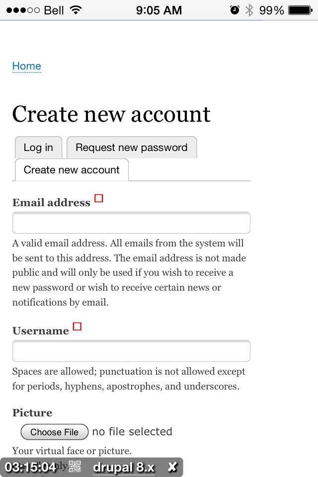
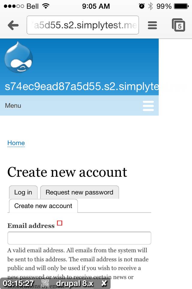
mgiffordThat's great. However, this is what it looks like on my iPhone 4S in Chrome & Safari:
Strangely, looks way better in Opera.
Comment #93
LewisNyman@mgifford That bug is caused by the very long site name generated by simplytest.me, I think there's an issue for that already. It\s definitely not caused by this patch.
Comment #94
mgiffordIn that case, let's call it RTBC.
Comment #95
webchickAwesome, thanks for the confirmation, quicksketch!
Committed and pushed to 8.x. w00t!