
Meta Issue of all Commerce 2.x UX changes and improvements, see related tasks for detailed work, this main issue will contain overall audits and discussion.
| Comment | File | Size | Author |
|---|---|---|---|
| #41 | bill-ship-addy.png | 13.14 KB | jjpoole |
| #38 | D8DC2.Xcheckout-ui-side-by-side.png | 92.61 KB | websiteworkspace |
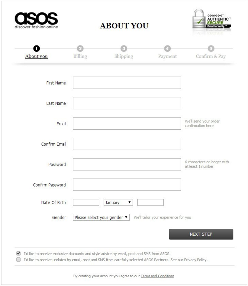
| #28 | Hint-Examples.jpg | 38.59 KB | jjpoole |


Comments
Comment #2
bojanz CreditAttribution: bojanz at Centarro commentedComment #3
bojanz CreditAttribution: bojanz at Centarro commentedComment #4
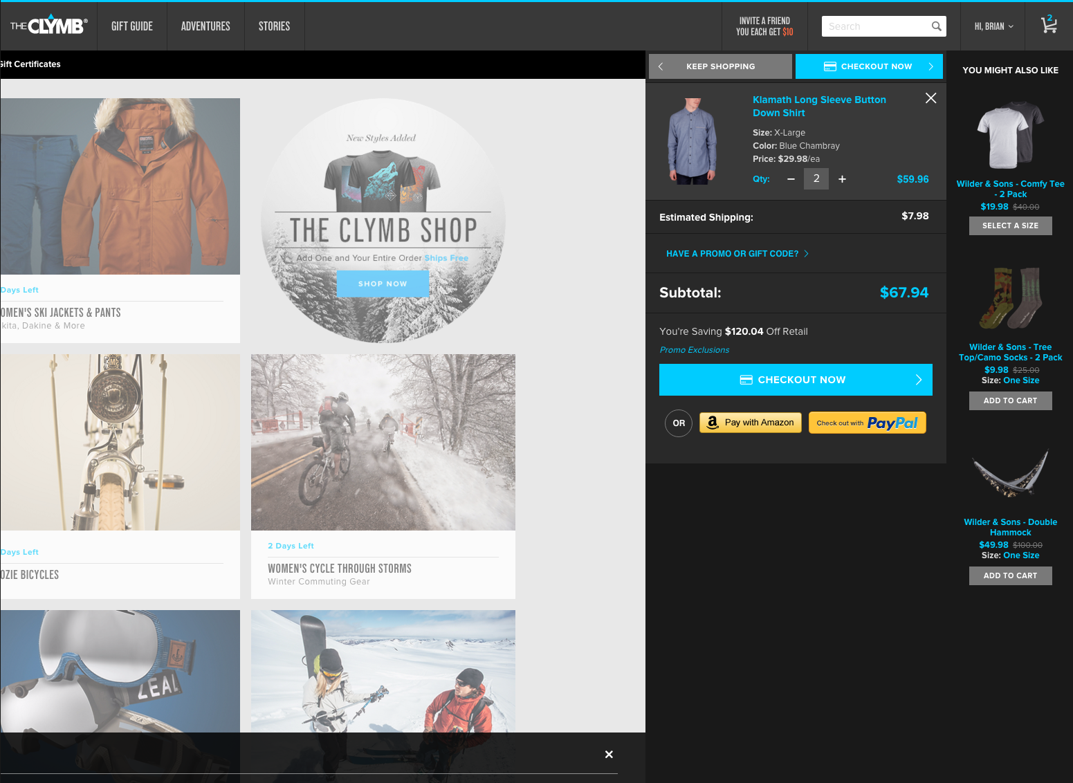
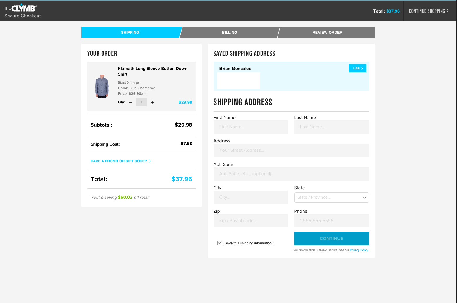
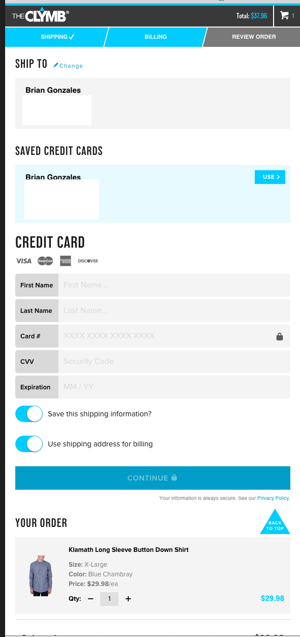
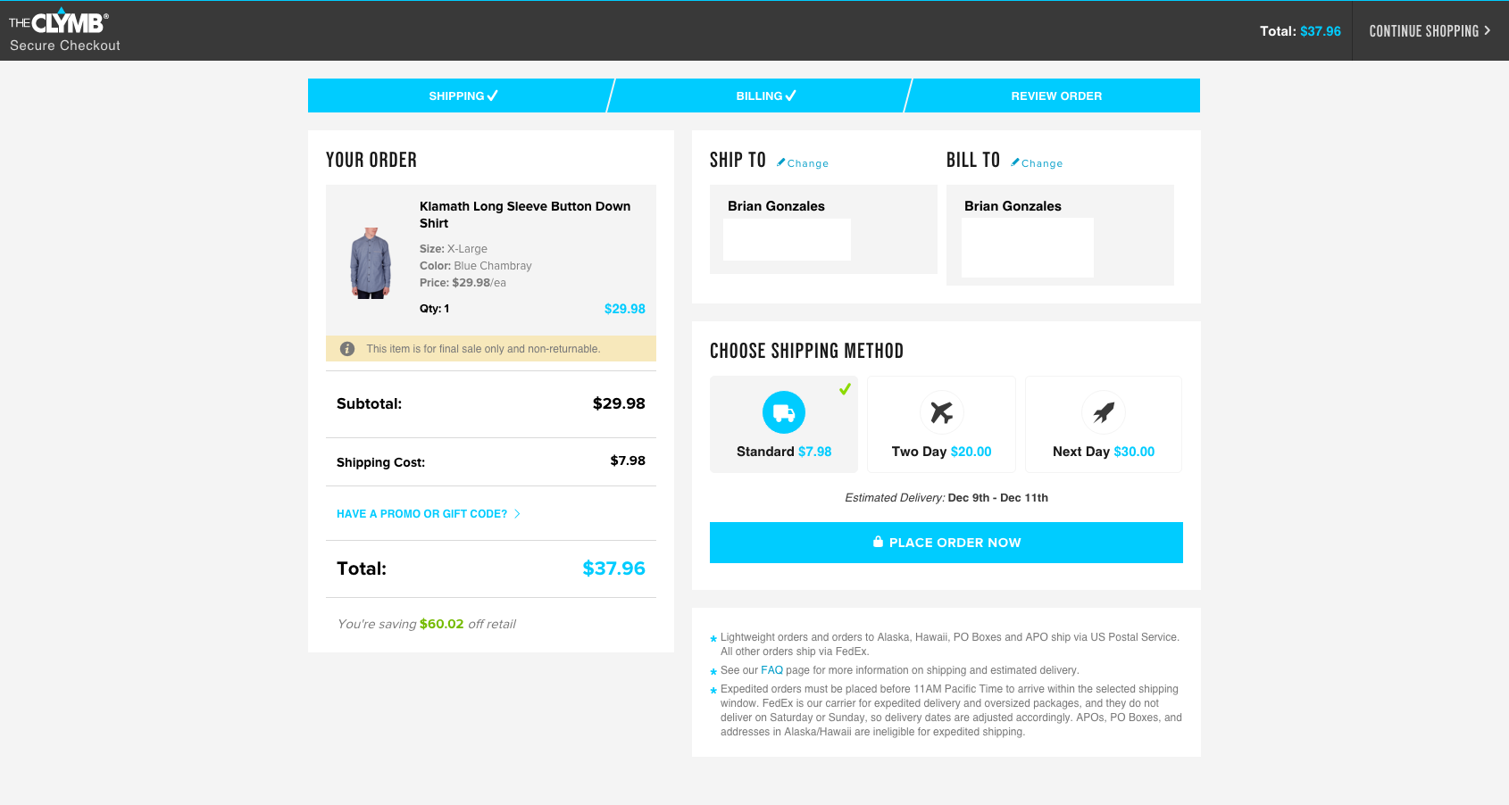
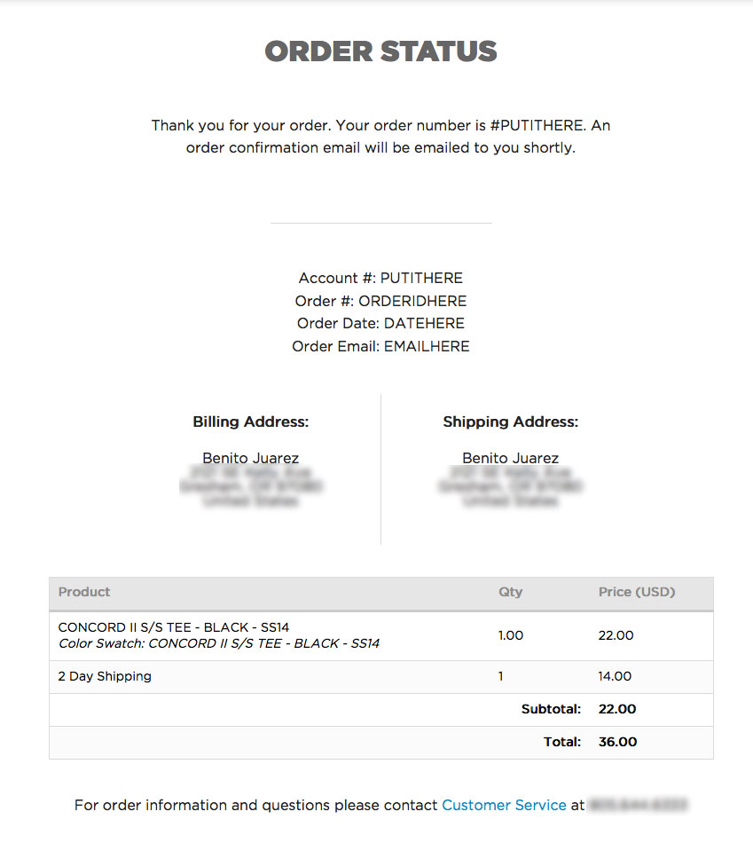
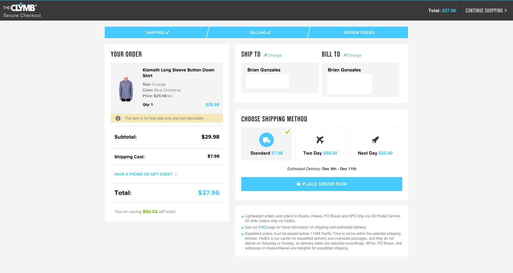
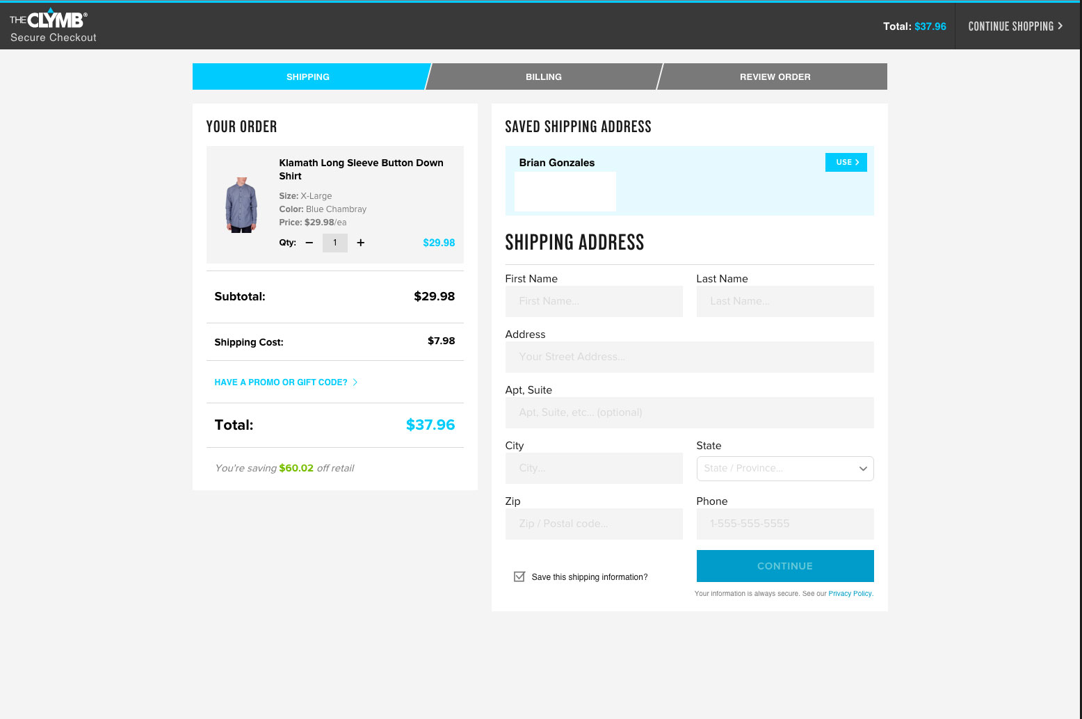
gonz CreditAttribution: gonz as a volunteer commentedI like the idea of having the cart displayed at all times through a short checkout process. This eliminates the need for a review screen as well.
ex: The Clymb theclymb.com
PS - sorry the screenshots seem out of order to actual checkout workflow.
Comment #5
gonz CreditAttribution: gonz as a volunteer commentedSorry about last set of images - these image names are more meaningful:
Looking through @Julien's the Docs - these followed many of the suggested guidelines:
Comment #6
smccabe CreditAttribution: smccabe as a volunteer and at Acro Commerce commentedNote about not requiring a review screen. While these examples do have the cart tagging along for each page, many payment gateways require a final review page after all information has been entered. I would recommend we keep the final review page as it is that sort of final check to prevent incorrect orders and help protect you from chargebacks as best you can.
PS. That clymb site requires you to login with email or facebook before you can even click any links? yuck
Comment #7
gonz CreditAttribution: gonz as a volunteer commented@smccabe - yeah - its a flash sale membership site. That why I left out the login screenshots before these checkout screens - it was already done.
I'm curious - can you give me an example of 1 or 2 Payment Gateways that require a final review page? We mainly use Auth.net or Paypal Pro - and so far they do not require it - but I know we should be thinking and developing with as large of a user base in mind as possible. Maybe we can use their API guidelines in our UX strategy.
Also curious if a consolidated version like the clymb - would suffice as a final review page.
Comment #8
rszrama CreditAttribution: rszrama at Centarro commentedPayPal EC requires an on-site order confirmation page in the event you use the Express Checkout button from the cart form to log in at PayPal and authorize payment.
Comment #9
smccabe CreditAttribution: smccabe as a volunteer and at Acro Commerce commented@gonz One I know off the top of my head is Moneris, I've attached their little quick checklist, although if you actually setup an account with them they will do a manual review that can be a little more in depth. Their wording isn't precise, so the clymb style may suffice, tbh it would probably come down to the individual reviewer.
The list might be helpful though, it give some technical details they prefer like return and privacy polices, currency display etc.
Comment #10
AaronChristian CreditAttribution: AaronChristian commentedHey Guys,
I have a few notes on the UX of how the final checkout flow could be designed. I work closely with the Telus Mobility teams in Vancouver and Toronto and have solved some fundamental issues they have encountered with Checkout flows and conversion rates.
Some things I think we should consider/implement with the direction of the new D8 commerce project.
Some ideas I'd like to see implemented to reduce time spent filling out billing/shipping/payment details;
I would be willing to contribute UX/UI improvements in regards to designs/mockups so we can get some of these proposed changes into action.
Some great UX/UI reads;
http://www.ahfx.net/weblog/164
http://www.smashingmagazine.com/2011/04/fundamental-guidelines-of-e-comm...
http://baymard.com/blog/one-page-checkout
Comment #11
jjpoole CreditAttribution: jjpoole at Acro Commerce commentedHey guys,
Here is best practice/UX stuff we've gathered from different sources and our experience:
https://docs.google.com/document/d/1Hm3T5o7JrO8dUAbIo-tRtnky773D0H5avemC...
Comment #12
jjpoole CreditAttribution: jjpoole commentedHey guys,
Here's some UX recommendations our team has compiled.
https://docs.google.com/document/d/1Hm3T5o7JrO8dUAbIo-tRtnky773D0H5avemC...
Comment #13
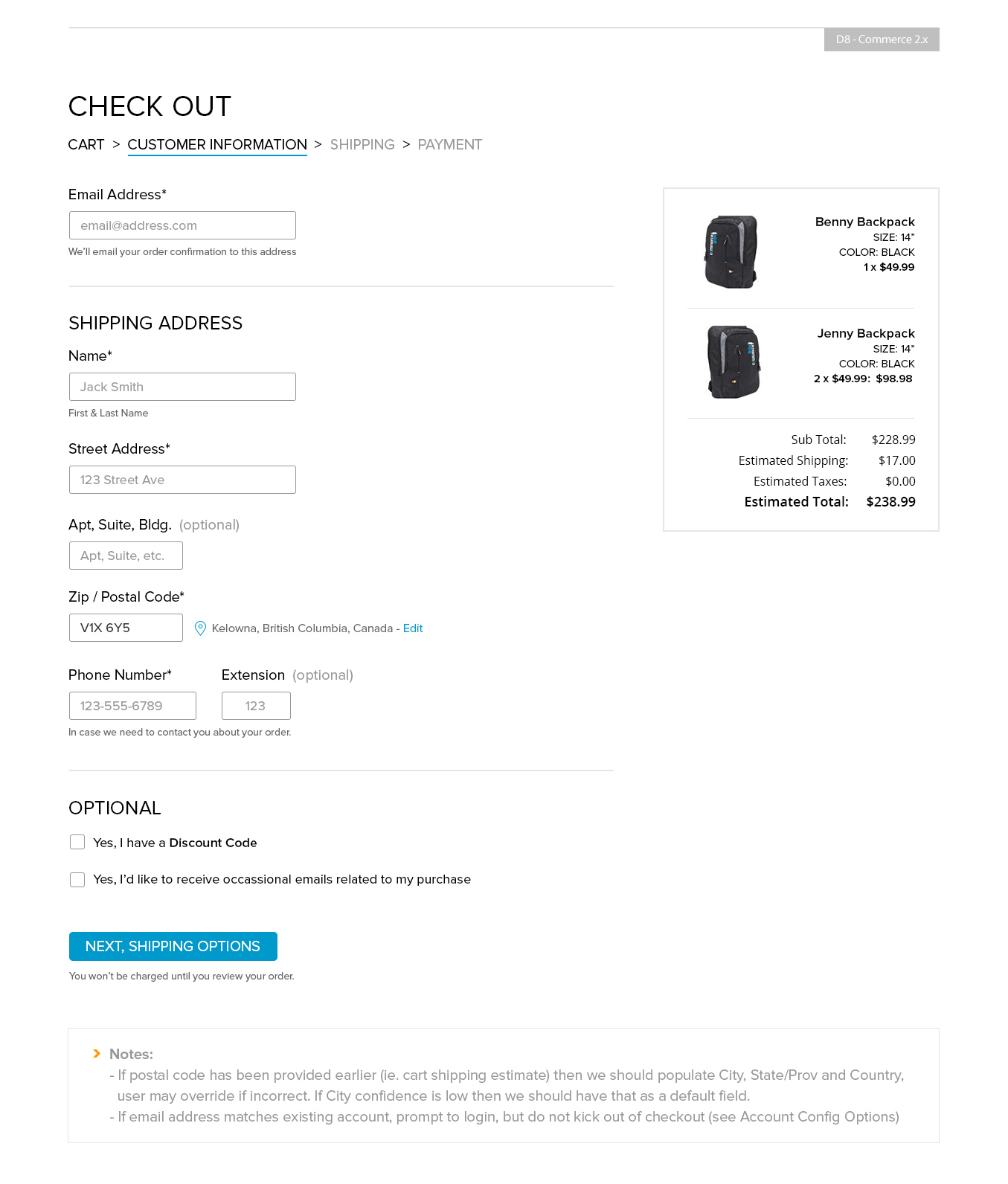
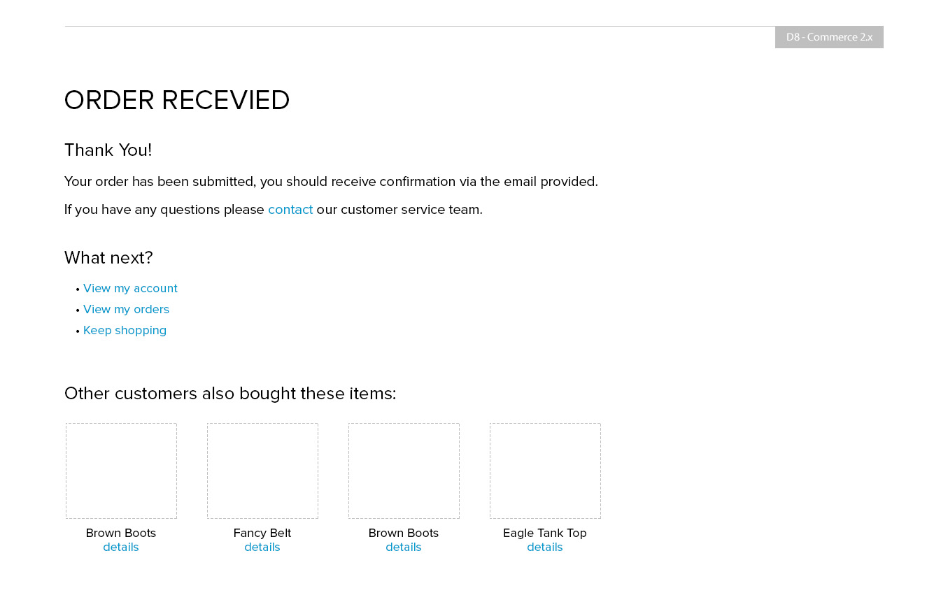
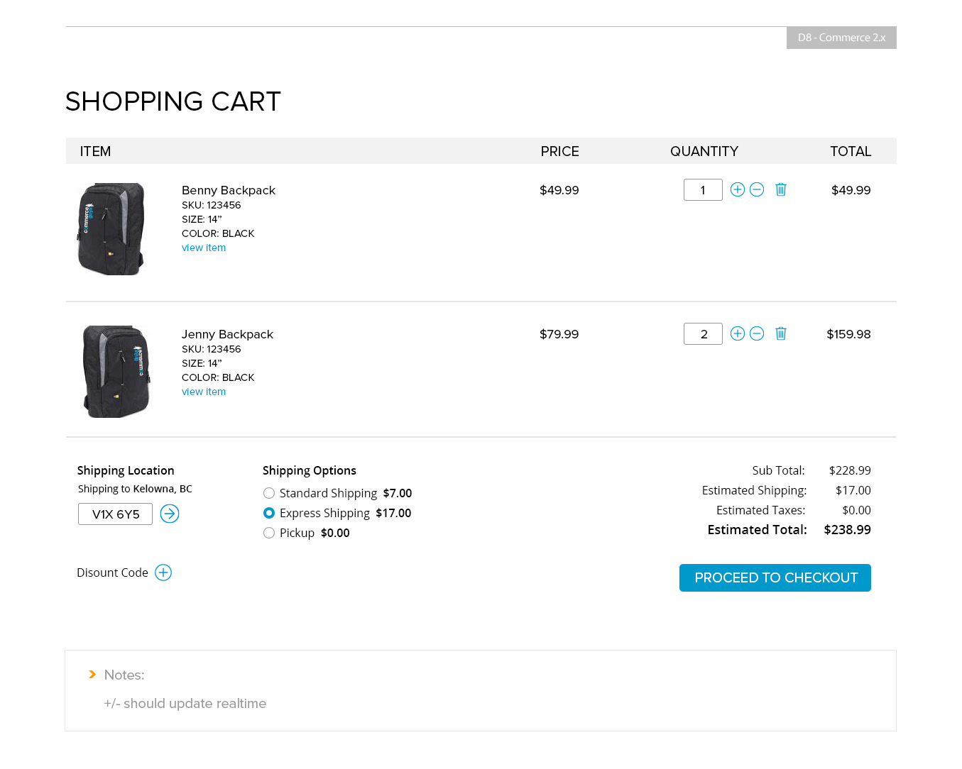
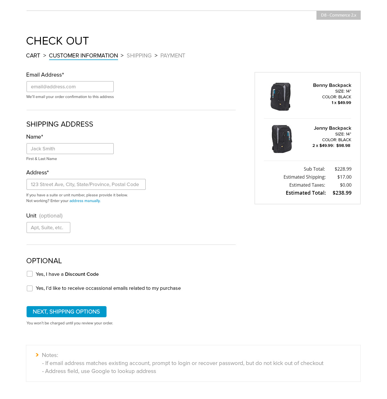
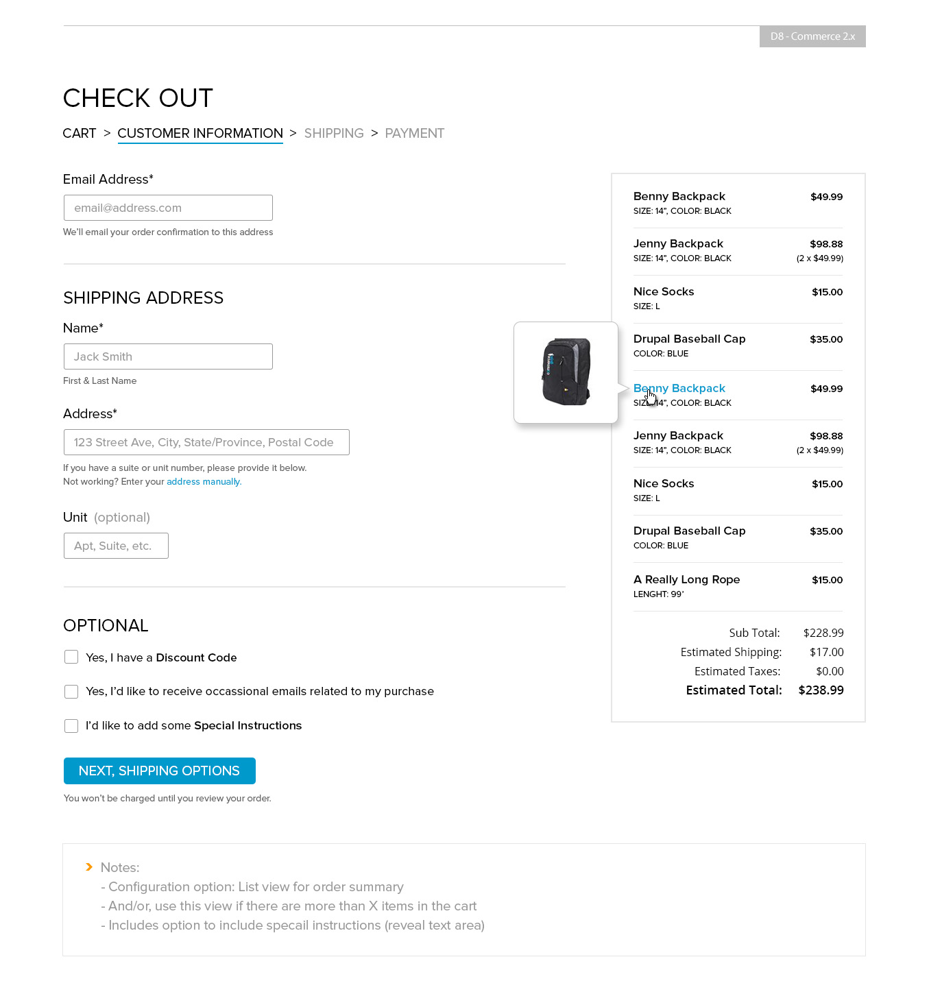
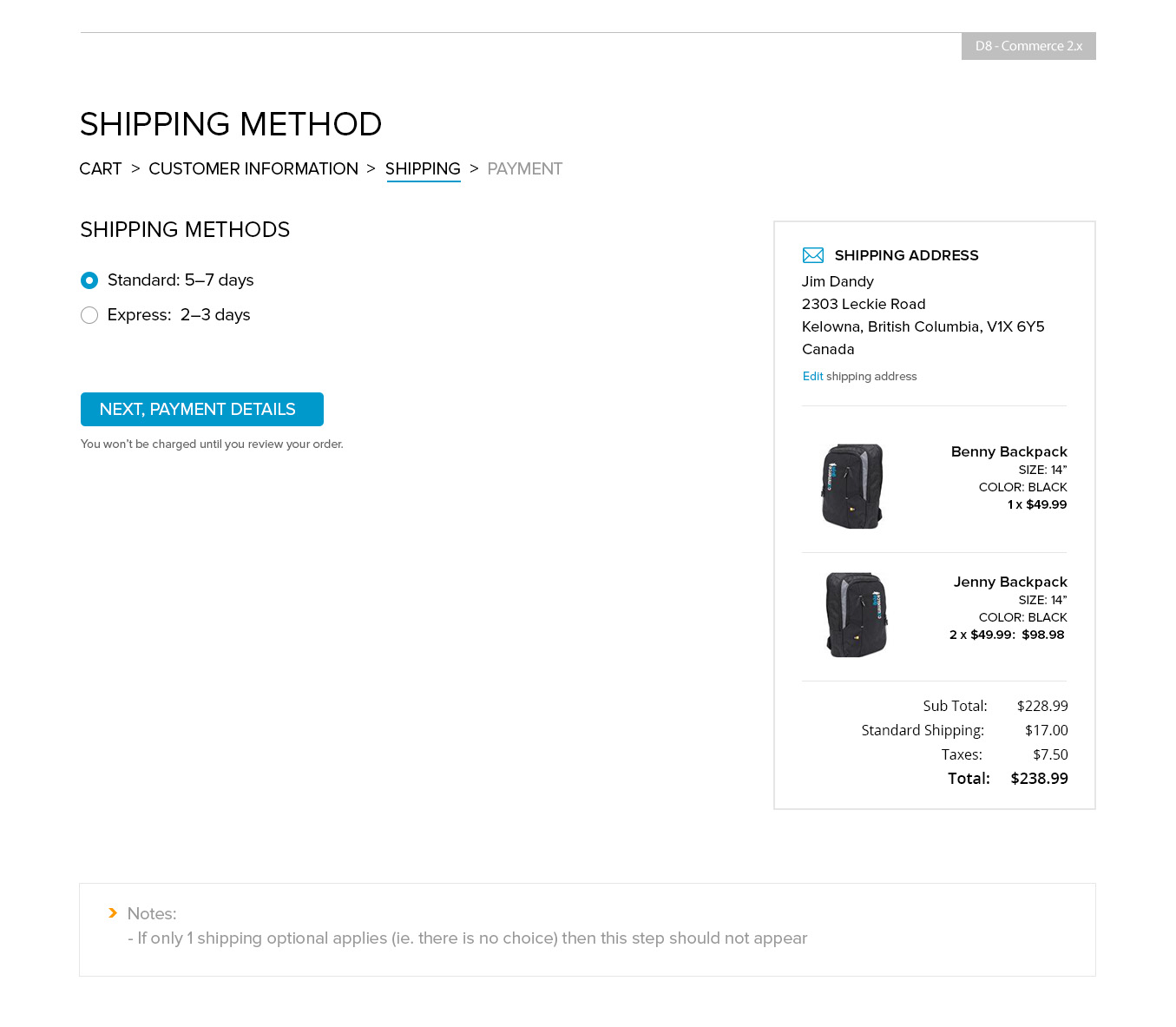
jjpoole CreditAttribution: jjpoole commentedHere are a series of mockups for the cart/checkout process. Most screens have a few notes at the bottom of the mockup.
Flow:
Comment #14
jjpoole CreditAttribution: jjpoole commentedHere's a revision to the Confirmation page, just wanting to give it a bit more love and try and make it more useful to the customer. Ideally the upsell products would be related the items just purchased.
Comment #15
bojanz CreditAttribution: bojanz at Centarro commentedIRC feedback given to Shawn for #13 / #14:
1) Address fields have already been designed, we can't provide a single-field lookup out of the box because we'd need to depend on an external service. That's contrib material.
2) We need to think about the UX for reusing addresses. Related: #2633656: UX For reusing addresses in checkout and order edit.
3) We need to think about the login/register/continue anonymous step (or block shown on the billing information step).
Login is tricky cause it essentially changes the whole page (available addresses, header/sidebars, who knows what else).
Do we allow login as a part of the flow (perhaps its own page), or insist it's done elsewhere?
The register / continue anonymous can be done on the Billing information step.
4) Review is frequently tied to the payment step, cause the payment step executes the payment, so you can't offer review after payment (even doing just authorizations feels a bit like cheating).
Comment #16
smccabe CreditAttribution: smccabe as a volunteer and at Acro Commerce commented1) I'll get the comps redone without the google requirement and spin that out into a contrib options
2) We'll do some comps up for address options based on mglaman's research
3) ..I'll have to think on this one more
4) Switch the order? Review -> Payment? Review would be an optional page if it is required?
Comment #17
bojanz CreditAttribution: bojanz at Centarro commentedHow about merging the Review and Payment steps? First half review, second half Payment. I believe 1.x did it that way too.
Comment #18
smccabe CreditAttribution: smccabe as a volunteer and at Acro Commerce commentedIsn't that pretty much what the payment page already is? it has full part and shipping info on the side already. The idea was to have an optional review page to toggle if payment gateway requirements needed it. I see now though that having a page in-between payment info and submit would be a functionality nightmare for many payment integrations. At this point maybe we should just drop it? I know UX wise Jason hates it because it is an extra step that does nothing.
Comment #19
jjpoole CreditAttribution: jjpoole commentedHere's some direction for Account Configuration (login options).
Comment #20
jjpoole CreditAttribution: jjpoole commentedUpdated Customer Info (1.1) page that doesn't rely on Google auto-complete. We do want to leverage the postal/zip code to populate as much other data as we can.
Comment #21
joshmillerUpdating the summary with content from the report by request of Bojan.
Comment #22
bojanz CreditAttribution: bojanz at Centarro commentedImproved the notes.
Comment #23
drewmacphee CreditAttribution: drewmacphee commentedwww.lifeisgood.com's checkout has a lot of the elements we're looking for.
Their optional login is simple.
Enter your email address, link to a modal login/registration form for "Express Checkout"
Updating shipping address updates shipping methods and total in the review. (Pick Canada vs US and the shipping prices change)
Also has promo codes and gift certificates add links like discussed elsewhere. (modal though, instead of reveal)
Shows what additional panes would look like (Gift wrapping / Donations)
I believe the site is running on Demandware and is likely a one page checkout add-on.
Comment #24
bojanz CreditAttribution: bojanz at Centarro commentedI did list that in the issue summary as a possible option for contrib.
However, we'd need to find and implement a good modal solution first.
This one looks promising: https://awkward.github.io/backbone.modal/
Commerce still needs to support checkouts that require login/registration, so the Apple-esque step 0 needs to be coded anyway.
Comment #25
drewmacphee CreditAttribution: drewmacphee commentedNot sure it's the best UX but if an account is required it could force the modal to open?
Although this all sounds like a contrib version rather than the default.
Comment #26
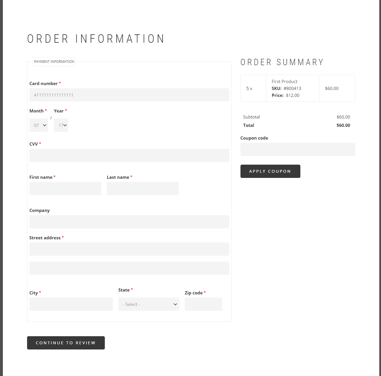
jjpoole CreditAttribution: jjpoole commentedHere's a UI review on an alpha we setup, didn't have shipping/payments setup so didn't review those areas. Realize some of this stuff is theme/style related but thought I'd just add all them comments anyway.
Comment #27
bojanz CreditAttribution: bojanz at Centarro commented@jjpoole
Thanks!
Here are some responses:
- It's up to the site to theme the Item column to contain a thumbnail. We don't ship with an image field, so we can't do that by default.
- The -dev release ships with a checkout progress block, you probably need to enable it manually in the Blocks page (composer create-project gives you that automatically).
- The cart summary is being tracked in #2710985: Add an order summary and is a priority.
- Can you provide example field hints?
- Search/combo box for the country is a job for the (optional) select2 module (it did it automatically in d7, we should make sure it still does in d8 once it's fully ported).
- The VAT ID field will show up automatically if added to the billing profile. Nothing for us to do.
Comment #28
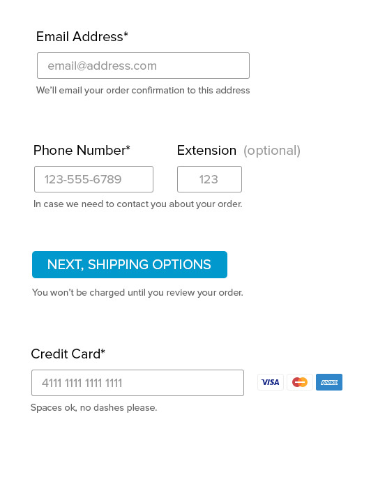
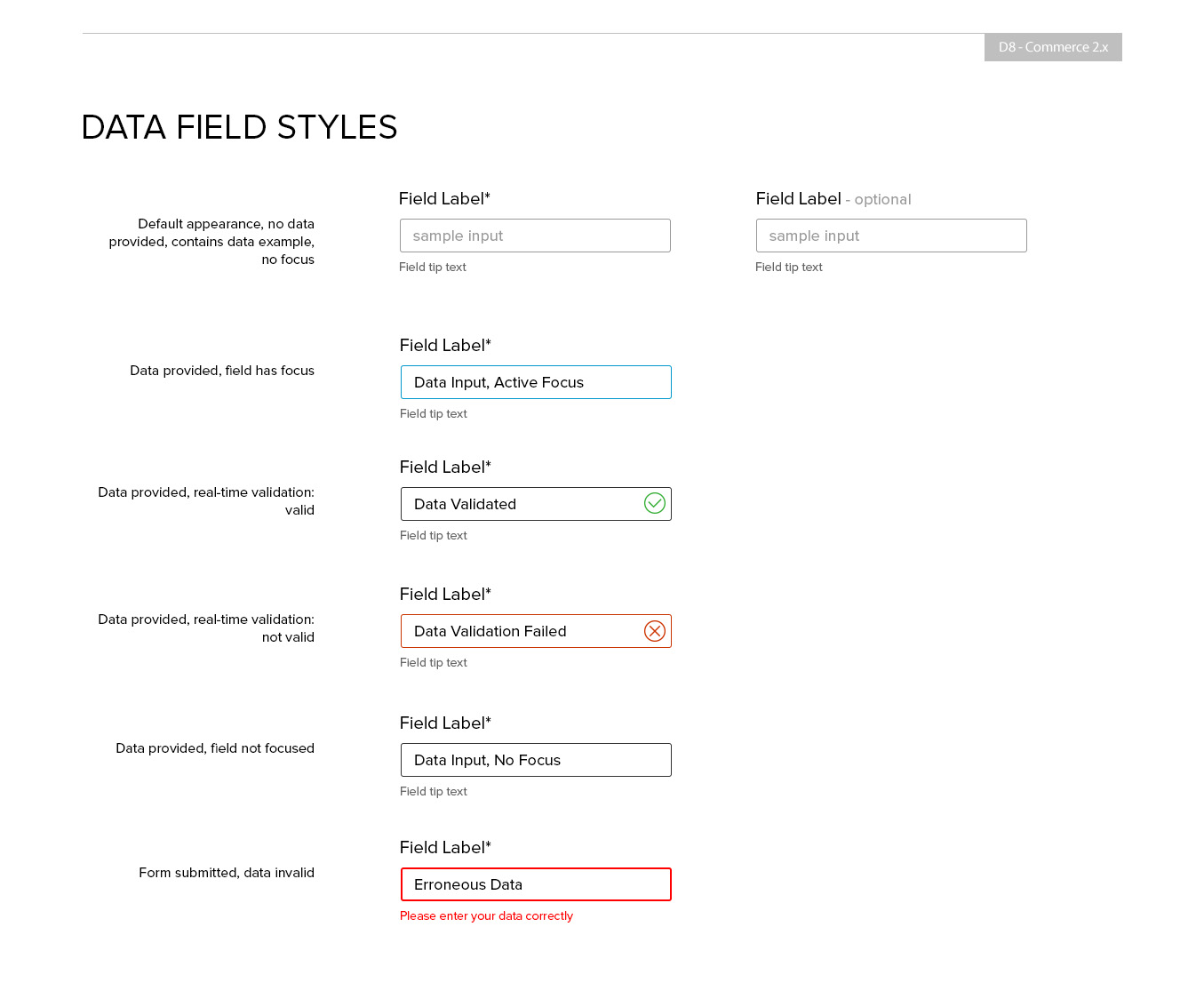
jjpoole CreditAttribution: jjpoole commentedHere's a couple examples of field hints (or field descriptions). Fields seem very obvious to us, but typical users can get confused by simple inputs. This can turn into a major issue if a user doesn't understand what is being asked for on required field.
It can also set the users mind at easy when you tell the customer why or what you are doing with the information you are asking for (why do you need my phone number?).
A couple of examples in the attached image. Note, it can be very userful to have hints on buttons as well.
Comment #29
smccabe CreditAttribution: smccabe as a volunteer and at Acro Commerce commentedChanging this slightly to be a Meta issue for various UX work, since the review work here needs to be spun off into child issues for individual fixes.
Comment #30
smccabe CreditAttribution: smccabe as a volunteer and at Acro Commerce commentedComment #31
bojanz CreditAttribution: bojanz at Centarro commentedVarious UX work around checkout. Let's be more specific.
#2710985: Add an order summary has landed. We can open issues for the rest (marking optional fields, adding hints...)
Comment #32
rszrama CreditAttribution: rszrama at Centarro commentedRecovering the deleted issue summary that included research and screenshots. Let's try not to delete this sort of information in the future:
Initial Report
Sharing initial research done by Julien Dubreuil last year:
Report: https://docs.google.com/document/d/1FAjwteqzJtJ_kaWQIwWyNTPyNPoXFT9lmYPX...
Raw data: https://docs.google.com/spreadsheets/d/1Qu7ykLwj0_MVLuO_oOmksTBCkYQjZDtP...
What we're missing from the report is what the rival ecommerce solutions (Shopify, Bigcommerce, Spree, Sylius, WooCommerce) are doing.
Based on report I'm assuming we'll want to continue having a multistep form (and not an accordion).
Checkout forms will be swappable for people willing to experiment with drastically different designs.
Checkout
Checkout Layout
Commerce currently has an Address page which collects both shipping and billing information.
The payment method (saved cards / new card) is selected on the Review step, below the review pane.
Problem: We’re asking for the billing address before we even know if it’s needed. A payment method such as “cash on delivery” doesn’t actually need a billing address. And if we select a saved card, then it already has a billing address, making the checkout entry useless. Conceptually, the billing address is tied to the payment method, and this design divorces them.
Solution: Tie the billing address to the payment method form.
In Europe the billing address is the one that controls taxes, so selecting a billing address will change the order total (and might even change the currency). That means that the payment method form is only for selecting a payment method (and tokenizing card details if supported), the actual payment is executed later once the order total is final.
Having this distinction (selecting a payment method VS executing a payment) is very helpful for single page checkout too. Here’s a proposed flow:
Account -> Order information -> Review -> (Payment) -> CompleteThe (Payment) represents the sometimes used page used to redirect the user offsite, or show an iframe.
The order information page now actually has all of the information entry:
Since that billing address might change the order total, we must place the Review on the page after, to show the customer the changes. The review page has a “Place order and pay” button which actually triggers the payment (do redirect, show iframe, capture amount based on token, etc).
It’s also recommended by: http://conversionxl.com/how-to-design-an-ecommerce-checkout-flow-that-co... under “Asking for Credit Card Info Last”
Login/register
There are two (very different) use cases here:
“Allow guest checkout” & “Show registration form” are settings of the Login checkout pane.
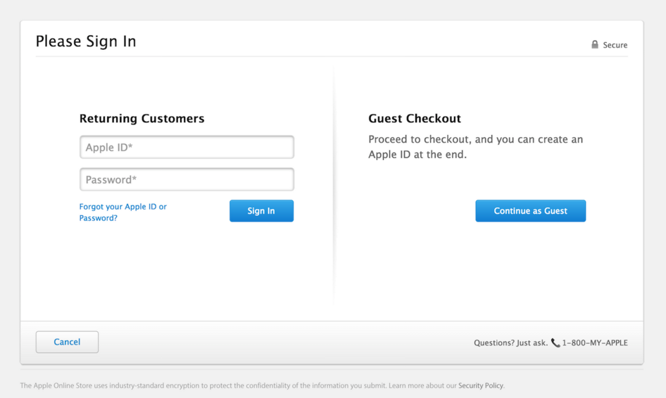
I suggest implementing the UX seen on apple.com and many other websites:
It is a very simple page, which gives you the opportunity to login, or a big button to press if you just don’t care about accounts. As a customer I’ve always liked this design, and it simplifies the next steps (since you don’t need to repeat the login form).
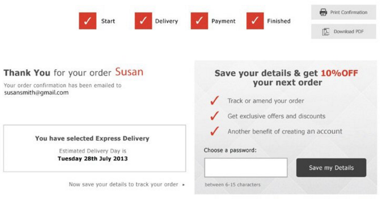
If you continued as Guest, the top of the next page has an Email field (just like on 1.x) and the checkout complete page has a pane that allows you to create an account once you’re done. Example:
Sites that require registration usually enforce it on the Login screen, so we’d (optionally) replace the “Proceed as guest” column with the registration form. This is the same as the commerce_checkout_redirect UX in 7.x
ASOS used to do interesting thing, since they had a long registration form, they’d replace “Continue as guest” with “Continue and register”, then show the registration form as the next step:
That would be perfectly doable on a per-site basis, for clients that need it.
UX Alternatives:
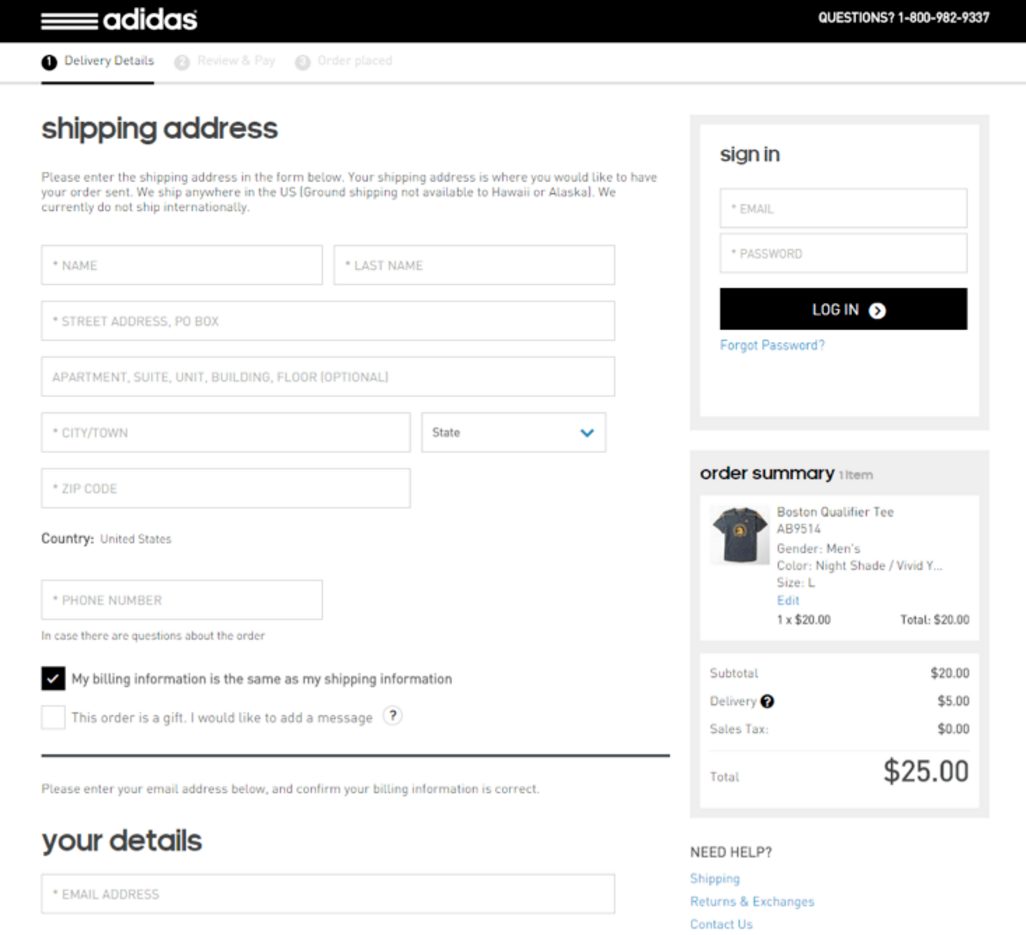
A site could also easily implement the Adidas UX, where the “Login” pane and page are disabled, but the next pages have an ordinary Drupal login block in the sidebar (above the order summary block).:
An interesting contrib-worthy UX is the Forever21 one, where you get all three account options as radio buttons (and the form underneath shifting via ajax). It feels a bit harder on the brain than making a quick login/guest decision on the previous screen, but it does remove an extra page with minimal effort.
Initial UX design for Drupal Commerce by Acro Media, Inc.
This is the initial login UX design for Commerce 2.x done by Acro:
The checking for matching accounts in the background is impossible to do quickly, and is also a security issue (reveals the presence of emails in the system). The switching via AJAX between two very different screens felt confusing. The only sane version of this UX is an Email field that has a “Have an account?” link below, opening the login form in a modal. Shopify’s looks that way, but it doesn’t use a modal, so I get redirected to a separate page and feel lost.
Links
Do note that these sites get redesigned often, Newegg looks nothing like the site in the report, for example.
Notes:
- At the end of anonymous checkout, e order will be assigned to an existing user with that email, if found. If not found, there's the pane for providing a password for a new account.
- A review page is required by law in the EU, and generally a good practise elsewhere
- I like the idea of a cart summary being shown on the right side of the page (instead of on top like in 1.x). Shopify also allows coupons to be applied here.
Comment #33
steveoliver CreditAttribution: steveoliver commentedAdded another checkout related issue.
Comment #34
Lukas von BlarerOne of the biggest UX issues I had with commerce 1.x that I never resolved is this one: #2815115: Resolve UX issue with the AJAX callback
IMO this one is really critical since it can lead to data loss, makes tabbing between fields impossible and can be very frustrating for the user.
Comment #35
AaronChristian CreditAttribution: AaronChristian at Acro Commerce commentedComment #36
websiteworkspace CreditAttribution: websiteworkspace commentedFollowing thread.
Submitting D8 Commerce 2.x software problem reports to help make DC 2.x the best it might be.
Comment #37
Lukas von Blarer@DrupalWebsiteBuilder please use the follow button at the top of the page on the right side as described here: https://www.drupal.org/node/1306444
Comment #38
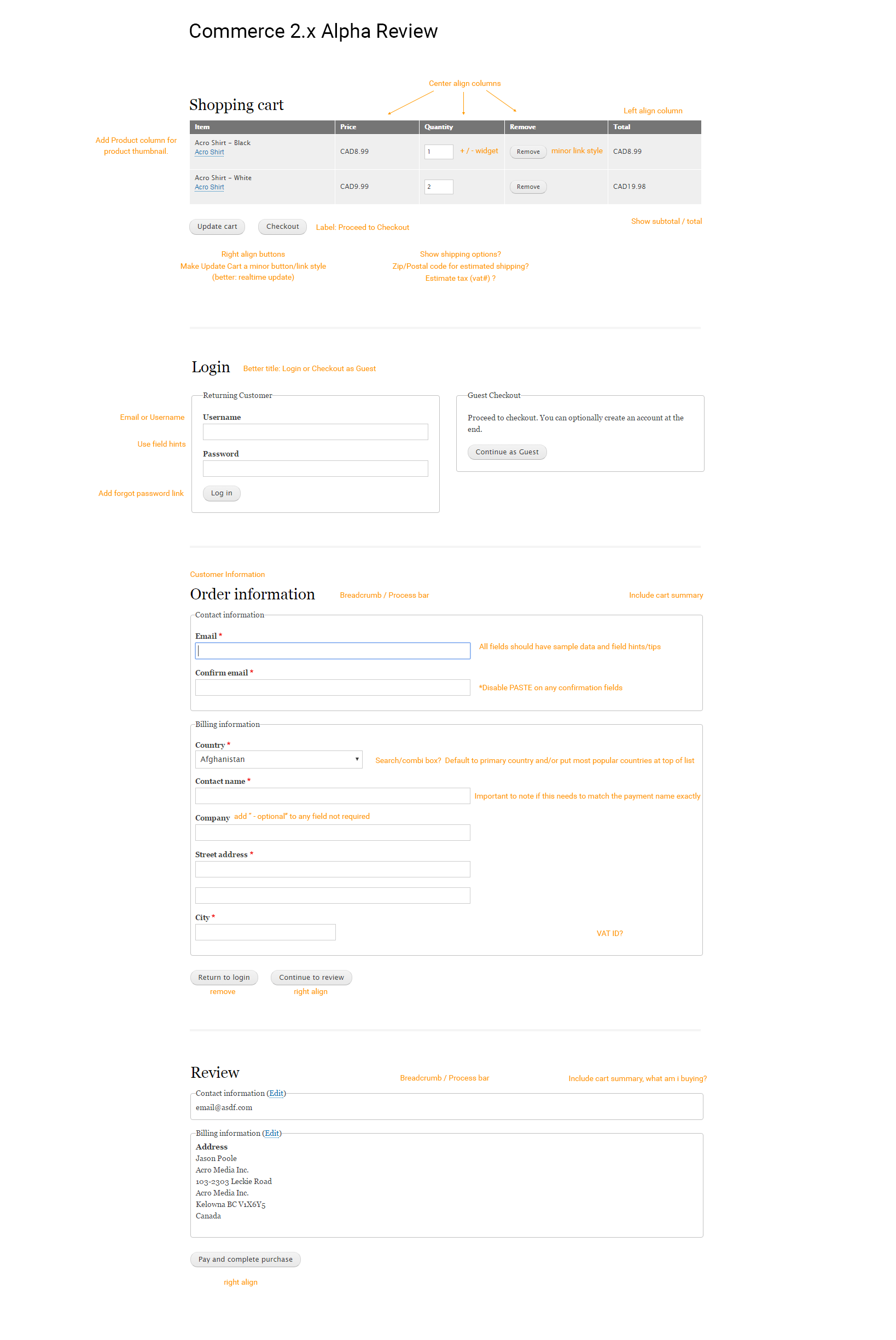
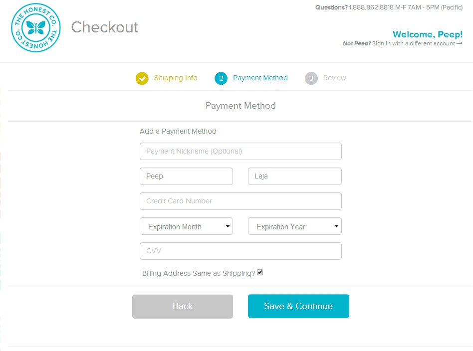
websiteworkspace CreditAttribution: websiteworkspace commentedAfter working with the current default side by side checkout form, illustrated as follows:
it seems like a vertically stacked default checkout form, with the order summary above the payment information, having both the order summary and the payment information forms with similar styling, and both in a similar field group, would be a better default setup.
A vertically stacked checkout page layout leaves more room for detailed product descriptions in the order summary and for showing product pictures in the order summary, horizontally left of the product description. The current narrow side by side setup would require product pictures to be stacked vertically above product descriptions and other information, in what is a rather narrow column, as the sample image illustrates.
--
The checkout page example above uses the default, out of the box, commerce checkout forms, and only adds CSS inherited from the drupal theme.
Comment #39
bojanz CreditAttribution: bojanz at Centarro commented@DrupalWebsiteBuilder
We won't be changing the default layout of the checkout page.
Sites are free to implement to override commerce-checkout-form--with-sidebar.twig.html to merge the sidebar into the left column if they wish to do so.
Comment #40
pyxio CreditAttribution: pyxio commentedi feel there is a major issue with the logic of billing same as shipping behavior. if you click the same as billing address checkbox the billing info form is hidden and we have the shipping address exposed. this is wrong. it should be the other way around. we need to hide shipping and just keep billing displayed. billing form will typically have more information like tax numbers etc that we do not want duplicated on the shipping form. in fact, the same form fields are duplicated twice ... so a tax number or such will appear in both billing and shipping forms. this is just not correct. shipping should be an address only with perhaps a contact number. and it should be hidden if user checks billing same as shipping.
Comment #41
jjpoole CreditAttribution: jjpoole commentedBest practice (based on Baymard study) says Billing Address equal to Shipping Address, by default. Summary of the address should be provided so the customer can confirm on the spot. Uncheck or "change" link would reveal form.
Comment #42
bojanz CreditAttribution: bojanz at Centarro commentedIt's time to mark this as fixed, because it's not tracking any specific set of improvements.
Commerce 2.14 modified checkout UX by introducing address book functionality.
Commerce 2.12 introduced the ability for anonymous users to register at the end of checkout.
So we remain committed to iterating on this subject, via concrete issues.