 Support for Drupal 7 is ending on 5 January 2025—it’s time to migrate to Drupal 10! Learn about the many benefits of Drupal 10 and find migration tools in our resource center.
Originally submitted on Github
Problem/Motivation
Recent interviews and research exposed pain points around Drupal's admin experience of looking and feeling dated.
Proposed resolution
Implement new Dialog (and Overlay) styles:

Specs:
https://www.figma.com/file/OqWgzAluHtsOd5uwm1lubFeH/Drupal-Design-system...
Remaining tasks
Update patchRTL review (Right to left)- Accessibility review
Test Pages
@todo
| Comment | File | Size | Author |
|---|---|---|---|
| #104 | 3023311-104.patch | 56.33 KB | alexpott |
| #104 | 103-104-interdiff.txt | 2.91 KB | alexpott |
| #102 | interdiff-101-103.txt | 1.25 KB | nod_ |
| #102 | core-modal-3023311-102.patch | 57.46 KB | nod_ |
| #101 | interdiff-3023311-97-101.txt | 1.8 KB | mrinalini9 |





Comments
Comment #2
saschaeggiPostponed as design is not final yet
Comment #3
lauriiiIs this issue duplicate to #3023311: Modal dialog style update?
Comment #4
huzooka@lauriii, this is #3023311: Modal dialog style update
Comment #5
lauriiiOops, I was supposed to reference #3023312: Dialog style update
Comment #6
ckrinaComment #7
ckrinaJust closed #3023312: Dialog style update as duplicate of this one.
Also shortening the issue summaty.
Comment #8
huzookaRe #7:
I think that it's totally fine to have a separate issue for Dialog/Modal since the off-canvas dialogs are totally different.
Check the attached screenshots.
Comment #9
ckrinaComment #10
lauriiiCore is looking into replacing jQuery UI with another library. We might want to consider doing the same here, even if that's before core makes any moves on this.
Comment #11
lauriiiComment #12
lauriiiComment #14
ckrinaComment #15
ckrinaUpdating issue status & giving credit to Kishan's great design work.
Comment #16
lauriiiComment #17
lauriiiComment #18
fhaeberleI did some research on this and found some pretty exiting libraries for showing dialogs/modals.
Searching them, I focused on open source, wide adoption, accessibility, clean API ... just to mention the key factors.
vex
https://github.com/hubspot/vex
vex is a modern dialog library which is highly configurable, easily stylable, and gets out of the way.
You'll love vex because it's tiny (5.6kb minified and gzipped), has a clear and simple API, works on mobile devices, and can be customized to match your style in seconds.
Demo http://github.hubspot.com/vex/docs/welcome/
Doc http://github.hubspot.com/vex/
a11y-dialog
https://github.com/edenspiekermann/a11y-dialog
a11y-dialog is a lightweight (1.4Kb) yet flexible script to create accessible dialog windows.
Demo http://edenspiekermann.github.io/a11y-dialog/example/
Doc https://github.com/edenspiekermann/a11y-dialog
Micromodal
https://github.com/ghosh/Micromodal
Tiny, dependency-free javascript library for creating accessible modal dialogs. The aim of this library is to make modal dialogs accessible and easy to include in your project with minimum configuration. It's only ~1.8kb minified and gzipped - A tiny library for big change. Following are some of the interactions handled by the library:-
Demo https://micromodal.now.sh/#introduction
Doc https://micromodal.now.sh/#configuration
Comment #19
andrewmacpherson CreditAttribution: andrewmacpherson as a volunteer commentedRe. #10:
Please, let's NOT do that! Instead let's just style the core dialogs (whatever library that happens to use).
We are going to have to replace jQuery UI in core, because it's unmaintained now. That's going to involve a lot of accessibility review and manual regression testing. I know that themers can over-ride JS libraries if they choose, but I think it would be a bad idea for Claro to do that since it's intended to become the core admin theme.
Nitpick: the terminology here is wrong. It's not "dialogs and modals" - it's just dialogs. Dialogs can be modal or non-modal, but that describes their behaviour rather than their appearance. They both look the same.
Overlay refers to the transparent grey background behind the dialog, right? That's usually the only difference between modal and non-modal dialogs.
Re. #18:
Thanks for finding these @fhaeberle. I hadn't heard of Vex or micromodal before. These can all be considered in the core issue to replace the jQuery UI dialog. (Note that whatever library we end up using, it will have to support both modal and non-modal behaviours. I'm suspicious of the micromodal description.)
Comment #20
huzookadialogtest module added to Clarodist Tools!Comment #21
lauriiiI don't think we should work on this before core has chosen which direction they are going to go.
Comment #22
huzookaComment #23
lauriiiLet's unblock this given that the current dialog solution will be around for at least the Drupal 9 life cycle. So let's start with styling the jQuery UI dialog modals here.
We need a follow-up for non-modal dialogs such as settings tray.
Comment #24
lauriiiComment #25
huzookaComment #26
huzookaComment #27
huzookaSomehow, Views UI modals are forced to have lower z-index that the required (see Z-indexes in Drupal 8 doc).
And this bug exists even with Stark or Seven, and seems to be related to the View UI view edit form. (Other modals are file, e.g. the ones that the Editor module provides.)
I also noticed that after #3074267: Replace jQuery UI position() with PopperJS is added, closing an off-canvas-top dialog that has a customized height makes the page be scrolled down.
Comment #28
huzookaComment #29
huzookaThis is ready for the first review.
@ckrina, please check the states of the dialog close button!
I was able to fix the z-index issue mentioned in #27.
For development and testing this, I was using the Views UI dialogs and the Dialog Test (
dialog) submodule of Clarodist Tools.Comment #30
huzookaThe needed follow-up: #3088531: Off-canvas dialog style update.
I think that the normal (non-offcanvas) dialog can be handled here.
Comment #31
huzookaSince we have answers for #3, I remove the NSU tag.
Comment #32
fhaeberleI didn't review this in detail but I recognized the close buttons hover styling and wanted to question this as it's not defined in the design spec.
How should the hover(/focus) of the close button look like?
At the moment we're using a thick white border and in the focused state additionally the green outline – is this intended?
Comment #33
Peter MajmeskuI could not reproduce the green focus outline. Neither in current stable Chrome version on MacOS, nor on IE11.
However, the modal does not correctly respond on mobile devices. Tested on iPhone 6S with Safari and the modal is positioned wrongly. The mentioned lack of responsiveness is also easily checkable in Chrome dev tools.
Comment #34
huzookaRe #33:
The issue you highlighted is not a Claro-specific issue, this happens in Classy, Bartik and Seven as well. It is more related to #3068696: Tables overflow on mobile.
Comment #35
Peter MajmeskuFair enough. If you remove the tables from the page, then the modal is shown correctly. Let's handle the tables in a different context. I am marking that issue RTBC.
Comment #36
lauriiiShould we remove the focus effect from the modal?
What is the expected state of the off-canvas as a result of this patch?
Checked that these are line with https://www.drupal.org/docs/8/theming/z-indexes-in-drupal-8 👍
Where is this needed?
Where is this needed?
This doesn't seem super reliable. This doesn't work with Views UI for example. I'm wondering if we should at least document our assumptions here?
This might have some accessibility implications because this changes the visual order of the elements.
Comment #37
huzookaComment #38
huzookaRe-rolled #29.
Comment #39
huzookaAddressing #36.4, #36.5 and #366.
Re #36:
Without this override:

With this override:

.views-ui-dialog. Fixed.If I'd change the way
Drupal.behaviors.dialog.prepareDialogButtonsworks (and make the primary buttons be the last in the DOM as well and not just visually), the primary button (that is the most important button) would be the last form action that user can reach by keyboard navigation (accessibility?).I recommend that we do not do this reorder at all, but as I mentioned above, it was not my decision.
Comment #40
lauriiiComment #41
huzookaComment #42
huzookaRe-rolled #39.
Comment #43
ckrinaRe #39:
1. It looks like for the feedback gotten on the #accessibility channel the focus might not be needed, so maybe it can be discussed on a follow-up how to address now it's handled by core.
2. Great call @huzooka! +1 on that direction so when we start that components we already know what's being inherited.
7. I think it's a UX+a11y conflict that we should address together and with proper discussion, so +1 to move it to a follow-up too.
Comment #44
lauriiiComment #45
huzookaComment #46
huzookaReported #3096805: Dialogs are focusable in Seven and Claro for addressing #36.1 (and #43.1).
I also removed the button reorder styles and added #3096793: Dialog button order in Claro as follow-up to #36.7 (#43.7).
Comment #47
andrewmacpherson CreditAttribution: andrewmacpherson as a volunteer commentedRe. #32: focus on the close button in the dialog header.
It would be good to use the green outline when the dialog header close button has focus. The intention behind the green outline was to use the same distinctive focus signifier everywhere, and the green colour isn't used for anything else. Seven has wildly inconsistent focus styles which makes it harder to follow focus around, and we're trying to improve on that. The focus green has sufficient contrast against the dark dialog title bar background.
Hover shouldn't use the green focus outline - hover isn't focus. The user needs to be confident about which one will be activated by a keypress. If hover uses the focus style it can be misleading; one control might have keyboard focus while another element has pointer hover.
Re. #36.1: when the dialog container has focus...
Leave it in place please. It's important to see what has focus.
The discussion on Slack got mixed up between:
As a theme, Claro only needs to address the second part. It's permissible for a dialog container to have focus, and this should be visible when it does.
Some of our dialogs get focus when it would be better to focus an element inside them, but that depends on the dialog contents. It's application logic, not look-and-feel.
Re. button order:
Keep the DOM, tabbing, and visual reading order in sync. Anything else is confusing to sighted keyboard users, whether using assistive technology or not.
Using CSS flexbox/grid
orderto rearrange operable controls (or containers with operable controls inside) is a fast route to a WCAG level-A failure (Focus Order).#39.7:
I don't really think there's an issue with that, so long as the DOM, visual, and tabbing order are in harmony. Predictability of tabbing is much more important than the number of key presses needed. But can
Drupal.behaviors.dialog.prepareDialogButtonsproduce a different button order per theme?Comment #48
bnjmnmIt would be good to get confirmation from @andrewmacpherson that this is valid, but it looks like non-primary submit buttons in the buttonset do not meet Success Criterion 1.4.11: Non-text Contrast: Active User Interface Components. which includes the following
In this case, the contrast ratio between button and background is 1.34:1. Subjectively - on one display I tried it on it was quite difficult to distinguish button from background.

Comment #49
lauriii@bnjmnm Thank you! That seems like valid feedback that should be addressed on the design level. Moving back to needs work.
Comment #50
lauriiiComment #51
bnjmnmIt seems like the work being done is based on the screenshot in the issue summary, as opposed to the the Figma link which goes to a comp labeled "work in progress". In many other Claro issues I've worked on, the Figma link is the canonical reference while it's understood the screenshot can potentially be outdated. If this isn't the case for this particular issue, perhaps that can be made more clear in the issue summary.
Comment #52
ckrinaThanks for bringing this up!
Does anybody knows what should ideally be the contrast the button background should have towards the region background?It was already defined in the previous comment:
Thanks @bnjmnm!
Comment #53
lauriii@ckrina the success criterion 1.4.11 requires color contrast of 3:1 for controls.
It seems like this is a pre-existing problem which is just worse in modals. The button has a contrast of 1.47:1 against white background.
Comment #54
DyanneNovaIn reviewing the guildlines on 1.4.11, I don't actually think that the button background here needs to meet the 3:1 contrast requirements as long as the text contrast ratio is met.
Understanding Success Criterion 1.4.11: Non-text Contrast states "A button which has a distinguishing indicator such as position, text style, or context does not need a contrasting visual indicator to show that it is a button." The listed example has a 1.3:1 contrast between the button background and page background.
Comment #55
saschaeggiI also believe in what DyanneNova stated (according to the guidelines in WCAG 1.4.11):
and
So the current implementation should pass, but we might want to find another solution as an improvement for easier access after all. To not block this ticket after all I've created a new related ticket to explore improvements to the secondary button #3103261: Improve button default variation accessibility.
Comment #56
lauriiiAwesome, thank you @DyanneNova and @saschaeggi! It would be nice to get confirmation from either @bnjmnm or one of the accessibility maintainers if this addresses the concerns raised in #48.
Comment #57
fhaeberleUpdating the issue summary.
Comment #58
edwdeapri CreditAttribution: edwdeapri at Promet Source commentedMy recommendation would be to ensure that a button should be easily identified as a button for those with low vision and/or color blindness. Consider the first paragraph under Active User Interface Components...
Comment #59
bnjmnmRerolled patch attached
The followup issue for the secondary button contrast is fine by me, especially since it may require more discussion. I do think that it technically passes accessibility as the button text does communicate its purpose, but it's also not ideal for several reasons (among others, I can barely see the button on some displays) and we can dig into that in the followup.
I see some differences in the Figma designs and the patch.

Screenshots are from cd_tools modal, and confirmed the same happens with ckeditor's "add link". In some cases, the views modals better match Figma, which is documented.
Figma:
Patch:

Comment #60
kostyashupenkoComment #61
kostyashupenko==================
✓ Fixed
==================
❗I can't reproduce it in any dialog, on my side it is always 16px
==================
✓ Fixed
==================
❗On my side it has always epxected bg-color.
==================
❗ On my side it is always black (#222330)
==================
I have used Drupal v9.1.x branch. I tested the following dialogs:
1. Here
node/add/articlewith ckeditor field, "Add link" and "Add image" buttons2. "Add" button from here
/admin/structure/views/view/content3. cd_tools module (https://github.com/zolhorvath/cd_tools)
Comment #62
bnjmnmThe changes are looking good! Whatever was preventing styles from fully being applied on my local is now addressed, so several of the things I spotted in #59 were in fact specific to my local.
Here's a line-by-line:
This needs an /* LTR */
Remove LTR comment, this is in a RTL block
This could be replaced with --font-size-s, but also possible this is better scoped for the off-canvas issue.
The presentation is more consistent across browsers if this declaration isn't removed, and (in my opinion at least)the change happens to be an improvement.
In core, the progress message is hidden in all dialogs, not just views.
This should be the case here unless that's part of the new design I overlooked.
Does this need an LTR if it's not changed in the rtl equivalent?
Comment #63
kostyashupenkoComment #64
kostyashupenkoFixed all feebacks, except of:
1.
I can't reproduce it in Chrome, FF, Safari and IE. But property
background-size: 12px 12pxwas added.6.
Markup for ajax-progress was overridden in Claro =>
.ajax-progress--throbber .ajax-progress__messageselector is not same as. ajax-progress-throbber .message7.
rtl equivalent exist, please check again :)
Comment #65
meena.bisht CreditAttribution: meena.bisht at QED42 for Drupal India Association commentedAs per the comments on #62 comment, I have verified the patch#64. All changes suggested are covered in patch#64.
Except:
1)
I can't even reproduce it from my side in Chrome, FF, Safari, and IE.
Not marking it as RTBC, further discussions are required.
Comment #66
bnjmnmRe #64.1 I investigated the close centering further and it does not seem to happen in IE, Safari or OSX Firefox. In Chrome and Windows Firefox, this occurs at specific zoom settings and may not be visible at the default.
OSX Chrome 110x


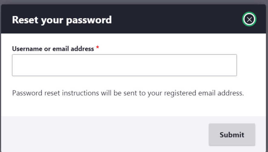
OSX Chrome 125x
Windows Firefox 150x
Windows Firefox 120x
Windows Chrome 125x
#64.6
They seem equivalent to me. For example, this is the "Opening media library" throbber in Seven:
So targeting
.ajax-progress-throbber .messagein Seven is equivalent to targeting.ajax-progress--throbber .ajax-progress__messagein Claro.With this being the case, if
.ui-dialog .ajax-progress-throbber .messageis set todisplay: hidden;in Seven, the Claro equivalent should also be hidden unless the design specified otherwise.Screenshot examples of this:

In Seven, the throbber message is hidden if it is inside .ui-dialog
In Claro, it is visible, which (unless there was a design change), it shouldn't be
Comment #67
lauriiiWe should be probably using this design for the throbber:
It doesn't seem like that supports the message. I don't think we have to solve that here. However, it might make sense to open a follow-up to discuss if we should add a variation to the floating throbber that would allow displaying the message.
Comment #68
lauriiiAccording to the designs, the while border shouldn't be visible on the focus effect of the close button.
The current implementation:

The current design in the design system:

Comment #69
kostyashupenkoThanks for such detailed review and feedback, gonna kill it
Comment #70
kostyashupenkoComment #71
lauriii@kostyashupenko thank you for working on this 🙌
The close icon is not in the center of the element on some resolutions on Chrome.
For some reason, the position is calculated incorrectly on Chrome (only with even numbered viewport widths 🤷♂️). It seems like we could add
background-origin: border-boxdeclaration to change how the background is positioned which solves this inconsistency, at least for me.It seems like there are some regressions in the workspaces UI as a result of this.
Is there some reason to have
.ajax-progres--throbberin the selector? Wouldn't this be more consistent if this was just.ui-dialog .ajax-progress__throbber?Let's explain here that we're rendering throbbers in dialogs with the fullscreen variation where the message should be hidden.
Why do we need to declare this element as block element?
What is this needed for? Can we add comment explaining that and why this is excluded in Views UI?
Where is this element visible?
Comment #72
kostyashupenkoComment #73
kostyashupenko1.
I tried to manage it again, please test it.
background-origin: border-box;will not help 100%. This is common scaling problem of any browser actually, if my fix will not help - idk how to fix it, really.2.
We may have a follow up for it.
3-6. fixed
7.
Oh.. this is very interesting part. In few words - i don't know. Source code is here https://git.drupalcode.org/project/drupal/-/blob/9.1.x/core/modules/view..., but actually it comes from 2010th, from views module for Drupal 7, sources are here https://git.drupalcode.org/project/views/-/commit/3b93bcb992ef3aa2825815...
I tried to reproduce this indicator, but i couldn't, without hardcode in devtools. I'm not sure if this code is still actual. So some help is needed here to understand what is going on and how it can be reproduced.
For now - i propose to keep this code. But if this indicator can not be reproduced anymore - we need a follow-up to remove its implementations in views_ui module and all themes with
.views-progress-indicatorselector attached.With hardcode in devtools visual styling of this indicator is the following:
Comment #74
lauriii#73.1: Interesting 🤔 I'm curious to know which browsers were broken with

background-origin: border-box? I tested the solution in #73 and unfortunately, it's not working properly in Firefox:#73.2: Hmm, I don't think we should move fixing this to a follow-up since it's a regression which prevents people from using workspaces and is caused by this patch. 😔
#71.7: @bnjmnm pointed out that the progress indicator is visible after adding multiple fields to a View at once.
Comment #75
bnjmnmThis may open up some potential solution for the centering issue. It looks like the "X" is nicely centered in its container at different zoom levels. It looks like it's the position of the focus outline that varies.

Since the
<button>receives the focus, but the icon is added to a<span>inside it - perhaps there's a way to position the span that is more tolerant of different zoom distances.Comment #76
bnjmnmThis patch
<span>. Moving that rule to the parent div results in the same styling of the span, but without forcing the element height in Workspaces when that is not desired. (3) Removed the first-child/last-child margins and replaced with top and bottom padding of the dialog content div to achieve the same benefits.Comment #77
boulaffasae CreditAttribution: boulaffasae as a volunteer and at Fullwave commentedHi, here is a problem with Media Modal.
Comment #78
boulaffasae CreditAttribution: boulaffasae as a volunteer and at Fullwave commentedAdded same margin for count text
Comment #79
lauriiiI think we should probably move the counter to left on Claro because we've moved the button to the right side of the modal. Ideally this would be done as part of #3062751: Media and media library but since this is a regression, it might make sense to fix it here.
Comment #80
boulaffasae CreditAttribution: boulaffasae as a volunteer and at Fullwave commentedHi laurii, can you check now ? what about the margin ?
Comment #82
bnjmnm#80 won't work as it makes a change to media library that impacts all themes. I suspect that is why there's a failing test, too. This patch modifies the approach so only Claro is impacted. Media library's JS is changed to trigger a new event, but that won't disrupt other themes.
Tagging "needs followup" since it would work best to have the Media Library counter be abstracted into a theme function.
Comment #83
lauriiiIs there any pre-existing event we could use for this? I think we should only add this as a new API only as the last resort.
Why do we have to take Views UI dialog into account here?
Comment #84
bnjmnmFollowup created and added some @todo items to this patch referencing it #3134526: Create theme function for selection counter
Re #83.1
- not that I could find. This occurs inside the final event fired during dialog creation. I tried adding another listener to the same event and seeing what options there were to control the order, but the only way I'm aware of would require refactoring both listeners to not use anonymous function and would be uglier than either creating the theme function or trigger that edge-case event. There's a @todo next to the event trigger to remove it in the followup, at least
#83.2
Without excluding views UI there's a regression so the top bar with the search elements are not flush with the dialog titlebar. I added a @todo referencing #3066006: Convert Views UI to new design system to remove the "not()" selector. It shouldn't be needed once the Views style update is complete.

#83.3 High contrast close button added:

Also moved the media library CSS rule out of dialog and into a Media Library UI specific file.
Comment #85
bnjmnm@lauriii pointed out that the new event being triggered in #84 may be difficult to remove when it's no longer needed as it would technically be a BC break. This increased our interest in pursuing #3134526: Create theme function for selection counter, and in that issue (and in Slack), Media Library maintainer @phenaproxima expressed some reasonable concerns about adding this ala carte as there are broader issues that this could complicate.
So instead of a custom event or theme function I went with a MutationObserver, which fully keeps the logic in Claro. MutationObserver is supported by all browsers Drupal supports, and the other use of MutationObserver happens to be in core. My biggest concern about using MutationObserver - a mysterious process running in the background at all times - isn't an issue here. It only exists if a Media Library dialog is opened and the selection counter is not yet present in that dialog. As soon as the selection counter is added, the observer will move it to the desired area of the buttonpane then stop observing.
Comment #87
bnjmnmThe test in #85 failed due to
core/modules/media_library/js/media_library.ui.es6.jsnot getting fully reverted, so I fixed that here.Comment #88
bnjmnmMy concern about the contrast in #48 was addressed by #54 and #55.
Comment #89
lauriiiWe can probably also remove the accessibility review tag based on #88 because the tag was added to address #48.
Comment #90
lauriiiI like the MutationObserver approach over the previous approach that required adding a new event. We can probably get rid of that once #3134526: Create theme function for selection counter has been resolved.
One small problem I discovered was that on the high contrast mode the close button X is not center of the button. If this can be resolved easily, it would be nice to fix here, but otherwise we can also fix it in a follow-up.
Comment #91
bnjmnmThe centering of the close button in high contrast mode is not an easy fix, I tried several approaches but neglected to mention when the patch was posted. I had some ideas on how to get around this, but it would require enough iteration that it would be best in its own issue.
Followup created #3137015: In High contrast mode, Dialog close button "icon" not fully centered.
Comment #92
lauriiiWe should at least change the background color back to its original state, since the cold grey on the title doesn't work well with the warm grey used on the rest of the off-canvas.
Before (from Seven):

After (Claro with this patch):

Nitpick 🧐: For consistency s/zindex/z-index
Should this element be a heading? Maybe this could be a follow-up but just wondering based on the styling 🤔
Comment #93
bnjmnm#92.1
Changed the background color. Tried out changing a few other styles to better resemble the default off-canvas styling and this is the only change that worked well
#92.2 Renamed the z-index
#92.3 created followup #3137839: Consider making dialog title a heading.
Comment #94
lauriii#93 addresses all of my feedback from #92. As part of #92 I did extensive cross browser compatibility testing on Chrome, Firefox, Safari (Mac + iOS), Chrome for Android, IE 11 and Edge. I think this is finally ready 🎉
Comment #95
nod_Didn't look at the CSS.
On the JS minor nitpick, still RTBC for me. I like the mutation observer, that's a good one.
We can have a bit more specificity in selecting the dialog:
That will make sure we're targeting this specific modal, not that nested modals should happen anyway.
Comment #96
lauriiiMoving back to needs work for #95.
Comment #97
codersukanta CreditAttribution: codersukanta at Srijan | A Material+ Company for Drupal India Association commentedUpdated the patch as #95 suggested.
Comment #98
nod_Please make sure you check with eslint before submitting the patch, the code doesn't follow our coding standards. take the habbit or running
yarn run lint:core-js-passingbefore you submit a core patch with javascript changes.missing a space after the "=", closest on the next line and the .find with the proper indentation.
Comment #99
nod_Comment #100
mrinalini9 CreditAttribution: mrinalini9 at Srijan | A Material+ Company for Drupal India Association commentedComment #101
mrinalini9 CreditAttribution: mrinalini9 at Srijan | A Material+ Company for Drupal India Association commentedUpdated patch as per the changes mentioned in #98, please review.
Comment #102
nod_Thanks for the update, if you run
yarn run lint:core-js-passingyou can see there is still an issue.@codersukanta: you should not edit the generated file
/core/themes/claro/js/media-library.ui.jsmanually, this is generated by the build step for JS, see: https://www.drupal.org/docs/frontend-developer-tools-for-drupal-coreUpdating the patch to fix the JS part
Comment #103
lauriiiChanges since #94 look good! Tested manually to confirm that everything still works as expected.
Comment #104
alexpottSome small spelling mistakes noticed by cspell. In core we have always used off-canvas so let's not introduce a new word here.
Comment #105
lauriii+1 to the changes in #104
Comment #106
alexpottHere's why my patch file is smaller... it's because I have
in my .gitconfig file.
Comment #107
alexpottCommitted and pushed 74bad3ce90 to 9.1.x and d2cf243c49 to 9.0.x. Thanks!
Backported to 9.0.x as claro is experimental.
Comment #111
andrewmacpherson CreditAttribution: andrewmacpherson as a volunteer commentedThis issue took a wrong turn at #68. The two-colour focus outline IS intended. Filed a follow-up at #3172056: Restore two-colour focus indicator