
 Support for Drupal 7 is ending on 5 January 2025—it’s time to migrate to Drupal 10! Learn about the many benefits of Drupal 10 and find migration tools in our resource center.
(Originally submitted by saschaeggi on Github)
Problem/Motivation
Recent interviews and research exposed pain points around Drupal's admin experience of looking and feeling dated.
Proposed resolution
Implement new Toolbar design to create a favorable first impression of Drupal for evaluators and a better user experience for site authors. No functional differences.
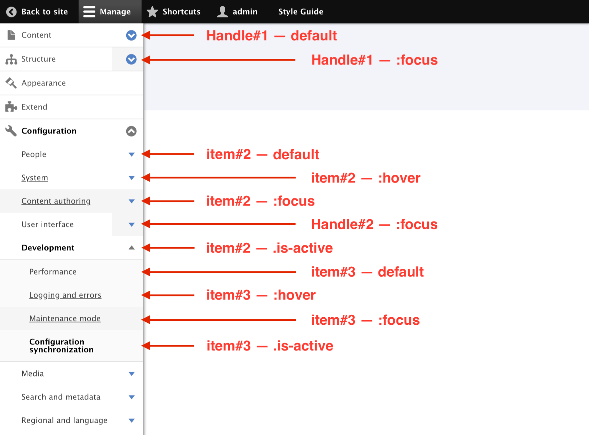
Specification
Quick overview
This image is just a quick overview for Navigation list specs. Please use the Figma link to full specification as the main resource for specs.

Full specification
FIGMA: https://www.figma.com/file/OqWgzAluHtsOd5uwm1lubFeH/Design-system?node-id=3324%3A0
This link is anchored to the board with the full specification. As an anonymous user you can see the design, but to actually be able to pick colors and sizes please login on Figma.
Remaining tasks
- Update patch styling to include time inputs
- Create a Merge Request or reroll the patch based on #73.
- Integrate feedback from #74 and #75 (can be done together with previous step) and move to the issue status to Needs review.
- To start the reviews, take screenshots of the results.
- Accessibility review to ensure that whatever design is approved is at least as accessible as the upstream solutions for:
User interface changes
No functional differences.
Test Pages
/admin/
| Comment | File | Size | Author |
|---|---|---|---|
| #124 | focus-ring-inside.png | 7.98 KB | camilledavis |
| #124 | focus-ring-outside.png | 7.95 KB | camilledavis |
| #122 | white active button.png | 5.68 KB | camilledavis |
| #122 | lighter focus ring just for active button.png | 5.63 KB | camilledavis |
| #122 | insufficient contrast.png | 5.59 KB | camilledavis |
Issue fork drupal-3020422
 Show commands
Start within a Git clone of the project using the version control instructions.
Or, if you do not have SSH keys set up on git.drupalcode.org:
 changes


Comments
Comment #2
antonellasevero CreditAttribution: antonellasevero commentedComment #3
saschaeggiComment #4
saschaeggiChanged the ticket back to unassigned, this can be worked on
Comment #5
lauriiiToolbar styles are located in the Toolbar module and Stable theme. If we want to update the styles, it should happen in the Toolbar module and Stable theme. This causes a problem where these design changes will affect all sites, including sites that haven't enabled Claro. I'm not sure if we can even do that because of our BC policy. However, there's a core issue to move Toolbar styles to Seven #2539992: Move theme toolbar CSS to the Seven theme which would help this issue.
Comment #6
saschaeggi@lauriii so do you think it's realistic to move the styles into Seven then?
Comment #7
huzookaWe just have to extend/override the
toolbar/toolbarlibrary.I don't see any blockers here (correct me if I’m wrong).
Comment #8
saschaeggi@huzooka I had the same feeling
Comment #9
lauriiiThe problem with overriding the library from Claro is that this will only override the styles on pages that are rendered with Claro. Toolbar is visible on every page, including pages that are not rendered using Claro.
Comment #10
saschaeggiComment #11
saschaeggi@lauriii good point. But if we won't be able to override the toolbar, we can at least change the styles for the Claro theme in the meantime.
Comment #12
huzookaIf we ask for a sameish api for toolbar like ckeditor or quickedit has, we would be okay.
My problem is that I'd make toolbar styles admin-theme specific. (Since our design matches mostly with Clary, we would be okay with this...)
POC code for toolbar module:
Comment #13
huzookaLot of element state should be defined:
Comment #14
saschaeggi@huzooka update: all the states are now reflected in the specs: https://www.figma.com/file/OqWgzAluHtsOd5uwm1lubFeH/Design-system?node-i...
Comment #15
huzookaComment #16
huzookaComment #17
huzookaSeven screeshots:
Comment #18
huzookaWIP patch.
Comment #19
huzookaComment #20
huzookaComment #21
huzookaAnother update.
* I still have to create some core issues
* Hopefully only the green focus indication is missing from the actual code.
Comment #22
huzookaI still have to report some issues (issue urls are missing...), but now this is ready for code review (it will take longer than usually).
To easily test contextual (and settings stay) you have to comment out
claro_preprocess_block()inclaro.theme.Tour tab is available only on view edit routes.
Comment #23
huzookaAdded core issue references as well.
Summary of changes:
fonts/claro-icons/src/config.jsonScreenshots come in an hour...
Comment #24
huzookaScreenshots attached.
Comment #25
huzookaForgot the toolbar-specific variables, back to NW.
Comment #26
huzookaComment #27
Peter Majmesku@huzooka: I have tested the changes in Chrome and IE11. Looks like in Figma. Very good.
What I would remove are the todo comments:
# @todo Remove after https://www.drupal.org/node/3024975 is in.They clutter the code and tend to live as left-overs. So I have created a separate issue for that. Would you please remove that comments in the libraries.yml file? Then I will set the status to "Reviewed and tested by community".
Comment #28
huzookaToolbar button provided by Workspace is missing from the latest patch.
Comment #29
huzookaComment #30
huzookaAdded workspace and re-rolled screenshots on my localhost + mobile devices.
#27 isn't addressed, so leaving nw.
Comment #31
ckrinaSorry to be late into the party and after you've done so much (great) work, but I've read about the icon font in another issue and wanted to express my disagreement about moving into that path. I don't want to extend myself too much since nowadays there's plenty of content around the web about that, so I'll focus on my main points:
So I'd suggest moving into a planned SVG icon system rather than loading an icon font.
Comment #32
huzookaRe #31:
However, if an icon (set) don't have differently colored shapes (this means that we have the option to choose serving icon font over an SVG set), using an icon font have a big benefit regarding to performance and on color change (triggered on hover or focus) is doable without waiting for an another SVG to be downloaded.
And because the fact that if toolbar is rendered then we'll need lot (20+) icons ASAP, I'm convinced about that using an icon font for the toolbar bars and menu items is better than provide the icons as independent assets.
I still won't choose an icon font for a throbber or for a details, for the current case I strongly suggest to do that.
Comment #33
lauriiiTagging for accessibility team visibility. Using icon fonts affects accessibility so we should get a sign-off.
Comment #34
ckrinaComment #35
Wim LeersBLAST FROM THE PAST! 👴🤓
See #1963886-55: Use HiDPI icons in the toolbar. Icon fonts indeed affect accessibility, but also extensibility.
Comment #36
huzookaComment #37
huzookaComment #38
lauriiiDiscussed with @huzooka. Given all the discussion that has happened when Toolbar was initially being developed (#1963886: Use HiDPI icons in the toolbar), we decided not to block our work on icon fonts. It might be something we'd like to pursue later on if #1849712: Add theming template and prepare logic for rendering icons starts gaining momentum. The actual problem we want to solve is that icons should be loaded at the same time as the toolbar, and we could use inline svg for doing that. We might be even able to use a PostCSS plugin for that, given that we've proposed to use PostCSS in core #3060153: Use PostCSS in core, initially only for Claro.
Comment #39
saschaeggi@lauriii @huzooka I'd recommend the SVG Spritemap Webpack Plugin (svg-spritemap-webpack-plugin). It has an option to use "fragment". See more here https://github.com/cascornelissen/svg-spritemap-webpack-plugin/blob/mast...
So basically it generates a SVG Sprite file with and you can point to the right viewBox with it. It also generates an optional SCSS file so you can set the icons in the SCSS with
@include sprite('icon');It's quite easy to implement and works great. Also the support for the SVG fragment identifiers is quite strong: https://caniuse.com/#feat=svg-fragment
Here would be the test implementation in webpack:
Comment #40
huzookaComment #41
huzookaRe-rolled patch from #30.
Comment #42
huzookaRe #39:
@saschaeggi, I think that the concept you described does not meets the requirements that are described in the comment #1963886-55: Use HiDPI icons in the toolbar.
However, if we add postcss-inline-svg and it does what's documented there, that can solve
allmost of our issues and meet our requirements/expectations.Comment #43
saschaeggi@huzooka the proposed solution would meet the requirements in my eyes as well.
https://github.com/TrySound/postcss-inline-svg is a bit bad practice as it blows up the CSS file size quite a bit with inlining all SVG files.
Comment #44
fhaeberleI think the main point to use inline svg (of course, I don't like that from a beauty perspective too) is the override ability provided by the css cascade. The override ability is a huge +1 for module/theme maintainers which want to modify the icons in some cases.
@saschaeggi As I get it right, your svg sprite proposal can't be used without SASS and would partly break the official? approach 2 on how to set these icons?
Comment #45
saschaeggi@fhaeberle ah SCSS is the point sorry ;-) Yes it's generating a SCSS file, but there is also an option to generate a CSS instead, so this shouldn't be a problem. See https://github.com/cascornelissen/svg-spritemap-webpack-plugin/blob/mast...
Instead of inlining KBs of SVG code like
it would then use fragments (for the Claro bundled icons)
The benefits would be that it doesn't bloat the CSS up.
So the "Approach 2" of overwriting the icons by modules would still be possible without any problem.
Comment #46
fhaeberle+1
Comment #47
huzookaJust a quick update that shows my update.
What happened since #41?
Todo:
./images/toolbar/[color]/directories, provide those icons only what we actually use. This is only done for./images/toolbar/000000/.postcss-spritescannot ship the needed output that we need here.I think this is still a better option than adding webpack...
Comment #48
huzookaWith this path, our toolbar icons use SVG fragment ids!
Luckily I was able to manage this by adding only really small changes to the original PostCSS plugin.
The
idis still the base64-encoded absolute path of the original SVG source (so it's environment-specific). PostCSS-sprites needs to restore the original file path somehow for post-processing the CSS files (that's how it determines the needed with, height and other metadata), and the easiest way is to set the id to the encoded path of the SVG shape.I want to make these fragment IDs use only the project-root-relative path as id.
Todo:
Comment #49
huzookaRe #48:
Unfortunately: Firefox, IE11 and Edge are downloading the SVG sprite as many times as it is referenced with a different fragment id. And since the sprite SVG is obviously bigger than the singe SVG file, this is a huge performance penalty.
The SVG icons are really blurry on IE11 and Edge compared to the icon-font-based solution (#30).
My Windows 10 instance with Edge browser just got off, please forgive that I don't add those screenshots.
Comment #50
huzookaComment #51
fhaeberleI'm reviewing this.
Comment #52
fhaeberleI did an in depth review and it looks good so far. Great work @huzooka !
:activestyle for thetoolbar-icon-toggle-vertical?In Figma there is one mentioned (
absolute-zero-active).We have to target this one next!
I can reproduce both bugs and the one of Firefox is also discussed on bugzilla for a long time and it doesn't seem to get fixed soon. e.g. Link Link
Brings back the discussion about whether to use svg sprite or icon font.
Leaving the icon font as only viable option in my opinion. Any thoughts?
Comment #53
lauriiiOpened #3070493: Introduce a mechanism to provide an alternate Claro design for the toolbar in the future to try to work around #2539992: Move theme toolbar CSS to the Seven theme.
Comment #54
huzookaComment #55
komalk CreditAttribution: komalk at Srijan | A Material+ Company for Drupal India Association commented"It's a nit-pick but is there an :active style for the toolbar-icon-toggle-vertical?
In Figma there is one mentioned (absolute-zero-active)." Giving the patch for the issue. Refer the screen shot.
Comment #56
komalk CreditAttribution: komalk at Srijan | A Material+ Company for Drupal India Association commentedComment #57
komalk CreditAttribution: komalk at Srijan | A Material+ Company for Drupal India Association commentedComment #58
bnjmnmPostponed on #3083657: Devise strategy to address several SVG loading+usage issues -- where an SVG strategy will be decided.
Also postponed on #3070493: Introduce a mechanism to provide an alternate Claro design for the toolbar in the future, where it will be decided how Claro's toolbar styling will be made available to the front-end theme.
Comment #60
bnjmnmUn-postponed: SVG approach is essentially decided in #3083657: Devise strategy to address several SVG loading+usage issues and the front-end theming strategy that will be decided in #3070493: Introduce a mechanism to provide an alternate Claro design for the toolbar in the future doesn't need to prevent progress here.
There's no interdiff as earlier patches were written when Claro was a contrib module and was structured very differently, so this is a manual rebuild. This was pretty complex so reviews are very welcome as some things may have slipped through.
This builds from #49 as much as possible, as it looks like #55 may have been for a different issue as most of the changes are to Umami files and there are no longer any modifications to Claro yml files - which are definitely necessary.
Something to note during review
You'll notice the open/close triangles in the design have been replaced with pluses and minuses. This is not yet the *official* design, but triangles will be going away as part of a redesign due to this issue: #3057772: Ambiguous icons for collapsing/expanding menu items. The solution will likely be pluses and minuses, but there 's no official design yet. What is currently in the patch should be considered a placeholder pending the new design.
Comment #61
priyanka.sahni CreditAttribution: priyanka.sahni at Srijan | A Material+ Company for Drupal India Association commentedComment #62
priyanka.sahni CreditAttribution: priyanka.sahni at Srijan | A Material+ Company for Drupal India Association commentedVerified and tested by applying the patch #60 on drupal 9.1.x for Claro theme.It looks good to me.Can be moved to RTBC.
Before Patch -

After Patch -

Comment #63
priyanka.sahni CreditAttribution: priyanka.sahni at Srijan | A Material+ Company for Drupal India Association commentedComment #64
sarathkmComment #65
bnjmnmRerolled now that the inline SVG build tool has been added to core.
Comment #66
lauriiiSetting static height for the links doesn't work well because the text could be wrapped to multiple lines when the toolbar is in vertical mode. This also results into the link text not aligning well with the icons.
I think for consistency we shouldn't use this commenting pattern.
s/ToolBar/Toolbar
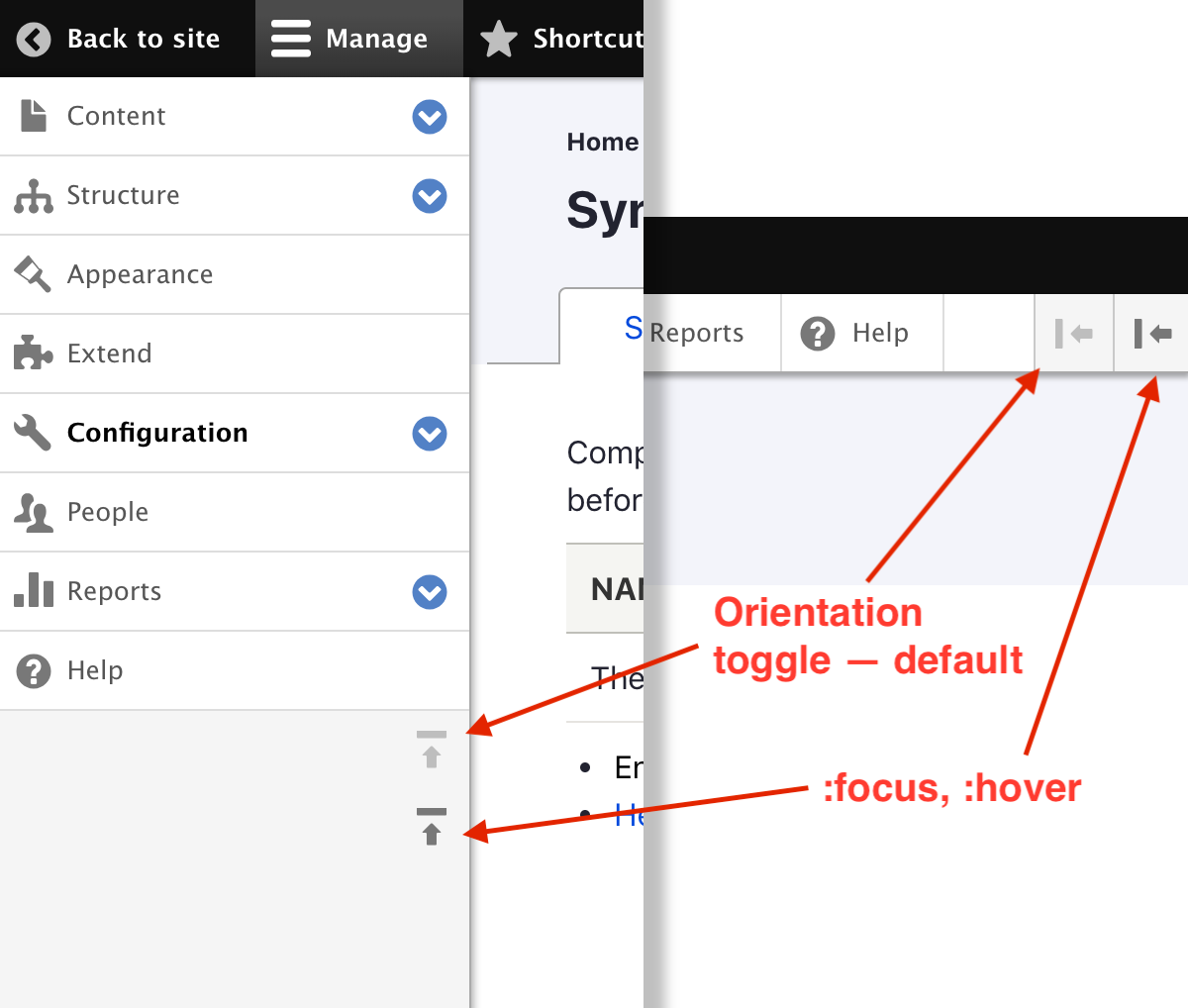
I think we need this for the toolbar direction toggle button too
Couldn't we apply the font size on
.toolbar?Should this be part of Toolbar module?
Nit: space after if
Workspace button could have a nicer focus effect. Let's open follow-up for re-designing the workspace dialog.
This is probably fine as it is but the hover effect here looks a bit funky. When the link is hovered, the whole item receives background including the expand button. Not sure I have good solution in mind but just wanted to make sure this gets at least documented here.
Comment #67
bnjmnmComment #68
saschaeggiDroping this here: https://www.nngroup.com/articles/accordion-icons/
Comment #69
bnjmnmThis addresses most of the feedback in #66.
For #66.9 I created an issue for applying the DOM order fix to all of core. The Claro fix is still there just in case that issue runs into blocks that this one doesn't. #3167438: Presentation of some toolbar buttons differs from DOM order
The workspaces icon issue is here #3167464: Redesign workspaces toolbar button
This is still set to "needs work" as there is still refactoring needed
Comment #70
bnjmnmAdditional work still needed but adding my progress here. I'm n the process of going through each rule and eliminating unneeded ones and reducing specificity where possible.
Comment #71
bnjmnmMore refactoring to remove unnecessary specificity + some changes to better match Figma + some fixes for non-admin trays.
Comment #72
bnjmnmReroll + IE high contrast support for the menu open/close icons.
Comment #73
bnjmnmMore specificity reduction and high contrast improvements.
Comment #74
andrewmacpherson CreditAttribution: andrewmacpherson as a volunteer commentedThe images in the issue summary differ from the ones in recent comments. Can we get an update on what is actually proposed?
Some items are blue. Does this signify something?
Comment #75
andrewmacpherson CreditAttribution: andrewmacpherson as a volunteer commentedSkimming through the patch, there are a bunch of places where the windows high-contrast media query is used, but without any explanation of why.
Some of these include properties like padding and text-indent, which don't have any obvious bearing on the colour space. It would be good to include comments which explain how these are intended to help. The code is a bit esoteric otherwise.
This rings very loud alarm bells! What's the importance of a white border here? It's a very risky idea to use actual colours inside this media query, because you can't guarantee this border will be visible or have sufficient contrast. I wouldn't advise doing this unless the specific colour is essential for understanding the content.
Instead, you can put the border in the main style rules (using any CSS colour value, even the transparent keyword), and get rid of the media query entirely.
Comment #77
boulaffasae CreditAttribution: boulaffasae as a volunteer and at Fullwave commentedPatch Updated, wokring with
9.2.x-devComment #78
bnjmnmThe patch in #77 didn'r apply, but also has ~40k of unrelated changes, the next reroll should still be based on #73
Comment #79
boulaffasae CreditAttribution: boulaffasae as a volunteer and at Fullwave commentedHi bnjmnm,
The patch did apply to me. I just went through the patch #73 and copied the lines.
Before:
After:
Comment #80
volkswagenchickAdding
NorthAmerica2021andEasy Out of the Boxtags for visibility.DrupalCon NA is April 12-16 with a focus on EOOTB on Wednesday, April 14.
Thanks
Comment #81
ckrinaNext step here should be:
1. Create a Merge Request or reroll the patch based on [#73].
2. Integrate feedback from [#74] and #75: Where is book log message? (can be done together with previous step) and move to the issue status to Needs review.
3. To start the reviews, take screenshots of the results.
Comment #82
ckrinaComment #83
nicoloye CreditAttribution: nicoloye as a volunteer commentedWorking on this as part of DrupalConNA.
Comment #85
nicoloye CreditAttribution: nicoloye as a volunteer and at Actency commentedI created the MR and also fixed the initial patch that was declaring claro_preprocess_toolbar() twice.
I've also encounter a strange behavior with the toolbar handle when it's open in vertical mode.
The svg is not rendered correctly.
I've seen that there's a difference between the way it is defined for both open and closed handles in toolbar.icons.theme.css.
On line 261 the closed one declares a background-image with a data:image/svg+xml element.
On line 278 and 284, the opened one declares a background-image with a svg file url (which seems good anyway, don't know why it's not rendering).
It's my first time working on Claro, I don't want to mess anything, so I let some more skilled people dealing with this !
Good luck !
Comment #86
KapilV CreditAttribution: KapilV as a volunteer and at Innoraft for Drupal Care, Drupal Association commentedaddressed above suggestion.
Comment #87
KapilV CreditAttribution: KapilV as a volunteer and at Innoraft for Drupal Care, Drupal Association commentedComment #88
joegraduateFWIW, I can't seem to reproduce the custom commands failure locally with the latest code in the MR branch.
Comment #90
ckrinaIt looks like 1 test is failing, and it would be great to update this against 9.3.x.
Comment #91
dhirendra.mishra CreditAttribution: dhirendra.mishra at Valuebound for Valuebound commentedUpdated this to 9.3.x
Comment #92
bnjmnm@dhirendra.mishra the patch you provided in #91 is not necessary as this issue is using a merge request instead of patches. It is also identical to the patch provided in #86, so it doesn't advance the issue at all and could be perceived as gaming for issue credit (though I assume that was not your intent).
You can learn more about working with merge requests here: https://www.drupal.org/docs/develop/git/using-git-to-contribute-to-drupa...
Comment #93
imalabyaThe toolbar changes works good. However, there is a regression when the toolbar is switched from vertical alignment to horizontal alignment the arrow overlaps with the menu links. Attached video
Comment #94
volkswagenchickTagging for Design4Drupal 2021. Contributions are Friday, July 22
https://design4drupal.org/
Comment #95
volkswagenchickCorrecting tag Design4Drupal2021
Comment #97
kostyashupenkoComment #98
rkollerI've tested the current state of the merge request #558. The issue mentioned in #93 i am unable to reproduce. If the commit in #96 was fixing that then i would consider that part fixed.
But I've noticed something else. I have tested the diff on 9.3.x-dev in Safari 13.1.2, Chrome 92.0.4515.159 and Firefox 91.0.2 on MacOS High Sierra. In Firefox and Chrome everything looks good but in Safari I've noticed two tiny cosmetic issues.
The border at the bottom of the menu items is missing which is quite distracting (see missing_border.png)
On mouse over on the vertical orientation button some border gets expanded on the top (see mouse_over.png)
Comment #99
volkswagenchickAdding tag for DrupalCon
Europe2021. ThanksComment #100
yogeshmpawarRemoving Needs reroll tag as it is no longer needed.
Comment #101
ckrinaMoving to Needs work per #3020422-98: Toolbar style update comment.
Comment #102
bnjmnmComment #103
vikashsoni CreditAttribution: vikashsoni as a volunteer and at Zyxware Technologies commented@KapilV i have applied the patch but i can't see any changes for ref sharing screenshots .....
Comment #104
kostyashupenko1. Rebased against 9.3.x

2. Fixed feedbacks from #98
3. Replaced some colours with new ones based on this commit
4. Fixed one more bug related to rtl support:
There was a little typo in css
On my side toolbar works normally now, tested in Chrome / Firefox / Safari 14
As usual probably i missed something, but looks like we are close to finish this ticket. Tagging.
Comment #105
rkollerI've applied and tested the latest changes listed in #104 with a current install of Drupal 9.3.0-beta2 to see if the changes work on my end as well. But the commited changes introduced a new display error while the issues in #98 seem only half way fixed. Installed a completely fresh Drupal 9.3.0-beta2 to rule out the possibility something went wrong with my existing install. But same result on my clean install.
1. the border is still missing. but only for the menu items when manage is selected (see missing_border_manage.png). if you choose shortcuts (see missing_border_shortcuts.png) or the username the border is showing. the other bit in #98 about the mouse over is fixed. thank you!
2. the detail newly introduced in the latest changes is that a few of the submenu items are missing a background color and have a transparent background instead.

Applies to:
content
-comments
-files
appearance
-install new theme
-update
extend (all three sub menu items)
people
-add user
-permissions
reports (all sub menu items except field list)
Tested with Drupal 9.3.0-beta2 (Olivero as the default theme and Claro as the admin theme) and admin_toolbar 3.0.3 on Safari 13.1.2 and the latest Firefox.
Comment #106
bnjmnmRe @vikashsoni #103
See #92 - this issue is using merge requests, and my comment there has a link to how to identify and work with merge requests. Any patches you applied are outdated and it's unsurprising they may not work.
Comment #107
kostyashupenkoAnswering to @rkoller on comment #105
1. background white for the
.toolbar-tray aselector was restored. I just removed it for the local tests i did and i didn't notice i have commited removal of it. So now links will not have transparent background anymore.2. As i understand from design - the default behavior of horizontal toolbar is to not have sub menus. Sub menus are hidden and impossible to expand it. But you can do it if to switch on vertical toolbar. Which means such case is just impossible to get looks like:

But ok, i'm fully understand how you reproduce this -> using contrib module admin_toolbar. You know this contrib module has own css styles which conflicts with ours and i almost sure we shouldn't handle it -> it's a problem out of drupal core's scope. However, now links doesn't have transparent background anyway, so probably we are fine now even with
admin_toolbarmodule. But css of this module still needs some polishing after this issue will be fixed.3.
i can't reproduce anything like this without
admin_toolbarmodule enabled. But when it's enabled -> it creates some more borders (using own css), which is again out of scope of this issue.For my tests i have used:

with Standard profile installation.
Comment #108
rkoller@kostyashupenko uhhhh i am sorry! i was completely unaware that admin_toolbar brings its own css styles into the mix (am not a developer). so i haven't really thought of that possibility - but i consider admin_toolbar as the defacto standard being installed on every project right from the start as default. but you are totally right it is out of the scope for this issue. gotta report it in the admin_toolbar issue queue that the styling has to be updated based on this issue. :)
about 3.
i've uninstalled admin_toolbar now and updated to Drupal 9.3.0-beta3 as well as to the latest version of the merge request but as you can see the border is still missing for menu items for manage and for the user. for shortcuts it is displayed as expected.
But i've tried also with the latest Firefox and Chrome and there the border is displayed as expected also for manage and user menu items. So it seems to be an issue exclusive to Safari 13.1.2 (That is the latest available version for older MacOS versions like High Sierra - the version I am stuck at currently until I get my new computer). So not sure if it is a requirement to be fixed then or if the border problem for Safari 13.x could be discarded and should be ignored? The current Safari version is 15.x.
I leave the issue with needs review so others could leave their thoughts about the Safari issue and how to deal with it.
Comment #110
rkollerOne detail that i have overlooked so far and just noticed. Currently the
usertoolbar icon is aligned to the left with theshortcutsandmanagetoolbar icons (see the screenshot in #108) but according to the spec in the IS theusertoolbar icon should be aligned to the right instead.Comment #111
kostyashupenko#110 It's fixed, but target branch of MR should be changed on 9.4.x i believe
Comment #112
kostyashupenkoComment #113
rkollerThank you @kostyashupenko working on the fix for #110. I've applied the diff to
9.4.x-devsuccessfully but you are probably right that it might be necessary to change the MR to 9.4.x. The user icon in the first level toolbar is positioned correctly like in the FIGMA design system now. But there three small details left to note.1. In the second level toolbar of shortcuts the edit shortcuts item seems aligned to the right instead of to the left on the desktop view


Same for the mobile view
2. I've noted about the missing border on Safari 13.1.2 before in #98 & #105 but always thought the border is missing consistently for all second level toolbars. But as you can see in the screenshots in point 1 the border at the bottom is displayed for


shortcutsbut formanageand theuserit is missing in Safari (for the latest Firefox it works):3. And one detail i've noticed by accident. There is a wrapping for the

managesecond level toolbar to a second line as soon the desktop viewport is too small for the number of toolbar items but before the breakpoint for the mobil second level toolbar is reached:Comment #114
dwwComing here from the Accessibility Office Hours, where we reviewed #3097907: Active toolbar tray has weak affordance and fails WCAG color criteria. Pointing out that we're going to want to keep the improved styles from that issue where the active tray has the same color scheme as the tray, producing an "inverted T" shape, instead of relying on a slightly different shade of grey to know which item is the active one with the subtray open...
Comment #115
dwwAt #3097907-69: Active toolbar tray has weak affordance and fails WCAG color criteria, @ckrina indicated that Claro intends to go a different path for solving that accessibility bug. Transferring the "Needs design" tag from there, and tagging for an accessibility review of the final designs here. Y'all can design this however you want, so long as it's at least as accessible as what we're doing at #3097907.
Also repairing formatting bugs in the Remaining tasks section, and adding the accessibility review there for clarity once that team is formally looking at this this.
Thanks!
-Derek
Comment #116
dwwRepairing a bit more Remaining tasks formatting.
Comment #117
dwwAlso adding #3270230: Toolbar focus styles are not sufficiently obvious to know where your focus is as related that needs accessibility review and design consideration here.
Thanks,
-Derek
Comment #118
saschaeggiI think we can and should do at least a quickfix to address the very valid & important point of @dww.
We could easily improve the active item by using the primary color (I've used a new ~450 shade of blue) – which would have a contrast of
3.08:1to the background of the toolbar (dark grey) and15.48:1to white.Comment #119
andypostComment #122
camilledavis CreditAttribution: camilledavis at CivicActions commentedHow would the blue active state from #118 work with the green focus ring, since the green and blue don't have sufficient contrast with each other?
I can think of two solutions...
1. Have the focus ring for the active blue button be a lighter color. But it seems confusing to have the focus ring be a different color depending on the button.
2. Go back to the active state proposed here: https://www.drupal.org/project/drupal/issues/3097907#comment-13792895 (White background, black text). Then, the same green focus state will work everywhere.
Comment #123
saschaeggi@Camille Davis the focus ring we use in Claro has a 2px white inset/offset so it passes the contrast.
Comment #124
camilledavis CreditAttribution: camilledavis at CivicActions commentedCross-posted from Slack #frontend and 3097907 - Active toolbar tray has weak affordance and fails WCAG color criteria:
@camilledavis: Is there somewhere I can grab that css from?
@saschaeggi: https://git.drupalcode.org/project/drupal/-/blob/10.1.x/core/themes/clar...
Note:
/**
* Default focus styles for focused elements.
*
* This is applied globally to all interactive elements except Toolbar and
* Settings Tray since they have their own styles.
*/
so that’s maybe what we want to change cc @ckrina
@camilledavis: thanks! So if that was applied to the toolbar it could go two ways, not sure which is best. Inside, you could see the whole focus ring. Outside, it would match the other focus styles.
@ckrina: +1 to this change as long as this visual language pattern is limited to the existing Toolbar.
And to answer @camilledavis, I would go with the inside focus ring, but just for the Toolbar and its specific placement.
I hope this solves the accessibility concerns.
@camilledavis: Should the focus ring replace the current focus state (underline, slight change in background color) entirely? Or appear in addition to it?
@saschaeggi: it should be additional to underline & bg color
@camilledavis: What about the tray -- should the focus ring cover the gray border on the left and right?
And here's what it looks like with admin_toolbar module enabled... should the focus ring cover the borders on all sides here?
@saschaeggi: that would be nice 👍
Comment #125
camilledavis CreditAttribution: camilledavis at CivicActions commentedOpened an MR for the focus ring on 9.5.x on this issue 3270230 - Toolbar focus styles are not sufficiently obvious to know where your focus is
Comment #126
itmaybejj CreditAttribution: itmaybejj at Princeton University commentedWould it be preferable to map the enhanced focus ring to the :focus-visible selector rather than :focus? This might "leak" into mouse interactions.
Comment #127
saschaeggi@itmaybejj I would like to avoid introducing an inconsistency here. As we use
:focusfor all other focus states in the UI (for Claro at least).Comment #129
mgiffordAdding reference to Windows High Contrast Mode.