
 Support for Drupal 7 is ending on 5 January 2025—it’s time to migrate to Drupal 10! Learn about the many benefits of Drupal 10 and find migration tools in our resource center.
Splitting this off as a bluecheese-specific subtask of #34496: [meta] Add Flag module to allow users to subscribe/unsubscribe without posting a comment ...
I've got all the basic pieces of the follow-issues-via-flag stuff deployed at http://subscribe-drupal.redesign.devdrupal.org (although there's not yet a data migration path for automatically flagging all the nodes you've ever posted or commented on). I'll update the issue summary at #34496 in a few moments...
Right now, the flag/follow UI is way too subtle. We need this feature to be OBVIOUS!
Flag itself just gives you a few knobs. The text for the link when you flag, the text for the link to unflag, a little message to display when you flag/unflag, and the hover title text for the 2 links. Currently, we have:
  'flag_short' => 'Follow',
  'flag_long' => 'You are not following this issue. Click this to follow.',
  'flag_message' => 'You are now following this issue.',
  'unflag_short' => 'Unfollow',
  'unflag_long' => 'You are now following this issue. Click this to unfollow.',
  'unflag_message' => 'You are no longer following this issue.',
(short is link text, long is the hover text, message is the printed message after you toggle into the state)
When I was talking to Leisa about all of this, we discussed something more like this:
Initial state (you're not following the issue):
- The "follow" link is a huge green button near the top of the page.
- I think it'd be nice to have the link also appear at the end of the comments (e.g. right above or next to the "Post new comment" header) and perhaps again at the very bottom of the page, under the comment form... quicksketch told me in IRC you can have the link show up multiple times on the same page, but they won't all toggle state together automatically. So if we do that, we're going to need some extra JS magic for that to all work properly.
Once you follow the issue:
- The "unfollow" link actually looks like "Following"
- When you hover over the "following" button, it turns into an "Unfollow" button that you can actually click.
In IRC, quicksketch suggested that a CSS sprite would probably work perfectly for this. We could do all the button visuals via CSS -- no JS required. However, we're still going to hit trouble if we have multiple follow links since they're not all going to toggle state together.
Another complicating factor:
- We need to make sure whatever we do is accessible to screen-reader users. Probably we can just keep things as they're currently defined in the markup and it'll basically work fine. However, it'd be great to get confirmation of that, so I'm tagging this "needs accessibility review".
| Comment | File | Size | Author |
|---|---|---|---|
| #47 | 1284694-47.bluecheese-issue-follow-ui.patch | 1.02 KB | dww |
| #39 | 1284694-39.bluecheese-issue-follow-ui.patch | 988 bytes | dww |
| #33 | 1284694-33.bluecheese-issue-follow-ui.patch | 3.48 KB | dww |
| #29 | 1284694-29.bluecheese-issue-follow-ui.patch | 3.31 KB | dww |
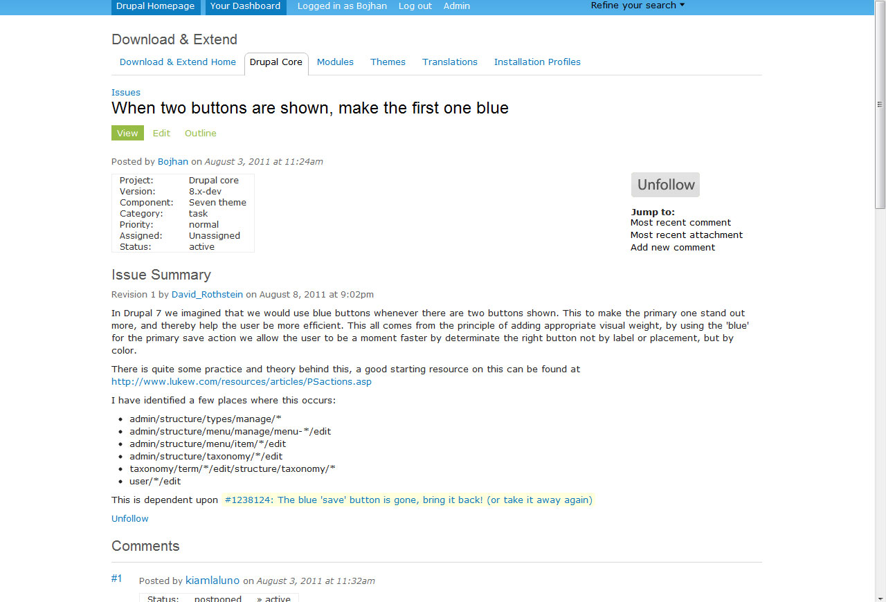
| #25 | follow-unfollow-toggle.png | 33.77 KB | yoroy |


Comments
Comment #1
Everett Zufelt CreditAttribution: Everett Zufelt commentedIs there an account setup on the test site that I can use to test?
My general thoughts (w/o testing).
1. The links need to have a heading before them, this can be made invisible using .element-invisible from D7
2. If the update / message is ajaxified then the message needs to be placed into a container w/ role="alert" This container needs to exist in the DOM prior to the message being added.
Comment #2
dwwHi Everett -- Thanks for the quick reply and feedback!
The test site uses a standard .htaccess password to even get to the site at all. User: drupal, password: drupal.
I hope you don't mind, but I've configured your account on that site to have a real email address again, and I think the site just sent you an email about that. If that email doesn't include a 1-time login link, you should be able to request a new password here:
http://subscribe-drupal.redesign.devdrupal.org/user/password
If you have trouble with any of this, just reply here and I'll do whatever I can to sort it out.
Thanks again!
-Derek
Comment #3
Everett Zufelt CreditAttribution: Everett Zufelt commentedIf we can use a heading and place role="alert" on the span w/ class = flag-wrapper then this should be good from a screen-reader perspective.
Of course the links need to receive visible keyboard focus and Have proper fore /f back contrast
Comment #4
yoroy CreditAttribution: yoroy commentedSubscribe (haha)
Comment #5
Bojhan CreditAttribution: Bojhan commentedAlright, a quick mockup - obviously this could use some fine tuning. But I think in general is this is what we want, using existing sprites and possible a custom one for unfollow. I think a very visible follow and less visible unfollow button should be fine.
The unfollow button is transformed to upon click, there can be a hover for "unfollow" but since the standard style guide didn't provide it for the standard green button I didn't either.
When it comes to the actual messages, I am confused that we don't just do it in a dsm. Even if its a "fake" dsm that simply shows and hides again - like you do already on the site.
Comment #6
Bojhan CreditAttribution: Bojhan commentedAfter feedback from dww and merlinofchaos, I switched to a 3-state button. This is way more nice :) Also some tweaks to the color scheme, arguably these can use further tweaking (tried to stay close to existing patterns). We dropped the message, because its placement is awkward visually and the information value can be delivered by using 3-state button (also for screenreaders, I think).
When this is clicked the button fades-into a following button, shown below.
When following is hovered, the unfollow button is shown and upon click the follow button appears again.
Comment #7
dwwThanks for these mockups! This is a big help...
Personally, I prefer the first (dark green) follow button. I'm concerned that follow2.jpg is too subtle and it'll be easier for people to miss this functionality. Especially if we're only going with a single link/button on the page.
I have these 3 open in tabs to toggle between them and I think it's working quite nicely:
http://drupal.org/files/issues/follow.jpg
http://drupal.org/files/issues/following.jpg
http://drupal.org/files/issues/unfollow2.jpg
Try for yourself. ;)
Apparently bojhan is concerned that follow.jpg is *too* much attention to draw to this functionality... I think this is so important, it's worth it. Clearly, it'd be great to get another set of eyes on this (yoroy and Leisa, I'm looking at you). ;)
As a compromise, perhaps we should roll it out with DARK GREEN IN YOUR FACE!!! for the first few months, and then when the culture of "+1 subscribe" comments has been thoroughly destroyed, we can tone it down again at some later date. ;)
The other concern is that the "Following" button doesn't look much like a button and the word isn't a verb, so it's not visually obvious you'd want to mouse-over it to get the unfollow button... not sure what to say about that (except that unfollow is going to be a pretty rare operation in the scheme of things, and I'm much less concerned about it over all).
Comment #8
Bojhan CreditAttribution: Bojhan commentedI am not really concerned about the Following button, we can enhance the look to make it look more like a button (the gradient, par example - search button uses that too). Additionally other actions showing up when hovering over an active indicator button isn't really a new pattern its used by twitter (follow) and facebook (subscribe) for example. Given that its not a very important interaction either, I wouldn't favor dedicating a special space for it.
I am on the fence to do a blue or green button, I will let others decide on this one.
Comment #9
drummI think the color should be green. Green is used elsewhere on the site for actions and customization. For links,
class="action-button"sets everything up for something like the right side of http://drupal.org/marketplace-preview. We should keep these consistent throughout the site.One concern is the color, many of the greens on the site do not have enough contrast, #946344: QA: Simplify green hues, but that is a separate issue. The current home of Drupal.org's color palate is in the style guide, http://drupal.org/node/1051644. This is based on last year's redesign, https://infrastructure.drupal.org/drupal.org-style-guide/, but is now community-maintained, please edit if you can improve it.
Comment #10
Everett Zufelt CreditAttribution: Everett Zufelt commentedI'm not quite understanding the recommendation, but it doesn't really seem like something that will be easy to make accessible.
Comment #11
dwwThanks to a lot of help from quicksketch in IRC, I've got an initial version of this implemented and ready for review and testing! I had to guess Bojhan's colors, but I think I got pretty close. You might need to clear your browser cache to get the full effect. But, for example, check out:
http://subscribe-drupal.redesign.devdrupal.org/node/1189292
Live-action screenies:
Initial state:
After you click "Follow", you now get "Following":
Unless you hover over "Following", in which case you see this:
Pretty slick! The text replacement is done via a tiny bit of custom JS in bluecheese.js.
However, to make the non-JS degrade case somewhat sane, I decided to leave the default link text in the markup "Unfollow" (which really is the action you can take if you're currently following). So, there's a possibility of text flicker on page load as the JS runs to swap out that text. Seemed like the lesser evil. The alternative is to just send "Following" as the default text in the markup, and then only toggle it on hover in JS. But as I said, that sucks for non-JS (and presumably for screen-reader users, too).
Note 1: I have not yet had a chance to understand and implement Everett's suggestions/requests. That's next on my list. I just wanted to get this up for immediate testing and review.
Note 2: Attached patch requires a minor fix to project_issue #1285798: theme_project_issue_summary() does not get passed enough context information to be useful ...
Comment #12
dwwEven better CSS based on a quick IRC chat with drumm. We can just let a.flag (all flag links) share the same style with action-button. Then, we only need to override the colors for a.unflag-action and a.unflag-action:hover (instead of redefining the whole border-radius, padding, fontsize, etc).
Comment #13
drummFor colors, I think we should stick to white text on a darker background, like #D23F3F for the red. Maybe white on a warm grey for following?
Otherwise, code looks good, please commit when otherwise ready.
Comment #14
dwwRe #13: Yeah, that sounds like a nice plan for the colors. I'll try those in the morning.
Meanwhile, if anyone wants to at least test the flagging UI (this issue) I reset the password on the "bananas" user on the test site. So anyone can at least follow/unfollow issues, see how all the buttons behave, and see the issues appear/disappear from "Your posts" and "Your issues".
Also note that we'll probably move most of this code (e.g. the JS and possibly the markup changes to render the follow buttons above the jump links) into project_issue itself since we're now planning to create the flag programmatically and provide even tighter integration. So, hopefully we'll just need the styles.css hunk of this patch in the end...
Comment #15
dwwI noticed that the flicker problems in #11 are extra yucky if you don't move your mouse at all after you click the "Follow" button. In fact, it's basically a bug in the UI -- the button says "Following" but it's got the color-scheme from the "Unfollow" (since you're still hovering, although the JS hasn't noticed you're hovering since you haven't moved). Probably there's some way to further complicate the JS to handle this case, but it just makes me wonder if this approach is too fragile and problematic.
Two other possible approaches to consider, each with downsides:
A) Use image buttons from a CSS sprite for everything
Cons:
- the font will be locked, even if other text-buttons on the site are using browser-specific fonts
- text won't be translatable
- more work to modify the visuals, tweak colors, fonts, sizes
- won't share styles with other parts of bluecheese (e.g. we'll have to remember to regenerate the sprite images whenever we change our standard color palate or we'll just have to let the styles diverge)
B) Use two
<span>'s inside the "unfollow"<a>for the two different link texts and *just* use CSS (no JS) to control which span is visibleCons:
- Seems like an ugly hack circa 2004
However, if that's the only reason not to do it, perhaps it's the right solution given the alternatives
Then of course, there's the current state of the patch:
C) Use JS to try to swap out the text for the "unfollow" link when you're not hovering
Cons:
- Possibilities of text flicker during page load and during flagging AJAX changes
- Doesn't degrade for browsers without JS -- you're only got 2 visual states, not 3
Hrmph. Would love more input on this... Is there another option? Do I not understand the pros/cons of the current options?
Thanks,
-Derek
Comment #16
dwwHere are the following and unfollow buttons along the lines drumm suggested. I kinda like it. FYI the grey I'm using here is #BFBFB3. Now deployed on the dev site.
Default "Following" case:
Hover over "Following" to see "Unfollow":
Comment #17
dwwHere's another grey for consideration: #828282. This one is about the lightest grey I could get that "Sort of" passes http://snook.ca/technical/colour_contrast/colour.html
Seems way too visually loud to me, but drumm had pointed to this tool and was hoping we'd be able to comply...
Comment #18
Everett Zufelt CreditAttribution: Everett Zufelt commentedLooked at the test site briefly.
1. The link is her to find, can we please get a heading to make it a little easier to discover?
2. I think this was mentioned by someone earlier, but 'Follow' and 'Following' seem unbalanced, can we do 'Unfollow'?
Other than that it is good, can someone pleas confirm:
1. Can received keyboard focus (I believe it can)
2. There is a noticeable visual focus indicator.
Comment #19
dwwThanks for testing and reviewing, Everett... As I said, I still hadn't started addressing your concerns, but I'm glad to know it's not a total failure of an interface, even now. ;)
Re: heading: we can definitely add one that would be hidden for sighted users, that should be easy...
Re: "Unfollow" vs. "Following": that's actually a bug related to keyboard focus. You can focus the link via keyboard (and it's actually pretty early in the process of tabbing through the page, which is good), but unfortunately all the UI magic is only happening on hover, not focus. So, we need to fix whatever approach we end up doing out of our choices in comment #15 to happen with both hover and focus. I believe it'll be a lot more sane for non-sighted users at that point. The "Following" text is just supposed to be informational text to tell you what state you're in while reading the page. If you focus/hover, it should become "Unfollow" which is the action you want to do. Hope that's clear. Will that be usable and accessible to non-sighted users?
Thanks!
-Derek
Comment #20
Everett Zufelt CreditAttribution: Everett Zufelt commentedNot sure how well it will work, I can't think of a single other place where I have seen link text change on focus, so we'll have to test and find out.
Comment #21
dwwHeh, okay, cool. ;) Thanks for the quick feedback. I'll hopefully have something working later today that we can test out.
However, for that to be possible, I'd kinda need to hear back from some of the people more savvy about UI and front-end implementation than I am about my concerns in #15.
Cheers,
-Derek
Comment #22
dww@Everett: I haven't fixed the header yet, but I think I got the focus and hover stuff working. Probably need to clear your browser cache to see it in action. But it seems to be working splendidly in my testing. Let me know if/how it works for you.
Thanks!
-Derek
Comment #23
dwwp.s. Playing with all this via keyboard focus made me realize it's probably nicer to have the follow/unfollow button and the "Jump to" links appear first in the markup, before the table of issue metadata. That way, tabbing through links always brings you to the main action links first, instead of potentially having to tab through all the issue tag links in the table. We might add more links to that table in the future, so it seems more humane to always have the actions first. Visually, we're already floating those links to the right, so it doesn't matter what order they appear in the markup. Seems like a good fix that I'll probably just fold into project_issue upstream (assuming you agree).
Thanks again for all your help on this! I just love learning about these sorts of problems and how to fix them.
Cheers,
-Derek
Comment #24
Everett Zufelt CreditAttribution: Everett Zufelt commentedWOrks well.
Only point on the visual / markup position is that it is best when keyboard focus follows some sort of logical (predictable) order. Haven't tested this, I'll leave it to your judgement.
Comment #25
yoroy CreditAttribution: yoroy commentedI had a closer look at the coloring and I think the current design is overdoing it a bit. I would especially stay away from using red here. We should preserve red for errors and other alarming actions and statusses. Unfollowing an issue is not that big a deal. This became especially clear when I clicked to follow and let the mouse pointer within the button area. When following is finished and you start moving the mouse pointer, you immediately get the red flashed at you. It really is not that big a deal to unfollow an issue, so I think the design should reflect that.
Here's a design that uses the green for both ways around, with the darker green on hover. I also tried a more muted version of the 'following' state, using a light grey for the bg and the default blue link color for the link text.
The current title attributes are a bit wordy, can we move over some of that to the wording of the actual link, in all its states?
In this proposal I tried:
Follow this issue (default, not following yet)
Following this issue (you are following this issue)
Unfollow this issue (on hover when already following this)
So the default is worded as an invitation, projects the future state, as an action
The 'following' state is worded as a status, reflects the current state, as a label
When hovering in the following state, the message changes to the actionable wording again, this time to let you unfollow.
Always tricky territory those flip-flop buttons in that regard, but in this case with all those savvy computer users in here, it might just be enough ;)
Exciting to see this materialize, good work all around.
Comment #26
dww@Everett: What should the hidden heading actually say? I don't understand what role it is supposed to play. Can you clarify?
Re: #24: re: focus stuff working -- hurray!
Re: #24 re: logical (predictable) order for focus -- that's exactly the reason I wanted to swap the order in the markup. Seems best to always get the action links in focus first, not some random number of issue tag links between the post's author link and the action links.
Re: #25: now that you mention it, I agree that "Unfollow" isn't worth a scary red. However, I wonder if having it look *just* like the "Follow" button is a good idea. yoroy and I chatted in IRC briefly and he points out it's only for the hover/focus state, so maybe that's okay. Recovering from an unintentional "unfollow" doesn't even require another page load. ;) So yeah, probably this is fine.
Re: #25: re: "... this issue" in the link text -- we want to re-use this UI (and functionality) for following forum posts, too. So, adding "... this issue" to all the link states just makes that harder. If we really want that, we should probably enable token.module so the link text can be "Follow this [node-type]" but that's a mess (and a potentially big delay since we're not yet using token.module on d.o). yoroy agrees this is too much trouble. His intention was that there was enough context for you to know what you're following, but hopefully that'll be self-evident. If it's somehow a problem, we can revisit that later. So, we agreed to just keep the link text to the single words...
---
So, to summarize this issue's status:
A) The JS to handle the non-focus/non-hover "Following" text is broken if you don't touch the mouse (or move focus) after you click on "Follow" -- it always replaces the text to "Following" even if we're still hovering over the button (which will be pretty common after clicking that link).
B) Point (A) leads me to doubt if the JS is the right way to manage the 2 different states for the unfollow button. I proposed 2 other possible solutions in comment #15. I still don't know how best to proceed.
C) We need agreement on the colors. I now like yoroy's proposal in #25. Neither of us want to spend much more time thinking about the colors themselves. Can we just go with #25 and be done with it?
D) I still need to add some kind of hidden header above these links -- need clarification on what it's for and what it should say.
E) I need to decide how much of this logic/code should move upstream into project_issue since it's looking like we're going to be defining the flag programmatically and "owning" the flag, so probably we're going to want this same behavior for anyone trying to use flag + project_issue.
Comment #27
Everett Zufelt CreditAttribution: Everett Zufelt commented@dww
I think that with where the link is now it can live w/o a heading. I'll open up a followup if I change my mind about it.
Comment #28
Bojhan CreditAttribution: Bojhan commentedI agree to the colors, lets just do it - so hereby stop discussing it :) . I am sure we can revisit it if we truly encounter issues.
For the feedback on front-end implementation, lets do a shout out to jacine, sun, jeff burnz etc.
Comment #29
dwwAlthough I got some more JS help from quicksketch in IRC, his suggestion still doesn't actually work in Safari and Chrome (perhaps it's a bug in WebKit?), and isn't needed in FF. I have no idea how IE behaves with this. I'm thinking that this special case (the AJAX injecting the link directly under your pointer/focus) is going to be very browser-specific. I *really* don't want to go down that route. Plus, the JS approach doesn't degrade. And, even in the best of circumstances, there's the weird flicker on page loads. Screw that. ;)
So, I whipped out my trusty CSS fu circa 2004 and did this the good old-fashioned way: 2 spans and a tiny bit of CSS. In my testing, this works perfectly on all browsers, there's never any flicker, and it works with JS disabled. I tried to make the markup as semantically sane as possible:
And I'm using the following CSS:
My only remaining concerns are:
- Does this still make sense and works properly via screen readers?
- Does this work in IE7? (Apparently IE7 a:hover doesn't work unless you change a style, although we're already changing a bunch of styles so I think we're fine).
Now deployed on the test site, e.g.: http://subscribe-drupal.redesign.devdrupal.org/node/1189292 (again, might need to clear your browser cache).
Thoughts?
Thanks!
-Derek
Comment #30
Everett Zufelt CreditAttribution: Everett Zufelt commented+1
Comment #31
Bojhan CreditAttribution: Bojhan commentedJust pondering, can we do a fade instead of the weird scrolly thingy? (which also seems to take longer, than the actual action should take).
Comment #32
aspilicious CreditAttribution: aspilicious commentedThe width should be fixed. It's very anoying to see the width change when hovering.
PS: I TESTED IN IE7 AND IT WORKS
Comment #33
dww@Everett: Yay, glad to hear it! Thanks again for all your testing on this...
@Bojhan: I really don't want to try to re-engineer *how* flag.module is doing the AJAX replacement. That's just more effort (and custom JS hackery) than I care to spend on this. The whole point of #29 is I'm trying to avoid using *any* JS for customizing this UI.
@aspilicious: Thanks for testing on IE7. I see what you mean about the fixed width. Using display: inline-block instead of inline and this rule seems to do the trick:
Now deployed on the dev site. Clear your browser cache and try this:
http://subscribe-drupal.redesign.devdrupal.org/node/1189292
Are we all happy now? ;) RTBC? I still might move some of this into project_issue before committing -- we'll see.
Thanks,
-Derek
Comment #34
aspilicious CreditAttribution: aspilicious commentedI would say make the follow button the same width as the unfollow. But at least the flickering is over :).
My mouse pointer goes to select mode while hovering the text can you make it a pointer again?
Comment #35
dwwI don't think it matters that Follow vs. Unfollow are differently-sized. There's an obvious replacement thing happening. I'd rather keep them consistent with the style of other action buttons on the site (which shrink/expand to accomodate whatever link text we have).
Re: mouse pointer -- works normally for me (always a pointer) on FF, Chrome, and Safari. So no, I can't make it a pointer again since I can't reproduce the problem you're seeing. ;) If you can provide some CSS that does what you want, I can fold it in and make sure it doesn't break anything on my browsers.
Thanks for the testing and feedback!
-Derek
Comment #36
webchickSUBSCRIBE! :D
Comment #37
Bojhan CreditAttribution: Bojhan commented@dww I think any UI tweaks from this point on are polish. From a visual perspective its RTBC.
Outstanding polish items would be to move away from the scrolling thing(will make it feel more sexy), and fix the differently sized part (its actually not a consistency thing, because we don't have buttons that change on hover this radically).
Comment #38
dww@Bojhan: I already fixed the width on "Following" vs. "Unfollow" on hover. aspilicious is just talking about wanting the "Follow" button to also be the same size so that when you do the AJAX replacement the new button isn't any bigger. I think that's pointless. But hurray that you agree this is visually RTBC for now and the rest can be shunted to different followup issues. ;)
Comment #39
dwwI just opened #1290166: Improve UI for following issues to move a bunch of the logic/plumbing from this patch into project_issue itself. All bluecheese needs to care about now are the d.o-specific colors and the fixed-width of the following vs. unfollow.
The resulting markup and visual UI are identical, I'm just moving around the implementation details so that other sites running project_issue + flag will benefit from all the work we've done in here.
Comment #40
dwwOne thing I just discovered while testing #1284244: Auto-flag when a user creates or comments on an issue
Say you land on an issue, you read it, and decide you have something to say. You post the comment. You're now automatically following the issue. So far so good. However, the way core works is that when the page reloads after your comment, it sends you to the comment id anchor on the page. So, you're scrolled all the way down to the bottom of the issue to see the comment you just wrote, meaning you don't see the nice "Following" stuff we've spent so much time on. ;) Nor would you see a drupal_set_message() since that's also at the top of the page. Basically, there's nothing to indicate that you're now following this issue unless you happen to scroll back to the top of the page.
This seems like another good reason to duplicate the Follow/Following/Unfollow button near the bottom of the page. Perhaps floated to the right of the "Post new comment" header but basically inline with it?
Mostly it'd be pretty easy -- most of what we did in here could be re-used. The only tricky part is that the two buttons aren't going to toggle themselves in unison via AJAX (unless we do some custom JS to try to make that work).
Maybe this isn't worth worrying about or spending time on this. But, it does concern me so I wanted to raise it here for further consideration.
Thanks,
-Derek
Comment #41
tvn CreditAttribution: tvn commentedI wish I'd see this issue earlier so I could comment on colors :)
Auto subscribing to the issue when commenting on it is the standard behavior right now on d.o, without any notification about it as well, isn't it? So I don't think it's necessary to duplicate button at the bottom.
And agree with #34, same button widths would be good.
Apart from that everything looks cool! Spent some time following issues around on test site. :)
Comment #42
dww@tvn: Yes, but we don't want people to comment if all they want to do is follow. Which is why I thought we might want something closer to the comment form that clues them that they can follow without commenting. Also, there's currently no notion of "following" an issue on d.o, so people aren't necessarily going to know that they're automatically following once they comment (although yeah, that's probably expected behavior at least).
Comment #43
yoroy CreditAttribution: yoroy commenteddww, i'm with tvn in that i think we should run into this problem if it exists, lets not bend the design towards the existing crappy pattern (of commenting) beforehand. Trust community etiquette to pick up on it and end-of-life the subscribe behavior instead. People who comment want to follow because they comment, seeing that acknowledged in a fancy new button should be fine I think.
Oh, does that mean that when I comment I cannot currently unfollow it through the button, to remove it from my issue list? (not saying that's a requirement for a first roll-out, but would be good to know)
Comment #44
dwwThat's cool. I'm fine leaving it with the single button for initial deployment and revisiting the "need" for a 2nd button after we've seen this live for a little while. However my point in #40 is that you're not going to see the fact that you're now following reflected in the fancy new button since after the page loads with your new comment in it, core helpfully sends you to the anchor of the new comment. So you're not even going to see the fancy new button at all unless you happen to scroll back up vffto the top of the page.
Yes, you can unfollow after commenting and the issue disappears from your tracker page, Your issues, etc. However, you can't currently comment without at least temporarily following. So, if you're configured to get emails from issues you follow, you have to at least get the email from when you comment, even if you want to immediately unfollow. Probably not worth messing with the comment UI over this (eg a checkbox that defaults on saying "follow this issue when you comment" or something).
Comment #45
sunThis has no effect on the initial "Follow" state currently.
It needs to be applied to a.flag instead to have the desired effect on all states.
Aside from that, this looks and works fine for me.
Comment #46
dwwIt's actually not intended to work on the initial Follow state. ;) But, apparently I'm in the minority thinking that's the right thing, so sure, we can move the CSS around (and figure out anew what the fixed width should be). Not urgent for deployment. If I don't get a chance to circle back around (and no one else provides an updated patch) I'm going to deploy this as-is.
Comment #47
dwwThe fixed-width is now a property of a.flag so it handles all 3 states. Now live on http://subscribe-drupal.redesign.devdrupal.org
Comment #48
dwwCommitted this to bzr, merged into the drupal.org branch, and deployed. There's no harm having this live now -- just a few additional CSS rules that don't match anything yet. And it's one less thing to worry about when the rest of #34496: [meta] Add Flag module to allow users to subscribe/unsubscribe without posting a comment goes live. ;)
Also, this no longer needs an accessibility review (thanks, Everett!), so I'm removing that tag.
Thanks again to everyone who helped make this UI slick.
Comment #49
naught101 CreditAttribution: naught101 commentedHrm, sorry for chiming in really, late, but I think this is potentially important. I see a significant difference between the concept "subscribe" and "follow". Subscribing generally implies recieving emails (or snail mail - it's a pretty old concept), which means that I don't have to go to the source to get the information. On the other hand, follow, a fairly new concept, introduced by twitter, implies that I want to keep up to date with information from a particular source, but that I have to go to a centralised point to be able to collect that information (neither twitter or facebook or anyone else I know send emails on "follow").
In the drupal context, this would mean this feature should be called "subscibe" (as per the original issue), while following should be more like the "tracker" feature - ie. you have to go to your dashboard to check out what's going on.
I think it's probably slightly clearer to users that they're recieving emails if the button says "subscribe".
Of course, that is hugely complicated by the fact that email outs are actually defined by subscriptions to issue queues, and not issues, so maybe all that is moot. Just thought I should bring it up, since I didn't see any discussion anywhere of the new (to drupal.org) "follow" terminology...
Comment #50
dww@naught101: Thanks for raising your concerns. However, following only means that things show up in your tracker on your dashboard (and "Your posts", in the case of issues "Your issues", etc). Optionally you can configure notifications to also get e-mail about the issues you're following, but that's a second step that the vast majority of users on this site never take. Hence, we don't want to use "subscribe" as the action here. Plus, as we expand the notion of "following" to other things (first #1304216: A user should be able to "follow" individual pages of content and receive email notifications for new comments and eventually projects, users, etc) "subscribe" becomes weirder and weirder, while "follow" continues to make sense. Finally, we want to as quickly as possible rid our community and culture of this "subscribe" behavior they're used to, so the clearer a break with that terminology, the better.
Cheers,
-Derek
Comment #51
naught101 CreditAttribution: naught101 commentedGood call, I agree with the terminology now.
Comment #52
sunAlso, that follow vs. subscribe differentiation isn't entirely true:
Facebook recently started to introduce a concept of "following" comments on posts/updates you like or commented on. Depending on your notification settings, you get e-mail notifications (as if you had subscribed to that post/update). They provide a link to "Unfollow this post".