
Intro
Depending on the HTML elements you enabled in the filter settings and what formatting options you want to make available for the users in the editor, you may want to customize the Editor toolbars. For this purpose, on the WYSIWYG Administration page you can select which buttons to display, however, unfortunately as a result, your toolbar gets untidy.
How to see it by yourself?
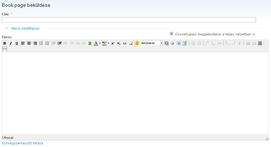
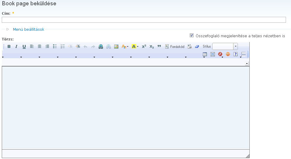
When you select the available buttons by hand, they are placed next to each other without any possibility to alter their order or do a "second line" of icon set. As a result, if you are using CKEditor and selected too many buttons to fit into a single line, your toolbar gets a strange form and displays an empty line with arrows on it as you can see on the attached screenshot. TinyMCE handles it a little bit better, if you select too much button to fit into a single line, your icons simply continue in the next line (see attached screenshot too).
How could you get a better result after customization (in other words: What the WYSIWYG module can do about that)?
The WYSIWYG module should allow site administrators to add separators and use multiple lines of button sets instead of a single one.
With TinyMCE there's a separator button which can be also achieved by adding a pipe (|) to the appropriate position. And also, it supports multiple lines by using the theme_advanced_buttons1, theme_advanced_buttons2, theme_advanced_buttonsn options in the TinyMCE init script.
Documentation about theme_advanced_buttonsn:
http://wiki.moxiecode.com/index.php/TinyMCE:Configuration/theme_advanced...
And documentation about available controls (including separator, which is the point now):
http://wiki.moxiecode.com/index.php/TinyMCE:Control_reference
I think CKEditor has similar options to add separators and using multiple toolbar lines, but never checked CKEditor documentation and never configured CKEditor by hand, so I cannot tell any more details about that.
| Comment | File | Size | Author |
|---|---|---|---|
| wysiwyg_tinymce_multiline_toolbar.png | 18.4 KB | fleetcommand | |
| wysiwyg_ckeditor_multiline_toolbar.png | 14.14 KB | fleetcommand |


Comments
Comment #1
TwoDThanks for a very well researched and documented feature request!
We are aware of the problems with having all buttons on a single row and/or in a single group and we are working to correct that in #277954: Allow to sort editor buttons, so I'll have to mark this as a duplicate of that issue.
Progress has been slow (it's a pretty complex issue and we have to consider all editors) but the more people who get involved there the better!
Btw, button re-ordering/grouping etc will be a major cornerstone in bringing Wysiwyg 3.x to life, so any help you can provide in #277954 will bring that closer. (There's an outline of our 3.x plans over at Wysiwyg 3.x - Wrapping it all up. over at http://groups.drupal.org/wysiwyg.